
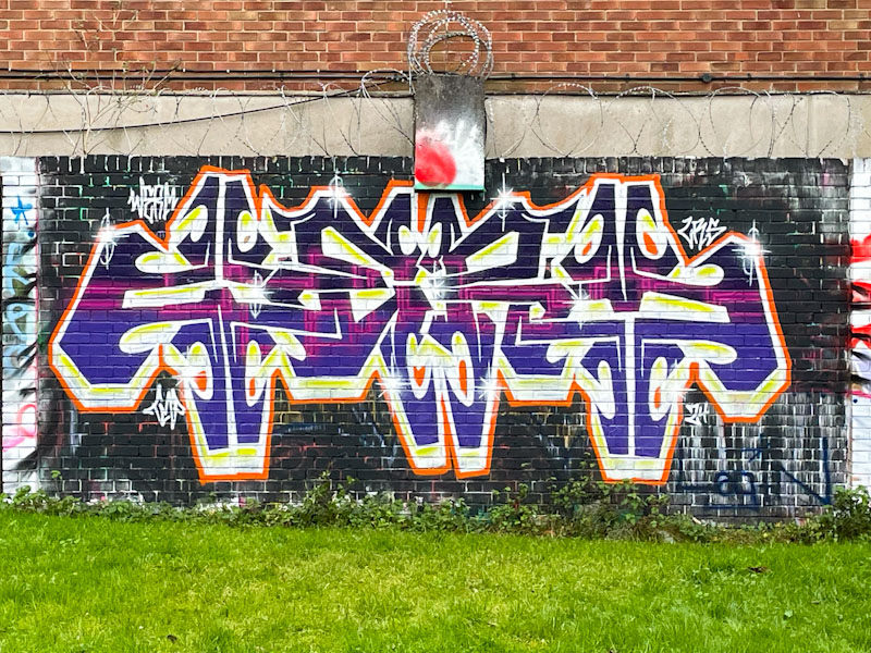
Werm has had a very good year in 2024, and tried out several new variants of his letters, sticking with some and abandoning others. This was a particular theme that saw him through most of the year, crafting the letters WERM into a bilaterally symmetrical pattern.
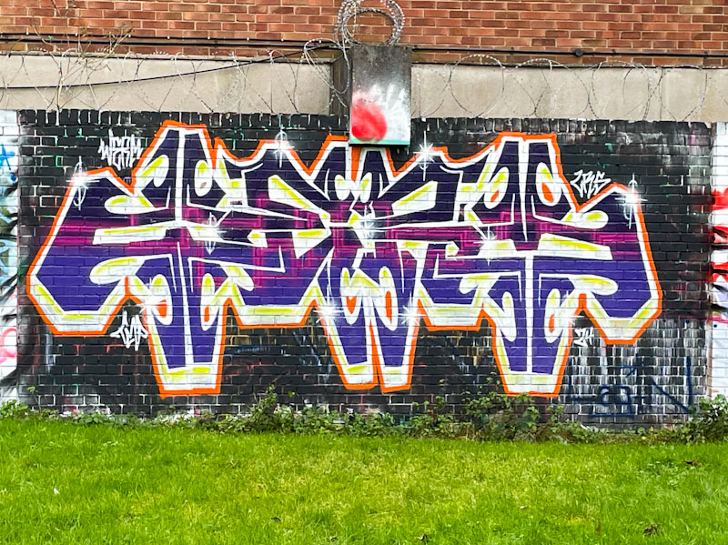
This one looks like it might have suffered a little at the hands of the weather, or the background wasn’t fully applied, which is a pity, because it distracts a little from the writing itself, demonstrating why backgrounds can be so important. It’ll be interesting to see if Werm moves on from this style in 2025.

PGL?
LikeLiked by 1 person
Thanks, edited. Written in haste.
LikeLiked by 1 person
This has structural design.
cjsmissionaryministry@gmail.com
LikeLiked by 1 person