
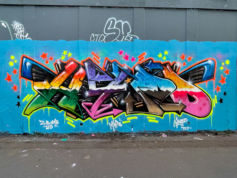
It is a great thing that Hypo has made more time for his graffiti writing over the last year or two. His regular appearances, painting the letters HYPO are more than welcome, and he has upped his game considerably over that time.
This is another piece in which he uses colour to the maximum, something he is really accomplished at, and he presents his letters with what looks like a water mark running horizontally through the letters. With subtle white highlights, his letters have a superb 3D effect, leaping out from the wall. This is a blinder of a piece.

Indeed
A thing of beauty . . .
LikeLiked by 1 person
He’s so good.
LikeLiked by 1 person