
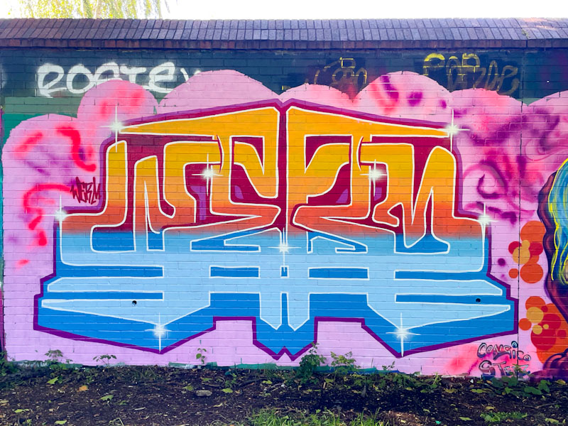
Just when you think you have seen all the improvements and variations Werm can make with his letters, he comes up with an original piece like this one. Spelling out the letters WERM, the piece is almost (but not quite) perfectly symmetrical.

The thick letters are filled with blues and oranges, with a pink and purple puffy background… not a combination of colours that should work in my mind, but somehow it works really well and draws the eye. I think that this piece really demonstrated that Werm keeps pushing boundaries and developing his style. Never a dull moment.


Wow, that’s very cool.
LikeLiked by 1 person
I agree.
LikeLike
I know it isn’t, but something about that strikes me as Asian. Really cool.
LikeLiked by 1 person
I know exactly what you mean and I agree. Perhaps like a design on a Nepali temple or something.
LikeLike
Thank you for doing all the leg work and research. You make me want to leave the house. I might do just that. Thank you.
LikeLiked by 1 person
Thanks for your kind words. I’m glad you appreciate the posts.
LikeLiked by 1 person