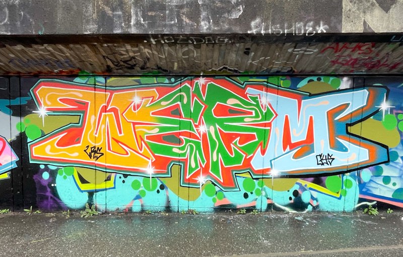

It feels like I have posted a lot of pieces by Werm recently, probably because I have. This is another in a sequence of high quality and original pieces of graffiti writing the artist is producing with great regularity and panache.
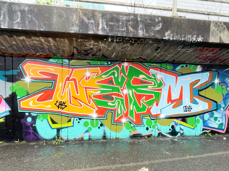
The symmetry, while there, is less strict than in other pieces, with the ‘W’ and ‘M’ being opposite ways up and the ‘E’ and ‘R’, being readable. The overall shape however is symmetrical. Three central colours dominate, orange, green and light blue, although the latter is a little lost alongside its stronger neighbours, which unbalances the piece a little. Some nice squiggles break up the solid fills enough to add variety, without being over-fussy. Another very nice piece by Werm.

 Natural adventures