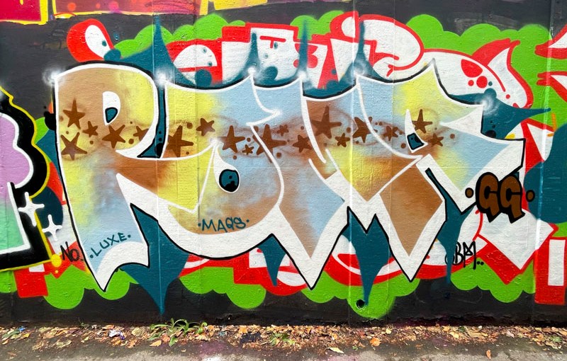
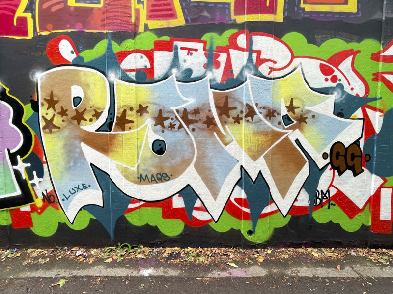
Roma has settled into a rather nice rhythm of painting and is also settling into a fairly consistent letter style. Her distinctive overlapping letters are quite pointy, although she has painted smoother letters in the past, and her ‘O’ and ‘A’ have an additional embellishment at the top.
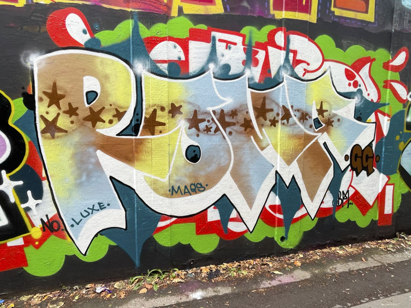
In this piece she has chosen to paint over a particularly busy piece – by Biers – which does distract a little from her own work. Perhaps a bit more background would help to delineate her work from the existing work of others. I know that this is a stylistic approach used by many writers, but my view would be to consider the wall, not only the letters. The blended fill and horizontal stripe of stars is fabulous and well executed. Upwards and onwards.


