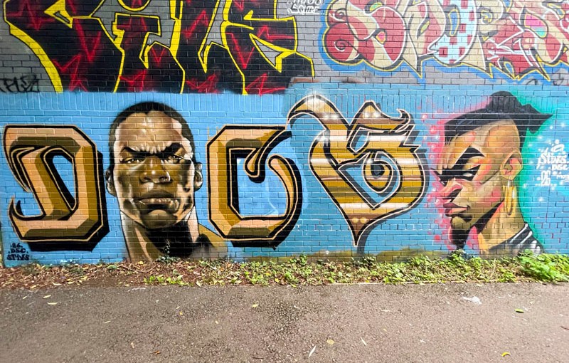
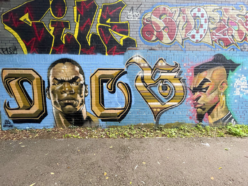
Such has been the consistency of sunny days this summer, the shadows cast on this piece have forced me to photograph it on at least three occasions, but my patience paid off at last with these ‘clean’ pictures of the combination of letters and characters by Stivs.
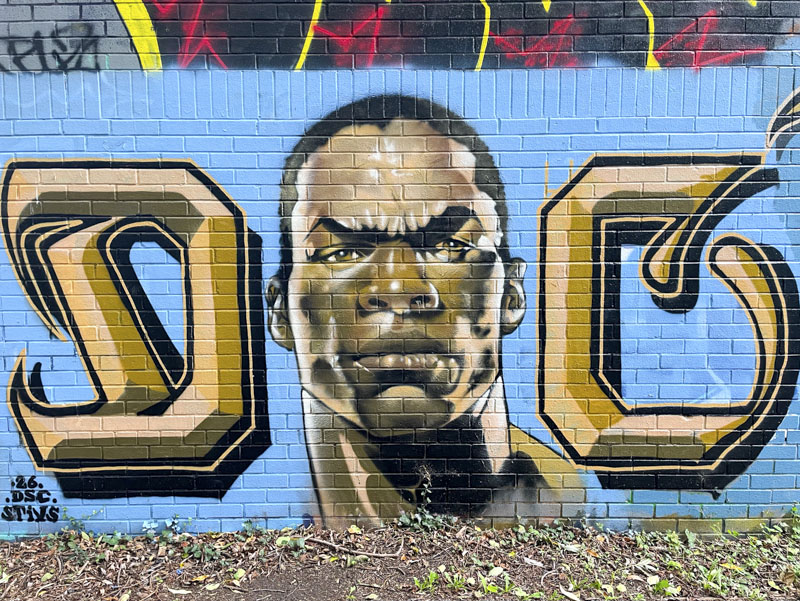
Judging from the buffed background in two slightly different shades of blue, it looks as if these two cartoon portraits might have been painted on different days. The first portrait is accompanied with a D and C in calligraffiti style, part of his DSC tag. The portrait in gold and brown tones and with slightly exaggerated cartoon features is fantastic.
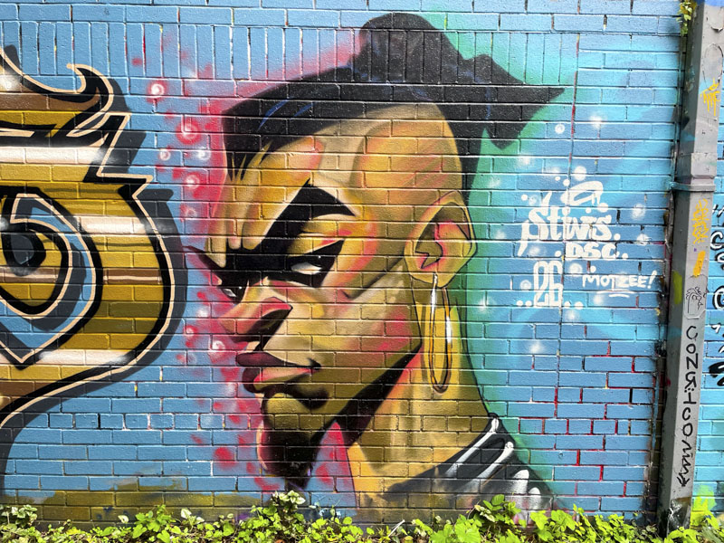
To the right, is a floating S written in a slightly different style, and a three-quarter portrait view, much more angular than the first, of a man with a tight haircut and goatee beard and large hoop earring. Once again the features are somewhat exaggerated. All beautifully finished as you might expect from Stivs. I’ll need to find out more about the characters next time I see him.


Normally ‘DSC’ and not ‘DCS’ so that might be worthy of a question as well . . . 😉
LikeLiked by 1 person
I’m not sure I’ll get a clear answer on that one.
LikeLike
The rendering of ‘gold” in the letters, with the 3D effect, without using metallic paint but just “normal” colors is done extremely well.
LikeLiked by 1 person
It is a clever technique used by many artists – probably the best at it is a guy called Fanakapan.
LikeLiked by 1 person
Years ago, in college courses, I was taught a similar technique for rendering chrome (for cars) using felt-tip markers. It was used for concept drawings in Industrial Design. I see the same concept being used in these letterings, and it is quite impressive. 🙂
LikeLiked by 1 person
Wow – interesting to learn the technique formally.
LikeLiked by 1 person