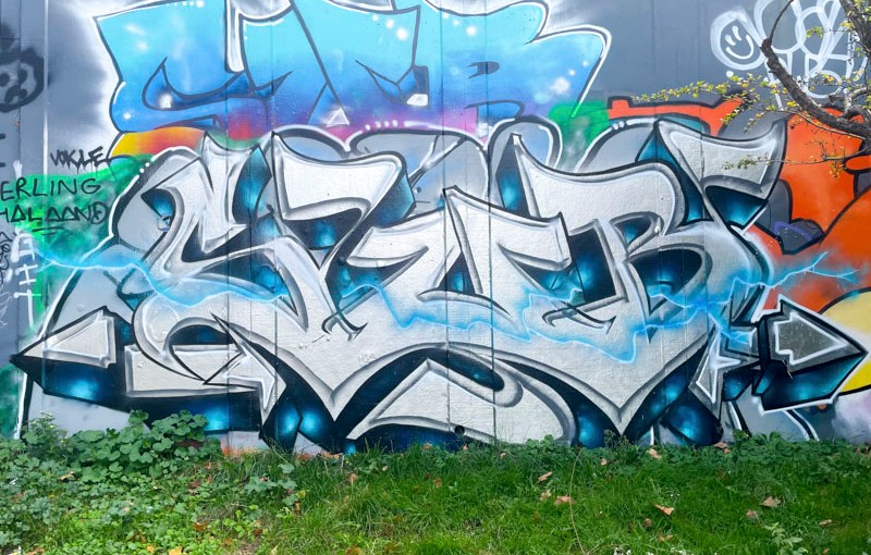
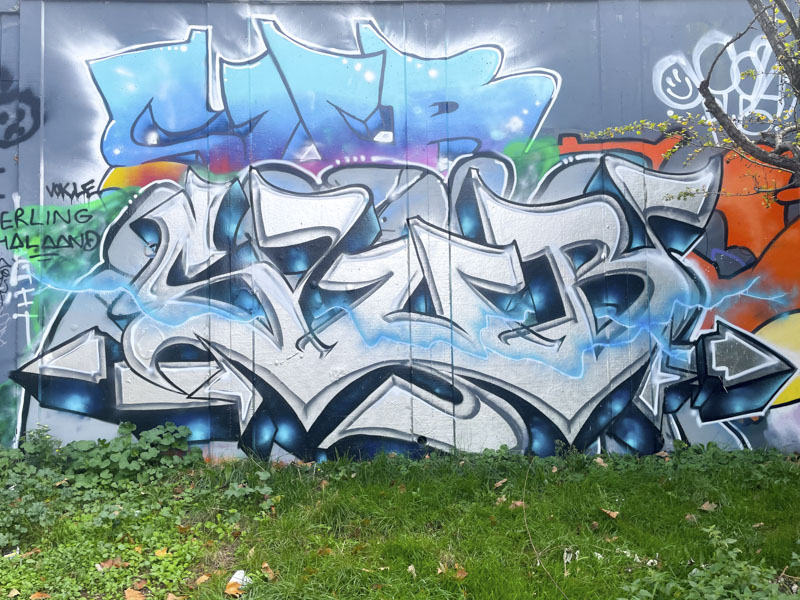
Reflecting back on the long hot dry summer, I would have to say that SUB is one of the most improved writers in Bristol. He has been relentless in painting his letters wherever he can it seems, and making them much more interesting with patterns, creative fills and adding the odd character here and there.
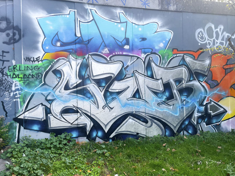
Sub has had a difficult challenge from the start by choosing only three letters, which tend to be large and so need a lot of work to make them stand out. Here he has managed to create a bevelled edge to his chrome letters, which works really well and together with a deep drop shadow creates plenty of depth. Running through the middle of the letters is a nicely worked blue plasma streak providing additional interest and without which the piece would be at risk of looking a little plain. This wall is a favourite spot for Sub, and there are layers of his pieces here, you might spot one or two.


