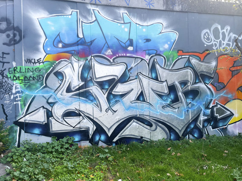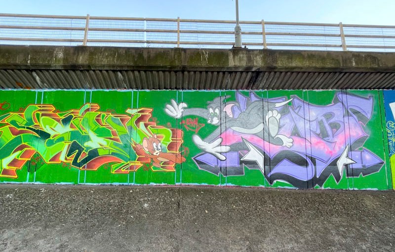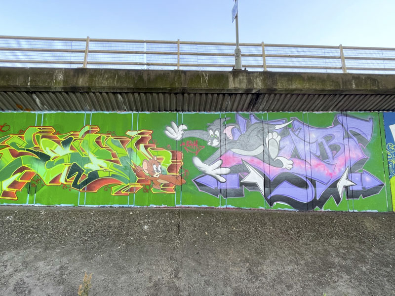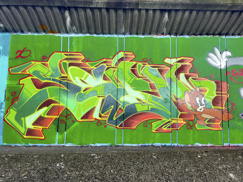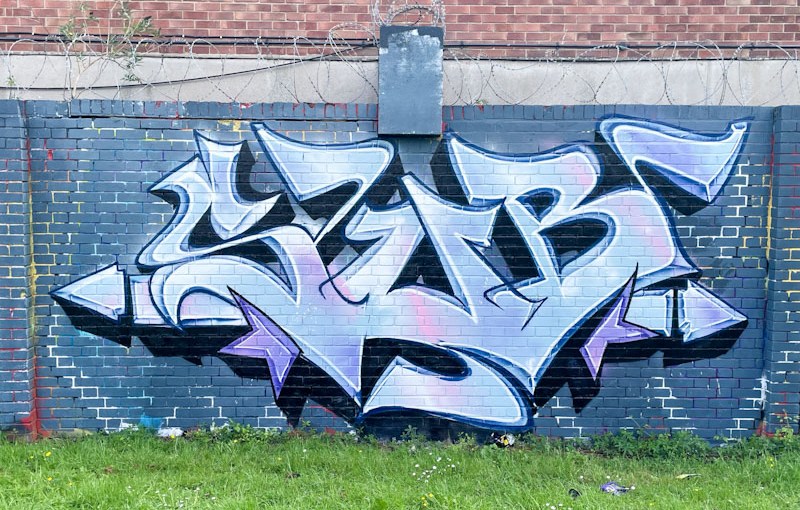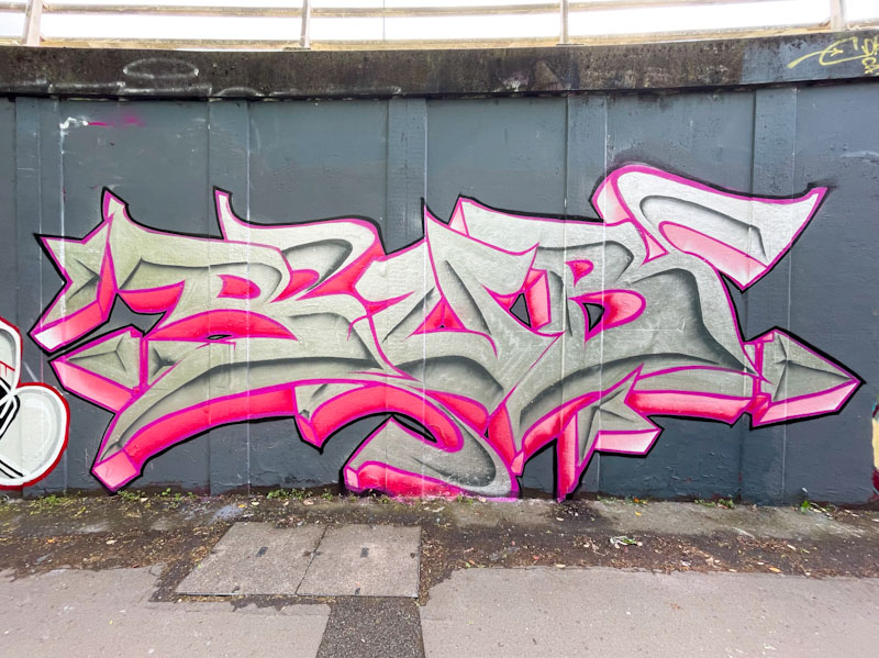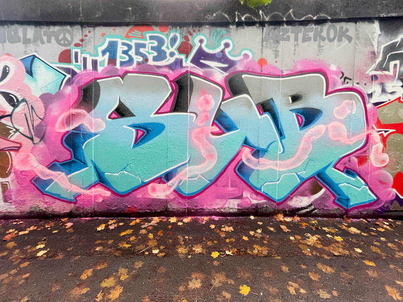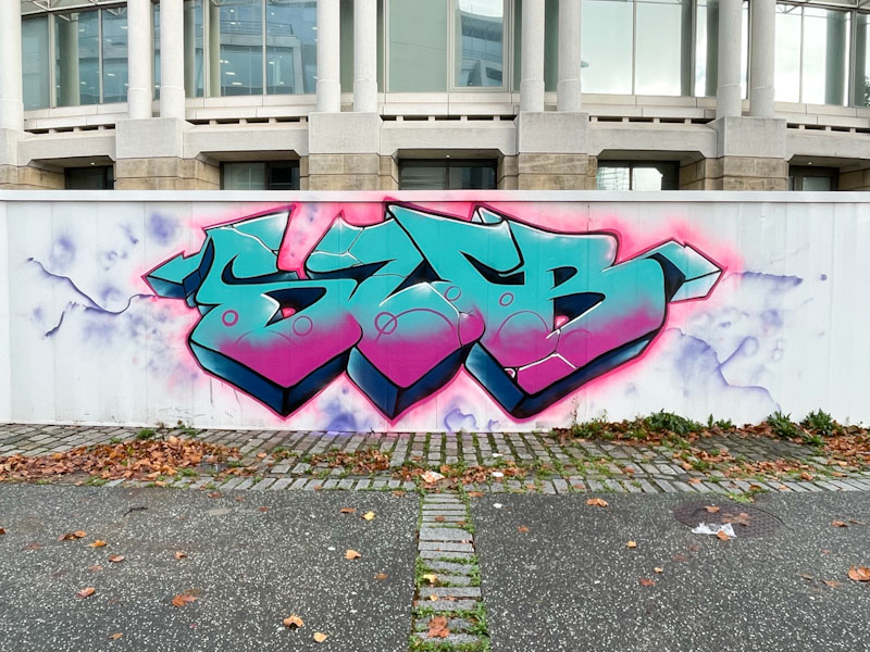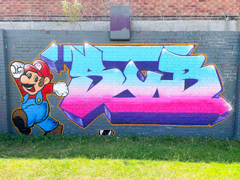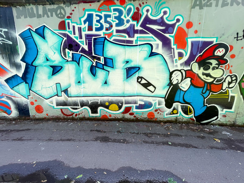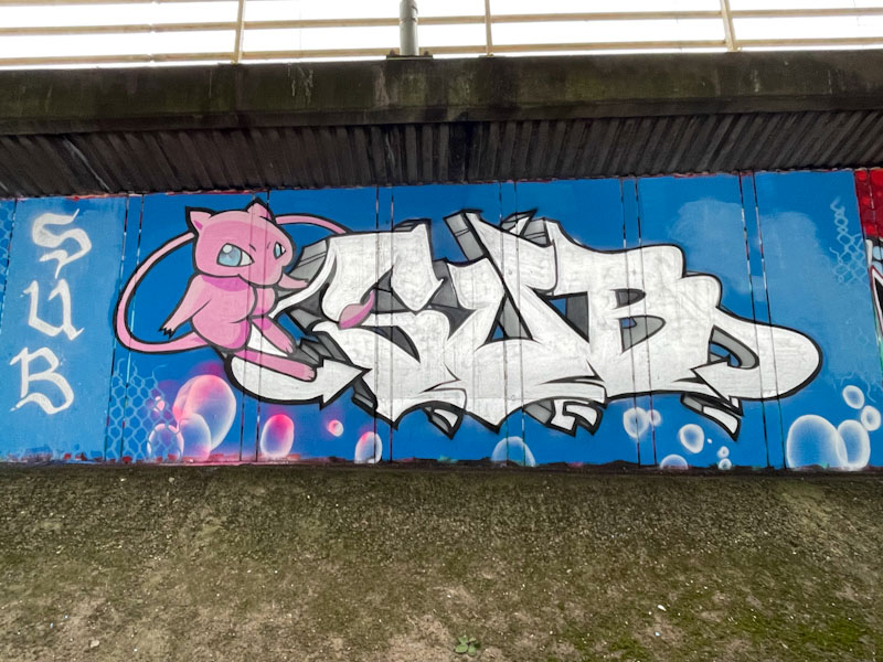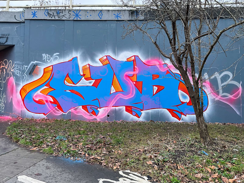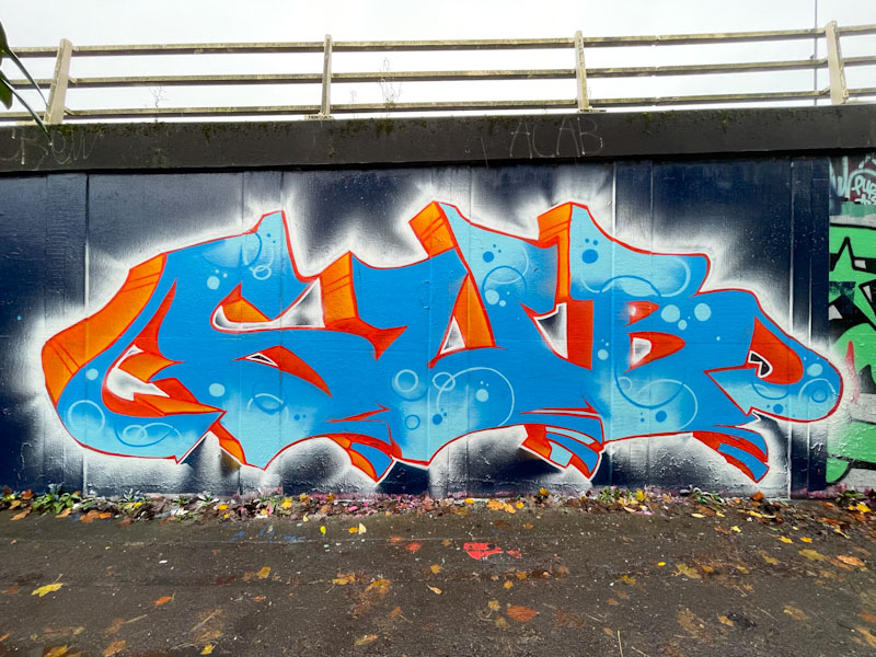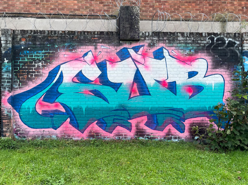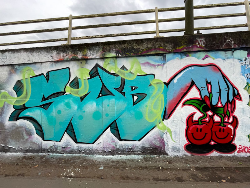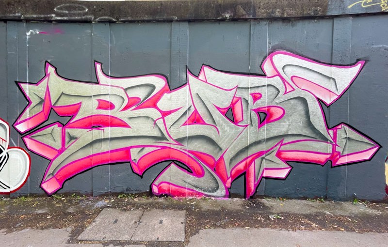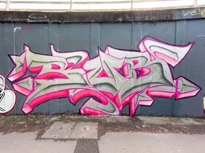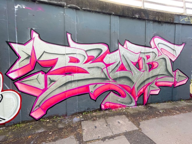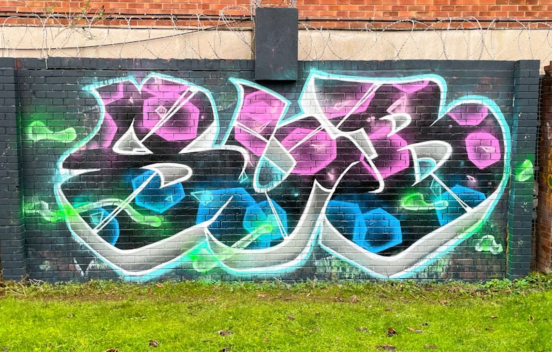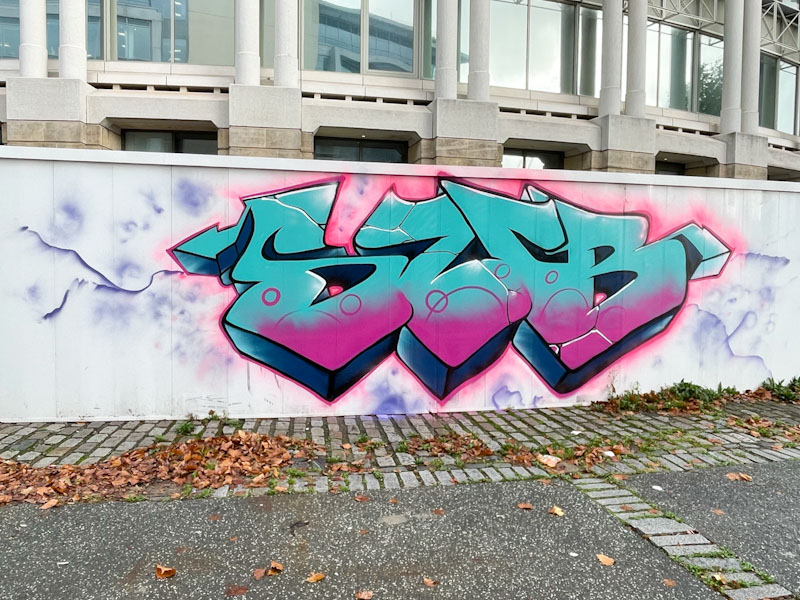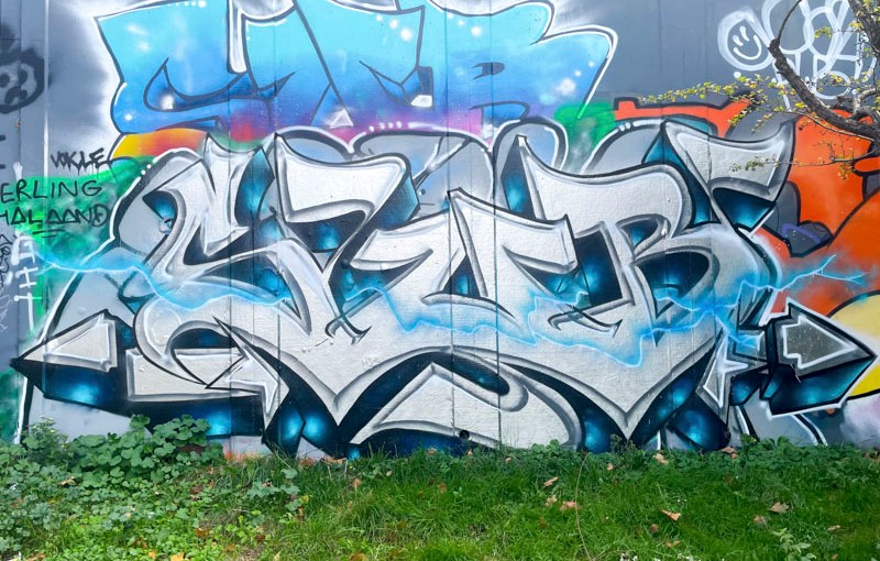
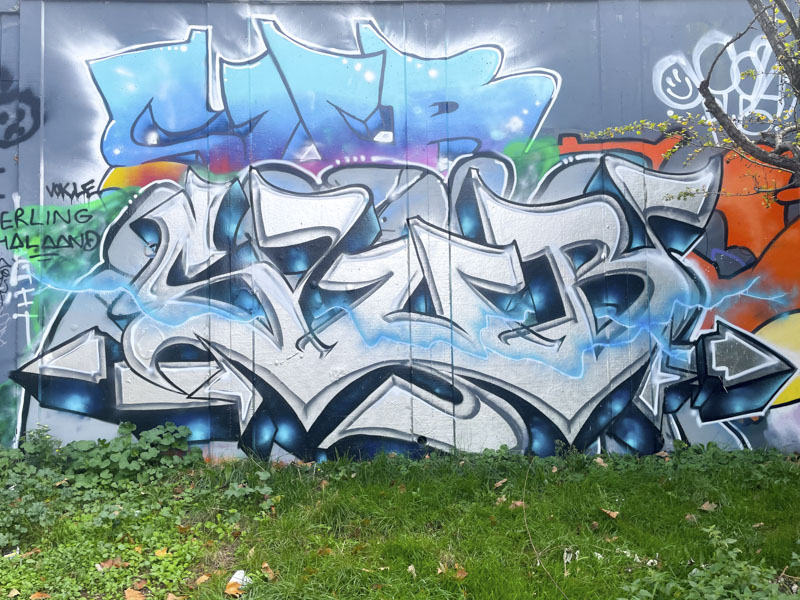
Sub is one of the more prolific writers in Bristol, and hardly a day goes by when I don’t see one of his pieces somewhere around the city. This is a reasonably recent one from the long wall at Peel Street Green.
Sub, Peel Street Green, Bristol, June 2026
There is a rather nice steely quality to the fill in these SUB letters and the letter surface has a bit of an iridescent sheen, reminiscent of a Pigeon’s breast feathers. Sub has played a little with the letter designs which are veering a little towards a calligraphy script. Nice piece from a hard worker.
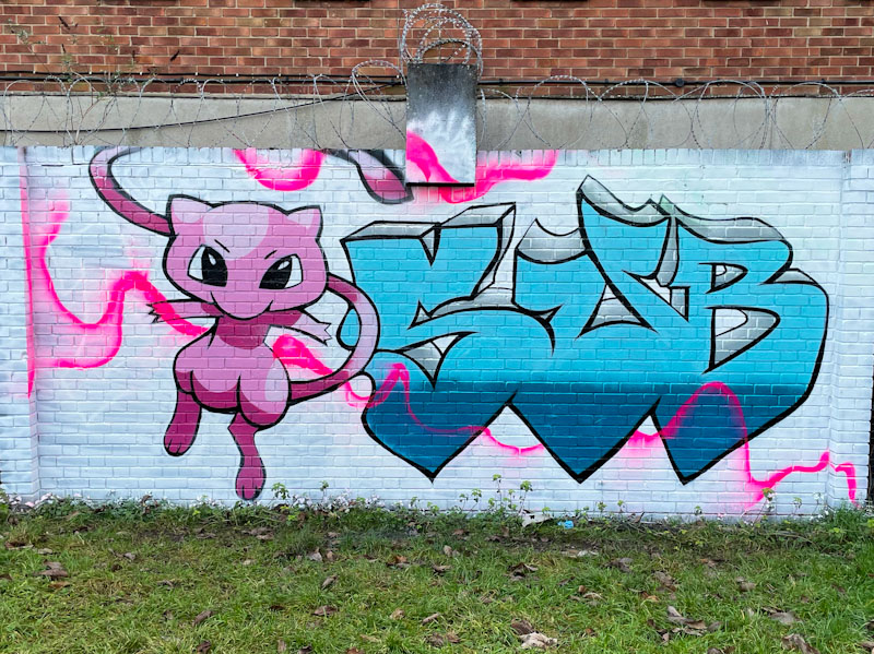
Sub, M32 roundabout, Bristol, April 2026Sub, Peel Street Green, Bristol, December 2025Sub, Frome Side, Bristol, December 2025Sub and Bloem, Frome Side, Bristol, December 2025Sub, M32 roundabout, Bristol, November 2025Sub, Monarch’s Way, Bristol, October 2025Sub, Peel Street Green, Bristol, July 2025Sub, M32 roundabout, Bristol, July 2025Sub, M32 roundabout, Bristol, July 2025Sub, M32 roundabout, Bristol, March 2025Sub, River Avon, Bristol, February 2025Sub, Greenway Bush Lane, Bristol, January 2025Sub, Frome Side, Bristol, January 2024Sub, M32 roundabout, Bristol, December 2024Sub, M32 roundabout, Bristol, November 2024Sub, Peel Street Green, Bristol, October 2024Sub and Bloem, M32 roundabout, Bristol, March 2024Sub, Greenbank, Bristol, February 2024Sub and Bloem, Greenbank, Bristol, February 2024Sub, Peel Street Green, Bristol, February 2024Sub, M32 Spot, Bristol, January 2024
I think that it is fair to say that Sub is an artist who has grown on me over the last couple of years. At first, I considered his letters too large and uninteresting, but to be fair, he has worked really hard and improves from piece to piece. He is developing his fill skills significantly and is now turning out some fine pieces.
Sub, M32 roundabout, Bristol, April 2026
It has been great witnessing this improvement, and here, Sub has elaborated on his letters and worked on a shaded midline running through them. This technique is at the heart of calligraffiti, and I think the Sub, in this piece, has made his first flirtations with the style. So much more to come from Sub.
This is what I have been waiting for from Sub – a wonderful fusion of his extra-large letters and a creative fill. In my mind’s eye, this piece and the one from underneath the M32 mark a new level in his work, and is a culmination of tons of practice and development during 2025.
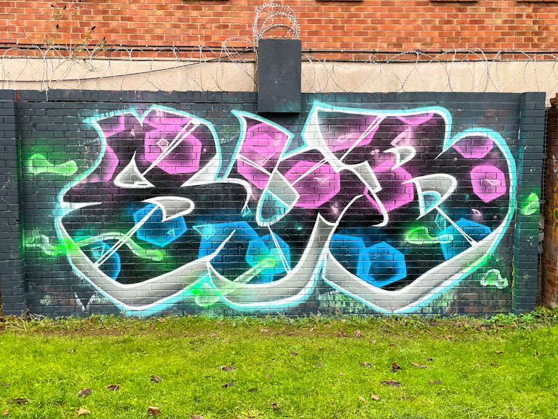
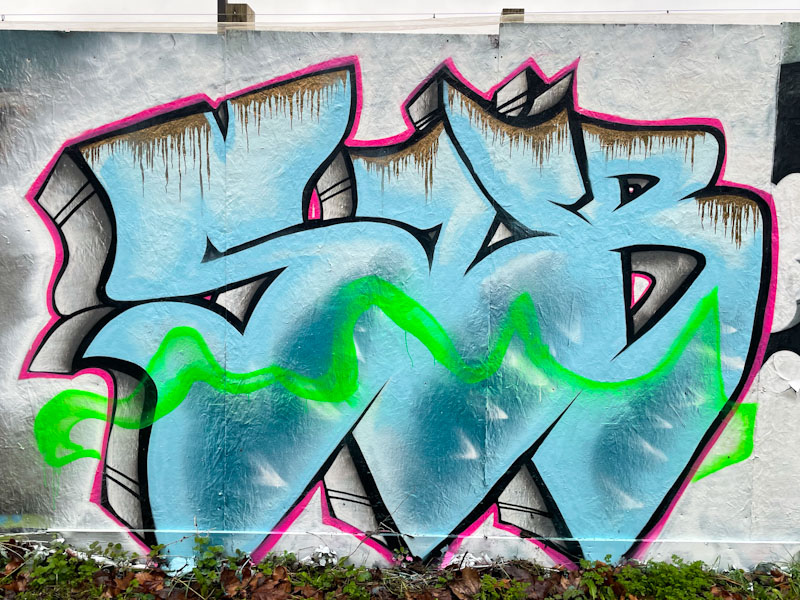
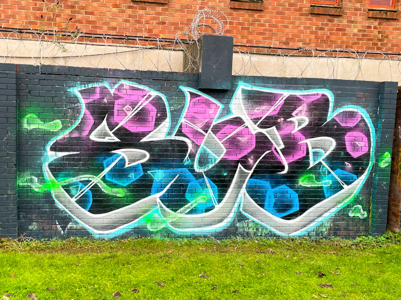
Sub, Peel Street Green, Bristol, December 2025
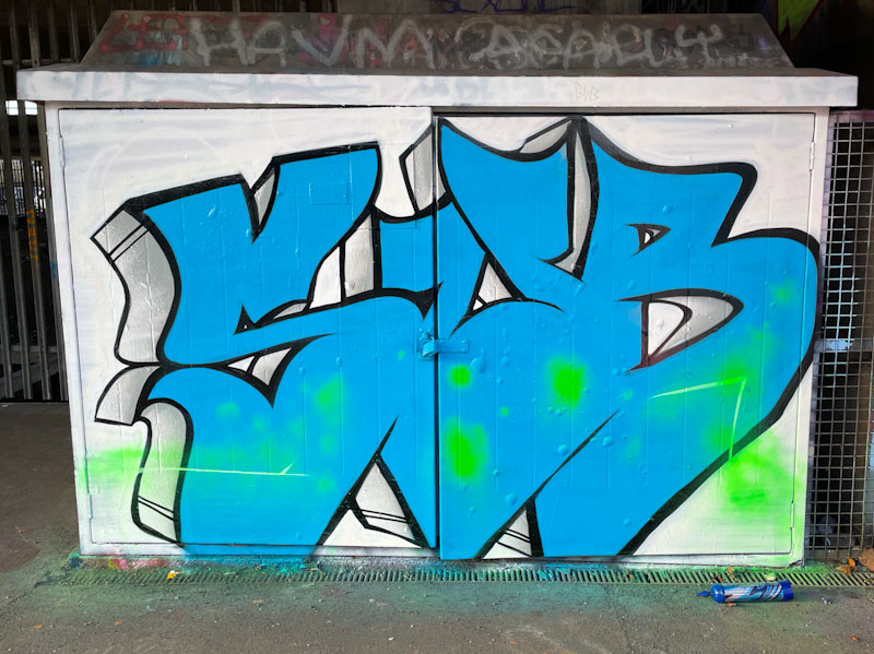
His SUB letters give the impression of being hollow and having the appearance of a pastry cutter, which is a clever effect. The void is filled with pink and blue ephemeral hexagons that appear to float in the space. Some green blobs distract the eye and round off the work – I can’t make up my mind whether they add to or detract from the piece. I hope that Sub will be able to kick-on from this fabulous end to the year in 2026 – I’ll be watching.
2025 has been an outstanding year for Bloem and Sub, with both artists making great strides forward with their work. In particular, Sub’s steady progress is beginning to bear fruit as he introduces more ideas into his letters, particularly with his fills.
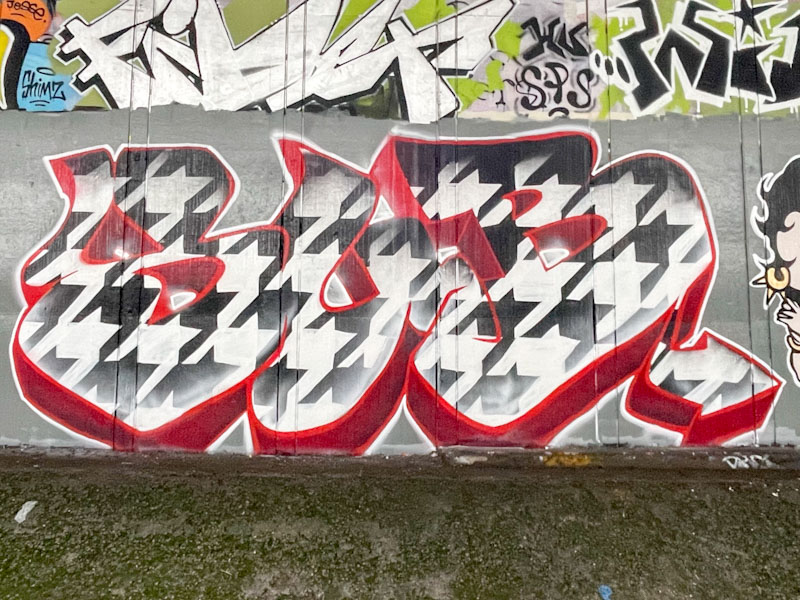
Sub, Frome Side, Bristol, December 2025
I have always felt that Sub’s letters were a little over large, but now that he is being more creative with his fill patterns, the space lends itself to something quite grand, like this repeating black and white pattern. This must have taken a while to complete freehand, but it was certainly worth the bother. A deep 3D drop shadow in dark red sets the piece off beautifully.
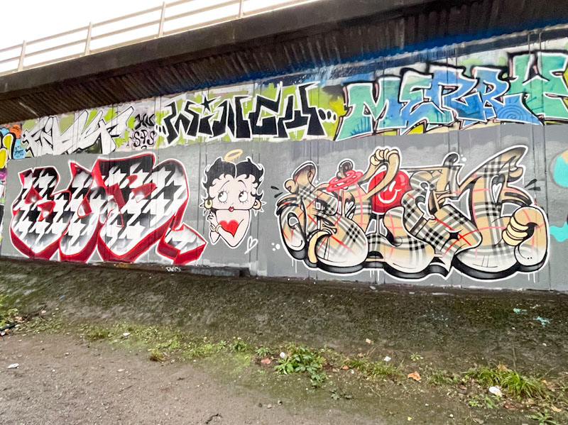
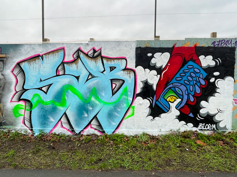
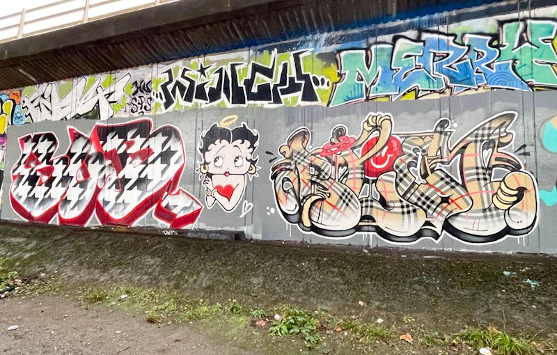
Sub and Bloem, Frome Side, Bristol, December 2025
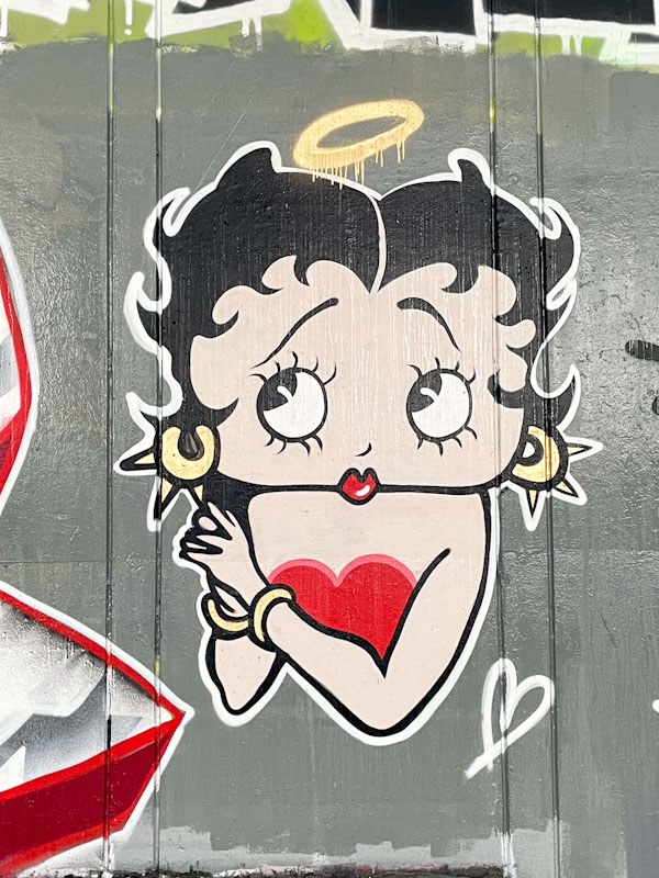
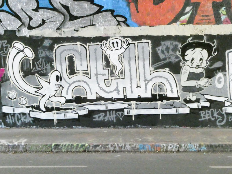
In the middle of the two pieces is a wonderful character piece of Betty Boop, skilfully and faithfully reproduced by the pair. I have a feeling that both artists were involved in the creation of this character. It is not the first time that Betty Boop has appeared in Natural Adventures (see below).
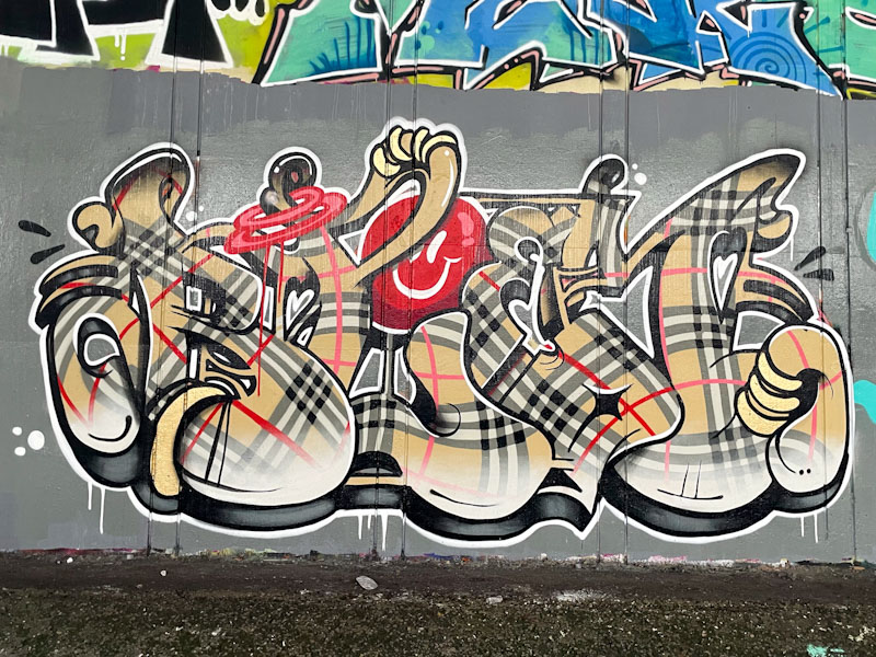
Bloem, Frome Side, Bristol, December 2025
Bloem continues with her outstanding work, and this Burberry check piece is simply brilliant. The letters spell out BLOEM, and the check design flows beautifully through the piece, swishing in all directions. I love the red smily face and strap handle. This is a supremely well crafted piece and a wonderful collaboration. Bravo!
In the centre of town, alongside the Harbourside (a floating harbour), there is a large office building called Canons House, locally known as the Lloyds building as it was the regional headquarters of Lloyds Bank, which they sold in December 2024. The Grade II listed building (only completed in 1991) is now undergoing a major redevelopment, and you know what that means… hoardings. The shiny white hoardings are not the easiest to paint, and the area is not one much frequented by street/graffiti artists, so finding anything of interest here is unlikely. However, Sub appears to have made himself at home with a couple of pieces, and there is a massive commission by Esme Lower too (coming soon).
Sub, Monarch’s Way, Bristol, October 2025
Sub has been working hard, and is improving so much with his overall presentation. His fills have been getting a little more intricate with some nice details, and here he has created a wonderful marbled effect on the white background, making good use of the hoarding colour. I do wonder if his enormous letters might be holding him back a little – it is a lot of space to fill, and whether an additional letter, might give him more creative latitude. I’m sure he is happy with what he is doing, but I think he is ready to take a big step forward.
I am rather liking it that Sub is starting to switch things up a little and push his boundaries. Because he has only three letters to play with, his pieces tend to be quite large and impactful, perhaps at the expense of subtlety or detail, but this piece is quite different from his usual fare.
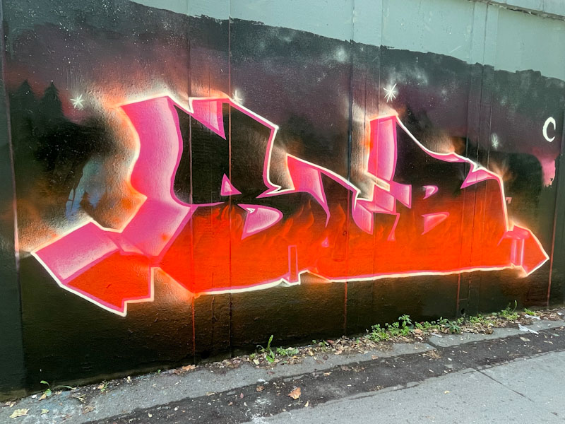
Sub, M32 roundabout, Bristol, July 2025
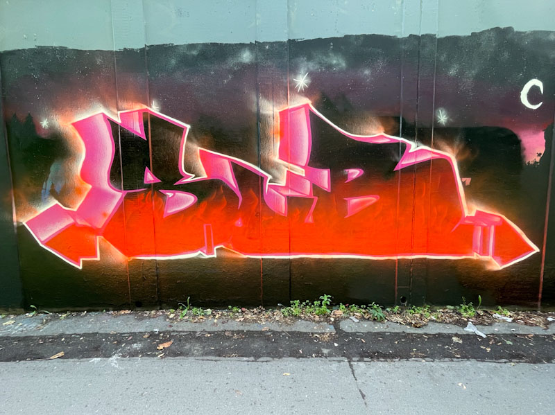
Sub has offered up a scorching scene of burning letters, that meld into one block, set in a nighttime landscape. This is a great creative advance, and probably took him some distance from his comfort zone. One small detail that I’m sure he will have learned is to do the border last, so that it retains the crispness between the letters and the background. All good stuff, and plenty more to come soon.
This is something a little different from Sub, who usually likes to go large and tends to be quite conservative with his use of colour. I am guessing that it might have been a bit of a dregs piece, I also think he is rather fond of newly buffed walls, and this one proved irresistible.
Sub, M32 roundabout, Bristol, March 2025
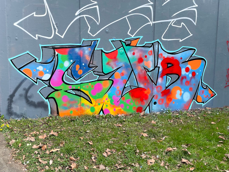
He has stuck to his simple three letter formula, with a deep, in this case unfilled drop shadow, but the obvious part of the piece is the splatter of colour throughout, keeping it lively and joyful. Sub continues to paint a lot and is gradually expanding his technique and scope.
Alas, we leave France today, our skiing adventure over for at least another year, but it will be good to get home and reunite with our son who has returned from his travels in Thailand. I haven’t left myself much time to write today’s posts, as we have an early transfer down the mountain to Chamberis airport. I will start with this piece from the ever-improving Sub.
Sub, River Avon, Bristol, February 2025
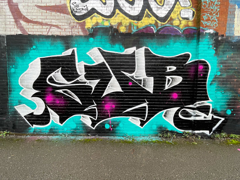
Big bold black letters (only three of them) have customary deep drop shadows in grey, creating a chunkiness Sub specialises in. Some random pink splatters break up the large black surfaces. A wispy blue background finishes the piece nicely, with a few subtle spots mixed in. Sub is a very busy boy.
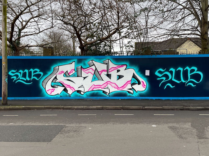
The great thing about a new graffiti spot, such as the long hoarding at Greenway Bush Lane, is that you can spread your wings a little and occupy as much space as you like without the awkwardness of painting over someone else’s work. Sub has ‘gone for it’ with his large SUB letters and a couple of smaller signatures, just in case you weren’t sure who he is.
Sub, Greenway Bush Lane, Bristol, January 2025
Sub continues to develop his writing, and his familiar chunky letters and deep drop shadow (in two shades) are going from strength to strength. The pink plasma strip runs nicely through the letters, which in their monolithic form are rather flat. To me, it feels like he is locked a little into his format, and to go to the next level, he might need to try something different, and then import his discoveries back into his customary style. Having said that, he seems to be very happy doing what he is doing, and that is the most important thing.