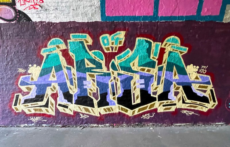
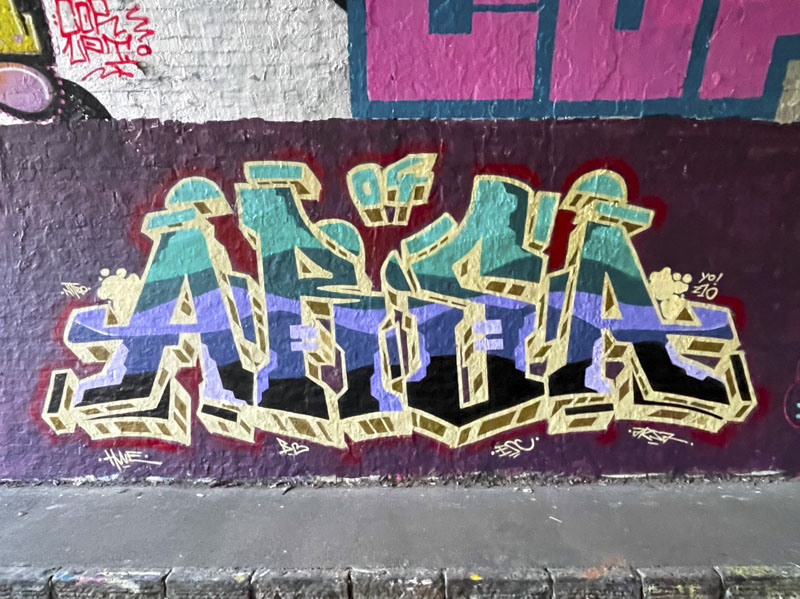
ARSA is known for his uniform bilaterally symmetrical pieces, which are often quite ‘blocky’ in appearance. This recent one in the tunnel, however, is rather softer than much of his work. Gone are the hard and regular straight line letter outlines, and in come some more gentle lines and a few curves. It is amazing what a difference it can make to the appearance of a graffiti writing through the introductoion of some curves.
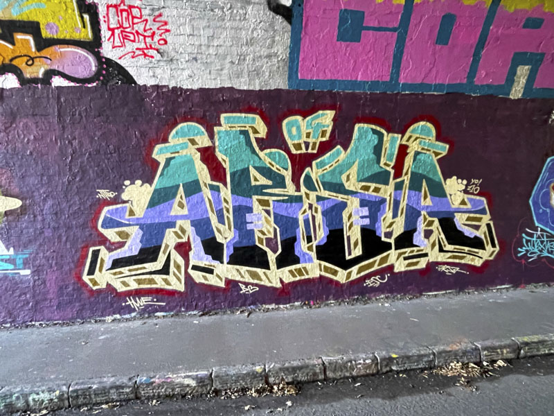
The colour scheme, which was used by a couple of other artists who painted alongside ARSA, is attractive, although slightly lost in the gloom of the tunnel. The cream border and drop shadow certainly helps to define the letters from the purple background. This is a nice development from ARSA.


That really stands out
LikeLike