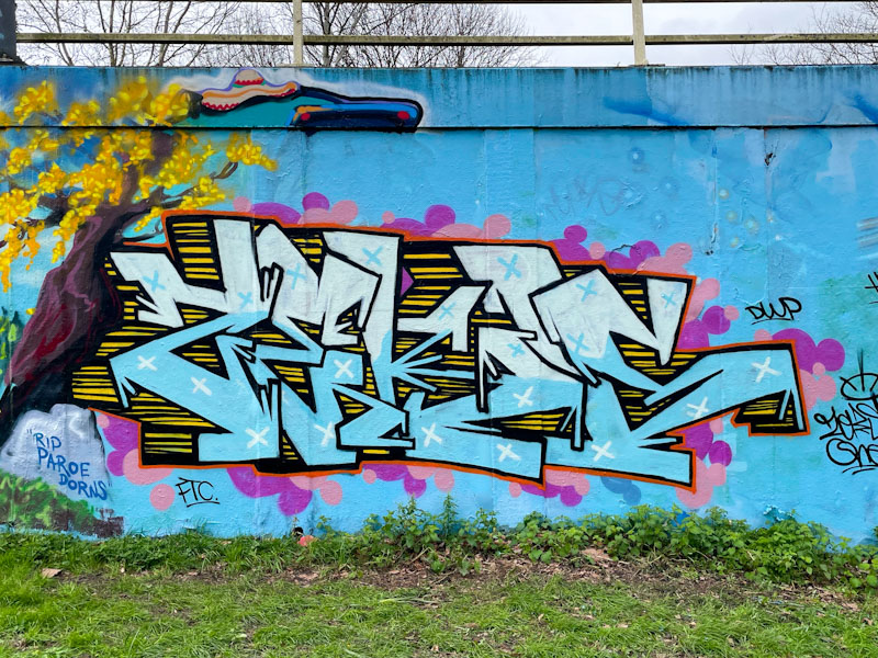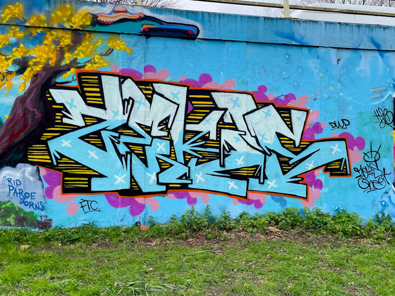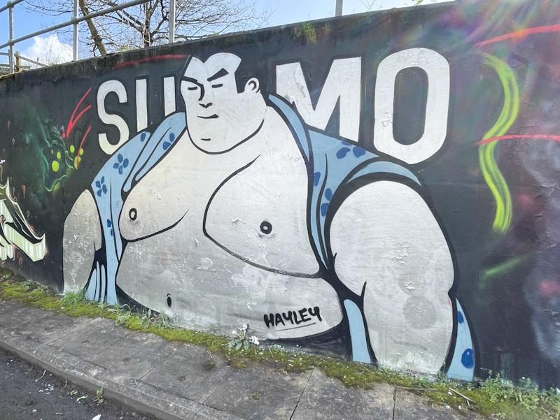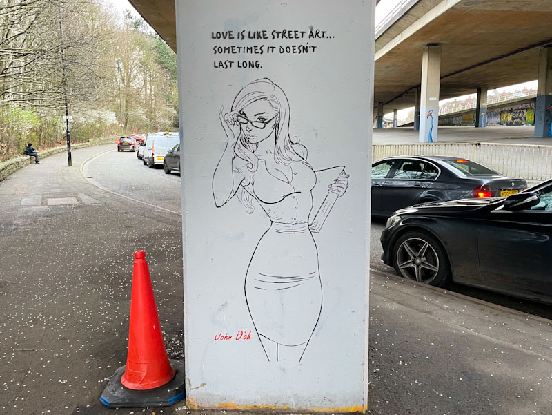
Another column piece from the John D’oh gallery of stencils underneath the M32. The artist has certainly made himself at home here, and I note from his Instagram account that he has been busy down there again recently.
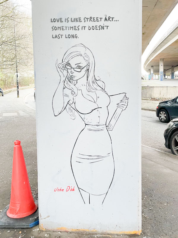
This simple piece features a rather stereotyped curvaceous woman holding a book and tilting her glasses. The caption says ‘love is like street art, sometimes it doesn’t last long’, which I guess can be true, there is also an additional view that might take the position ‘love is like street art, sometimes it lasts forever’. Yet more to come from this rich seam of John D’oh gold.