.
Charity shield
a game no one wants to lose
Arsenal win it
.
by Scooj
.
Charity shield
a game no one wants to lose
Arsenal win it
.
by Scooj
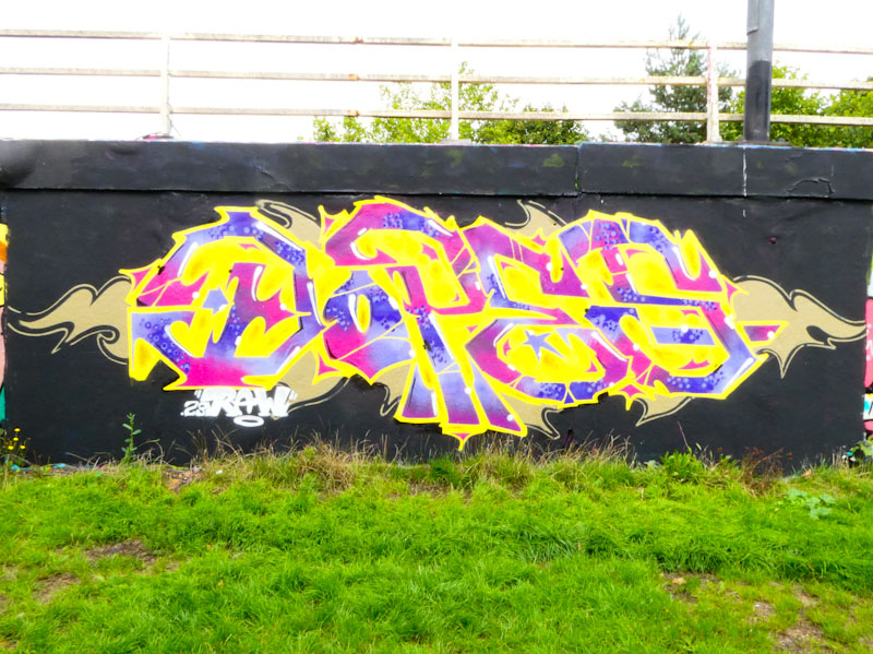
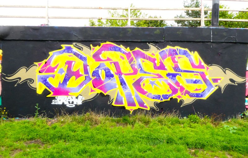
Dopes is another artist whose presence in Bristol has been fairly intermittent for some time, so it was great to see this wonderful piece on the roundabout a couple of weeks ago. When one sees a piece like this, it demonstrates just how powerful and important it can be to buff a wall first to bring out the best in the work.
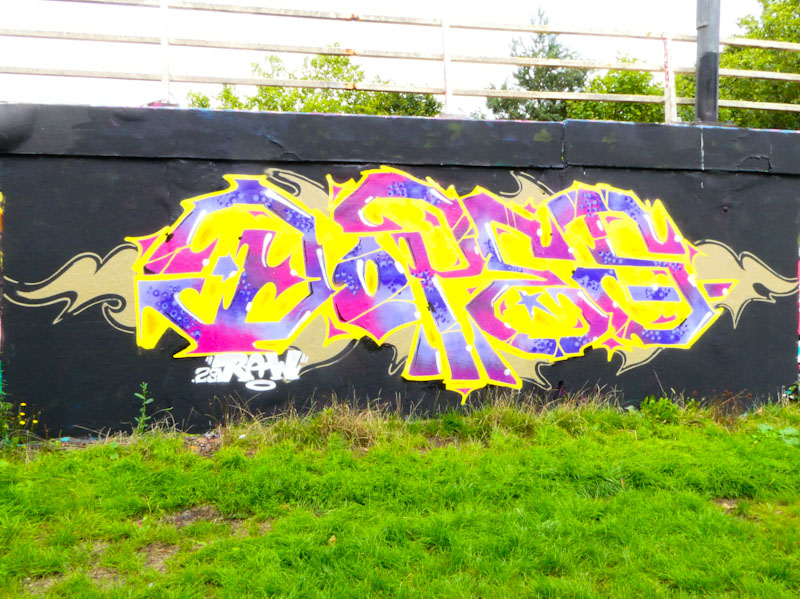
This piece is dazzling and has a great energy about it, with the yellow light bursting out from behind the purple and pink filled letters. I’m not so sure about the golden pattern on the background, which looks rather flat compared to the vibrancy of the rest. This is a really classy piece from Dopes, I only hope we don’t have to wait so long for the next one.

For much of the year, Pl8o has been fairly quiet, but in recent weeks he seems to have rediscovered his enthusiasm and energy for painting walls – perhaps he has a little more time on his hands. This piece in Sparke Evans Park is one of several new pieces appearing around Bristol at the moment.
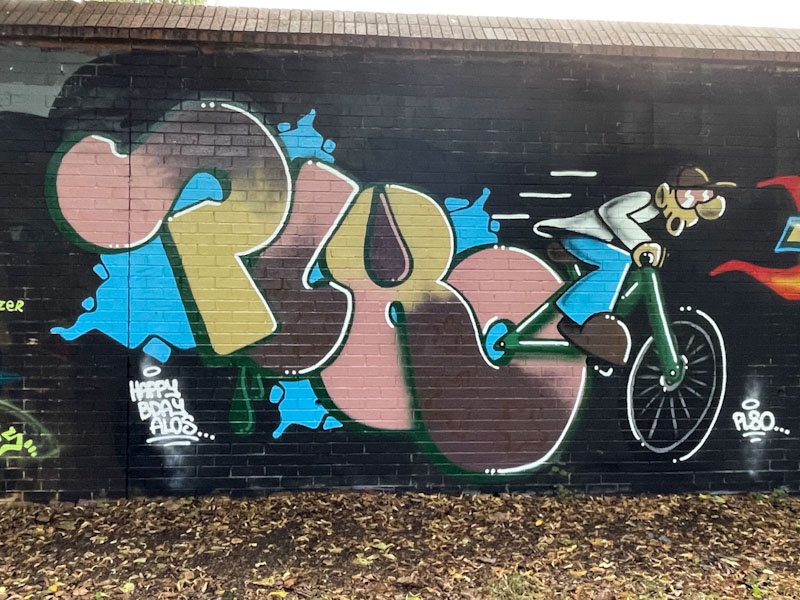
There is a lot of creativity in this piece, and the character is cleverly interlinked with the letters. The character is a beautifully painted carton cyclist, full of movement indicated by the shirt flaring at the back and the three white movement lines. The rear wheel of the bicycle is incorporated into the ‘o’ of Pl8o. A nice birthday piece for Alos.
.
Charity football
yellow team versus blue team
slava Ukraini
.
by Scooj
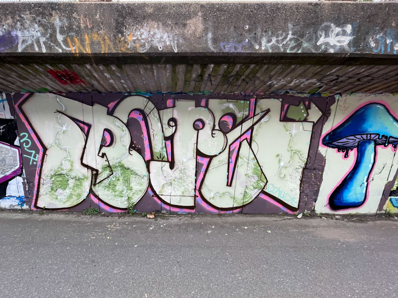
Dog Bless the Band is a curious street artist I have yet to meet. I say curious because his pieces are unlike pretty much anything else in the city right now. Curious also because of his name and because of the letters he writes – MOTEL, I mean what is it all about?

The large monolithic letters have a very earthy feel about them which is exaggerated in this piece by the muted colours, especially the green dusting, which gives the appearance of algae or moss on rocks. I’m not sure if that is the effect he was aiming for, but it is how it comes across to me. To the right there is a toadstool.
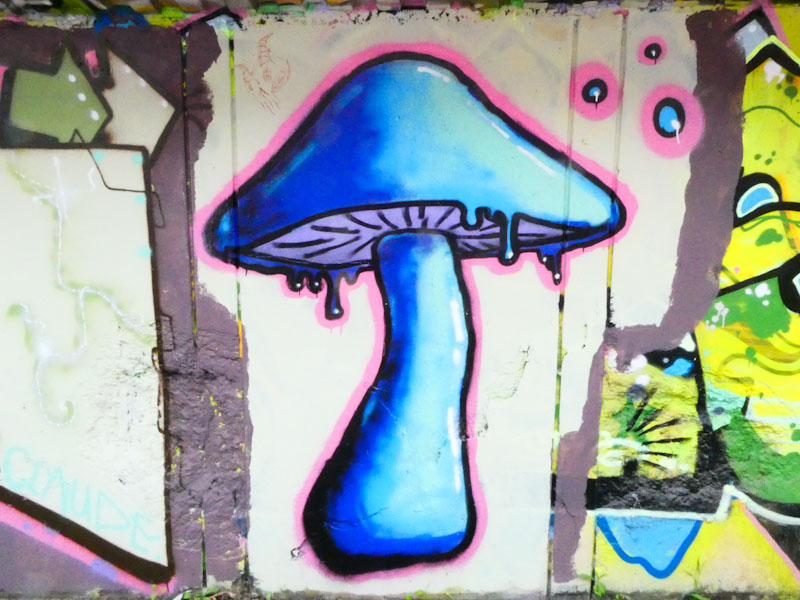
I wasn’t entirely sure whether the toadstool was painted by Dog Bless the Band or by a friend alongside, but have decided it is his own work, perhaps a study, because of the same colour selection and proximity. There are no other signatures or marks that would suggest another artist, simply the surprise of seeing the toadstool. Perhaps this signifies him straying into accompanying his letters with other work.

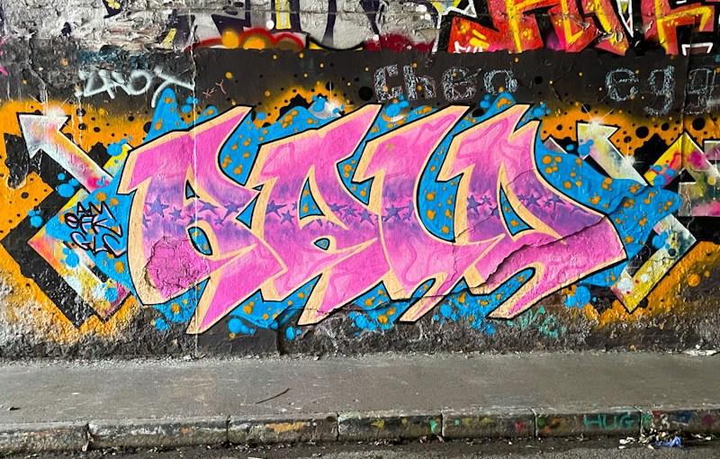
Observing Raid’s progress is a genuine pleasure. Each time I see his work I see some improvement, and a boldness or confidence that is growing. I also like it that he is adapting his style from piece to piece, settling for a while and then moving on.
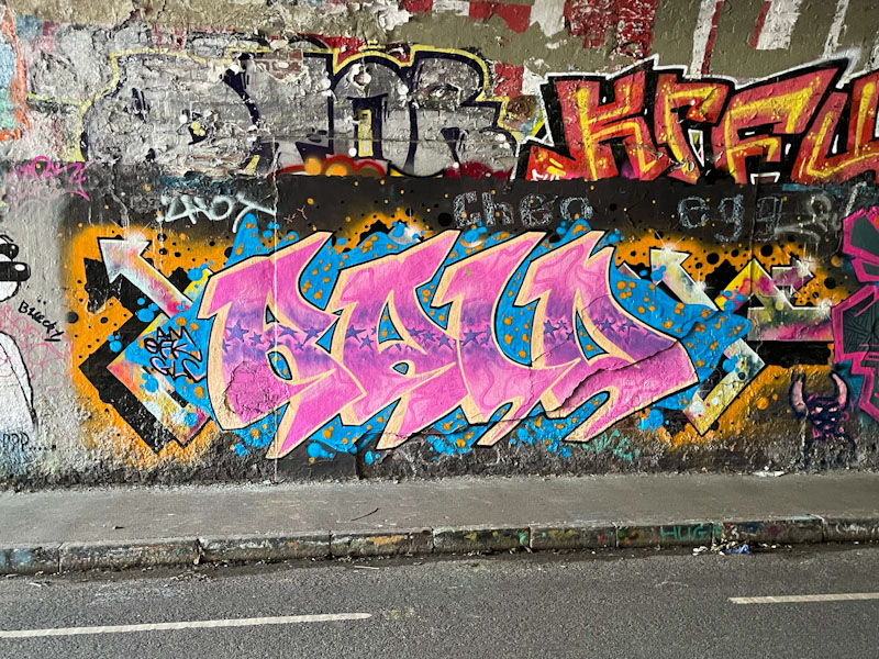
This is a nice one in the tunnel from a few weeks back, and uses that tried and tested colour combination of pink and light blue. The letters are beautifully presented, and the fills very nicely done indeed, with a swathe of stars running horizontally through the letters and pink ‘ribbons’ at the top and bottom. A decent drop shadow and blue backdrop round the piece off perfectly.
.
An unknown bird call
double screech from the tree top
but it’s a squirrel
.
by Scooj
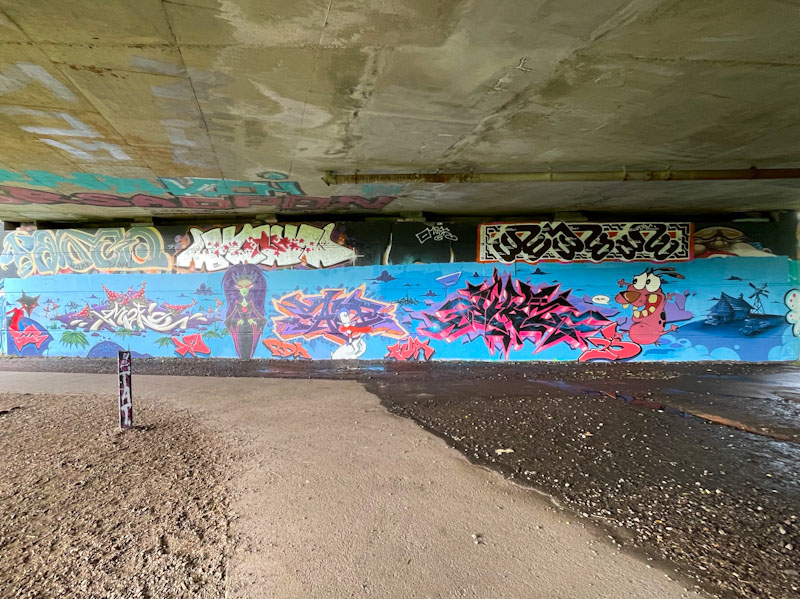
Only a few days ago I spoke about how many whole-wall epic collaborations there have been this year, and this huge wall is all the more impressive given that the whole thing was painted by only two artists, Fade and Dibz.
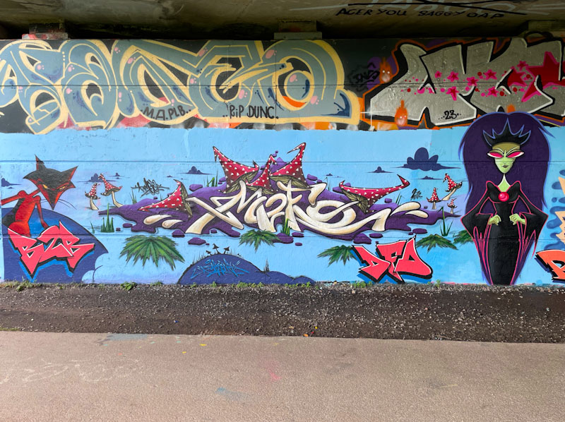
Fade appears to be something of a force of nature with both the quality and quantity of pieces he has been painting recently, and he appears to be equally comfortable with writing and characters. I have to confess that I am not 100 percent certain who painted each element of the wall, but I’ll have a go. I think the fox and the MOFO writing in white are by Fade.
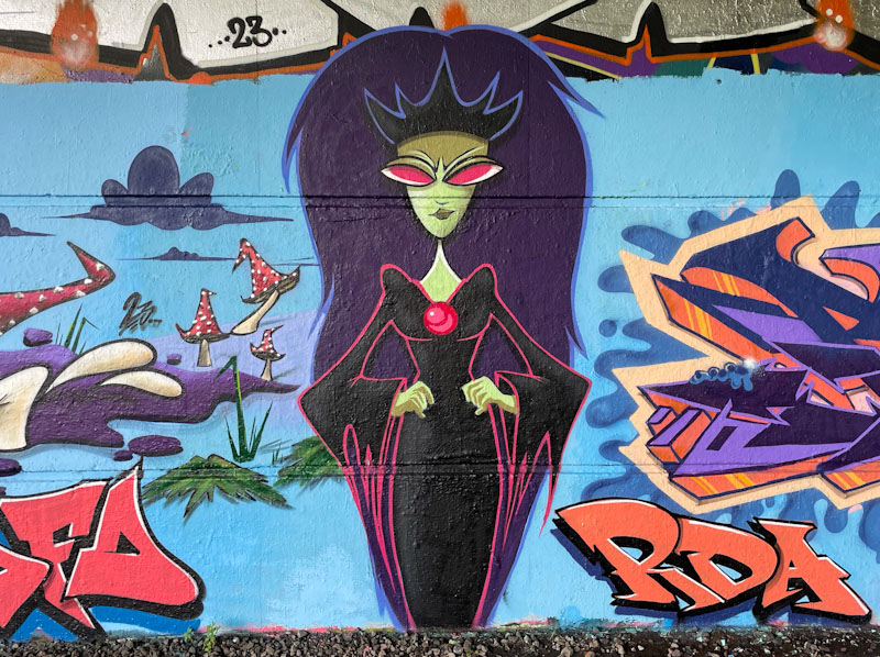
The vampire style character I have a feeling might have been painted by Dibz… it certainly has the crispness and quality that I would associate with his work, although equally, Fade might have crafted it.
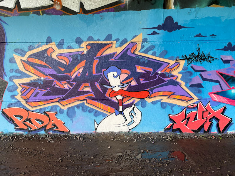
The next section of writing would appear to be by Fade, but having said that it might be by Dibz, doing that thing where he writes another artist’s name. The cartoon duck is fabulous, but I can’t place him.
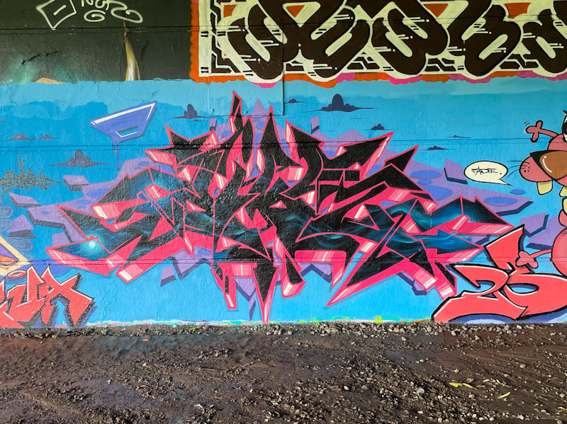
The next section of writing is definitely by Dibz… there are very few artists who could replicate his superb wildstyle graffiti writing.
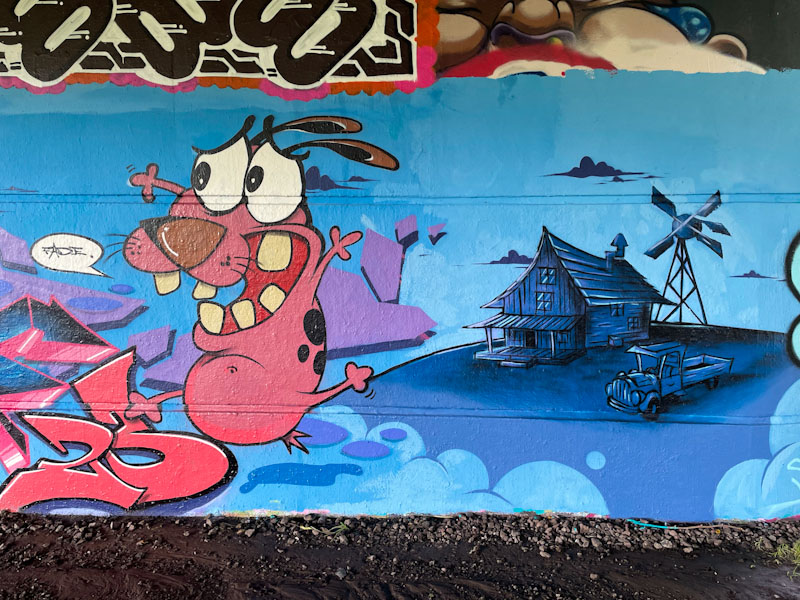
Rounding off the whole collaboration is a little scene with a cartoon dog and mid-west style farm house painted to perfection. The whole collaboration is utterly awesome and frankly it is difficult to process how they managed to pull it off so well. Bravo!

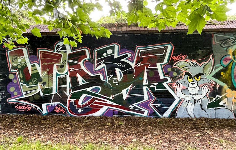
Although I have never met Wispa, I have recently had a conversation with her via Instagram messenger, and it is comforting to know that she is supportive of me sharing photographs of her work and writing posts like this one. It is just a matter of time before I am able to put a face to a name, and I only missed her by a whisker in Cheltenham. Speaking of whiskers, this is a wonderful piece featuring Tom the cat in Sparke Evans Park.

Once again Wispa delights with this outstanding piece of writing, and fills to die for. I don’t quite know how she does it, but she has great judgement in getting the right composition and proportions in her fills, supported by great colour selections. The letters spelling WISPA are nicely done and lifted with a white 3D drop shadow.
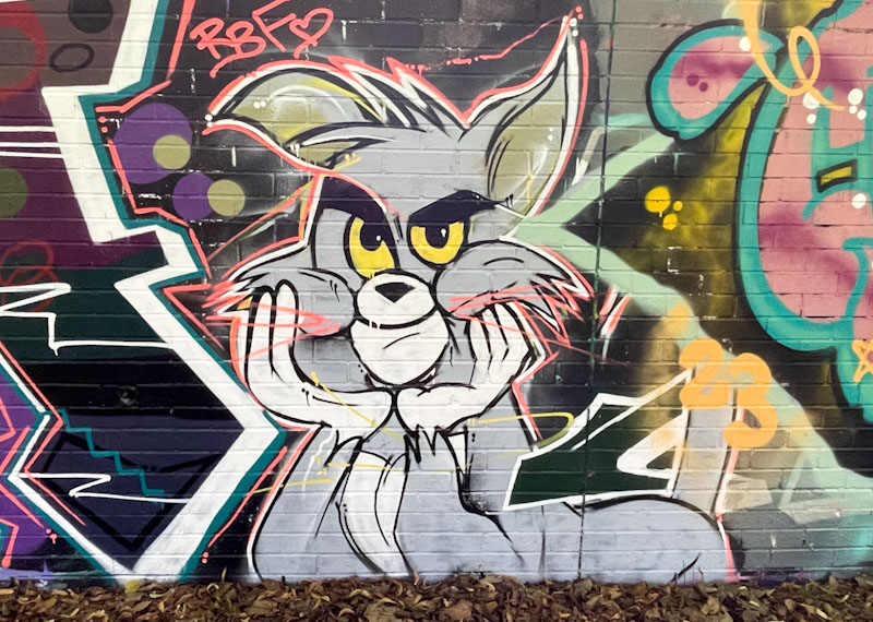
Wispa usually accompanies her work with a character and in this one we are treated to a fun Tom cat from the cartoon Tom and Jerry. It is always a great pleasure to find pieces by Wispa, and I hope she continues to visit Bristol as often as she is able to.
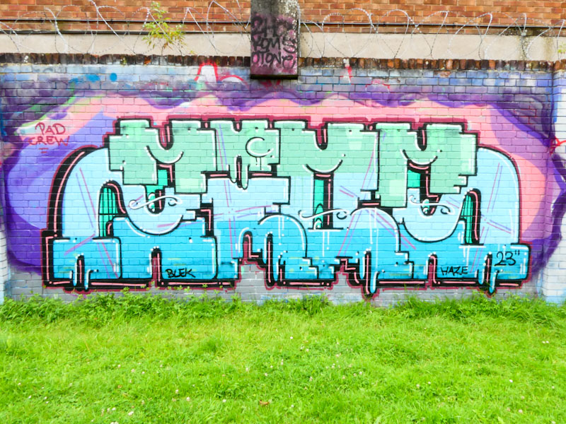
Trafficity is an artist I have huge respect for. His unique pieces are incredibly consistent in style as well as quality. The word he writes is ZIOM and is a slang term for homie, bro, friend etc. The term I guess is appropriate and relevant in an urban culture setting.
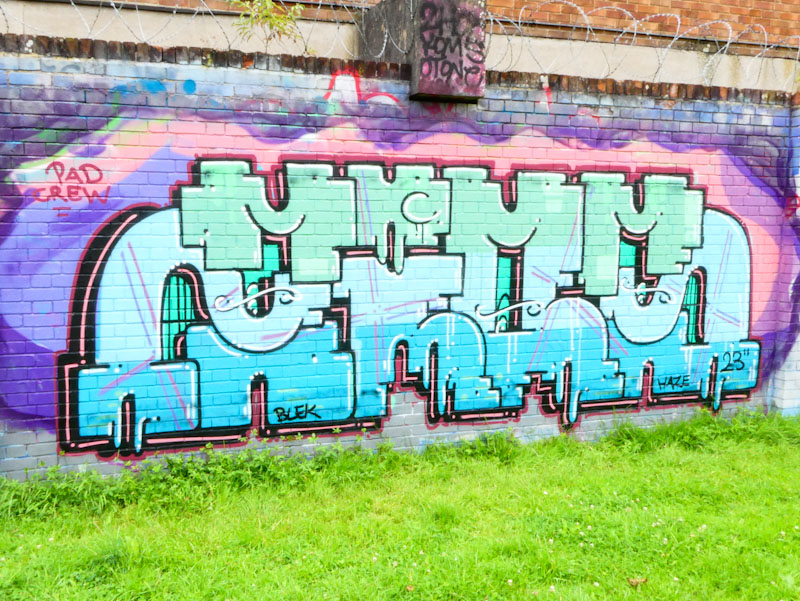
Trafficity’s letters are interesting, in that they are quite blocky and they interlock rather neatly. I think that there is probably more going on than meets the eye, and I have often wondered it there is some sub-lettering going on. For example across the top I can quite clearly see the word ‘MUMM’. Of course, this might be entirely coincidental and unintended, but I think the only way of finding out is asking the artist, should I ever bump into him again. Not too far away from having enough pieces for a Trafficity gallery.




 Natural adventures