
.
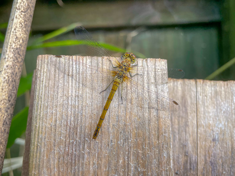
Obliging sitter
sunbathing, oblivious
to my approaches
.
by Scooj
.
Obliging sitter
sunbathing, oblivious
to my approaches
.
by Scooj

Some viewers/visitors may wonder what the numbering convention at the top of each street/graffiti art post on this blog is all about, and might legitimately question whether it is helpful or not. In my mind, it is quite simple. The first number is the sequential listing of the blog post, so, this is the six thousand three hundred and tenth post I have written about street/graffiti art on Natural Adventures. The following name is the spot or road where the piece can be found, and the number in brackets (unconventionally there isn’t one for Cumberland Bain (a quirk)) at the end relates to the number of posts from that spot or location. It might have been simpler to instead have the name of the artist included as well, but when I started doing this back in 2015, I didn’t know who most of the artists were and so a place-based approach seemed more sensible.
This is an absolutely gorgeous and rather unexpected collaboration from Esme Lower and Bloem.
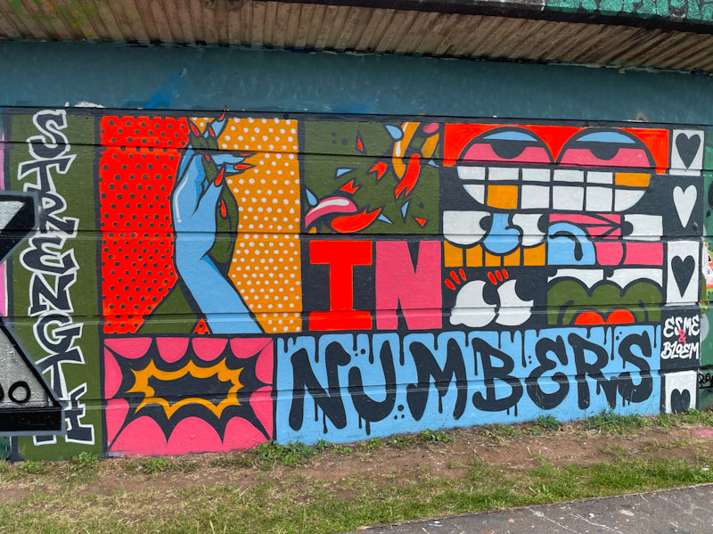
The collaboration appears to be entitled ‘Strength in numbers’ which might be a reference to the ‘counterprotest marches’ against the far-right riots that were happening around Britain at the time this piece was painted.
It is what I would call a ‘true’ collaboration where the piece is a mash-up by both artists, and although some parts are identifiable as being by one artist or the other, the whole thing is an integrated mixture. The hands and chain are definitely by Bloem and the eyes and teeth by Esme Lower, the rest could be by either one of them. It is great to see these two artists stretching themselves, and it would be wonderful to see more co-creations like this one in the future.
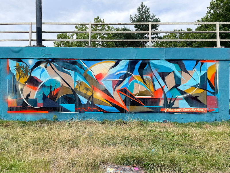
Oof! This is an absolutely outstanding framed piece of writing by Smak, which stands out ‘poster-like’ from the long wall of the M32. Rather well concealed, the letters spell out SMAK, and there is an overwhelming sensation of a tropical island landscape conveyed by the palm trees and a possible reference to a bright sun.
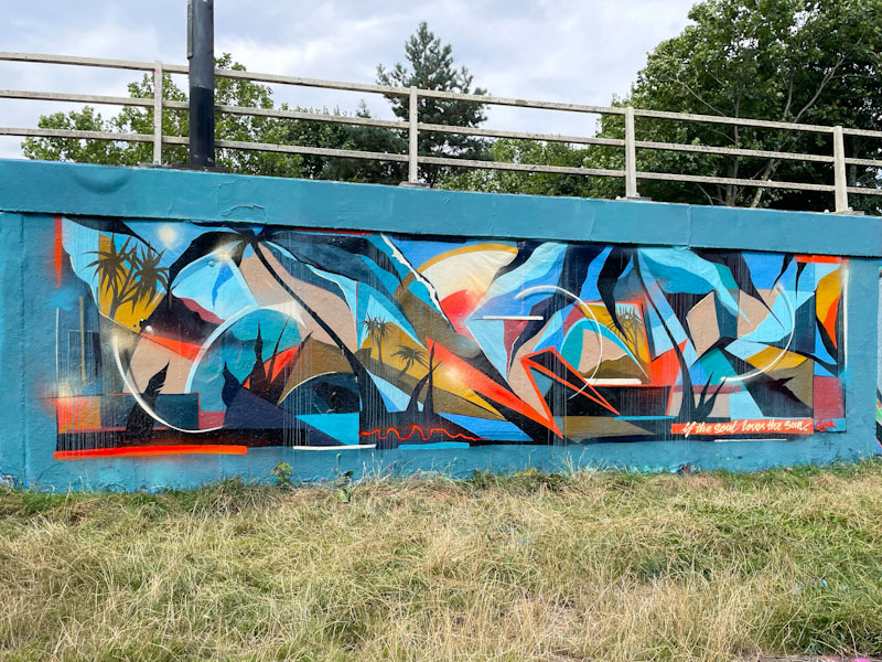
The way the piece is pulled together has a collage appearance, as if a youngster had cut up pictures from a holiday brochure (remember those?) and stuck them onto a rectangular piece of paper. This is a truly memorable piece by Smak and something a little special.
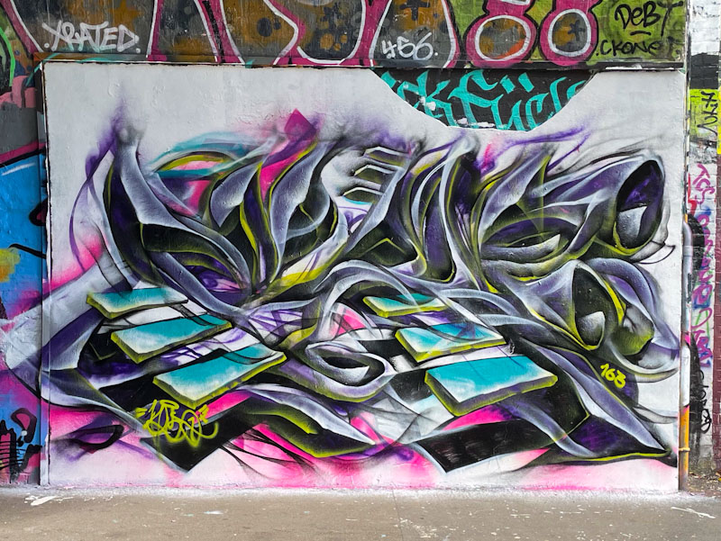
This outstanding abstract piece of graffiti writing by Mr Klue has it all, and has taken a bit of a shift in colour composition from his usual palettes of blues, greens, purples or oranges. It is really quite unusual to come across a piece by the artist with a white background, and it leaves the viewer with quite a different impression.
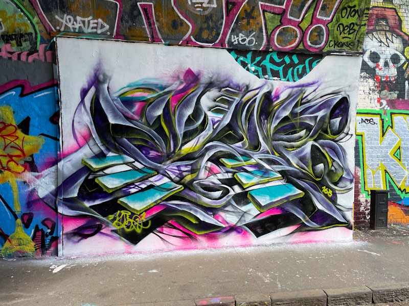
The wispy letters spell out KLUE, and I am pleased to note the incorporation of his floating steps, which I think really adds something to the mystery and spirituality of his work. It is interesting to see that he, and others before him, have chosen not to paint the semicircle of chipped wall along the top of the piece. Wonderful work from local artist Mr Klue.
.
After four long months
the traveller girl returns
family complete
.
by Scooj

It is a bit of an old cliché, but the idea of men going fishing to get away from their wives is one that has caused great mirth for as long as I can remember, and probably a lot longer than that. I imagine Sir Izaak Walton probably deployed the same reasoning when composing the Compleat Angler back in 1653.

Merny has captured the anglers fishing in rather angry looking water really well, and I rather enjoyed the concept when he told me what he was going to paint when I met him just before he started. This is another vibrant and humorous wall from Merny, who has been on fire this summer, perhaps inspired by his exhibition.
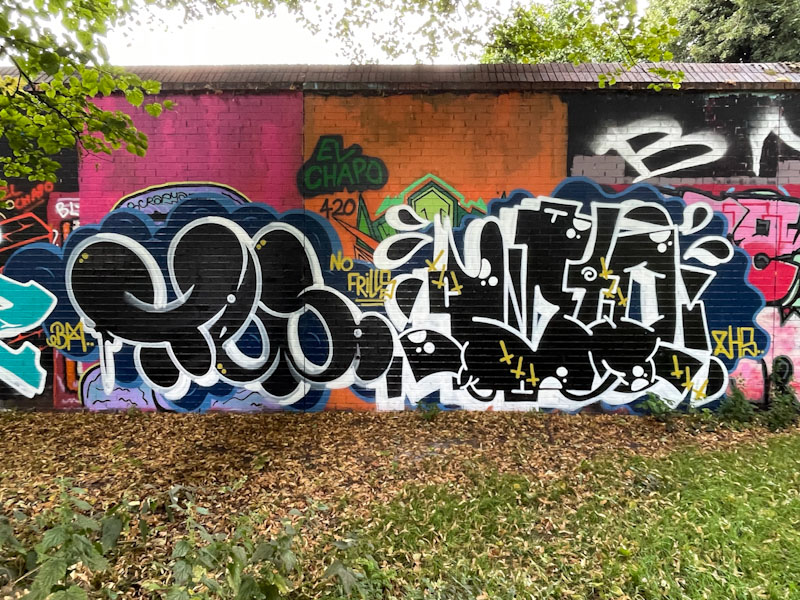
I haven’t posted many No Frills pieces for a while, in particular from Slim Pickings (TES), even though I have a whole stack of them in my archives. I don’t know how I’m going to manage the situation, but I’ll think of something. This is a nice collaboration from Slim Pickings and Biers.

I have stuck with the original names I used for both of these artists, for the sake of consistency, but you won’t find anyone else referring to Tes as Slim Pickings or WD40 (Jimothy Slip) as Biers. In this piece Slim Pickings offers his TES letters, of course, in a nice black and white combination with a light touch on the white outlines.

Biers appears to have abandoned his combination, pieces lately, dropping his characters and concentrating on his letters, which might be why I haven’t posted much of his work lately, because I do love his characters. Fun stuff from the No Frills duo.
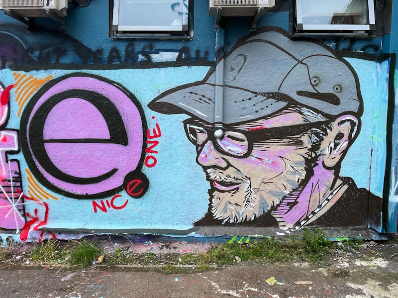
Over the past few months some rather nice script writing has appeared all over Bristol, with the words ‘Nice One’. I had nothing more to go on about the artist, until now, when a signed portrait by the artist appeared in Dean Lane recently. Unfortunately the identity of the artist remains a mystery, and until I know more I will refer to them as Nice One.
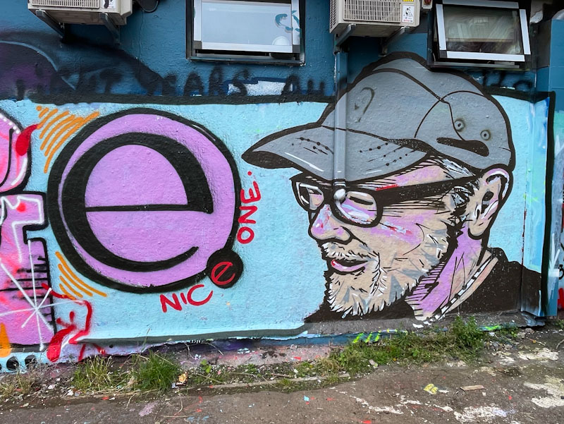
This is a fantastic portrait piece painted in a ‘brush-stroke’ style, as if it were a charcoal sketch in a black book. The proportions and perspectives are superb, the work of a trained artist I would guess. I love the expression on the character’s face. The bold ‘e’ in the signature is something I’ll be looking out for. More to come from this Natural Adventures debutant soon.
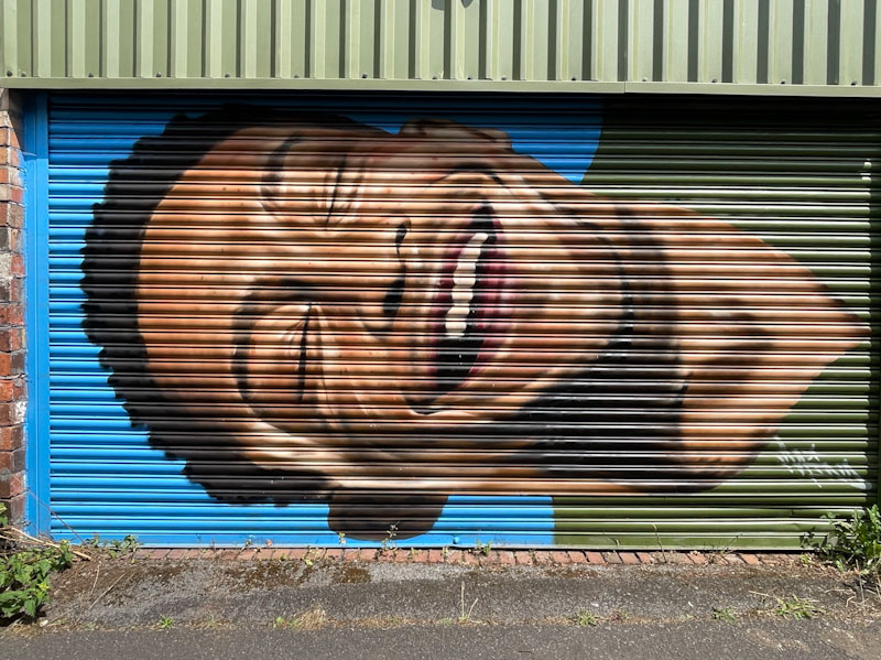
This was a bit of a red-letter day… not only was it gorgeous weather, but I got to meet Mind 49 for the first time, having been following his work for a number of years. He was painting alongside the Bristol Mural Collective at Bristol’s smallest street art festival at the end of July.
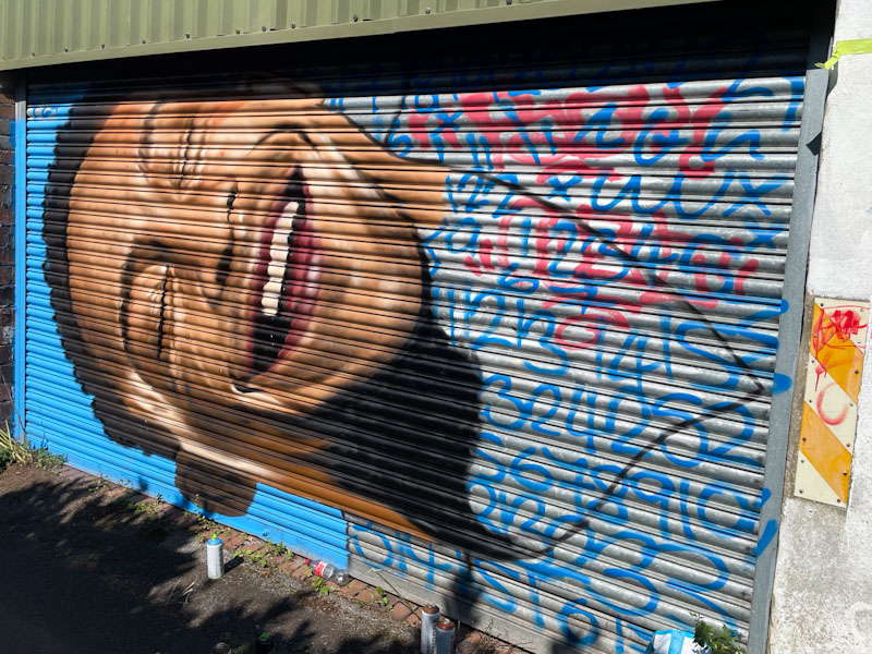
This is the first shutter piece that I have seen Mind 49 paint, and although the portrait is magnificent, I’m not convinced that the uneven surface lends itself well to his style, or at least in a narrow lane, where you can’t stand back to get the overall impression of the piece.

This is one of the first times that I have seen a full face portrait piece by Mind 49, as he usually likes to paint heads from all sorts of different angles, or with obstacles hiding parts of the face, creating a sense of mystery. A very nice piece indeed from a lovely artist.
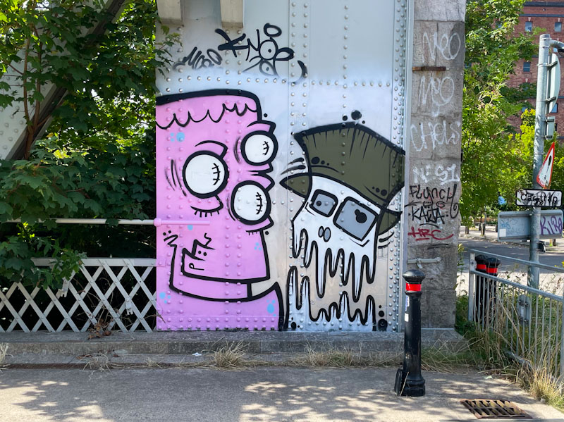
This fine Mote and Mr Crawls collaboration is at the northern end of Ashton Avenue Bridge, and greets with good humour all who cross it. The pair appear to have gone with a full-on monster theme for this collaboration, combining their styles well.
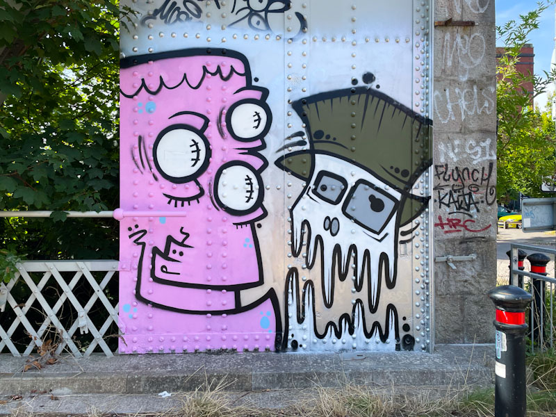
Once again we see their preferred chrome background, which is a quick and easy way to identify the artists. On the left, Mote’s monster, in pink, has a little bit of Frankenstein’s monster about him, perhaps sub-consciously. On the right, Mr Crawls has gone for the melting face look, a device used by other artists such as Laic217. It works really well with this character piece. All in all, a tidy and fun collaboration.


