.
I need a lie in
bladder and routine foreclose
rising with the larks
.
by Scooj
.
I need a lie in
bladder and routine foreclose
rising with the larks
.
by Scooj

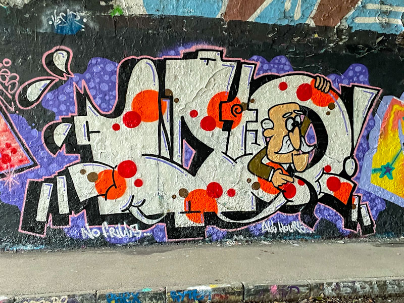
Saor, formerly known as Flava136, is an artist at the top of his game and one who paints in a similar style to Epok. He consistently pushes the boundaries of design, precision and interesting content. Saor often paints with his NTS crew mates, Mudra and Kosc, and this piece was part of a recent collaboration on the north wall of the M32 roundabout.
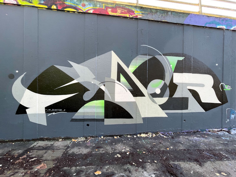
There is a lot to like about this outstanding piece of writing. The letters spell out Saor in Black Grey and white, with some subtle but impactful tints of green. There is a sense of geometry creating a framework from which some more organic shapes and forms are trying to emerge. Perhaps a tension between precision and softness that grabs the attention. The can control that Saor has is second to none and this is a magnificent piece of graffiti writing. We are blessed.

There are some artists who, for one reason or another make a significant impact on me. Others will drift by, because their work, if I am being honest, simply doesn’t have any ‘wow’ factor, or show any signs that it is likely to. I guess that is being a little harsh, but some artists won’t and don’t appear to have the desire to improve, others might have loads of headroom and gradually piece by piece get better, developing their style and content. I guess that one thing they all have in common is the enjoyment they get out of slapping some paint on a wall.

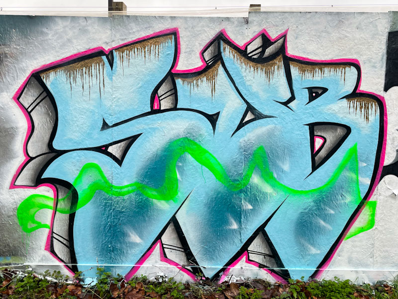
Noise is an artist who grabbed my attention from the very first piece I saw, with his large chunky letters making a loud visual noise. In this piece the nicely constructed letters are beautifully filled with a series of horizontal blue shades with clever stripe transitions and some superb icicle drips on the letter tops. This is a really nice piece, and adds to an ever growing portfolio… time for a gallery soon I think.
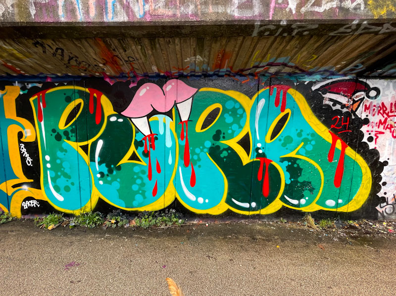
Every once in a while, Pura Decadencia drops a piece as if just to remind us that she is still out there. It is a pity that she doesn’t paint on the streets more often, because her quirky writing and vampire teeth add breadth to the spectrum of styles, nationalities and content of Bristol’s street/graffiti art culture.
I think that this might be the tightest piece I have seen from Pura Decadencia, with nice bubble letters a strong yellow border/drop shadow and some lovely fills, with great transitions between the colours. Of course, not Pura Decadencia piece is complete without a set of vampire teeth drawing blood. I hope we don’t have to wait too long before her next piece.
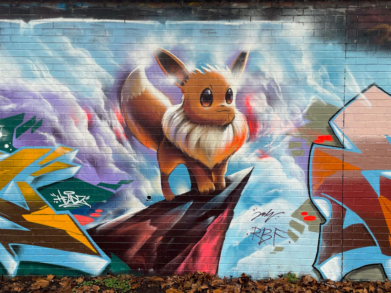
A short while ago, Desi and Evey celebrated their birthdays with a paint jam in Sparke Evans Park, the theme of which related to Pokemon, which is not one of my strong points, having struggled for years with my son’s obsession with the cards when he was at primary school. While I understood the concepts and watched the TV show a few times, I was always concerned that my son knew more about Pokemon characters than he knew about British wildlife in his own garden. Things have changed considerably since then, for the better (IMO).
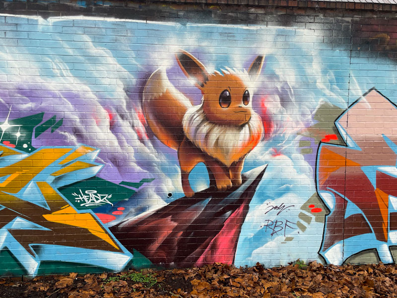
This is an absolutely stunning piece by Jodi, featuring a Pokemon character called Eevee – you can see what he did there. Jodi is one of Bristol’s very best street artists, who seems to keep a healthy balance between his street work and his studio work. In this piece he has captured the cartoon quality, faithful to the Pokemon brand, and presented Eevee on a rocky ledge with some atmospheric clouds in the background. Another wonderful piece from the incredibly versatile Jody.
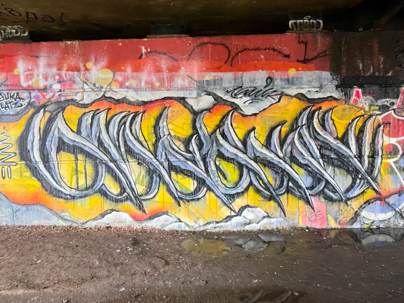
I think it would be fair to say that Wxttsart (Whatsxmilk) has been rather quiet over the winter period, but seems to have woken up a bit in the last month or so. It was painted alongside a rather different piece from Zed in the Clouds (to follow).
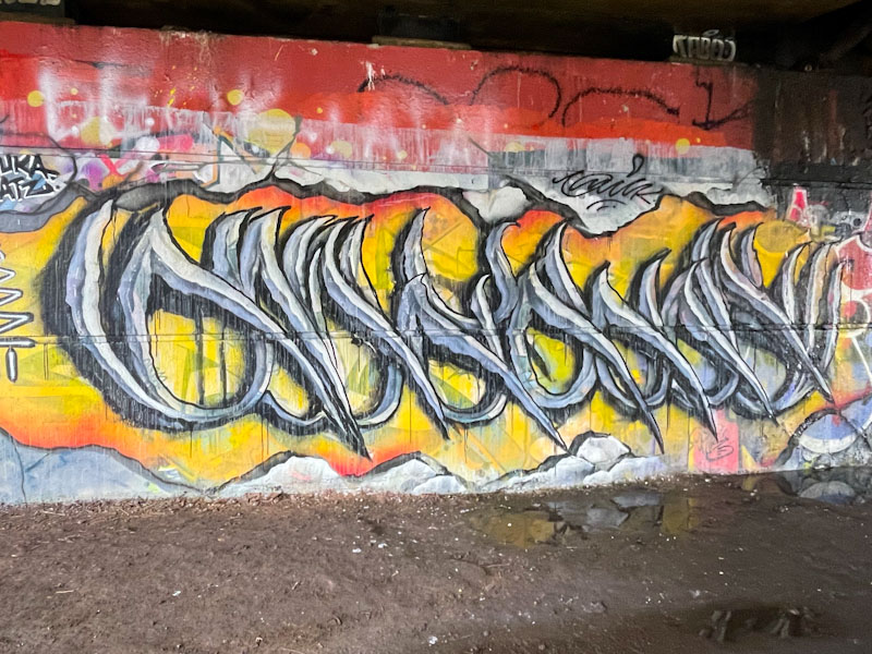
Wxtssart’s anti-style calligraffiti is very distinctive and usually spells out MILK, but I can’t quite make out the letters in this one, despite looking at long and hard. The steely grey letters are set on a warm orange background, providing plenty of contrast for the letters to stand out. It looks like the background paints might have been a little thin, and running low before completion, but it doesn’t seem to matter too much. This is a nice piece from the writer.
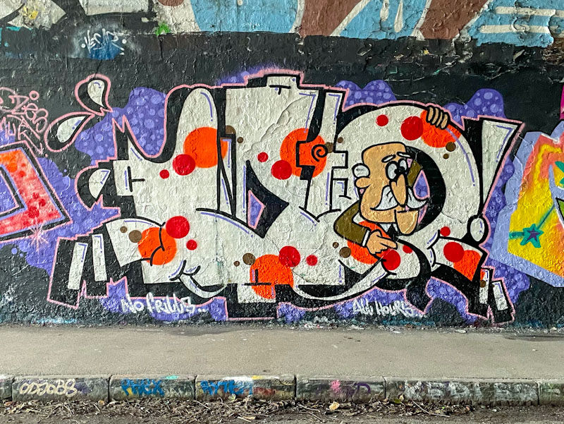
Biers, who writes WD40, has been very busy with his wall art over the last few months, and seems to be churning out pieces at the rate of about one a fortnight, which is pretty good going really. His general style is to write his letters and include a cartoon character inside the ‘0’, and it is a tried and tested formula which he has been using since 2021 or so. Before that he wrote O Yeah and before that Biers (and that is what I call him here on Natural Adventures).
I am not too sure who the old character is poking out of the ‘0’, and despite a bit of Googling, I haven’t had any luck. The WD40m letters are nicely finished, and the chrome fill with red spots is a delight. I am enjoying this steady flow of great graffiti writing from Biers, and long may it last.

I mentioned in a previous post what a pleasure it had been to meet Sub and Bloem painting together under the M32 a few weeks back. The pleasure continued on finding this pair of pieces on the long hoarding at Greenbank. While the two artists collaborate, in so much as they paint together, their work is separate and distinct.
Sub writes his bold oversized letters, with deep drop-shadows, and I guess that a challenge for him is to fill a space with only three letters. There aren’t too many writers who only use three letters, I suppose that Slim Pickings, who writes TES would be one. The fill is augmented with his trademark wisp of smoke running over it, and he incorporates some interesting drip work along the top.

Alongside Sub is this quirky piece by Bloem. It would seem that she ha a bit of a thing for old ‘brick’ style mobile phones, and hands with pointy nails. What I like is that she varies these motifs from piece to piece, keeping both the theme running and keeping things interesting. Bloem is one of those artists whose work I always love finding, like Pekoe, Face 1st, Kid Crayon, Fiva, to name a few. This is a fine couple of pieces and I look forward to many more from the pair to come.
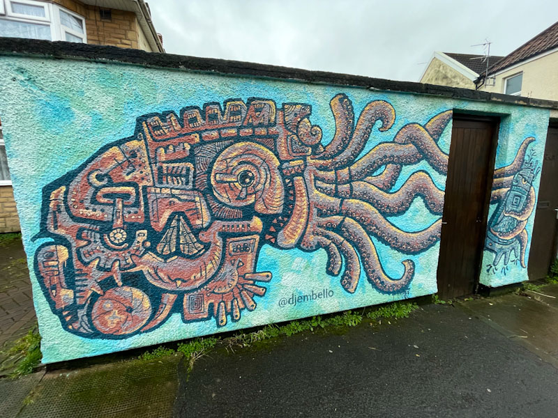
There are a lot of roadworks and diversions in Bristol at the moment, I guess it is that Quarter 4 underspend being used up before the end of the accounting year. The impact of this is that my usual routes to the spots I like to visit have been disrupted, and I found this unusual piece by Djembello on a new route to get to Greenbank.
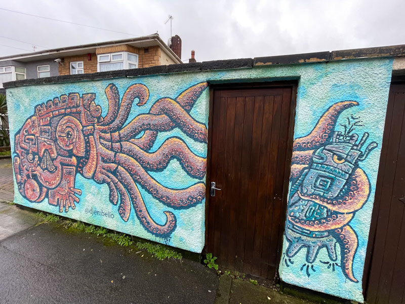
This wonderful octopus piece is a bit of a one-off, and I am guessing, a commission by the owners of the wall. Djembello is a Bristol artist, perhaps best known for his car-tyre sculptures, such as the cockerel near St Werburghs City Farm, and looking at his Instagram, it would appear he painted this around April 2021. I haven’t seen any other murals by Djembello, and this one seems to incorporate elements of sculptural design in it, not unlike the work of Feoflip, an artist who visited Bristol for Upfest a few years ago. This is a striking piece in a road with no other street art or tagging, and perhaps all the more outstanding for it.
.
Realisation
that practising mindfulness
writing haiku, works
.
by Scooj


