.
A game for wordsmiths
resurrected in our home
still competitive
.
by Scooj
.
A game for wordsmiths
resurrected in our home
still competitive
.
by Scooj
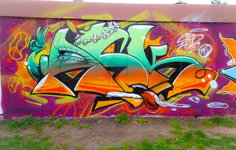
One of the things that I really like about Sled One’s work is that everything seems so effortless, and as a result, his pieces are immersive and compelling in a way that other pieces might be static and boring. As usual, even his writing seems to have a story to tell.
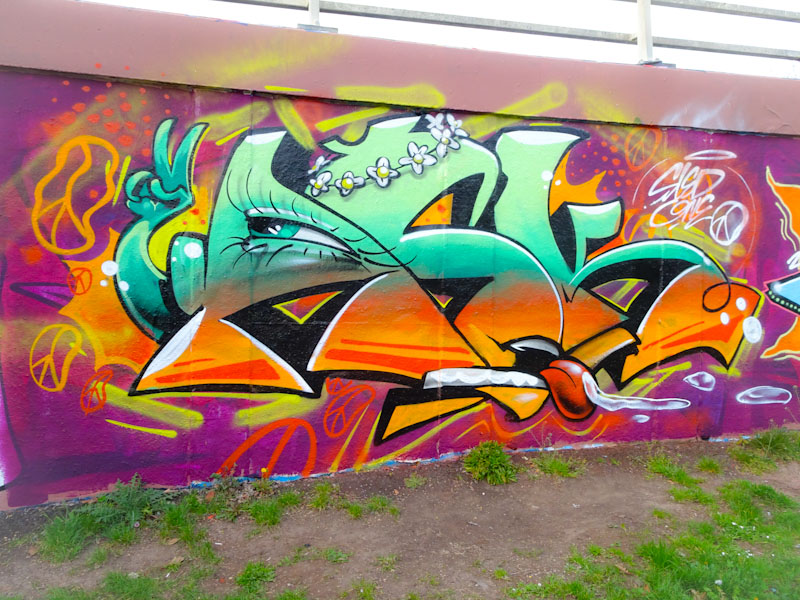
This ASK – After Skool Klub – piece is rather cute and engaging. The letters reveal an eye, a mouth, a daisy-chain garland and a hand with a peace gesture and the whole thing is a little bit ‘peace and love, man’ but so incredibly easy on the eye. This artist is the best at turning the inanimate into imaginable living things. Gotta love this one.
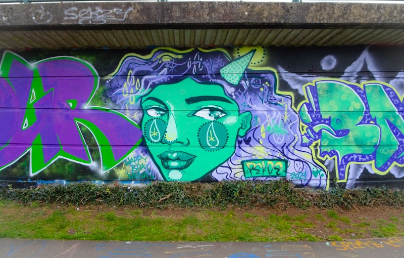
Ordinarily this artist would need no introduction, but that is especially the case right now, as hardly a week passes without Pekoe appearing on the pages of Natural Adventures. This wonderful portrait in purples and greens was part of a large paint jam in Cumberland Basin, and the themed colours ran from piece to piece.

This is a wonderful piece from Pekoe and incorporates a new feature that she is incorporating, namely the dotted circle on the cheek with the tear in it. I have only recently noticed this embellishment, and think I rather like it. It’ll be interesting to see whether it becomes a mainstream part of her work. This is a fabulous portrait as always, and she even has a Kid Crayon party hat.

.
So dry for so long
watering plants in April
at last the rain comes
.
by Scooj
Here he is again, the beating heart, the drum-beat of Bristol graffiti art reassuring us that all’s well. Face 1st has painted this doorway in Moon Street many times in the past, but his visits to this holy place for graffiti, along with visits of other artists, have declined in frequency since the area started undergoing some major gentrification. Soon Moon Street and the nearby hotspots for street art and graffiti will be mere memories, embedded in photographic archives and digital spaces. The Bristol scene will continue to thrive though, I am sure, just in different places.
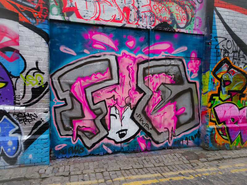
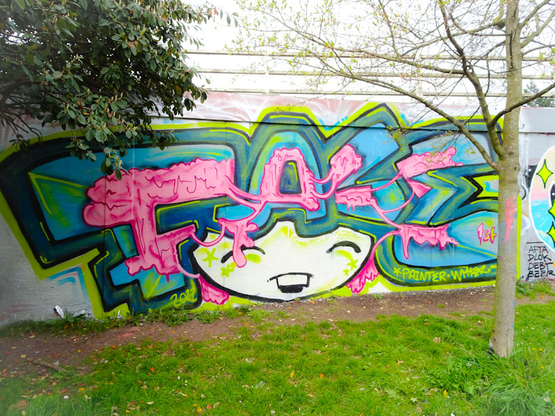
This piece is similar to one that Face 1st painter on the M32 roundabout a couple of weeks back, with a lot of pink bubblegum kind of stuff going on with the character’s hair. I think that Face 1st must have had a job lot of pink and needed to use it up. Always good and always present. Fun from this PWA perennial.
And they just keep coming. Rosalita (Raw) has been smashing it all over Bristol during the last six months and if I am honest, I couldn’t be happier about it. There is something about her work that feels very honest, at times brutal but so very full of soul. The subjects and the rich colours she uses are quite unusual in the street art world and her work stands out because of it.

This piece, at the end of the Brunel Way concrete support depicts a lady carrying a heavy load, in fact a caravan, on her back, looking like a Sherpa Porter. Entitled “if this is my home, where do I go?” This is a powerful piece on the subject of right to roam. So good.
.
Dear Boris Johnson
you have spun a web of lies
in which you are trapped
.
I was taught not to tell lies
Yours etcetera, Stephen
.
by Scooj
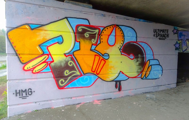
It would appear that this wall, after a considerable period of neglect is becoming a little popular. A week or two back there was a nice new collaboration from Mudra and Nugmoose. This has now been replaced with this more than half-decent piece from Pl8o.
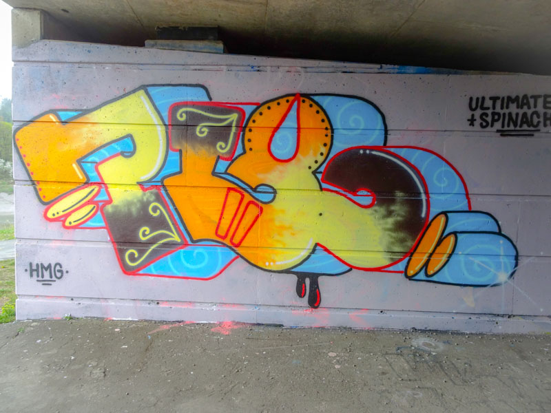
I am very pleased to see that Pl8o seems to be active again after quite a long absence – he is another artist who has gone to ground for much of the lock down period. This is a delightful deep-shadowed piece of graffiti writing spelling out the artist’s moniker yellow to orange to black fades. His letters lend themselves very nicely to writing and there is something very easy on the eye about them. Great to see Pl8o back hitting walls again.
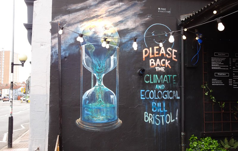
I genuinely miss my occasional conversations with Andrew Burns Colwill. I haven’t seen the artist for well over a year now, possibly two, and that is far too long. During that time I haven’t seen too much of his street work either, so it was with great joy that I found this recent piece by him on the wall of the North Street Standard.
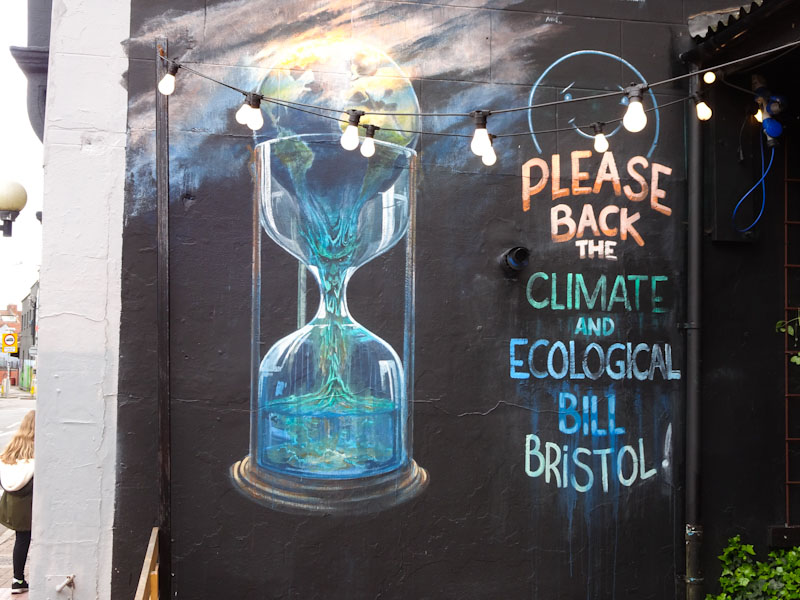
One of the things that chimes for me with all of ABC’s work is the environmental theme at its heart, and this piece is more overt than some of his work, with a direct call to action emblazoned on the left hand side.

The Earth sitting at the top end of an hourglass is a fabulous visual metaphor for the urgency of the predicament we find ourselves in. As the Earth drips down into the lower half of the hour glass, a face is seen in the centre, as if the soul of the planet was being drained out.
This is a fabulous piece of fine art from one of my favourite people in Bristol.
We all must do what we can, and we can do what we must.
.
Do you remember?
Conversation opener
to warm our cold hearts
.
by Scooj