.
The day’s work is done
tea and biscuits round it off
TV with the dog
.
by Scooj
.
The day’s work is done
tea and biscuits round it off
TV with the dog
.
by Scooj
It is truly great to see that Dibz and Shade One seem to be collaborating rather a lot at the moment, and they have absolutely knocked it out of the (skate) park with this recent piece in Dean Lane.

The face is by Shade One and to me represents a great example of a crossover of old school/new school, and what I mean by that is that there are some lines, for example the eyebrows that are quite angular and remind me of old New York style graffiti characters, but the blue frame, bubbles and decoration are much more contemporary in style.

As ever the graffiti writing from Dibz is outstanding, and the sharp clean lines with a complex colour scheme so expertly done demonstrate clearly why Dibz is simply one of the best graffiti writers around. The red object to the right of the piece I believe is a butt plug (although I might be mistaken) and was not part of the original collaboration, unfortunately it doesn’t add much to the piece in my opinion, and is ever so slightly annoying.
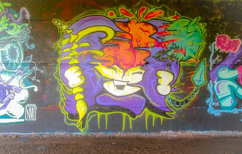
Woah there, steady… A column piece under the M32, who can it possibly be by? Zake of course, but unlike any Zake piece I have seen before. This piece feels like the artist has stepped up a level, having a depth and texture unlike any of his previous pieces, although there have been signs of continuous improvement.

The face (of course a face) is quite scary with bright teeth and a disturbing expression and the whole column certainly stands out. What I like most is that the piece is full of texture and folds, with light and dark and I think that Zake has really nailed it. I am totally annoyed though by the sticker over one of the eyes… I guess these things happen. Looking forward to more from Zake.
.
Dust-covered hero
a survivor of neglect
thrives in the corner
.
by Scooj
I have said it before and will repeat myself. I love this modest board underneath the M32. Turnover is quite slow, maybe one new piece a month and the quality of work here is usually pretty good, and that fine tradition continues with this zany collaboration from Kid Crayon and I Am Ian

I can’t begin to know what the story is in this piece and I will not attempt to unravel it, but it is full of fun and colour. On the left is a male head sporting a rather nice paper hat with a blue and white flag. All around the face are swords firmly planted in the blue substrate. The words between the two heads say Cloth Mother – I don’t know wat that is, maybe their crew name.

On the right is a face from I Am Ian, one that has ben severed from its body, presumably by one of the many swords. The character has horns and might be satan, but I’ll not guess any further because I said I wouldn’t try to unravel the collaboration. Instead I will sit back and enjoy it. Crazy people, crazy piece.
I have quite a few photographs of work by Todoaciem, but I haven’t posted many, maybe only one before. There are several writers in Bristol at the moment whose letters follow more of a calligraphy style, with regular shapes and details, including Stivs. I don’t know if it is a fashion or something longer-lasting. It is great to see though and this is a great example of the style.

The piece looks almost like a heraldic banner, especially with the letter E? picked out with red in the middle. I have tried to decypher the lettering, but just can’t quite see it. More to come from Todoaciem soon.
.
Three times forgotten
coriander on the shelf
got there in the end
.
by Scooj
Sometimes I’m just not quick enough off the mark. This lovely collaboration between Mr Penfold and RichT is a case in point. I had seen the piece on Instagram and knew exactly where it was, ut by the time I got organised to check it out it had been tagged with the word WONK. Not really a surprise in this part of town, but really annoying nonetheless.

The mural is one of those ‘true’ collaborations which is a blend of the two artist’s styles incorporated into the one piece. The flowers are courtesy of RichT and the abstract shapes are Mr Penfold’s. I think that it works exceptionally well and I would love to see more of these blended collaborations in the future.
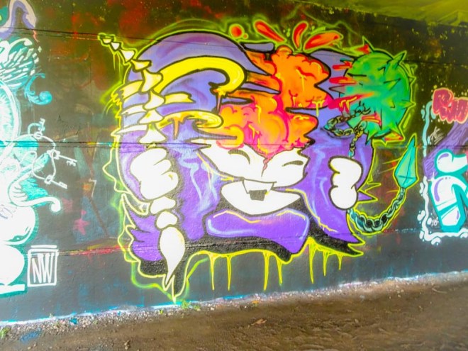
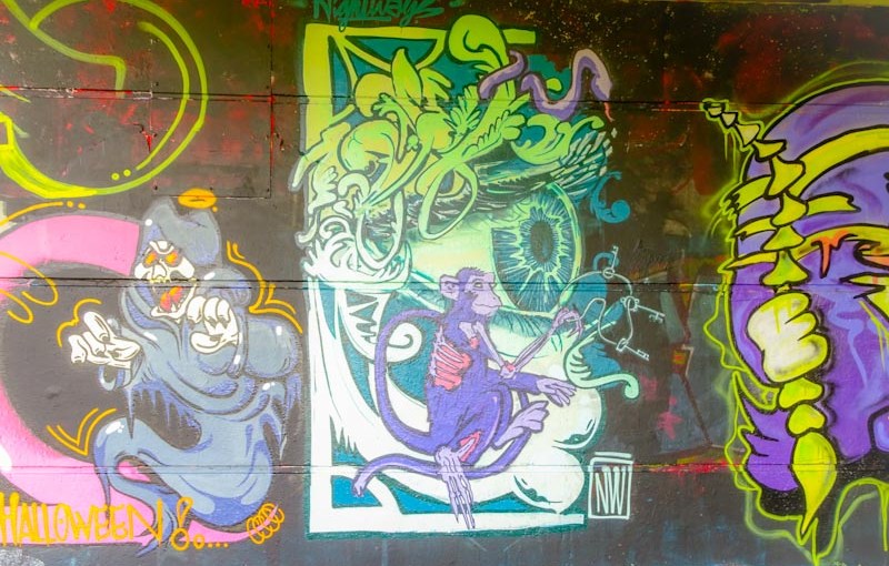
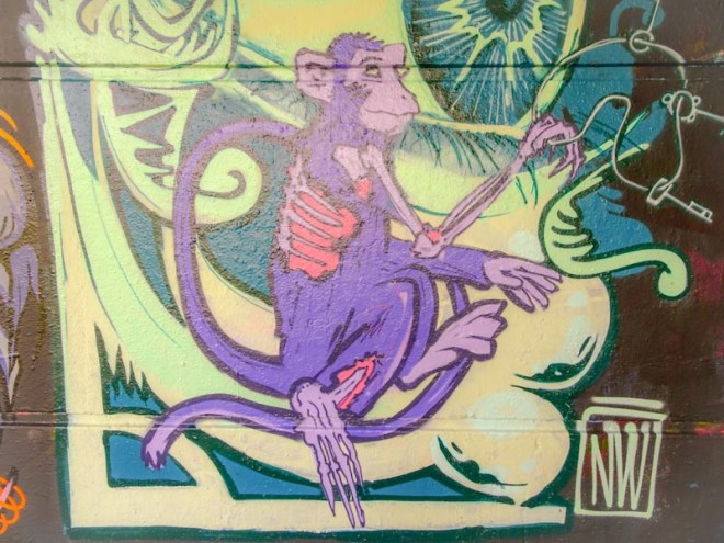
All too often there are some really nice pieces that are easily overlooked. In skate parks this happens frequently because any ramp street art tends to get scuffed, damaged and tagged really quickly. Fortunately I managed to find this lovely writing from Nightwayss before it got too bashed about.

Sadly there are no monkeys, but the writing is very nice and the style and colour selections very typical of the artist. I have seen Nightwayss use this grey colour an awful lot in his work which in itself is not unusual for graffiti writers, but he uses it more artistically than is the case for most throw ups that you see about the place. My guess is that this is one of those pieces that goes largely overlooked… not by me though.
.
All too fast night’s cloak
smothers the day we cling to
a tortured twilight
.
by Scooj