.
What is worse than hell?
a petulant bully Trump
breaking the broken
.
by Scooj
.
What is worse than hell?
a petulant bully Trump
breaking the broken
.
by Scooj
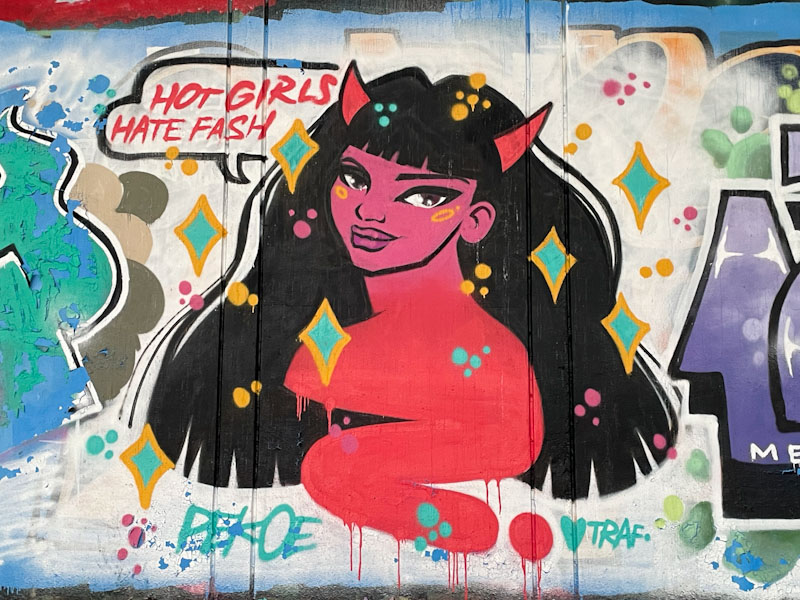
Pekoe is my heroine for coming up with this series of portrait pieces with the wonderful words ‘hot girls hate fascists’. We live in an uncertain time, when nationalism and the far right are on the rise, and we need look no further than to Trump and Musk to see the devastating effects and chaos caused by self-interest and populism. Pekoe provides a powerful and simple message for these people – it is not a good look.
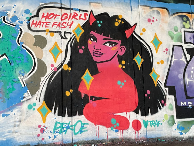
I have always admired Pekoe’s work and every single time I find one of her pieces I get an endorphin kick, which I guess is why I like finding and photographing street art, it is my rest and recreation. In this portrait piece the lady is either a devil or is wearing a devil hairband. I love the white streaks in the hair, providing gloss, and the lady’s face has a wicked smile. A wonderful piece under the M32.
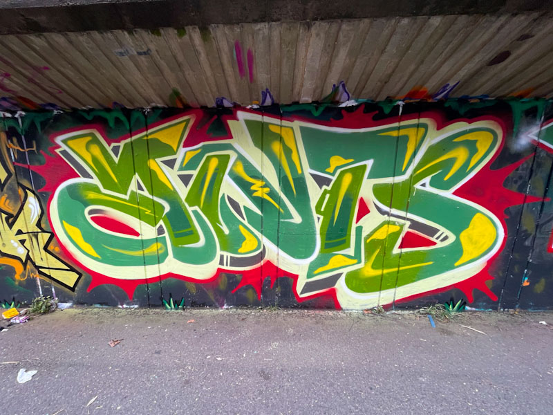
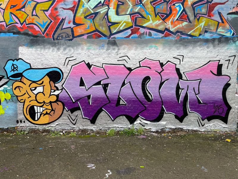
This is another fine piece from Jaksta’s birthday paint jam alongside the M32 from a few weeks ago. Another artist who I watched at work, but didn’t get to chat with and who I don’t know well at all is TLB and his fine DNTS (ANTS as corrected by Paul H) letters.
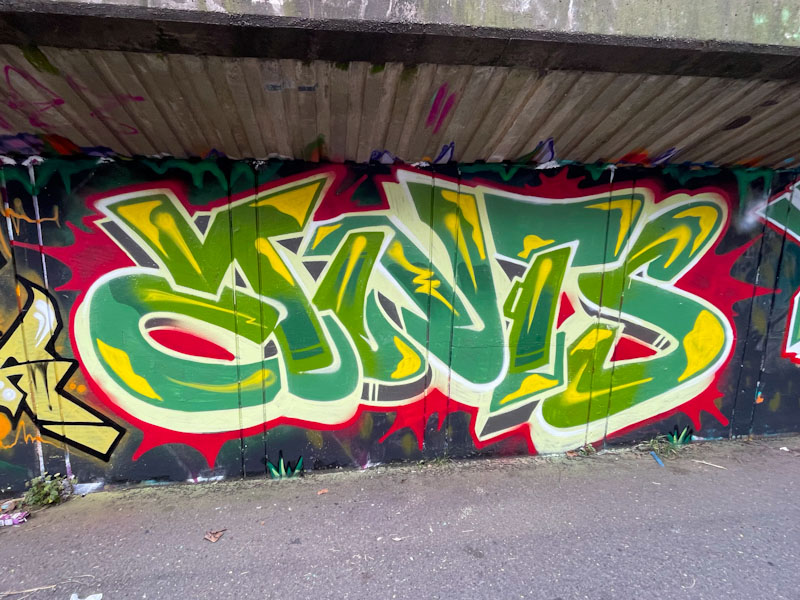
This is a classy piece of writing with only one small blip, which is the thin yellow paint, and I blame the manufacturers for that. Yellows and Oranges are often thin, and even the best artists can’t remedy that. The letter shapes are very pleasing and the themed green/yellow fills done nicely, a cream and black drop shadow adds some variation. The whole thing is set on a red burst background (the red paint is also a little thin). Great work.
.
Heavy day ahead
and heavy week following
in survival mode
.
by Scooj
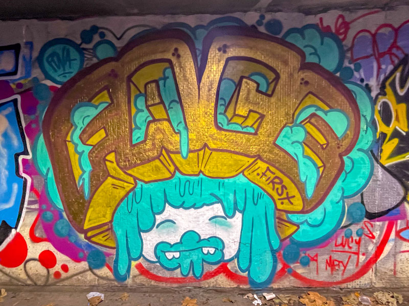
I don’t tend to venture to the Junction 2 roundabout on the M32, because there isn’t often much to see there, but my most recent trip was rewarded by finding this nice Face 1st piece in one of the multitude of tunnels. This was more special than usual, because as I have said here before, Face 1st has moved out of town, and his pieces appear less frequently.
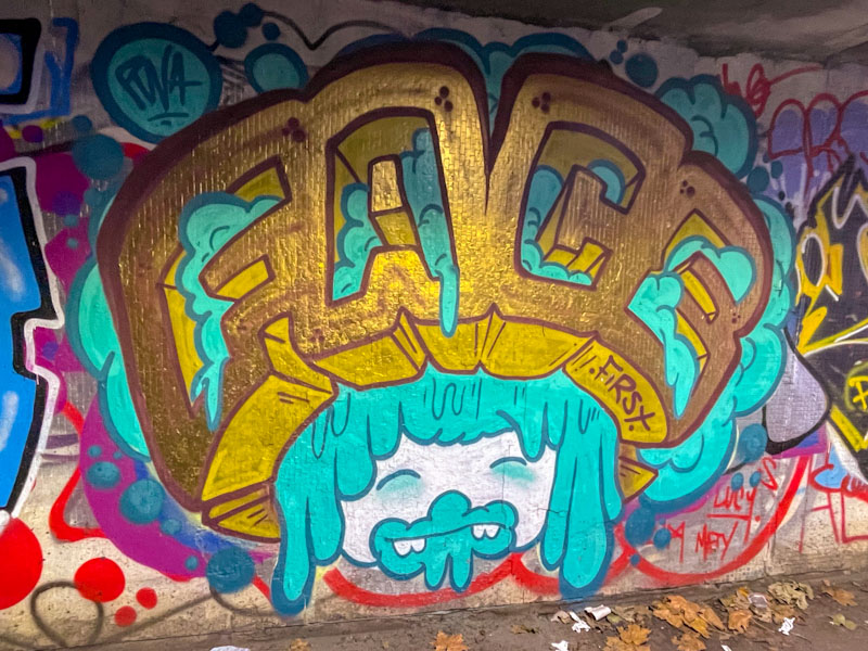
The piece itself is a classic combination from the artist, with a Girl’s face (somewhat mucky around the mouth), and big hair, with the word FACE in glorious gold, wrapped around. The letters are painted in a chunky block style that Face 1st rather likes to paint, and the whole thing is a bit of a blast from the past. It is great to see that Face 1st is living up to his word of returning to Bristol reasonably regularly to paint a little.
As if it were needed, this combination piece is further evidence that Jevoissoul is on an upward trajectory. Probably the most noticeable aspect of his improvement is the tightness of his work, and by that I mean his lines are clean and his fills tidy. When he first started out, His work felt a little cluttered and hurried, but I don’t get that feeling so much now.

To the left, our familiar character, complete with grimace, appears to be losing his cap, which creates a sense of movement in the piece. Jevoissoul’s artwork is becoming more sophisticated, with a two-tone light/shade aspect to the face. The letters also have a sense of movement, indicated by the black accent lines around the outside. Good colours and nicely blended horizontal strips fill the letters nicely. Perhaps there could be a little bit more interest in the letters themselves, but now I am just being picky.
.
One of those mornings
all troubles evaporate
glorious blue skies
.
by Scooj
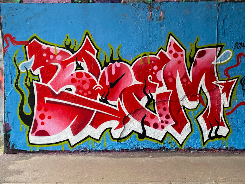
Carrying on the theme of female artists today, this is a superb piece of graffiti writing from Bloem. There seems to be no stopping her so far this year, and that can only be a good thing. What is so unusual about Bloem’s work, for an artist who is relatively new to graffiti writing, is the precision and clarity of her lines, which comes with incredible can control.
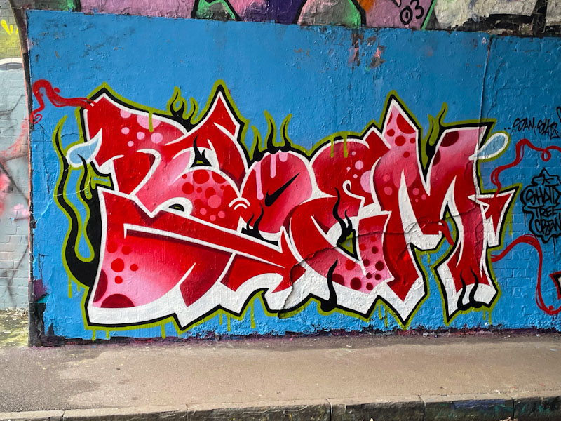
The irregular letters BLOEM pop so well from the wall, thanks to the brilliant white drop shadow. The red letter fill is blended so brilliantly, it isn’t possible to be sure where one shade ends and the next begins. On top of that, the circles and spots are perfectly applied throughout. Wrapping the whole piece up is a black and green border, which has a life of its own with ‘flames’ and drips. Every component of this piece comes together so well, and in Bloem we have an emerging superstar.
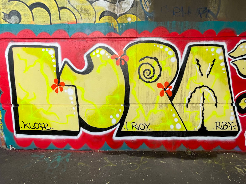
With some artists, there is a simple honesty, integrity and a resultant authenticity that makes their work so attractive. There is nothing pretentious about Lupa’s work, and this great big chunky presentation of the letters LUPA ‘does what it says on the tin’.
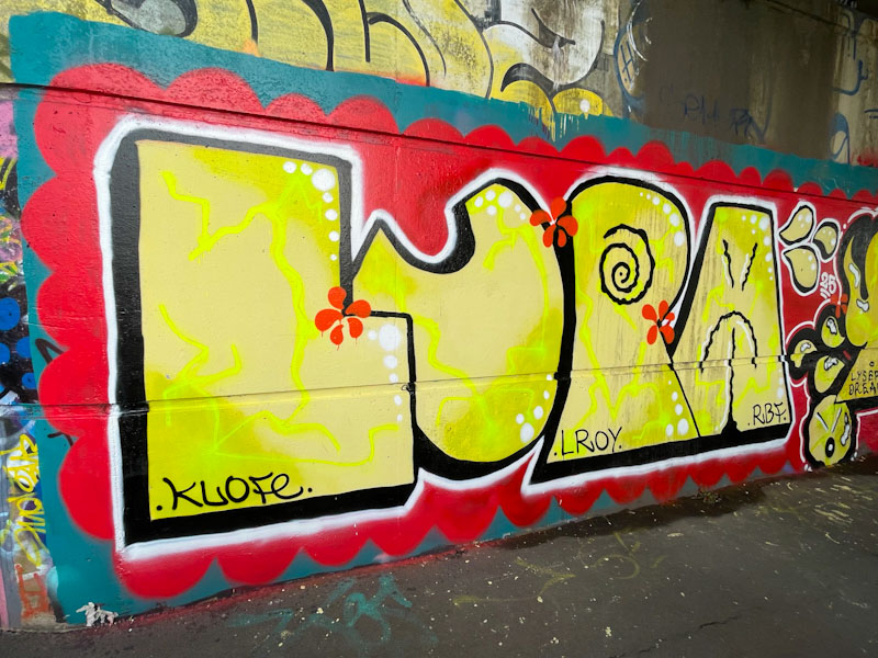
The big yellow letters stand out on the deep red background. The fills have an electric plasma shock running through them, and I love the black swirl on the ‘P’ and the sad/angry face on the ‘A’. With this piece there is nothing but the letters and the joy. Nice shout-outs to Klofe, Lee Roy and RBF.
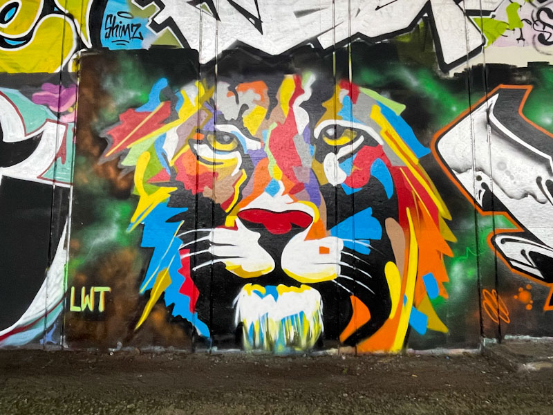
When I see pieces like this one from Jest Soubriquet (@likes12_art), I wonder how incredible our brains are at normalising and making sense of a patchwork of colour (all the wrong colours) to build an image of a tiger. Our capacity to ‘fill in the blanks’ is awesome.
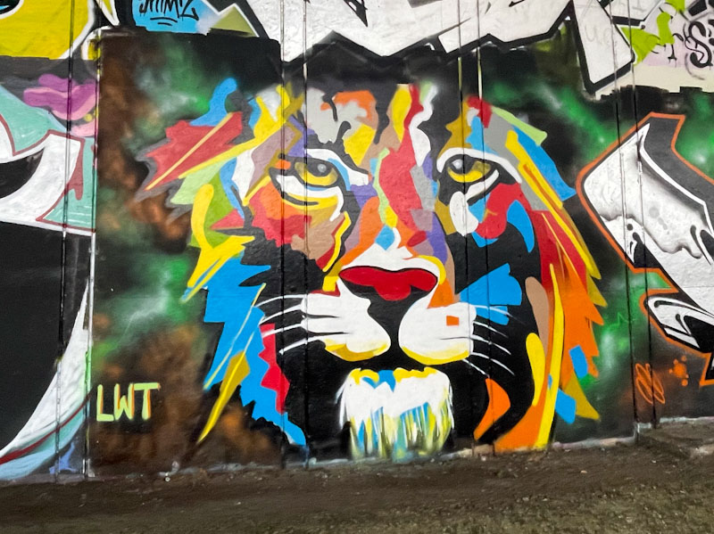
Equally awesome is Jest Soubriquet’s ability to paint a tiger portrait in a multitude of colours, and he has done a superb job in this challenging spot underneath the M32. I always find it interesting that artists come here to paint, because footfall is practically zero, and these pieces won’t be seen by many people. Perhaps this simply emphasises the point that many street artists paint for the pure joy of it.


