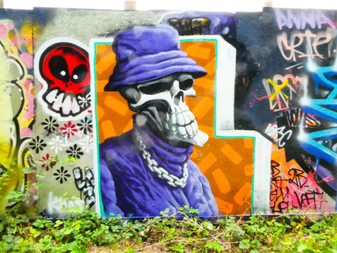
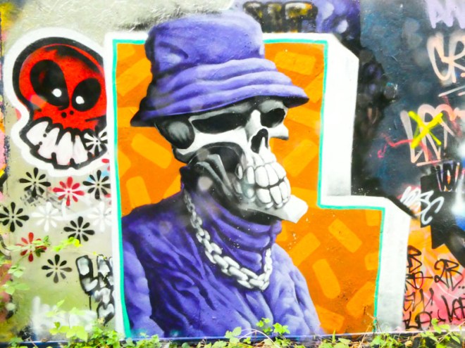
Although he doesn’t paint as often as he used to or as often as I’d like, Laic217 has managed to get into a steady rhythm this year, painting about once a month or so. This archetypal piece appeared on the long wall of hoardings at Greenbank earlier on in July.
Laic217, Greenbank, Bristol, July 2023
Set on a large orange ‘L’, which I assume stands for Laic217, the skull character comes complete with a bucket hat and large chain around the neck. These are stock items for a Laic217 piece, but it is his trademark skill at painting fabric that really stands out. The folds created with shadows and highlights give the material an almost velvet appearance. A nice tidy piece from a firm favourite on Natural Adventures.
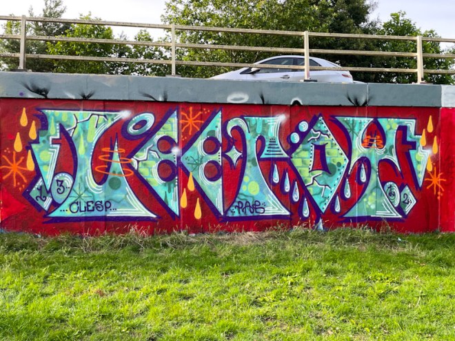
Lee Roy was just finishing off this piece when I turned up on my ’rounds’ and he made plenty of time to chat with me before packing up, which was kind of him. On the two occasions I have been lucky enough to meet him, I can honestly say he is one of the most gentle and likeable characters on the street art circuit (although to be honest, nearly every artist I have spoken to over the years have been thoroughly decent and generous with their time).
Lee Roy, M32 roundabout, Bristol, July 2023
There is so much to like about this one. The blood-red background is the perfect backdrop to contrast with the lighter greeny blue letters. Lee Roy’s letters are that strange combination of being quite regimented in his own style, while at the same time being disorderly and anti-style in nature… he carries off this effect perfectly. There are plenty of fills to enhance the letters, and a fabulous selection of drops in greens and orange. I like this one a lot.
This is the first piece I have posted by Yield, but I am certain it will not be the last. I have plenty of photographs, mostly from the River Avon pathway area, of the artist’s writing, but this one in Peel Street Green appears to be on a slightly different level.
Yield, Peel Street Green, Bristol, June 2023
There is a nice flow to the letters, almost a ribbon effect, an the blur and black fill patterns work nicely through the writing. Some classic features, such as arrows and dots provide interest and the pink background contrasts well with the blues. This is a decent piece of writing, and I will definitely feature more of Yield’s work in future posts.
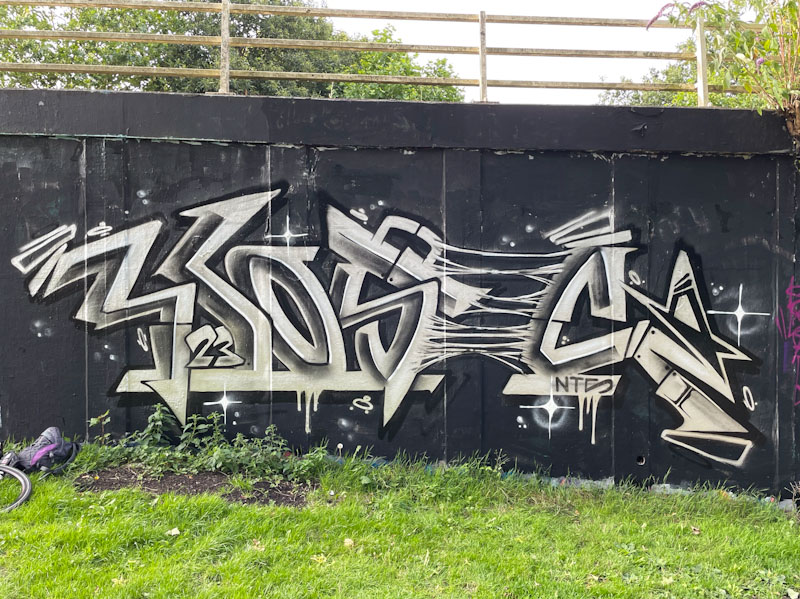
Kosc is surely one of Bristol’s most talented and versatile artists painting at the moment. Whether he is painting portrait pieces of graffiti writing in a collaboration or alone, his work is always immaculate and extraordinarily creative.
Kosc, M32 roundabout, Bristol, July 2023
This piece on the M32 roundabout is in his metallic/greyscale style and presents the letters KOSC with a little bit of disintegration between the S and K. Some trademark rivets in the letters add to the metallic look of the letter panels. A nicely thought out and executed piece from Kosc.
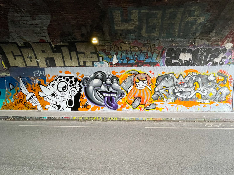
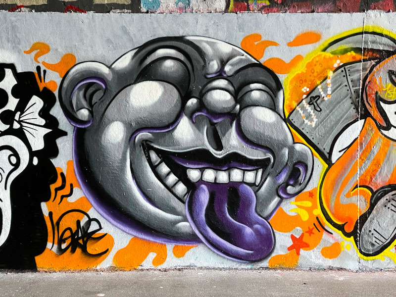
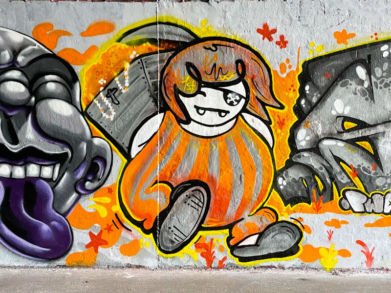
Chill, Zake, Face 1st and Soap, St Werburghs, Bristol, July 2023
I am writing this last night in the full expectation that I will be heading off to the Cheltenham Paint Festival this morning, which means that in a short while, Natural Adventures will be awash with fabulous pieces from Cheltenham by artists from nearby and far, far away. On to this fine collaboration from the PWA crew, Chill, Zake, Face 1st and Soap.
Chill, St Werburghs, Bristol, July 2023
There is a bit of a pirate theme going on (perhaps linked to PWA – Pirate Wall Art), and Chill kicks things off perfectly with this wonderful cartoon character wearing a bandana and brandishing a cutlass and crying out ‘AAARRRGH!!!’ The scar on the cheek and terrible teeth finish the character off brilliantly. A superb piece.
Zake, St Werburghs, Bristol, July 2023
Next up, Zake goes a little bit off-topic both in terms of a pirate theme and indeed the colour scheme too. His piece is fantastic and a bit of a return to the kind of faces he was painting a year or two ago. Tons of depth is achieved with clever use of shading, which is a speciality of the artist.
Face 1st, St Werburghs, Bristol, July 2023
Face 1st duly returns us to the pirate theme with his character, complete with skull and crossbones eye patch, makes off with a treasure chest full of gold and jewellery. It is a brilliant piece full of mischief and movement and so utterly Fac 1st.
Soap, St Werburghs, Bristol, July 2023
Finally, Soap sticks with his graffiti writing, and continues the pirate theme and colour scheme. The letters spell out SOAP, and the Ice King ‘O’ is wearing an eye patch. The letter fills and dynamism of the piece are perfectly presented and add a distinctive element to the quartet of styles. A truly magnificent collaboration, so full of fun and mischief.
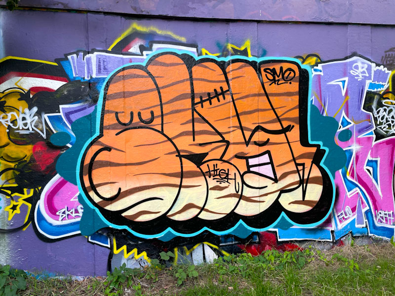
A rather nice bit of bubble writing, but what’s so special about that you might ask. The first thing that you might notice is that it is beautifully finished and much less crude than most throw ups painted in this kind of style. In short the piece has class.
SkyHigh, M32 roundabout, Bristol, July 2023
Perhaps the reason it stands out is that it is by the superb SkyHigh, and if you look carefully the letters, with the tiger print pattern, read SKY! with the word ‘high’ written in black script in the middle. I guess that the artist was passing through, as he often visits Bristol with Roo to visit friends/relatives. Often we are treated to a large SkyHigh wall with his unique style of high-end block lettering, but not this time. Great to see all the same.
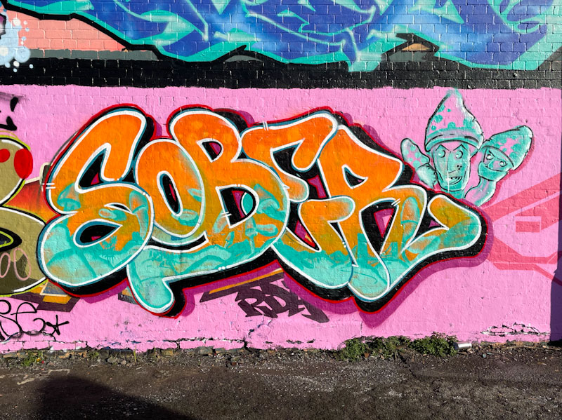
There has been a noticeable uptick in the quality of Klashwhensober’s work recently, and it feels like he has reached a new level. He is certainly broadening his horizons with letter styles and the introduction of ever-more sophisticated characters accompanying his letters.
Klashwhensober, Dean Lane, Bristol, July 2023
In this recent piece from Dean Lane, Klashwhensober has gone for a simpler, smoother letter style which is very tidily finished. The fills of turquoise and orange blend well and are an eye-catching combination. The three little toadstools with faces on the right are a curious addition to the piece. Great work from Klashwhensober.
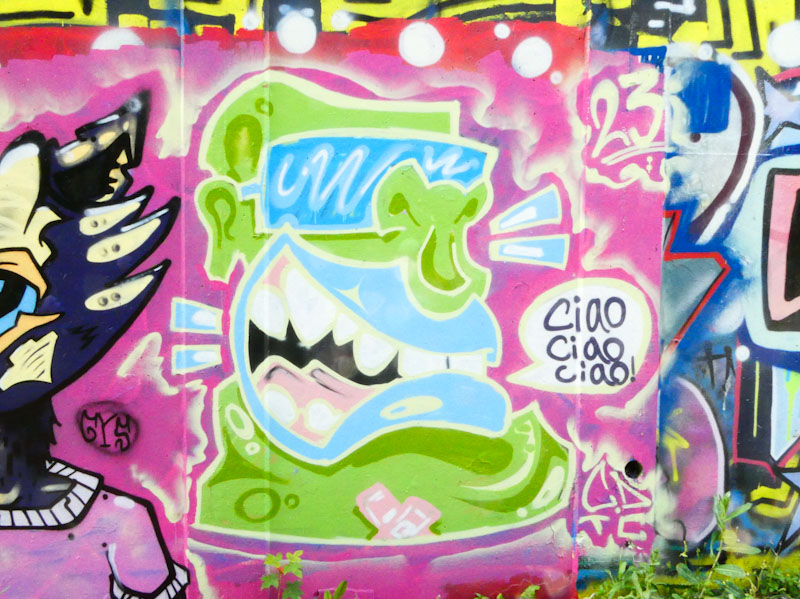
Daz Cat and CD.TC, M32 roundabout, Bristol, July 2023
It is always a great pleasure to see these two collaborate, it is a pity that it just doesn’t seem to happen all that often. I imagine that the limitation probably stems from CD.TC’s availability, as Daz Cat is a constant presence on our streets.
Daz Cat, M32 roundabout, Bristol, July 2023
There would appear to be a bit of an Italian theme going on with Daz Cat’s cat holding a little white pendant with the words ‘Bella ciao, bella ciao, bella…’. There is also a shout out to ‘Caroline’ on the cat’s pink shirt – maybe she is the bella. This cat feels very much like ‘old school’ Daz Cat, reminding us where he came from.
CD.TC, M32 roundabout, Bristol, July 2023
CD.TC continues the theme, with his rather cheerful monster character calling out ‘Ciao, ciao, ciao’. There are some nice touches going on with this piece, for example the sun visor glasses and the cross of sticky plasters at the base of the piece. As one might expect, the character has a disproportionately large mouth and gleaming teeth. Always great to see these two painting together.
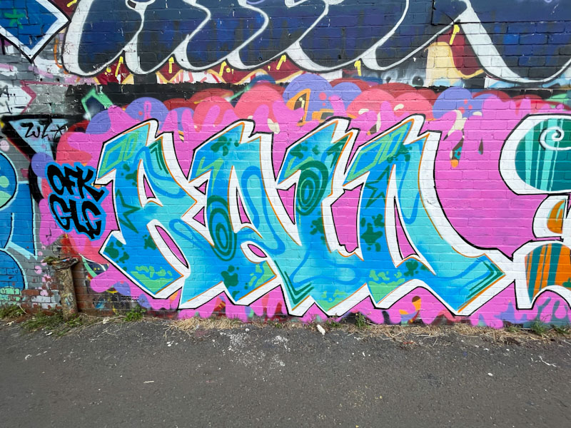
When a new artist makes it on to your radar, it becomes very difficult not to see their work everywhere, especially if they are as productive as Raid seem to be. Raid made his debut on Natural Adventures back in March this year, and since then he has appeared seven times, and I still have some of his work in my files. Look out for a gallery before Christmas.
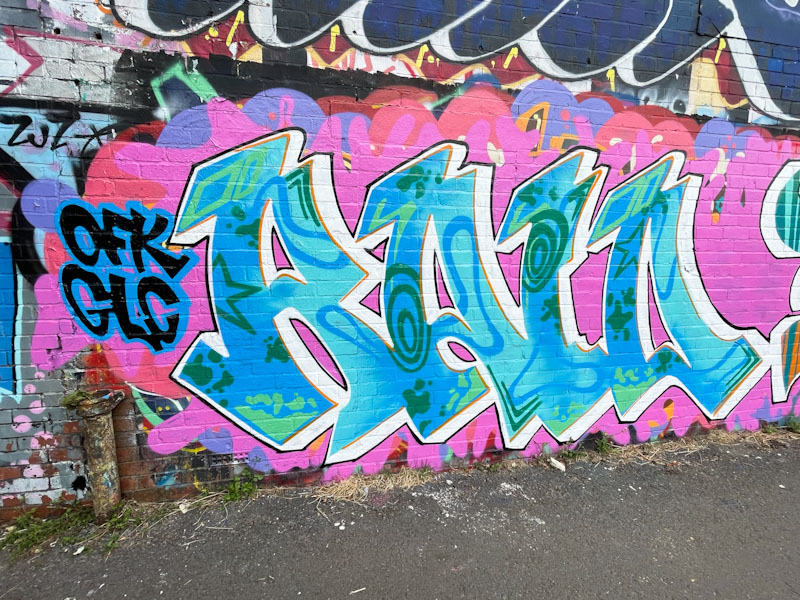
Raid, River Avon, Bristol, June 2023
The letters RAID, I imagine, are quite fun to play with, and the way that Raid writes with large bold lettering, gives him plenty of scope for interesting fills. The letters are joined at the base, and the fill bleeds from one letter to the next. Some nice swirly psychedelic forms and shapes fill the space nicely Some nice touches include a thin orange border on the right-hand side of the letters and a decent 3D drop shadow capped off with a tight black border. This is another fine piece from Raid.