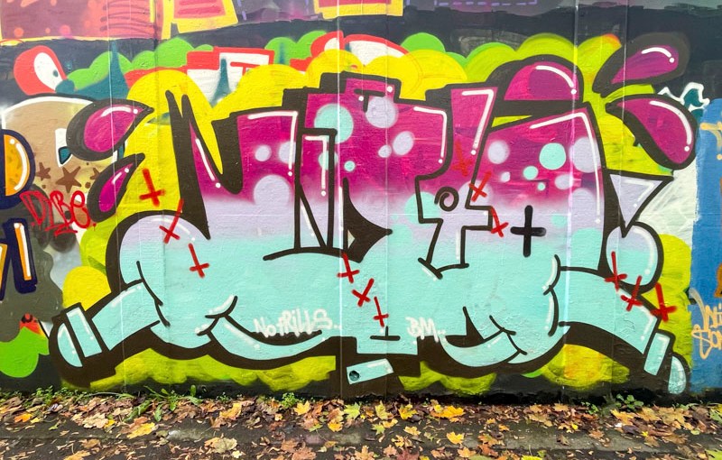
A couple of quickies this morning – I had forgotten I have a hospital appointment and a very busy day ahead. This is a beautiful WD40 Piece by Biers, not too far away from where I first saw his work, about ten tears ago, which from memory was a piece of toast combiation piece.
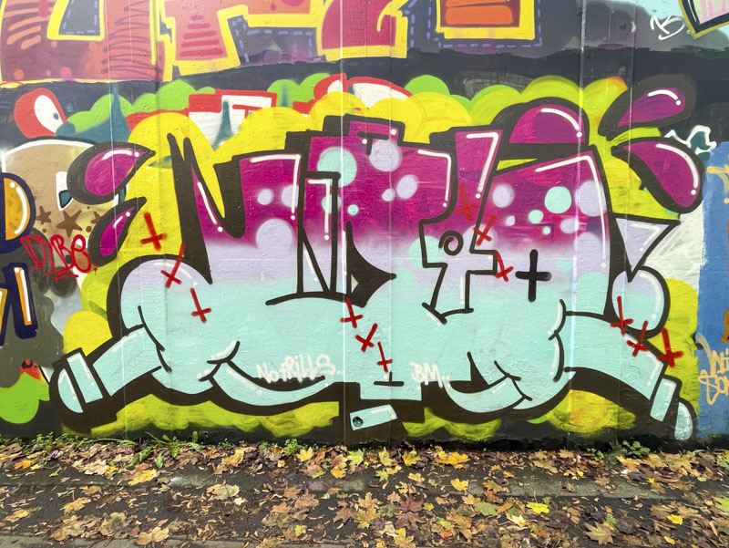
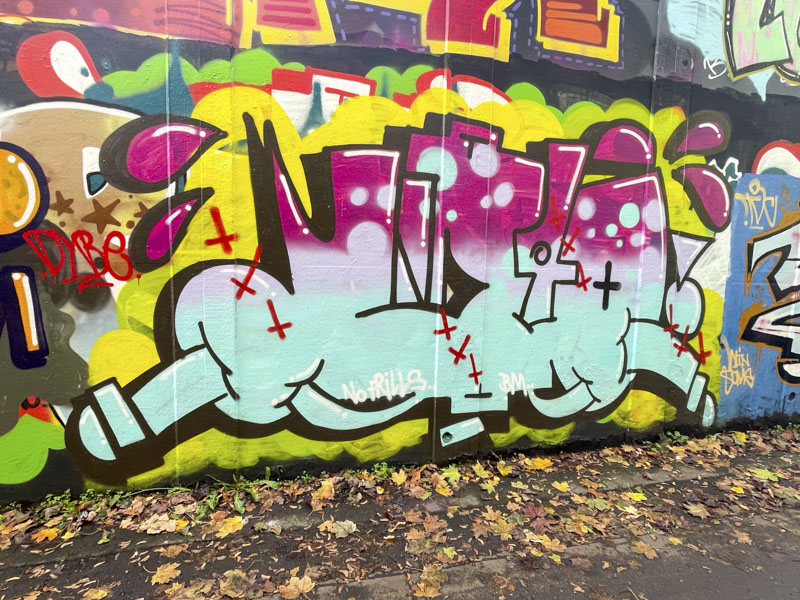
Biers, M32 roundabout, Bristol, October 2026
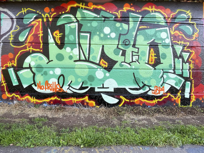
I love the colour scehem in the fill of this piece, grading from purple to duck-egg blue. Some reversed out circles, big ‘sweat’ drips on either side and typical upside down crosses provide all the features we are used to seeing from Biers. A lovely piece.
It would appear that Biers’ flirtation with writing the letters RABIES is over, at least temporarily, and he has for the last few pieces reverted to writing WD40. He seems to be much happier these days and is out and about painting more often.
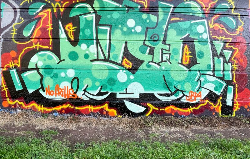
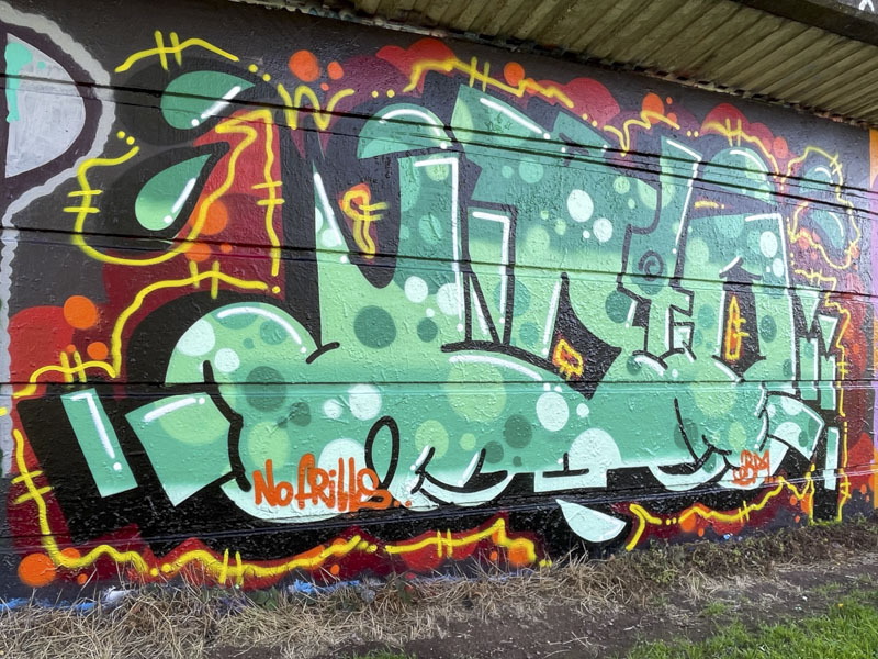
Biers, Cumberland Basin, Bristol, October 2026
There is an awful lot going on in this piece. His irregular letters/numbers are beautifully filled and outlined. Interestingly, his black drop shadow appears to veer upwards, leftwards and downwards, an unusual effect. A yellow floating border picks out the letters and separates them from an attreactive red and orange backdrop. Lots of circles throughout. A fine piece from Biers.
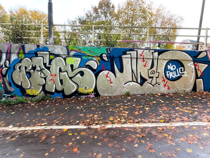
Bags and Biers, M32 roundabout, Bristol, November 2025
During the second half of 2025, there has been a definite uptick in the number of pieces painted by Bags and Biers, the latter of which appears to have rediscovered his mojo after a fallow period. These two have paired up numerous times in the past, and combine their styles nicely in this piece by adopting a shared colour scheme.
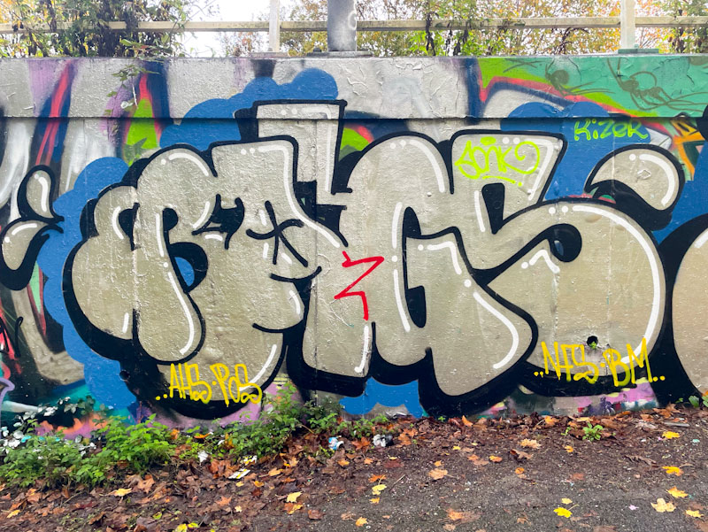
Bags, M32 roundabout, Bristol, November 2025
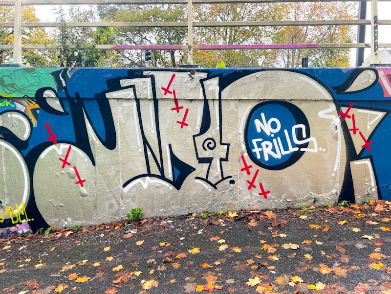
The No Frills pair have gone for chrome writing on a dark blue background, with Bags adding a bit more curvature to his letters than normal. He has included some nice apostrophe drops.
Biers, M32 roundabout, Bristol, November 2025
Biers has written his heavily disguised WD40 letters and added several red inverted crosses for decoration. He too has included some tear-drop apostrophes, something that is quite a theme for the No Frills crew. All good stuff and a nice way to round off the year.
For reasons that are too complicated to explain here, I don’t have my glasses with me this morning, which is making writing this post super-difficult and I am squinting, with a face like a bulldog chewing a wasp, while typing these words. Forgive any typos.
This is a superb combination piece by Biers painted to celebrate Minto’s birthday in the tunnel.
Biers, St Werburghs, Bristol, November 2025
The turnout for this paint jam was exceptional, covering most of the length of both walls of the tunnel with new celebratory pieces. The letters, WD40, are superbly filled with a cartoony design of lines and bubbles, and bordered with a fine black line. I feel like I should know who the character is, but I don’t. The whole thing is set on a brick wall, a common device used by graffiti artists. A really lovely piece by Biers, who might have just got his mojo back.
Bags and Biers, St Werburghs, Bristol, October 2025
This is a great collaboration from time-honoured members of the No Frills crew, Bags and Biers (WD40). Bags has been out an about a fair bit this year, but Biers is rediscovering his mojo (I hope), having had a period of poor motivation with respect to painting walls.
Bags, St Werburghs, Bristol, October 2025
To the left, the familiar BAGS letters are filled in the two-colour way that he appears to like doing, and he includes some colour coordinated spots for decoration. The tear drops surrounding the piece add movement, looking like cartoon perspiration, if that makes any sense at all. The white highlights add just that little bit of depth to lift the letters.
Biers, St Werburghs, Bristol, October 2025
At last Biers has painted a combination piece, something that is a bit of a trademark of his, and he includes the iconic comic character Inspector Gadget, although in this piece he calls him ‘Inspect Her Gadgets’ whilst examining a sex toy. The letters spell out WD40 and are really nicely presented. If you are wondering why I call him Biers, it is because that is what he was writing when I first encountered him. Below is the first of his pieces I ever posted.
I have waited a long time to see this wonderful piece from Biers. Over the last few months, Biers appears to have lost his mojo a little and has been painting infrequently and tending to use the short-form version of his WD40 moniker. It happens for artists from time to time – you can’t be on top of your game all of the time.
Biers, M32 roundabout, Bristol, August 2025
I hope this piece marks a return of the longer form combination pieces that are so typically the wonderful work of Biers. I don’t know who the character is meant to be, but I really like him (looks like a teddy boy to me) and I love the way he contrasts with the colours of the letters and background. The fills in the letters are outstanding With some nicely done reversed out circles in black and gold. The res patterns look like little viruses wafting over the piece. All in all a great piece and one, I hope, that encourages Biers to return to his former glory.
Biers was one of the first graffiti writers I met in Bristol, and back then he used to write the letters BIERS. He has undergone a few reinventions since then and currently writes WD40. I noticed yesterday that he has dropped off Instagram and hope that this is a temporary thing, and wonder if it signals another name change (probably not).
Biers, M32 roundabout, Bristol, February 2025
This is a nicely painted squat piece on the roundabout. Lately he has been painting fewer combination pieces incorporating characters, and concentrating on his letters, which in my view is a pity, because I rather liked his character interventions. This piece is on-point, clean and crisp… unpretentious and speaks of the joy of being a graffiti writer.
There are some artists in Bristol that I simply take for granted, in so much as I expect to find their work on a reasonably regular basis, while others may paint in fits and starts. Biers is one of those whose presence is always out there, and it is not difficult to stumble upon new work by him that I haven’t seen before.
Biers, River Avon, Bristol, January 2025
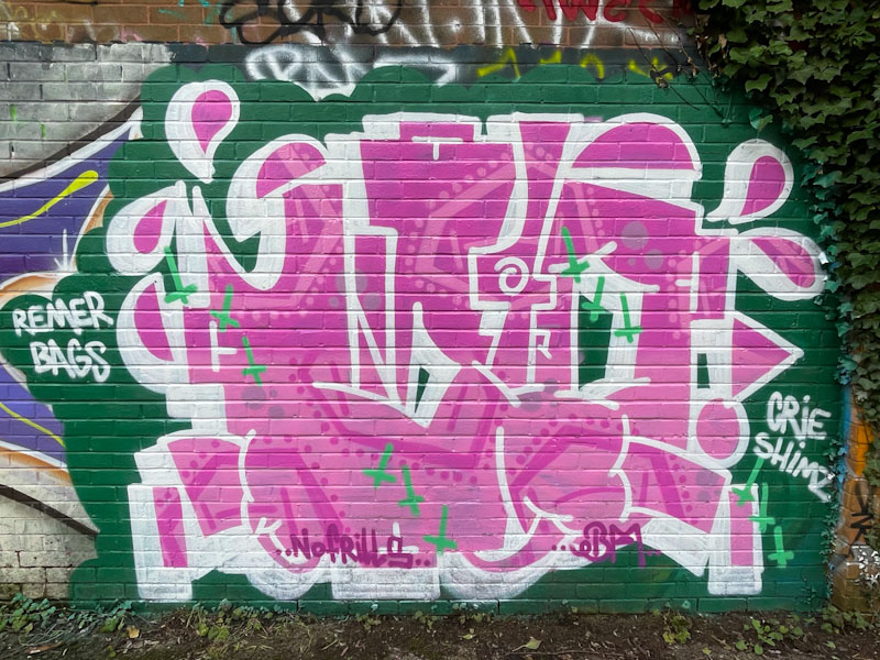
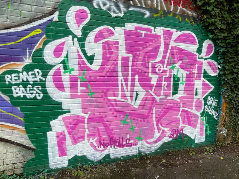
These rather nice WD40 letters in pink work really nicely on the green background, and the letters have been a little bit compressed into his short-form. When Biers incorporates characters to create combination pieces, the letters tend to sprawl out a little bit more. Some interesting fills, and a smattering of inverted crosses finish the piece off nicely.
Anyone who knows me will know that I am not a fan of ‘over-celebrating’ Halloween. The festival is so commercialised and has veered away from the modest affair that it used to be when I was a child. It is a generational thing, I know, but it doesn’t really ‘do it’ for me. One aspect that I am prepared to get excited about, rather predictably, is the Halloween-themed street art that always appears around this time of year, starting with this ghostly piece by Biers.
Biers, Dean Lane, Bristol, October 2024
Biers has been writing his WD40 moniker quite a lot recently, although without his accompanying characters, which is a bit of a pity, because his combination pieces are part of his USP. The graffiti writing is accompanied on this occasion by a cute-looking ghost who looks a little embarrassed, judging from his red cheeks. The whole piece is nicely finished and achieved without the need for borders, which is great to see.
Slim Pickings (Tes) and Biers, M32 Spot, Bristol, August 2024
It feels good to give these two a bit of attention, especially Slim Pickings (Tes), because although they are out there painting fairly regularly, I don’t tend to feature them on Natural Adventures as much as I should. I am pleased to see this collaboration between Tes and Biers because it is on one of my favourite spots in Bristol.
Slim Pickings (Tes) and Biers, M32 Spot, Bristol, August 2024
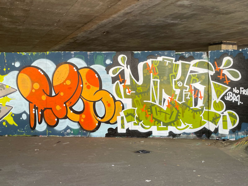
This is a particularly fine example of Slim Picking’s work, with the letters TES beautifully filled in two shades of orange with bubbles. Cleverly the drop shadow and the white spot highlights really make this one pop, fantastic stuff. Biers has incorporated little flashes of orange (upside down crosses) which work really well with his green shades WD40. A fine collaboration from two great graffiti writers.