6888. Dean Lane skate park (826)

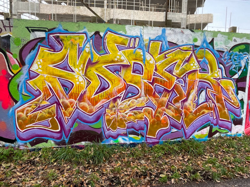
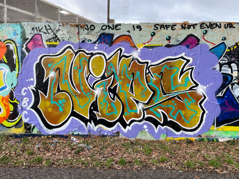
Conrico, Dean Lane, Bristol, April 2025

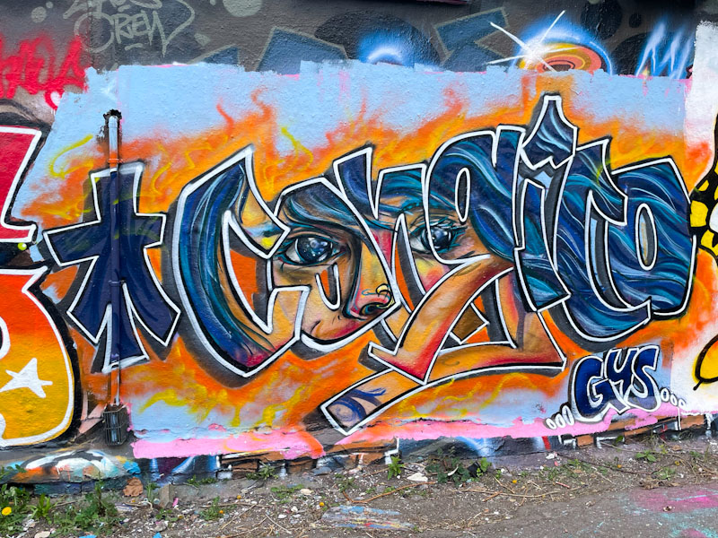
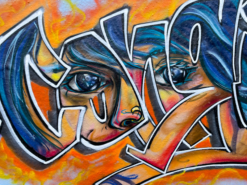
Every day, pretty much, I see graffiti and street art and every once in a while I see something by an artist I know and I think to myself ‘this is special, this is really classy’. This clever piece of combined writing and a portrait by Conrico left me feeling that this was special, definitely a ‘keeper’.

Conrico, Dean Lane, Bristol, April 2025

Conrico has painted his name, but instead of a solid or patterned fill, there is a portrait of a girl behind, as if you are peering through the letters to see her. The piece is expertly executed, but at the same time incredibly modest. No fanfare, no showing off, just a really great fusion piece.

Conrico, Dean Lane, Bristol, April 2025

Conrico has been turning out some great pieces recently, and this one expands and continues the series. As ever, I look forward to more.

6808. St Werburghs tunnel (483)

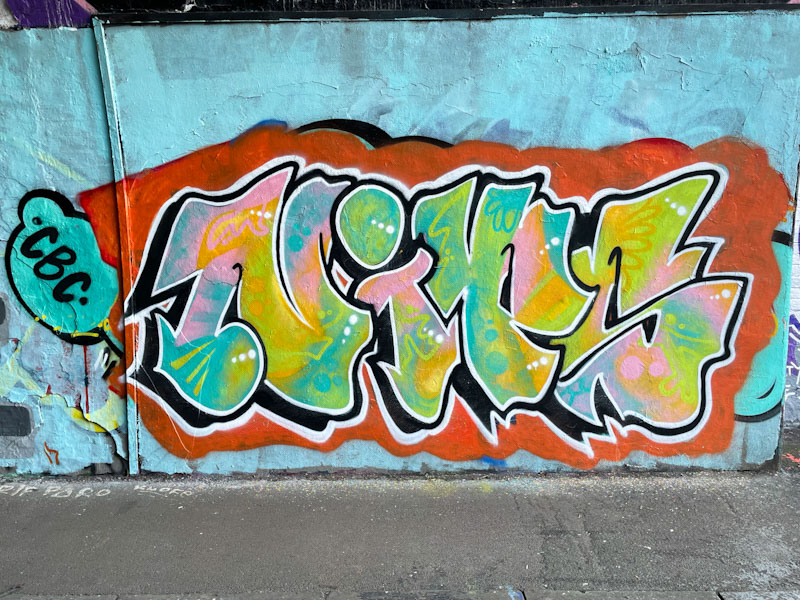
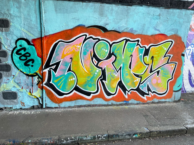
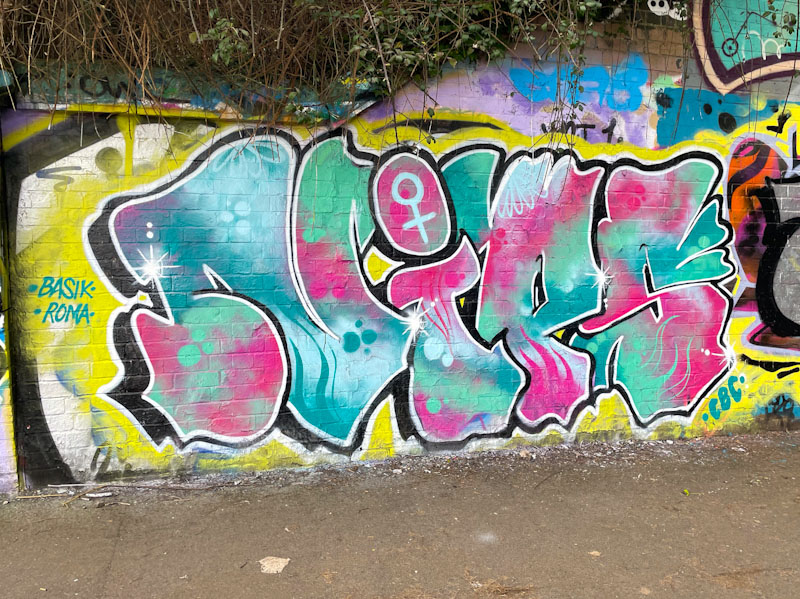
Nips, St Werburghs, Bristol, March 2025

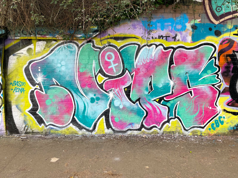
Aha! There is a certain consistency and reliability with Nips’ pieces that I am really attracted to. Her letters tend to be similar in shape from piece to piece, but it is in her fills where she really excels and shows off what she can do.

Nips, St Werburghs, Bristol, March 2025

Set on a fairly elementary yellow backdrop, the letters NIPS are filled with a stunning patterned mix of pinks and blues, with some great designs and reversed out spots. The eye is drawn to the female symbol in the dot of the ‘i’, which is assertive and proud. Nips has included a couple of nice shout-outs to Basik and Roma too. I hope we see plenty more of Nips in 2025.

6713. St Werburghs tunnel (473)

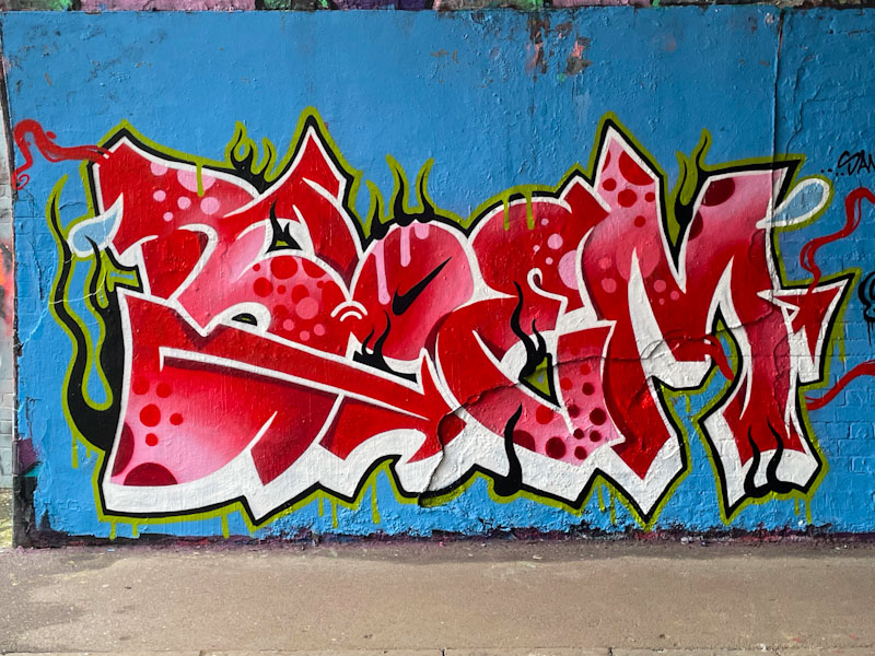
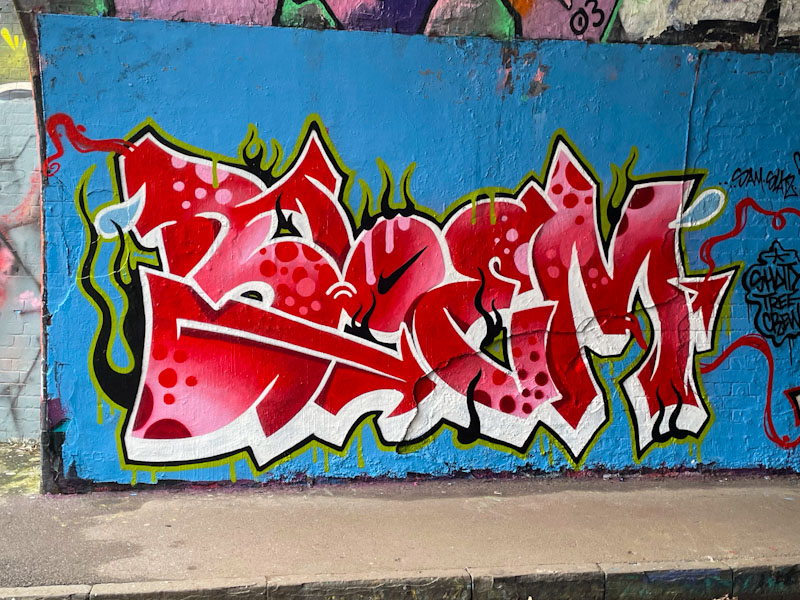
Bloem, St Werburghs, Bristol, January 2025

Carrying on the theme of female artists today, this is a superb piece of graffiti writing from Bloem. There seems to be no stopping her so far this year, and that can only be a good thing. What is so unusual about Bloem’s work, for an artist who is relatively new to graffiti writing, is the precision and clarity of her lines, which comes with incredible can control.

Bloem, St Werburghs, Bristol, January 2025

The irregular letters BLOEM pop so well from the wall, thanks to the brilliant white drop shadow. The red letter fill is blended so brilliantly, it isn’t possible to be sure where one shade ends and the next begins. On top of that, the circles and spots are perfectly applied throughout. Wrapping the whole piece up is a black and green border, which has a life of its own with ‘flames’ and drips. Every component of this piece comes together so well, and in Bloem we have an emerging superstar.

6616. River Avon (70)

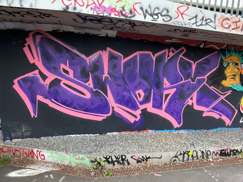
Sworm, River Avon, Bristol, December 2024

To use Sworm’s own words, this was a bit of an odd one. I know this, because I happened to meet him while he was painting in St Werburghs tunnel yesterday alongside Omie. This piece was painted with Klashwhensober on the pathway between Sparke Evans Park and Temple Meads Station… a nice walk if you have the time to do it.

Sworm, River Avon, Bristol, December 2024

On first inspection this piece looks like a quick throw up, but the swirly pattern in the letters is a deliberate fill rather than what could look like thin paint over a patterned background. The pink border and drop shadow is an essential ingredient in helping the letters to stand out on the black background. Although not his best piece, this is a rather nice work from Sworm.

6585. Greenbank (144)

Klashwhensober, Greenbank, Bristol, November 2024

Klashwhensober gets a lot of practice with painting walls, which directly leads to improvements in his work. Over the last few years he has managed to develop his style, which has gradually developed into a sophisticated blend of writing the letters SOBER with animated fills that ooze out from them.

Klashwhensober, Greenbank, Bristol, November 2024

This piece illustrates really clearly how the fill tells its own story, or has its own place, and you could almost imagine a scene unfolding, but you only get to see that scene within the confine of the letters. There is always a lot crammed into Klashwhensober’s work, perhaps an indication of a busy mind. This is a nicely executed and finished piece.

6392. Greenbank (135)

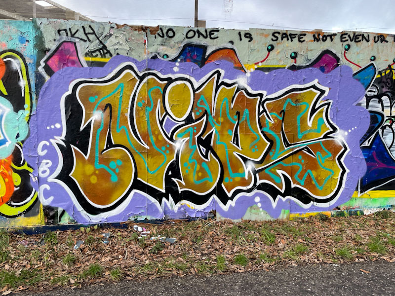
Nips, Greenbank, Bristol, September 2024

An explosive and colourful piece by Nips on the long wall at Greenbank was a very welcome sight, especially as the turnover at this spot seems to have slowed down a litle, so finding anything new there is always rewarding.

Nips, Greenbank, Bristol, September 2024

Once again it is the fills that delight and Nips seems to specialise in beautiful designs and colour palettes for her letters. As ever, the letter form tends to remain reasonably regular from piece to piece, although the dot over the ‘i’ allows scope for variation, and here she has placed a simple heart icon in the pink circle. I am not 100% convinced by the green and blue border, the green in particular gets a little bit overwhelmed by the purple fills. Nice stuff from Nips.
6219. Brunel Way (280)

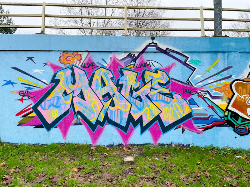
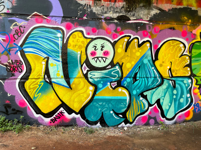
Nips, Brunel Way, Bristol, July 2024

One of the great joys of being a street art hunter and chronicler is the sheer number of endorphin ‘mini-snacks’ one gets exposed to on each exploratory walk. Some artists elicit slightly more excitement than others, and there doesn’t seem to be any logical explanation for why that might be. One artist whose work I particularly enjoy seeing is Nips, and it feels like there is progression with every new piece.

Nips, Brunel Way, Bristol, July 2024

I would say that Nips is a bit of a fills specialist, keeping her general letter shapes constant, while experimenting with colours and patterns in the fills and in that respect, she has excelled in this stunner. Her selection of colours and outstanding designs within the letters is utterly joyful. The whole thing looks rather like a sophisticated wallpaper design, and that is meant as a compliment. Nips continues, I am pleased to say, with her trademark face appearing as the dot of the ‘i’. More endorphins please.