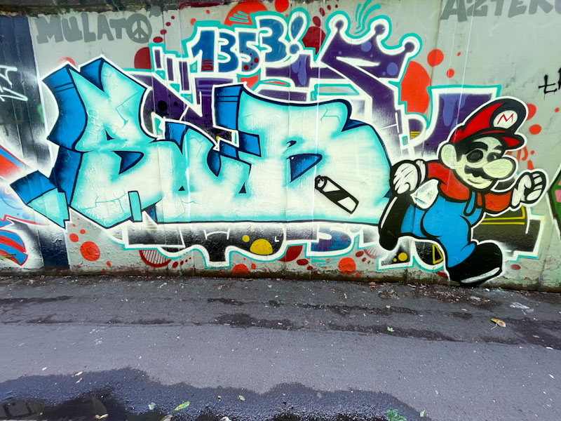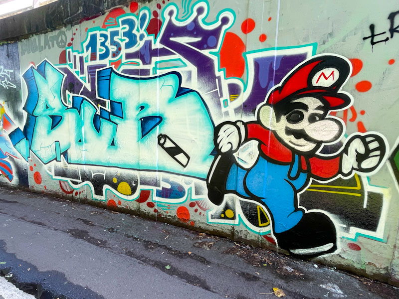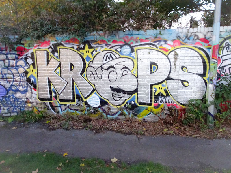
This decent combination piece by Sub in Peel Street Green is, as far as the Mario character goes, ‘take two’ and he has done a much better job of it this time round, demonstrating the value of practice. I published his earlier piece about a week ago and have dropped the photograph at the end of this post for comparison.
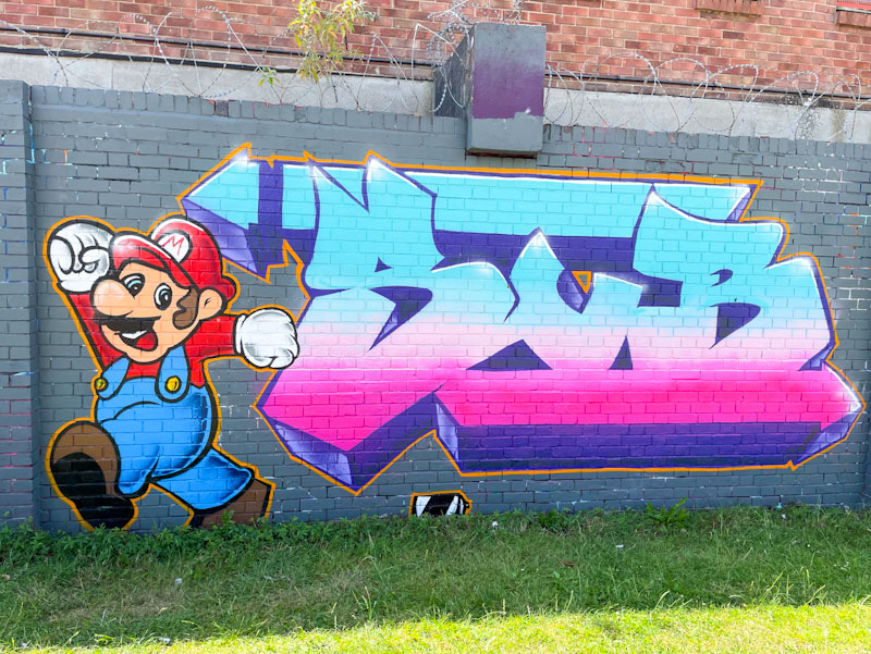
The letters are large and chunky, as I would expect from Sub, and have a very solid feel to them. The colour gradient is nicely worked and the whole combination neat and tidy. The Mario character is really well painted, with plenty of subtle shading to help bring about some depth in the character. This is a fun piece from Sub.
