A gallery of outstanding cartoon characters and writing from Bristol artist Bean
Instagram: @ceelo_bean
All photographs by Scooj
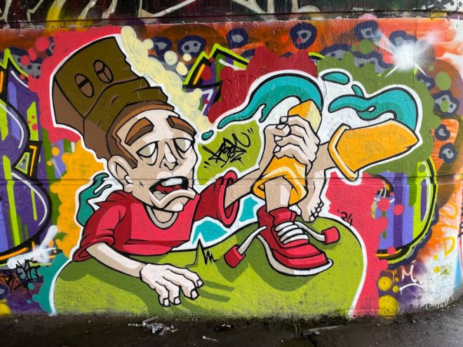


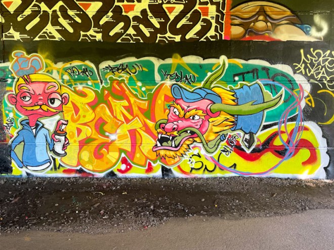


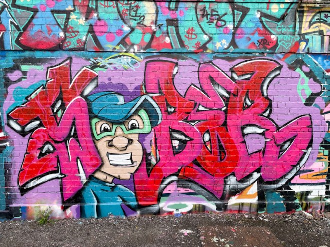


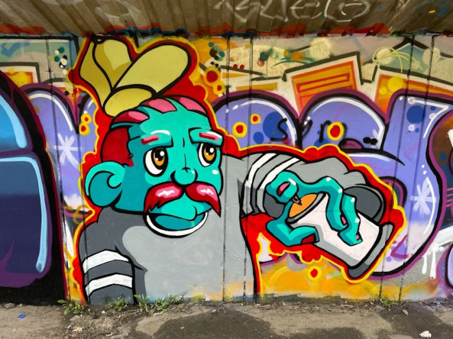

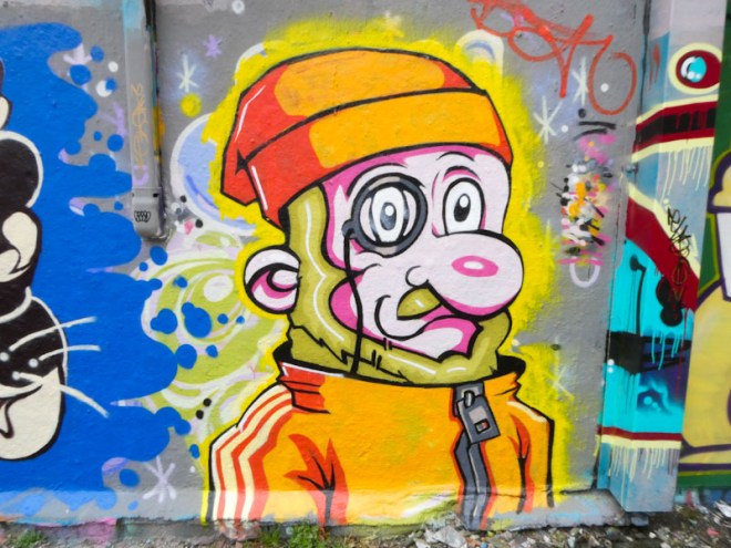
A gallery of outstanding cartoon characters and writing from Bristol artist Bean
Instagram: @ceelo_bean
All photographs by Scooj
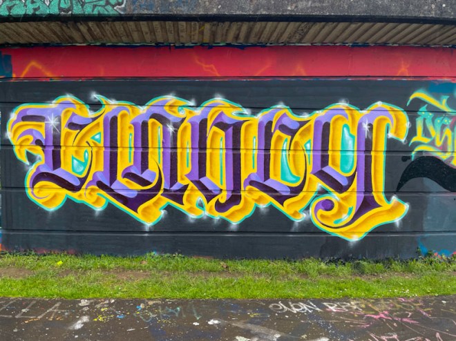
I don’t know who or what CLANCY is, but it makes for some fabulous calligraffiti by Stivs, who has been having something of a purple patch this spring. The colours that Stivs has chosen for this piece are rather regal and opulent, but also a little garish in a fairground kind of way, if that makes sense.
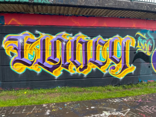
As ever his letters are beautifully crafted and have that regularity and discipline required for calligraffiti. There are three tones of purple used in the letters, each in the same orientation to create depth and a 3D effect, and this is offset by the yellow tones, looking like gold, for the drop shadow. This is a highly accomplished piece of writing from a master of the craft.

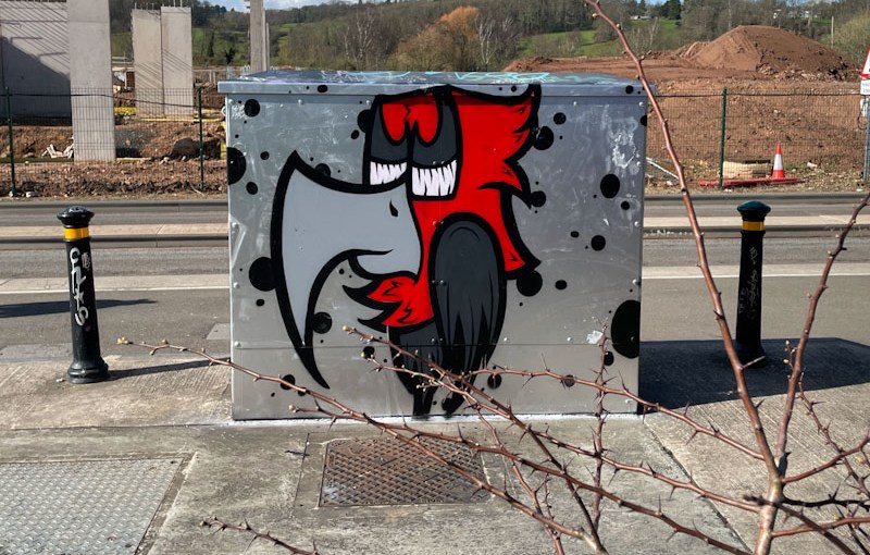
Everything about this piece by Mr Crawls is good. Utility box painting, in my view is providing a public service, and indeed in some countries is actively promoted, to turn these utilitarian metal monstrosities into something attractive and a talking point. This artwork is of course illegal and considered subversive, and yet what joy it brings.
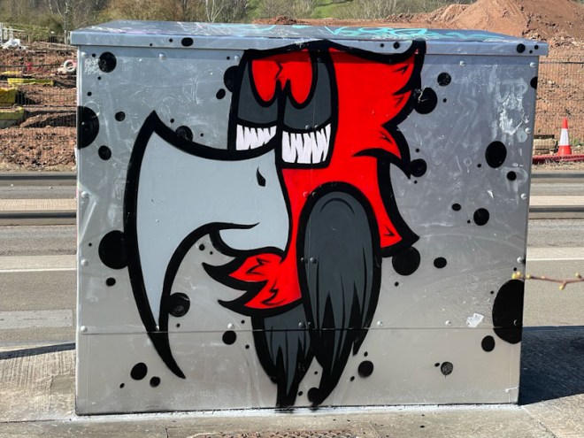
Mr Crawls has been using chrome backgrounds a lot lately and it works especially well here, providing a neutral backdrop to a stunning red and grey bird character piece. I think that the way this has come together and the location contribute towards making it my favourite piece by the artist so far (I think).
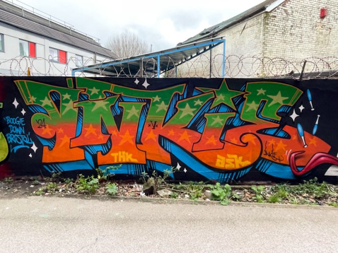
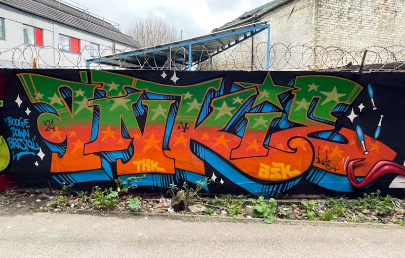
Inkie is arguably the second most well known street artist in Bristol, but unlike his contemporary (Banksy) still visits and paints in the city frequently. I was in the right place at the right time when he, Sepr and Haka were painting this wall together and although I have met Inkie on a few occasions, we actually had quite a long chat this time, whereas usually it is a ‘hi’ and ‘bye’ kind of thing.

This is a classic piece of Inkie writing, almost archetypal, which oozes confidence, capability and class. Green and orange work really well together, and we discussed the merits or otherwise of orange paint, which in this case was really thin, and he wasn’t overjoyed about it. There are some paints that just seem to be partially transparent and require more coats, and this was one of them. Unless you knew about the thin paint, you probably wouldn’t notice. Classy work.
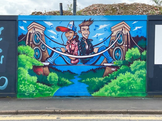
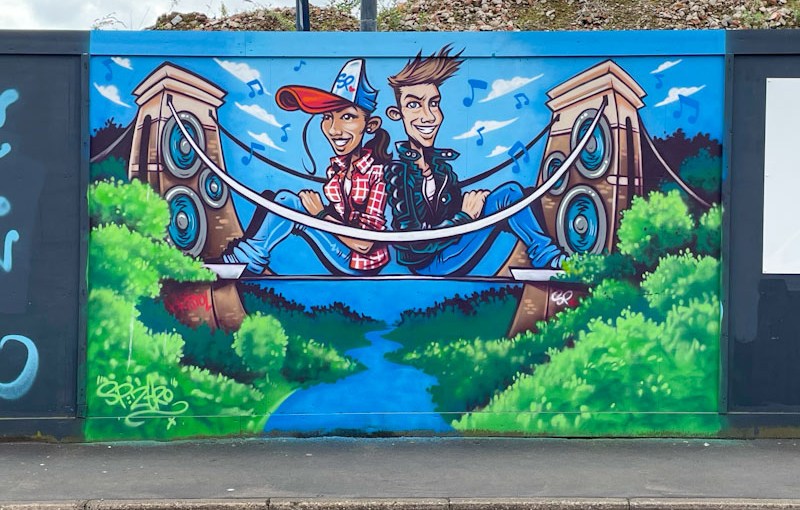
Every time I find a piece with the Clifton suspension bridge in it, which is reasonably frequently, I am reminded that I want to do a bridge gallery, it is such an obvious theme. The slight problem is that it would take rather a long time to compile, and isn’t going to happen until I have some free consolidated time. The aspiration is there though.
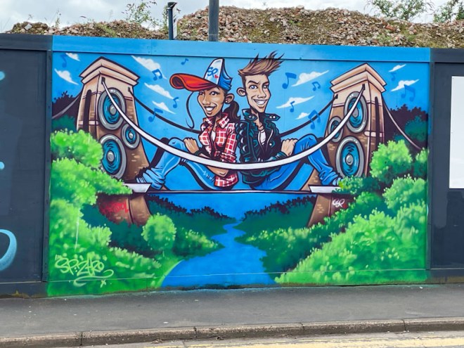
This is a wonderful piece by SPZero76, who has been quite busy this spring, featuring a couple of young people sitting on the suspension bridge, the uprights of which have been crafted into enormous speakers. SPZero76, despite altering the bridge, has remained true to the design and details, so there is no mistaking which bridge it is. This is a piece that speaks loudly and proudly of the culture and heritage of Bristol.

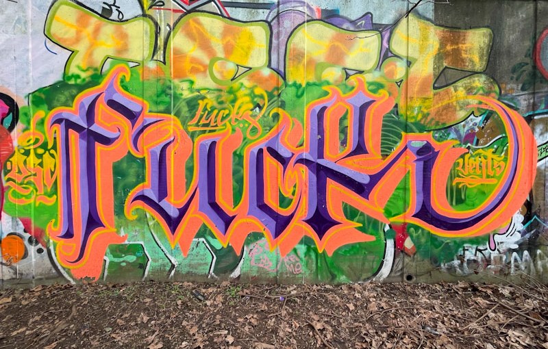
Profanity alert! It is a long held tradition for graffiti writing to be edgy, either in location, style or content, and sometimes writing profanities disguised or otherwise is part of that attitude, without which street and graffiti art would be nothing. Some of the earliest graffiti from Roman times was essentially cock and balls doodles in public spaces.
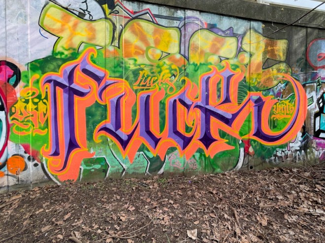
Stivs presents us with the word ‘FUCK’ styled with his exquisite calligraffiti writing that brings a bitter-sweet challenge. Great colours that smack you in the face and beautifully finished, this is graffiti art at its subversive best.
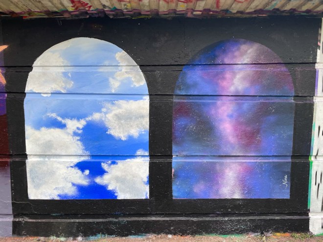
A piece by Nina Raines can only mean one thing, and that is a Bristol Mural Collective paint jam. There were several excellent pieces painted by artists of Bristol, unfortunately most unsigned, during the paint jam, and this one stood out. Nina Raines paints scenery for productions as a profession, and her skills have certainly come to the fore in this small piece.

One of the things I like about artists swapping a day in the studio for painting public walls is that they have a very different take from regular street/graffiti artists, not having any rules or conventions to follow, and often their work is incredibly creative. This piece is simple… a pair of arches, one with a cloudy scene and the other with something a little bit more cosmic, a nighttime sky, perhaps. I will try to post some other pieces from the paint jam, because the work of the Bristol Mural Collective definitely has loads of appeal.
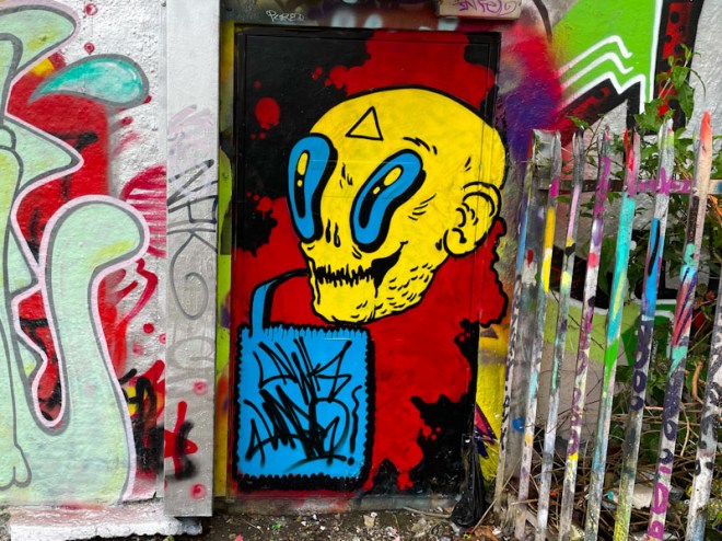
Awkward tends to drop his pieces in twos and threes, which is something he can easily do because his mega-tag characters are generally quite small. On this occasion he painted one on the door at the bottom right-hand end of Dean Lane and the other on the wall of the swimming pool, about 50 meters apart.

This door is a candidate for the One Wall, Many Faces series of posts which I will get on to when I have a bit of spare time (thumbs diary, that’ll be 2029 then). Awkward has created a vision in yellow, with vibrant blue eyes and speech bubble set on a gorgeous black and red background. The characters he paints are a little bit on the eccentric, some might say, weird side, but they are distinctive and compelling.

The character on the swimming pool wall uses the same three colours which are rotated, so the face is blue, the eyes and background yellow and the speech bubbles red. The writing in the speech bubbles is usually a signature, AWK WARD split over two lines, and in this piece he has included a year date ’24’. It is always a great bonus to find his work.

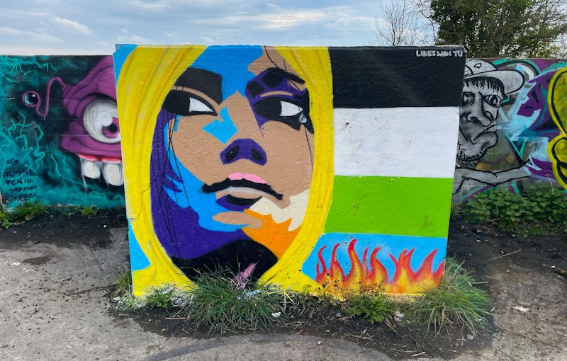
When visiting artists come to Bristol, they will often paint more than one piece, and in the case of some, such as Logoe, they might paint several over a single weekend. I think that this is one of two pieces painted by Jest Soubriquet earlier this year.
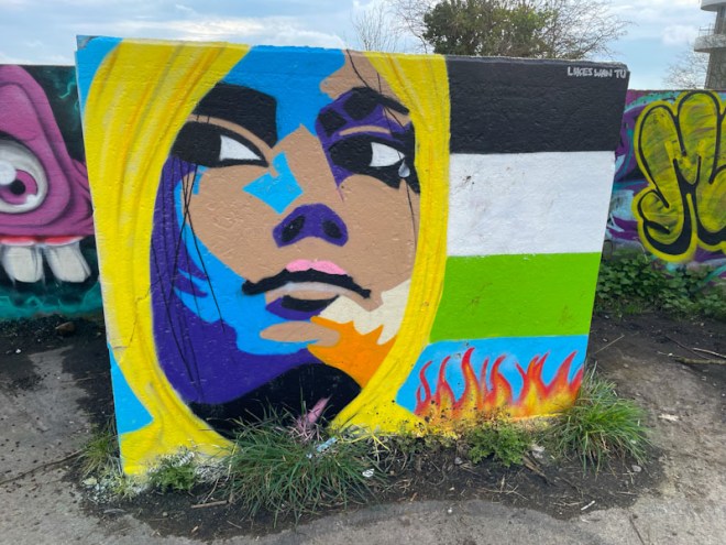
The portrait piece is set on a Palestinian flag, thus making it a relevant contemporary addition to the complicated and troubled commentary on the conflict between the Israeli government and Hamas. The portrait is cleverly painted in a patchwork of colours that shouldn’t really work, but somehow do. This is a wonderful and highly distinctive piece from an artist who will always be welcome in Bristol.

There is so much to like about Bloem’s work at the moment, and more than that, she is a really lovely person and talented artist and jewellery craftswomen. Her pieces are becoming more confident with each trip out, and she is spreading her wings, improving all the time.
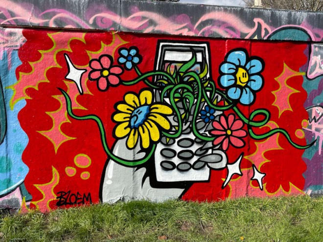
This piece on the roundabout contains a few themes that she specialises in, for example the hand with sharp nails and the old-style brick mobile phone, with keypad. Springing from the phone display is a tangled growth of flowers, complete with personalities. The whole piece is set on a glorious red backdrop softened with a few patterns. This is truly stunning work from Bloem.