
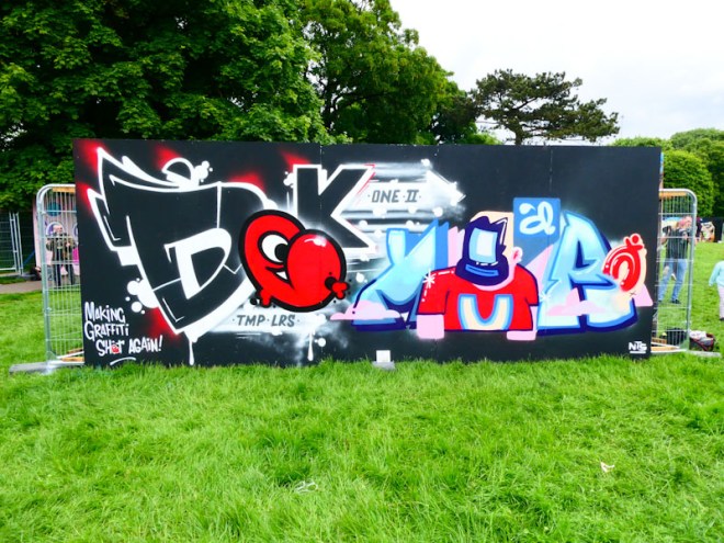
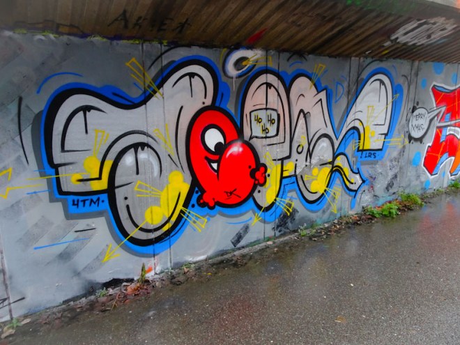
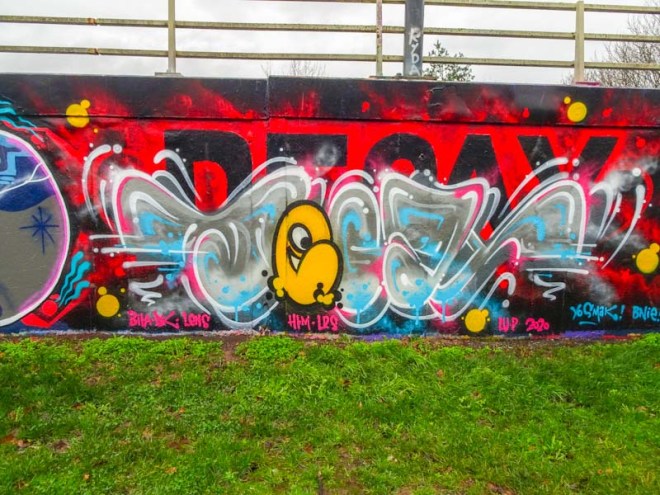
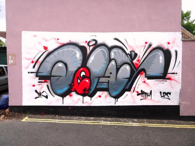
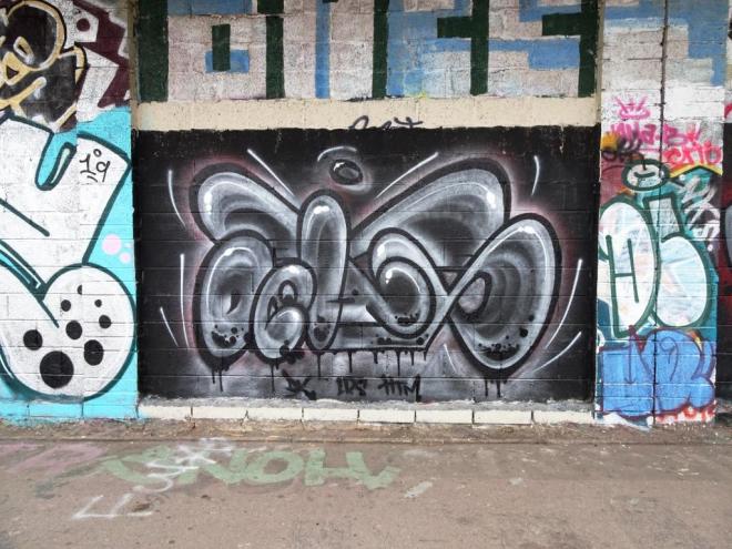
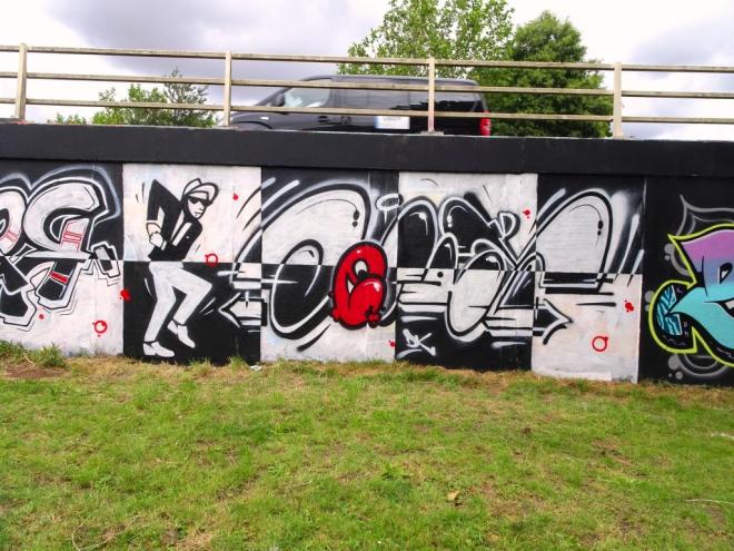
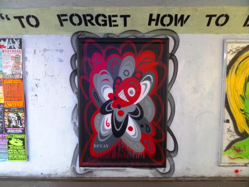
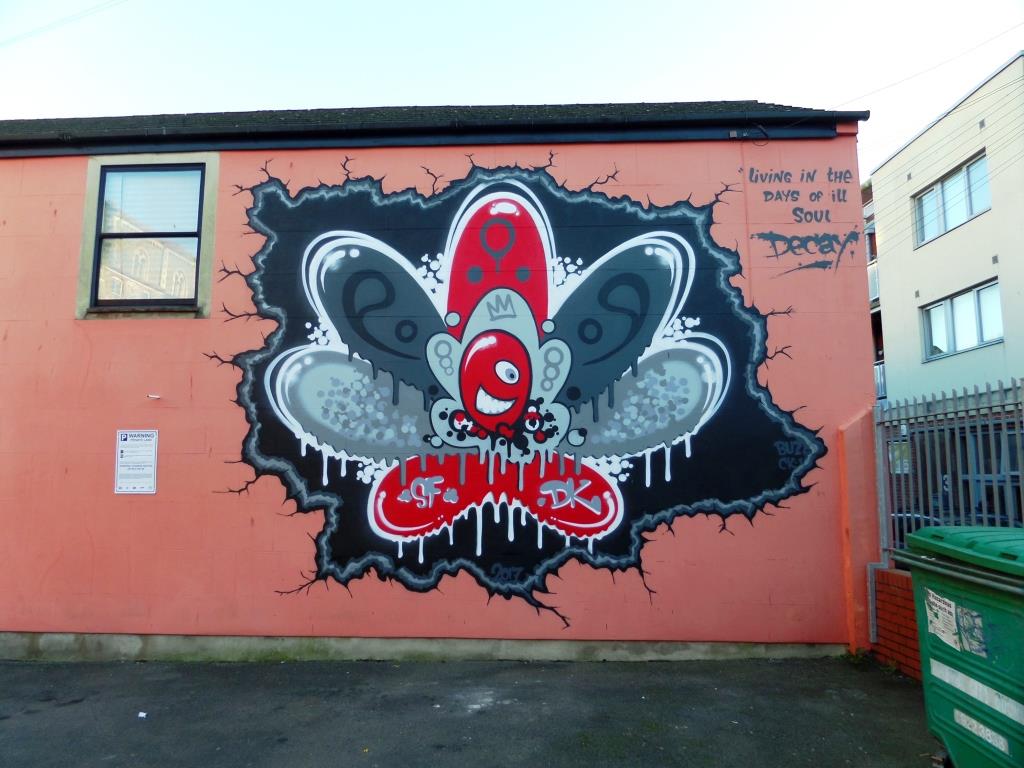
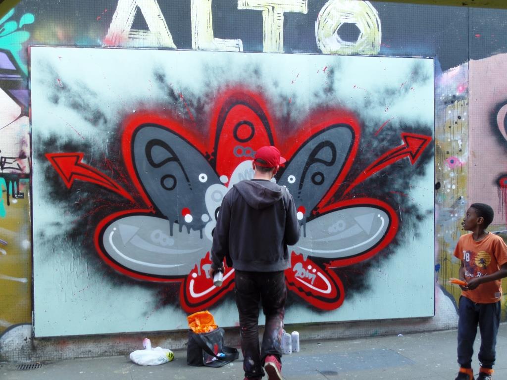
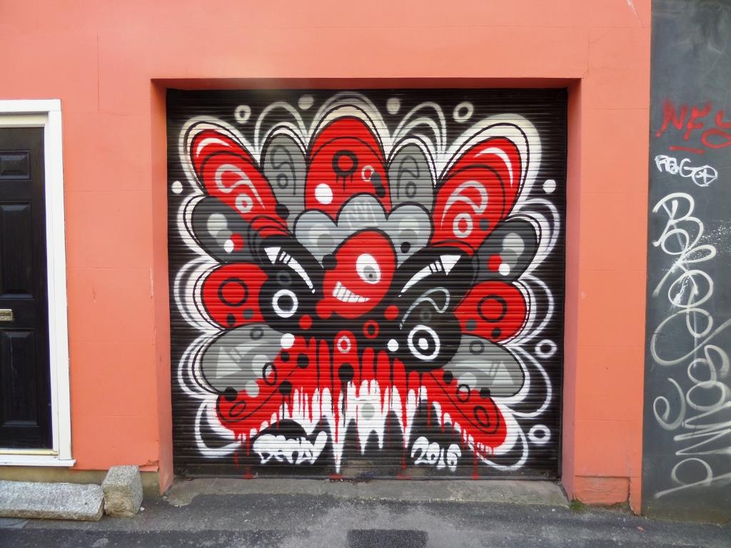
A collection of wonderful abstract street art by Bristol artist (formerly of Cheltenham), Decay (DK)
Instagram: @dk_tmp_lrs
All photographs taken by Scooj


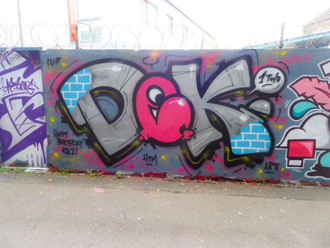


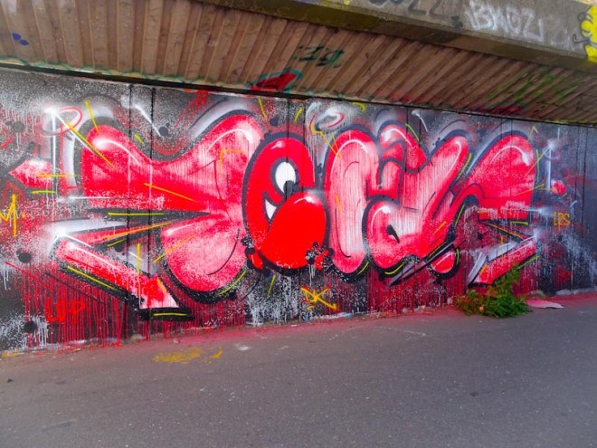


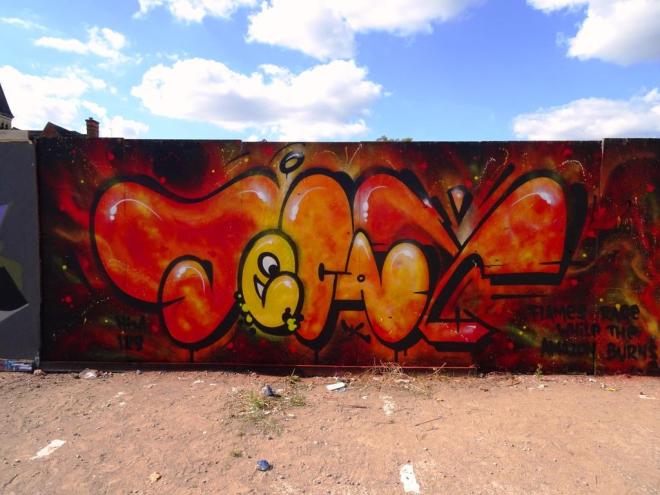


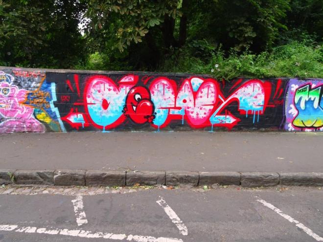


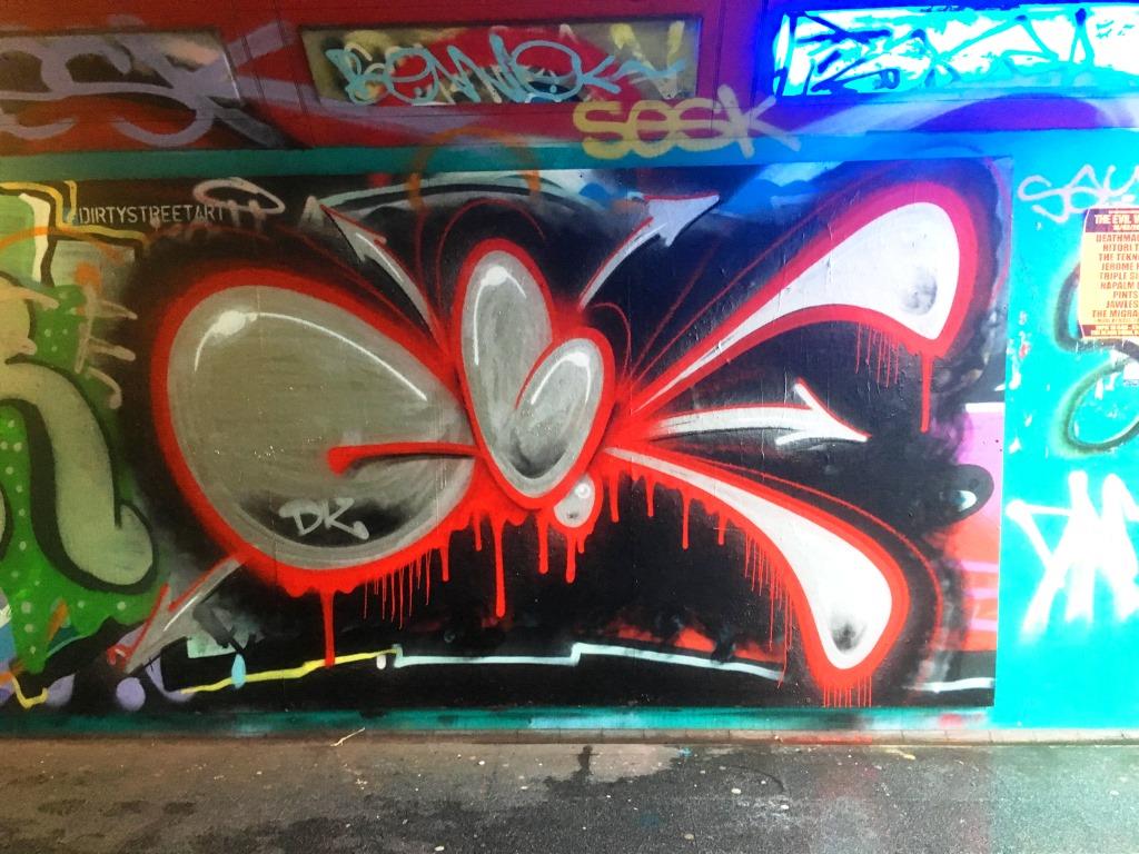
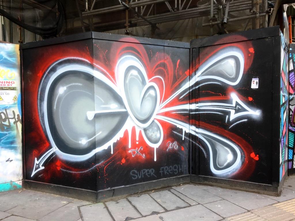
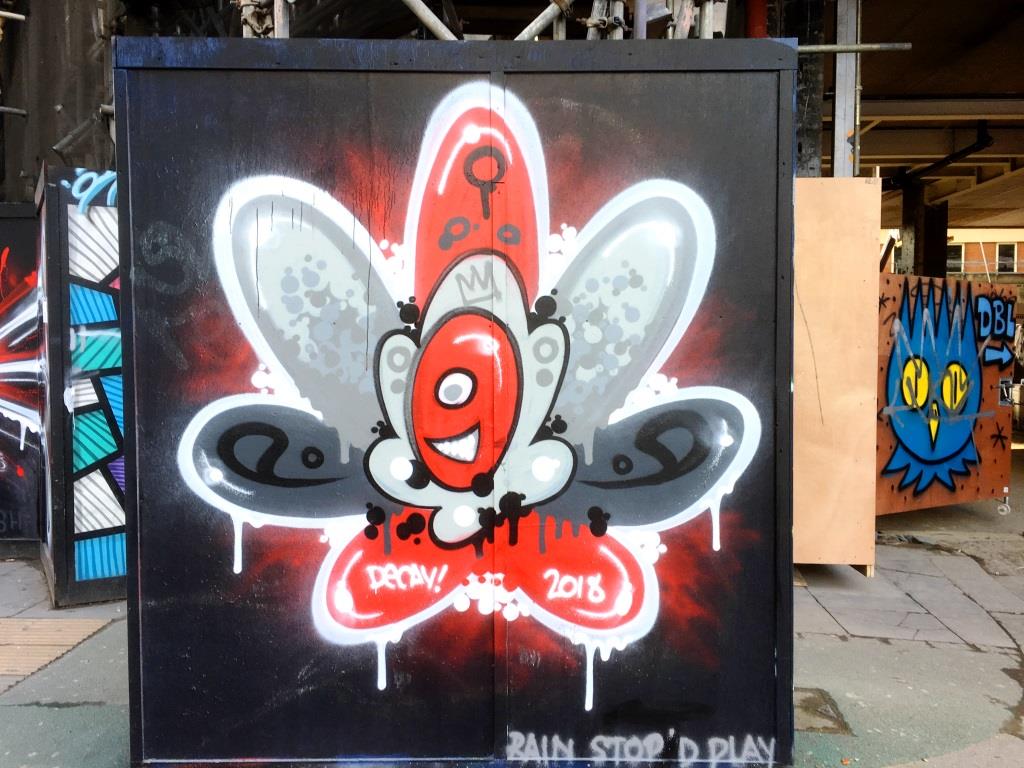

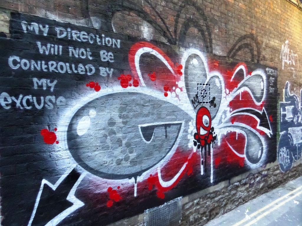


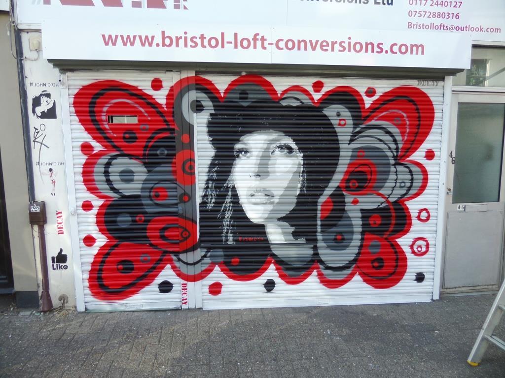


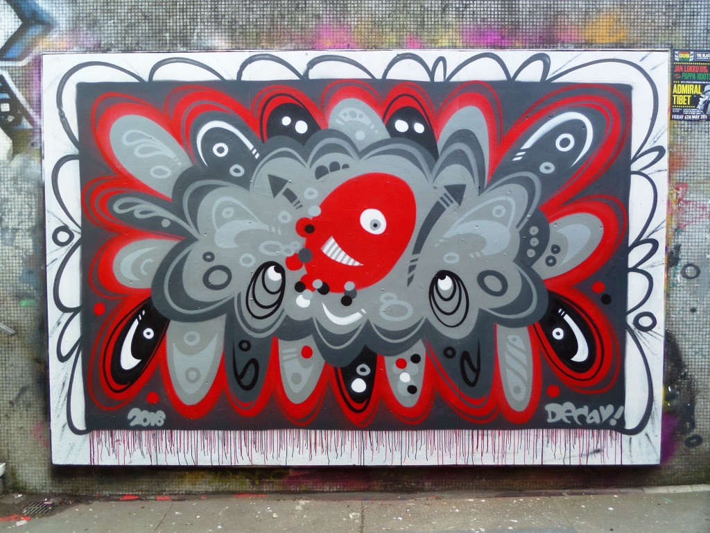


A collection of wonderful abstract street art by Bristol artist (formerly of Cheltenham), Decay (DK)
Instagram: @dk_tmp_lrs
All photographs taken by Scooj
This gateway is a particular favourite of mine and has played host to some lovely pieces by 3rdeye and Aspire in previous Upfests. This year it was the turn of Dr Love, an artist from Tbilisi in Georgia.

The piece is a large stencil, and you can see just how tricky it is to put together a stencil of this size from the picture above. Looking at this stencil, I can’t quite work out the layering, but that is why I write about these things rather than try to do them myself.
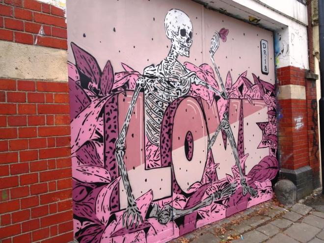
Dr Love likes to spread love with his work and I think with this piece you can sense the tenderness of a skeleton holding a butterfly on his finger and the message is conveyed loud and clear with the large word LOVE across the middle of the piece. Sadly the work only lasted a few months before it was tagged, and I believe that a Muckrock piece is there now, but I’ve not managed to get down to see it yet.
I think that this Paul Monsters piece counts as an Upfest work, even though it was completed a few days before the festival itself. Upfest simply wouldn’t be the same without Paul Monsters, and I mean that quite literally, as he is at the core of the organising work and biography gathering for the festival and works in the Upfest shop in North Street.

Paul Monsters is a master of creating these geometric 3D patterns which he does both as small prints or enormous walls like this one. What was preciously a bland and unremarkable wall has been transformed into a thing of beauty which lifts the mood of the area and those that look upon it.
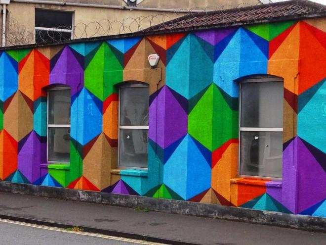
In this piece he uses his trademark colours of orange, brown, purple, green and blue using shades of these colours to create the 3D effect. A remarkable wall from a lovely chap.
I think that this was my favourite wall of Upfest 2018. Situated just off Dean Lane and on the margins of the Upfest main drag this new wall played host to four or five astonishing pieces, including my favourite piece of the festival by Kowse One. This magnificent and rather different piece is by Ione from Tenerife, which is interesting, because it shares the same understated tones used by Feoflip, a fellow Canary Islander, who came to Bristol in 2016 for Upfest and sprayed many pieces all around the city.
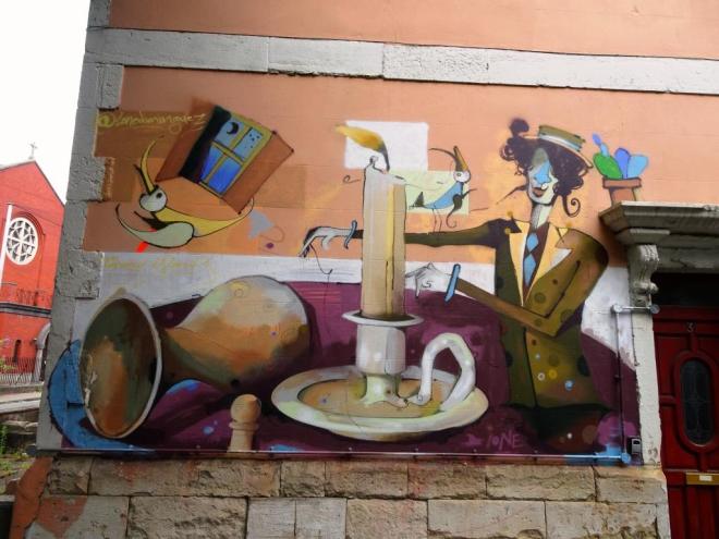
I rate this piece very highly in part because it is so unusual. It seems to borrow heavily from the Cubist and Surrealist genres and there are elements that remind me of Picasso and Miro. The figure also makes me think of Mary Poppins, but that might just be me. Subtle and interesting, I love this piece and love the wall.
Krishna Malla was late to the party this year, which was a good thing for me, because I managed to catch up with him just as he was packing up. Even though he seemed to be in a bit of a rush, he still made time for a chat. I remember his brilliant snail and hare work from Upfest 2016, so it was good to meet the Cornwall-based artist this time round.

This piece embraces fully the Simpsons theme for this year’s festival. The theme does seem to have divided opinion, but I sit firmly on the side of ‘love it’. I like the concept and execution of a mister Burns palm holding up the five fingers, each one a member of the Simpsons family. There is something rather od about it, but I rather like that. It would be great to see Krishna Malla return next year.

I love this stunning piece by Mose78, and I think the guy with the beard seems to rather like it too. Mose78 started off as a graffiti writer in the mid 1990s and transitioned into street art, although he doesn’t restrict himself to the spray can.

I have taken a look on his website, and I wouldn’t say that this piece is all that typical of his work, which is actually really diverse. Having said that, I really like this one, there is something rather compelling about it. It would be great to see more work from this Birmingham-based artist.
I first encountered the work of The Thomas Brothers at Upfest 2016 where they produced this wonderful work in North Street. Their style is highly distinct and recognisable, pulling together a kind of 1980s meets pop art flavour full of colour and dazzle.
This piece can still be found in the Tobacco Factory car park and is well worth a look. It is particularly gratifying to have pictures of the work in progress as it gives an insight into how the brothers construct their work.
Backgrounds are laid down first, which are then over-painted with stencil work, marking out the finer detail of the piece, such as the writing and the features on the woman’s face. The final touches are added to create the completed collaboration which is vibrant and assertive.
I like the way these guys work and am pleased that they visited again in 2018.
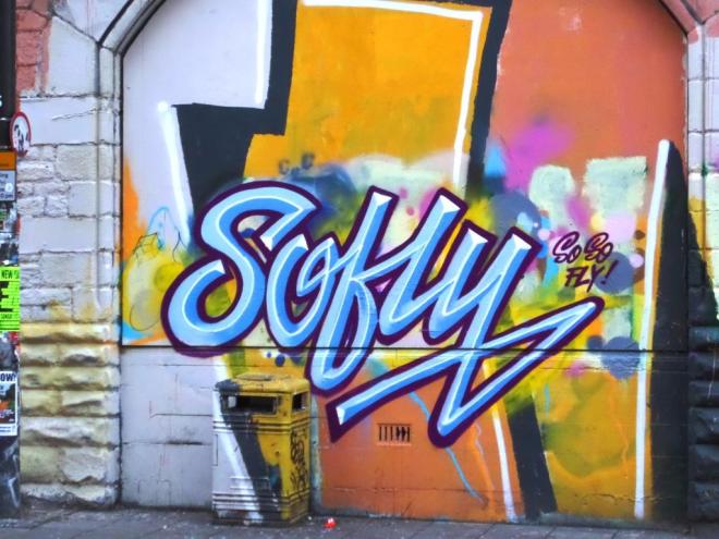
I have featured the work of Sofly a couple of times on Natural Adventures before and each time hoped that she would return to Bristol which thankfully she did at Upfest 2018. Sofly (Sophy Robson) was an official artist at the festival but nonetheless decided to paint on an unofficial wall, something I admire and something that keeps the festival ‘real’.
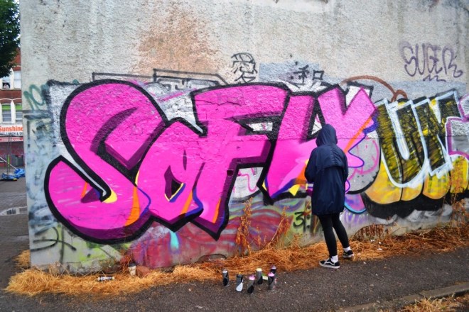
Tis is simply a really nice piece of writing, beautifully proportioned, and the colours are wonderful, especially the way the pink gets lighter towards the right hand side of the piece. I tried to have a quick chat with Sophy, but I think she was keen to finish up and move on, so the conversation was brief.
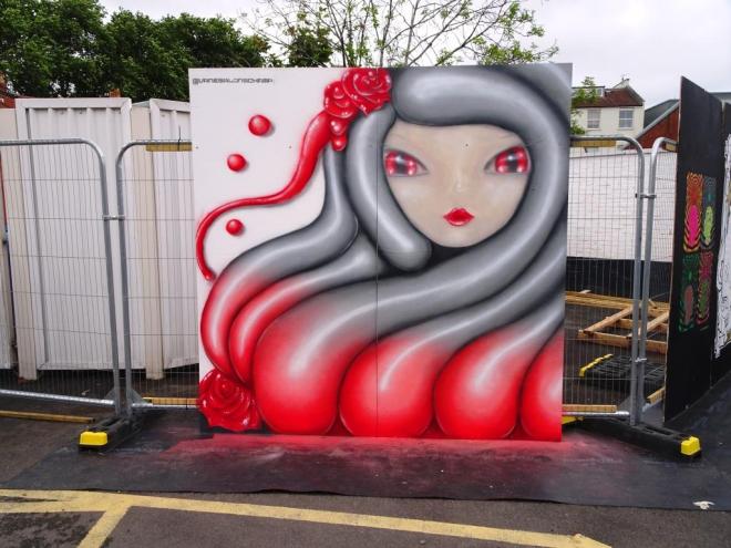
Whoops! a slightly wonkey picture of a beautiful shutter piece by Vanesa Longchamp on North Street. This was one of two Upfest pieces by the artist that I had not come across before the festival. Looking at digital social media, you can see how popular her work is and it is easy to understand why.
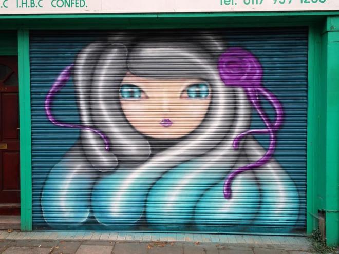
I love it when artists do more than one piece at the festival, especially when one of them is likely to have some permanence. Like her other piece, this is a beauty which oozes class. While the lines and concept are straightforward, the execution and USP are stamped all over it. We wwere lucky to see two of her works this year.
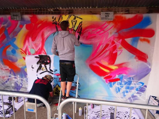
It is often the way with photographing street art that you can go for long periods without seeing anything from an artist, and then all of a sudden a rush of pieces all come along at once. This has as much to do with the habits of the viewer (me) as it does with the painter.
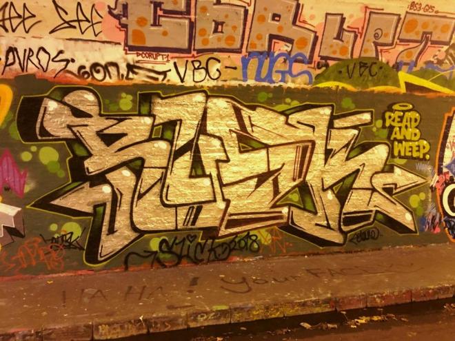
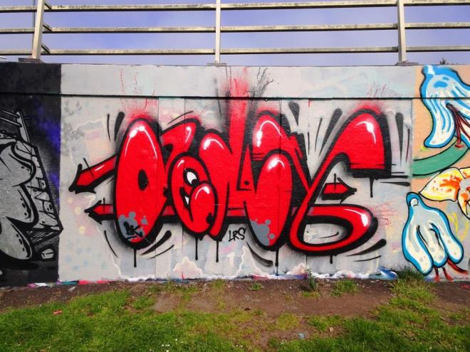
This is a fine piece in the middle of the tunnel at St Werburghs by Rusk from RAW (Read and Weep). Unfortunately the colours are dulled by the orange lighting in the tunnel, but you can see the metallic sheen on the writing, cleverly enhanced with the white accent dots. In case you haven’t worked it out, the letters spell RUSK. Two things I like here…the first is the piece hanging above by Corupt and the second is the Read and Weep label on the right hand side. Rusk rarely disappoints.


