

.
Where an acorn lands
is in the lap of the gods
make the most of it
,
by Scooj
.
Where an acorn lands
is in the lap of the gods
make the most of it
,
by Scooj
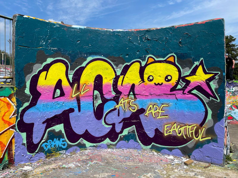
I think that it is fairly common knowledge that ACAB is a subversive acronym derived from the phrase ‘all cops are bastards’. I am guessing that it was coined in North America, because we don’t generally use the word cop in the UK, preferring the terms Police, bobby, old Bill, ‘pigs’ or even ‘copper’ but rarely cop. ACAB is used liberally in street/graffiti art, and this piece on the curved wall by Mr Draws, has a humorous take on the letters.
Firstly, I would say that this is a really attractive piece by Mr Draws, who continues to gently push his boundaries all the time whilst retaining his style and identity. The design is great, the letters are nice and tidy and the fill colours work surprisingly well. Mr Draws has softened the tone of the acronym so that it reads ‘all cats are beautiful’, and has added in a cat character for good measure. Perhaps one could term this piece ‘fluffy subversion’.

In amongst the dross in the tunnels of the Lawrence Hill roundabout, there are some real gems, but you need to hunt them down. This beauty by Slakarts stands out from the crowd, conspicuous on account of its superior quality in terms of both design and execution.
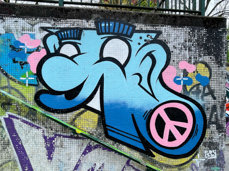
Although the character piece is on the small side, Slakarts has worked it into the location perfectly, following the contour of the handrail, rather than fighting against it. The winning combination of pink and blue colours is easy on the eye, but it is the crispness and clean lines that really grab me. I guess the piece is ll the more enjoyable for being in this location, where I wouldn’t ordinarily expect to find a Slakarts piece. Worth the trip alone.

Ha ha! This outrageous portrait piece by Laic217 at the entrance to the tunnel just makes me laugh. It has all the hallmarks of his work, that takes the grotesque to a new level, softened by some superb paint craft (by which I mean tone and depth) and a brilliant background.
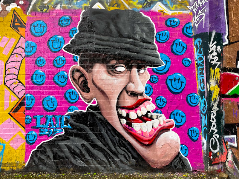
I wouldn’t ordinarily associate Laic217 with St Werburghs tunnel, but it is great to see him painting here. The distorted face features an enormous toothy mouth and protruding chin, but the character seems happy enough with it. Street artists often add an edge to portraits by omitting to include pupils in the eyes, which gives a bit of a sinister appearance, unsettling for the viewer. The material of the character’s clothes is as you’d expect perfectly painted, and the backdrop of blue smiley faces on a pick background, is suitably trippy. This is a great piece from Laic217.
Doors 265 – Doors from Highgate, London, November 2023 (Part V)
Forgive me if I appear a little distracted this morning, but I am still processing yesterday’s announcement by Rishi Sunak our Prime Minister, that we will be having a general election on 4 July (a special day on both sides of the pond), which is a little earlier than most were expecting. I’ll say no more about it, as Thursday Doors is a refuge from such matters, and instead focus on the final set of doors from a trip to Highgate in North London in November 2023, where I had lived for the majority of my teenage years.
I have also included a picture of the urinals in the public gents loo in Pond Square, simply because in spite of their function, they are elegant – they don’t make them like that any more (the old man in me says).
Most of these doors are from the Pond Square area, which is at the heart of Highgate ‘village’. When I was growing up, it was a place where teenagers would congregate to chat and make plans for which pubs they would try to get served in. It was also the focal point for the Pond Square Punks – it was the punk era, after all. I hope you enjoy the doors.


So that rounds things off nicely for this trip down memory lane, which I have really enjoyed sharing on Thursday doors. I have a great many folders of doors waiting in the wings but will keep my plans for next time as a surprise (mainly because I haven’t decided yet).
Have a great weekend, and if you live in the UK, batten down the hatches for six weeks of relentless electioneering.
If you have made it this far, you probably like doors, and you really ought to take a look at the No Facilities blog by Dan Anton who has taken over the hosting of Thursday Doors from Norm 2.0 blog. Links to more doorscursions can be found in the comments section of Dan Anton’s Thursday Doors post.
by Scooj

.
Overwhelming joy
general election called
so long overdue
.
by Scooj
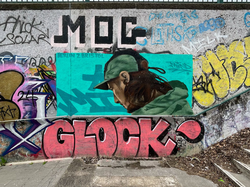
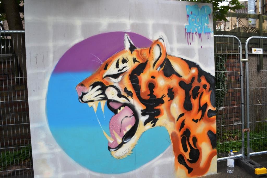
Lawrence Hill roundabout is a spot that is a little off the beaten track, and most of the graffiti down there is average at best, with a lot of bombers and taggers getting in some practice. Decent pieces tend not to last too long in a pristine state, but having said that turnover is pretty slow. I was therefore privileged on a recent speculative visit to find this beauty from Mind 49.

It has been wonderful to watch Mind 49’s development from a young artist at Upfest 17 when he was a youthful 16 year old painting under the name Mind Control. This piece follows the theme of concealed portraits that he has been painting in which parts of the face are obscured by hoods or glasses or other things and in this case by the fact that the subject is looking away. This style leaves more to the viewer’s imagination and is quite unusual in the street art world. This is a really wonderful piece tucked away from the more common spots.
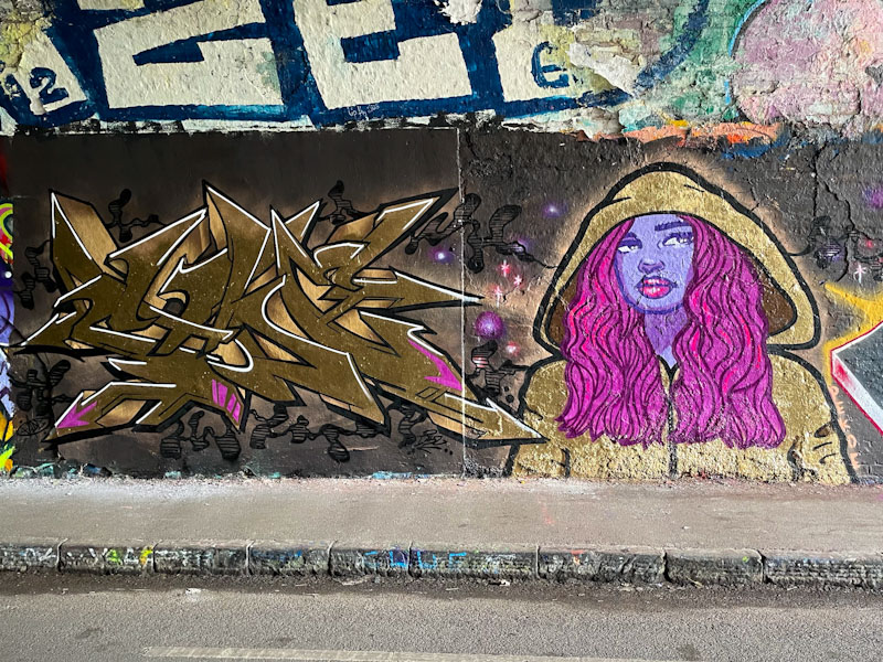
Ah! Bravo! Bravo! What a magnificent and, if I am honest, slightly unexpected collaboration from Fade and Pekoe in the tunnel. Although the pair have painted together in the past, it still somehow feels like a surprise when they hook up to paint together.
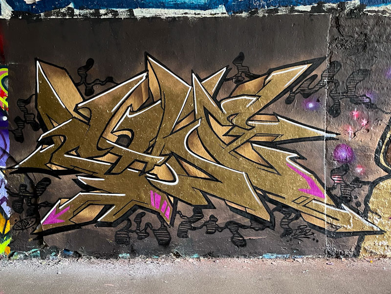
I was going to write that this might not be the tightest of pieces, but the more I look at it the better it gets I’m my view. The sumptuous colour palette of gold and light purple ticks all the boxes and turns a good wall into a great one. Fade has kept the purple flashes to a subtle minimum, with just enough colour to complement the wonderful gold writing. Lifting the letters further is the beautifully clean white accent line along the upper edges of the letters. Brilliant.
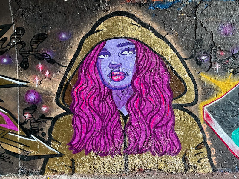
I wasn’t too sure about Pekoe’s portrait on first glance, but I am sure now that it is absolutely on point. The lady is wearing a gold hoody that frames a beautifully expressive face and flowing hair. The woman’s face looks quizzically amused about something, and seems to be suspended in that moment before breaking into laughter, at least that is what I see, and that is the joy of art, we each take home what we see. I really love this collaboration and look forward to their next project together.
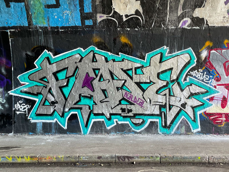
Turoe is nowhere near as productive as he has been at certain times in the past, so it is always great to come across a new piece. Although the frequency has dipped, the quality of his writing hasn’t diminished one iota.
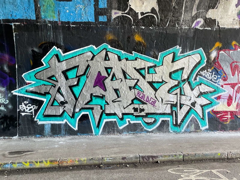
This is a lovely chrome piece in the tunnel, which is really brought to life with the steel blue border, without which the writing would disappear on the wall, and struggle to be noticed. Small things like this come so easily to experienced writers, and the thought that goes into design, colours and site location contribute to the final outcome. A fine piece of graffiti writing from one of the best.
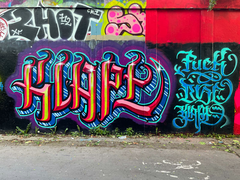
Here we have some more calligraffiti writing from Stivs, who appears to have had a bit of a rebirth lately and is painting furiously all over the place. I use the word ‘furiously’ deliberately because the words he is choosing to write recently are on the bluer end of the scale and play into the passive-aggressive arena, contrasting the beautiful writing with the potty mouth language.
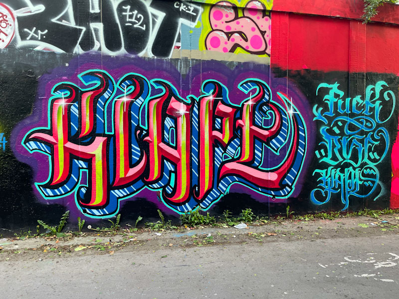
I believe this piece says KLAPE or KLAPY, which I think is just another way of saying CRAP, although I might be mistaken. The writing is, as ever, very neat and tidy, and has a sparkle about it, helped along with the little starbursts at the top of each letter. Much more to come from Stivs, and I am struggling to keep up as it is.


