
A gallery of illustrated graffiti writing from the brilliant Bristol-based artist Minto
Instagram: @instaminto
All photographs by Scooj
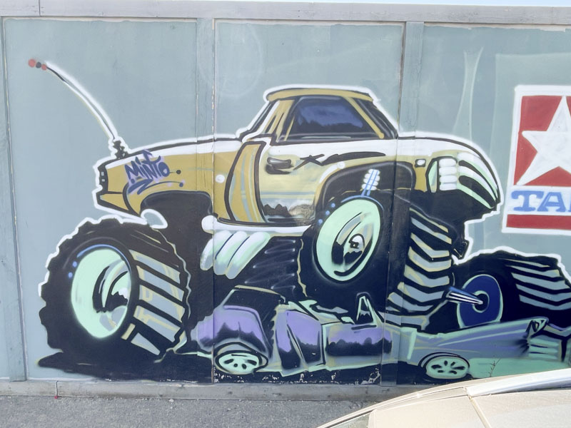
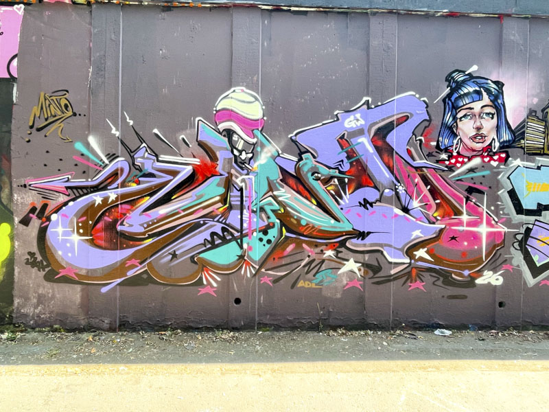


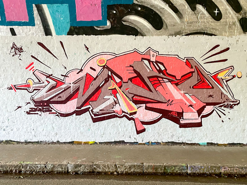
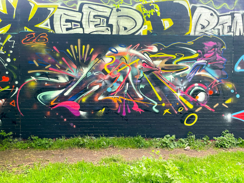

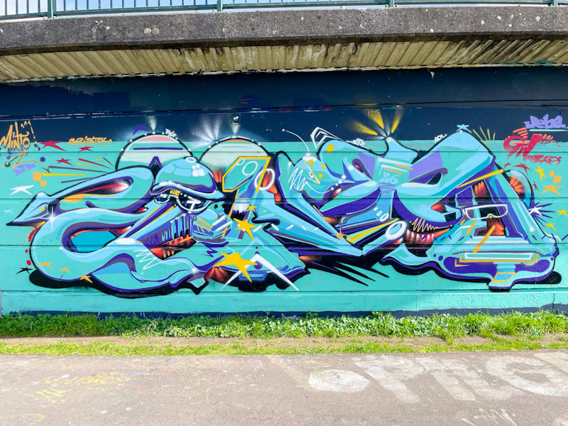


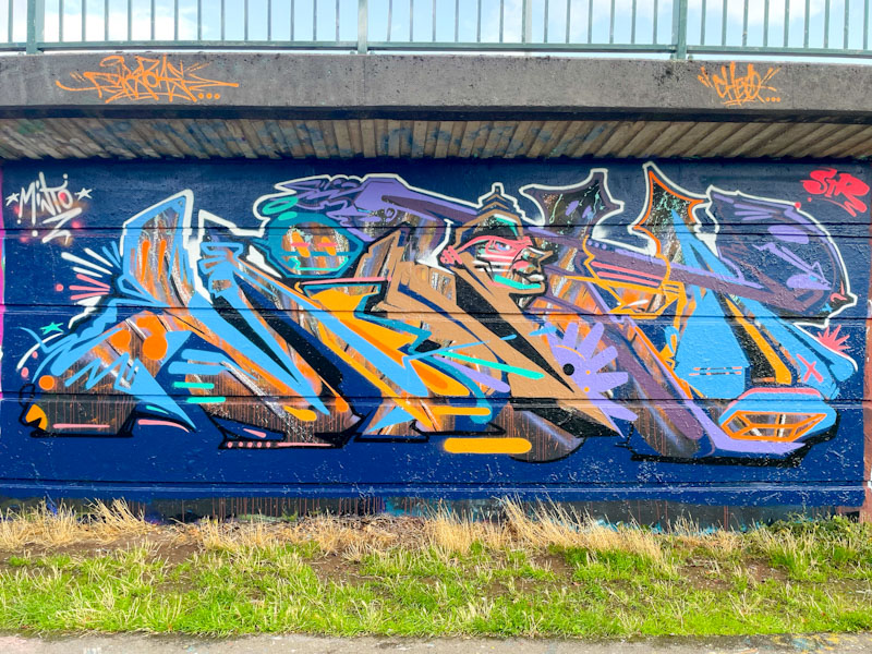
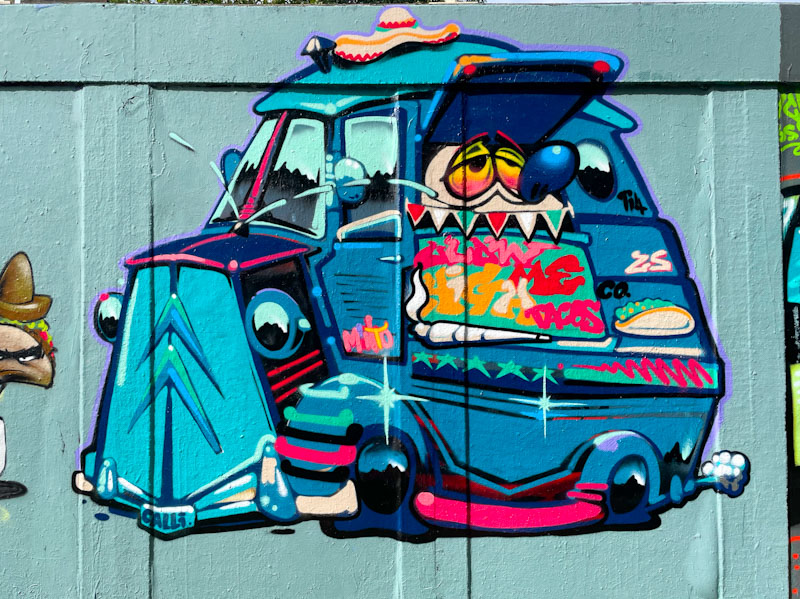
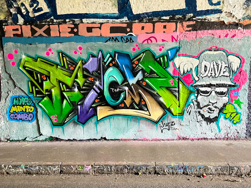
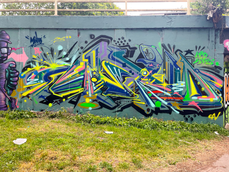


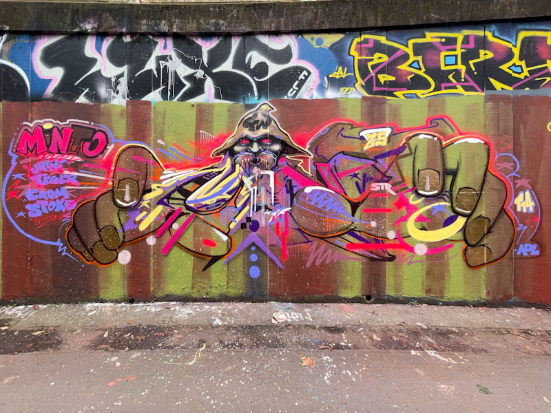
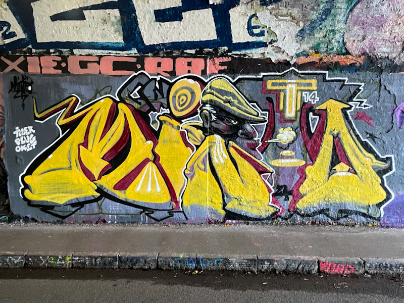
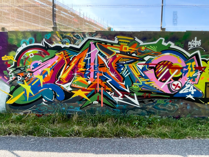


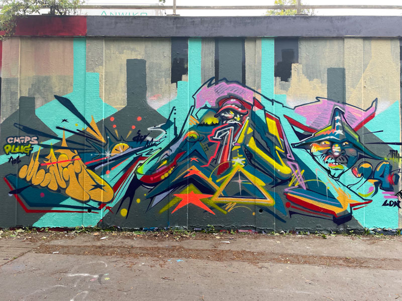


A gallery of illustrated graffiti writing from the brilliant Bristol-based artist Minto
Instagram: @instaminto
All photographs by Scooj

.
Holoparasite
a plant without chlorophyll
ivy devourer
.
by Scooj
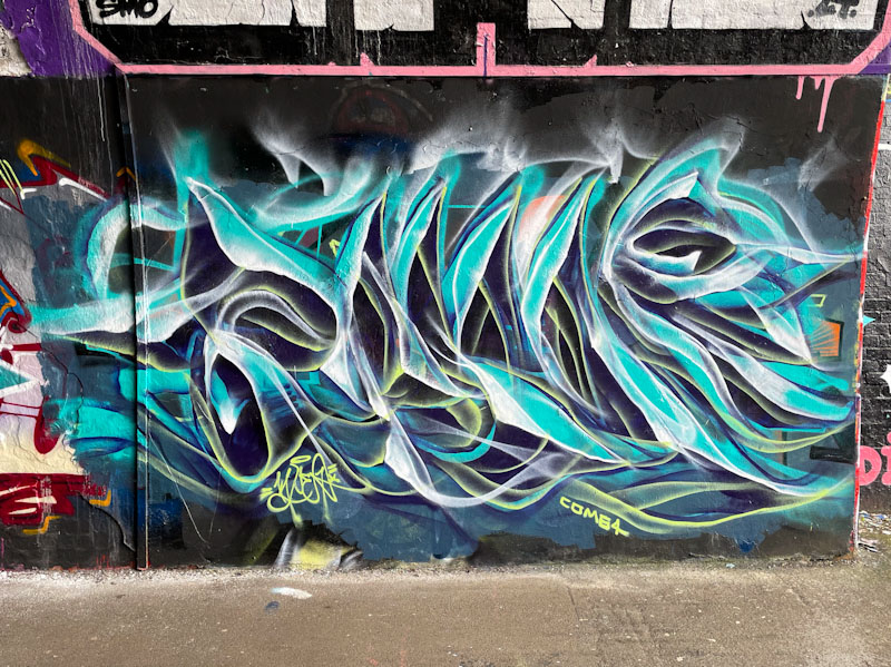
Every year, almost like clockwork, Mr Klue springs into action and follows up with frenetic activity for a month or two before slowing down again for the autumn/winter. This piece marks an up tick in activity which has produced several gorgeous ephemeral works in his favoured spot, St Werburghs tunnel.

The abstract smokey writing style adopted by Mr Klue makes for difficult reading, but this piece is easier than some to read, and you should be able to make out the letters KLUE, if you look hard enough. I’m not sure that Mr Klue gets the credit he deserves for his unique style of graffiti writing, probably in part due top his modesty, so this is a big shout out from me for his consistently brilliant work.

Wowzer! A word I rarely use, but this outstanding anamorphic piece by Uncle left me breathless, and even now, looking at the photographs, it plays tricks with your mind. This kind of anamorphic art has been around for centuries, and in its more formal settings is called trompe l’oeil, which in French means ‘deceiving the eye’, and which can be seen in cathedrals, churches, palaces and streets all over Europe (and beyond I expect). Street artists have been refining the style and are now creating some utterly mind-boggling work for all to enjoy.

One of the things about anamorphic art is that it often has to be viewed from a specific point to achieve the full effect, and the first photograph just about hits the spot. Uncle has managed to create a green box that appears to be sunk into the building, and the 3D lettering in red, white and blue is sitting within the ‘recess’. Much of the illusion is created with very clever use of light and shade and shadows cast.

I am so pleased that Upfest invited Uncle, who is from Hong Kong, to paint this piece this year, and I hope that it encourages more of this kind of awe-inspiring art in the city. You can find more of Uncle’s work on his Instagram feed, that has quite a few interesting images and reels of this piece. Outstanding work.

I have mentioned before that Upfest has a blend of local, national and international artists every year, but what is noticeable this year is that many of the Bristol-based artists have been given large feature walls to paint, which is great to see, and to be able to showcase some of our own homegrown talent.
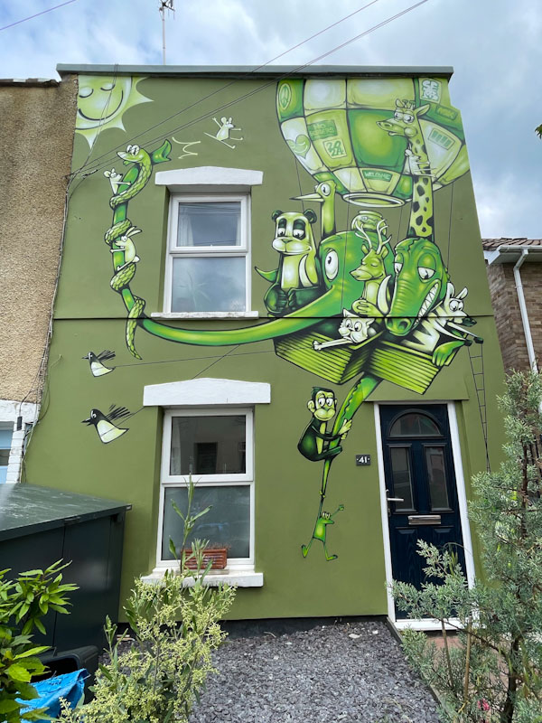
This is an outstanding mural from Sepr, who is no stranger to the pages of Natural Adventures – you can see more of his work in this gallery. The green colour palette is masterfully worked in this cartoon-style balloon ark. There is a wonderful story unfolding here of animals sharing a balloon trip (balloons, like street art, being one of Bristol’s USPs) under a warm sun. Sepr has designed the piece to work around the doors and windows of the house, which interestingly has no window above the door, allowing more mural space. In my view, this is a masterpiece of stylised cartoon street art that brings smiles to the faces of passers-by. Awesome.
Doors 269 – Doors from Cheltenham, July 2023 (Part III)
Good morning from Bristol, where the mood has been lifted by a couple of wonderful warm days, although the clouds today probably signify the end of our summer! This week I bring you the final selection of doors from a visit I made to Cheltenham last July to experience the Cheltenham Paint Festival. There is not too much to say about these doors other than they are a random selection from my wanderings, I hope you enjoy them.


I have a busy day ahead, so that’s it I’m afraid for another week. Next time I am thinking a return to Umbria in Italy is on the cards, see you then.
If you have made it this far, you probably like doors, and you really ought to take a look at the No Facilities blog by Dan Anton who has taken over the hosting of Thursday Doors from Norm 2.0 blog. Links to more doorscursions can be found in the comments section of Dan Anton’s Thursday Doors post.
by Scooj


.
Leafy green backdrop
frames centrepiece perfection
poison dressed in pink
.
by Scooj
.

Life in full colour! This outstanding Upfest piece, by Luke Smile in a way reflects the previous two posts (Shane O’ Malley and Paul Monsters) in its joyful use of colour and specific reference to colour in the words. Although this is not the first time I have seen Luke Smile’s work in Bristol, he is not a regular visitor, so it felt especially good to see this piece.

Luke Smile is a British artist and designer and has been concentrating on his ‘Smile sans’ font which we see here in this mural. I have lifted Luke Smile’s description of the font from his website, because I am sure his explanation is far better than anything I could write:
‘The bespoke font has a hollow-like quality where the 3D areas of the letterforms leave space for bold colour and texture whilst casting interesting shadows’
I have to say that this piece really struck me when I first saw it and it remains one of my favourites from this year’s festival.


There are some murals painted at this year’s Upfest that you simply just have to stand back and admire, and this extraordinary piece by Shane O’Malley is one of them. The double house wall is a new one for Upfest this year, and although a little way off the beaten track and without anywhere to park, is well worth the trip.

Shane O’Malley is an artist from Galway in Ireland who works on designs based around circles, geometry and colour in both the studio and on walls – you can see more of his murals on his website. This piece conveys joy and excitement and is complemented by the blue skies on the day I photographed it. A wonderful Upfest piece.

I have a feeling that this was one of the first walls to be completed for this year’s Upfest, and there is likely a very good reason for this. Paul Monsters, whose colourful geometric murals are well known in Bristol, also works with Upfest, so I imagine he needed to complete his piece early so that he could help with his festival responsibilities.

The wonderful mural is painted on the side of the Bristol Beer Factory, and Paul Monsters has carefully incorporated the pint glass logo into his design. The use of various tones of colours to create depth in these geometric pieces is a trademark of Paul Monsters’ work and although at first glance his work might look simple and straightforward, it is in fact complex and sophisticated. This post reminds me that it is high time I produced a gallery of his outstanding work.


