It is always a genuine pleasure to find Haka pieces, and this CK One graffiti writing and character combination is a bit of fun under the M32. I don’t know who the character is, but it looks a little unfinished to me.
Haka, Frome Side, Bristol, January 2024
The solid black letters really stand out, however, the white paint drop shadow is a little thinner, and could have done with another coat, maybe. Great work and a playful approach from Haka.
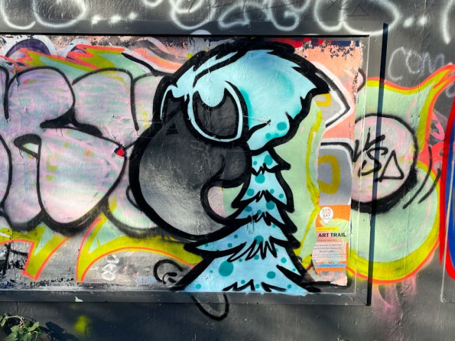
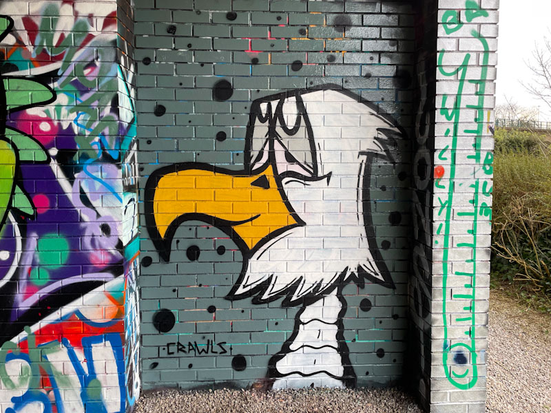
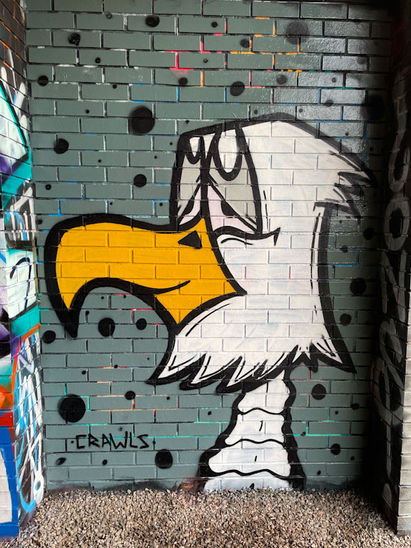
It’s that wonderful Mr Crawls again, treating us to another of his cartoon birds, this one on what’s left of the hoardings along the Bristol to Bath cycle path at Greenbank. This rather jolly bird character is a reminder of the wide range of birds that Mr Crawls has in his armoury.
Mr Crawls, Greenbank, Bristol, January 2023
The blue colour of the plumage decorated with darker dots gives the bird an almost comical appearance. More nice work from Mr Crawls.
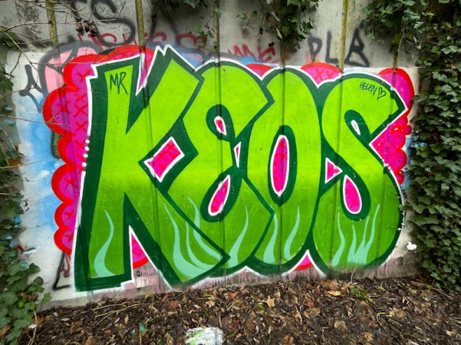
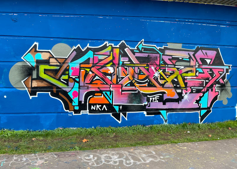
Keos visited Bristol not so long ago and left a few pieces, three I think, and this is the second I found. I don’t think I am likely to find another one. I think I got lucky to find this one, because I only rarely visit the Junction 2 roundabout of the M32.
Keos, M32 roundabout J2, Bristol, January 2024
As far as I can make out, Keos seems to travel around the country a fair bit and leaves his distinctive letters for all to enjoy. This one is big, bold and vibrant, welcoming visitors to the Eastville Tesco. Great colours, fills and background – always welcome to visit.
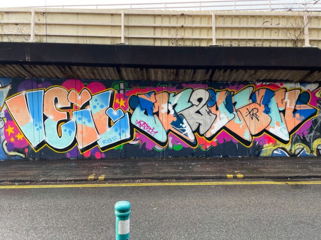
Desi and Mr Two Gram, M32 Spot, Bristol, January 2023
Desi (Veil) and Mr Two Gram paint together a lot, although I have posted far more of the former’s pieces than I have the latter. I think the reason, and it is a rather feeble one is that I keep forgetting Mr Two Gram’s name. I don’t think that this will happen too much more now, and I will need to draw out loads of his pieces from my archive.
Desi, M32 Spot, Bristol, January 2023
This is a lovely fresh piece from Desi, with a nice colour palette and very organised fills. She has also included the incorporation of some background pink in between letters, which is a difficult thing to do. She did miss a little bit, between the ‘V’ and the ‘e’, but I am being picky.
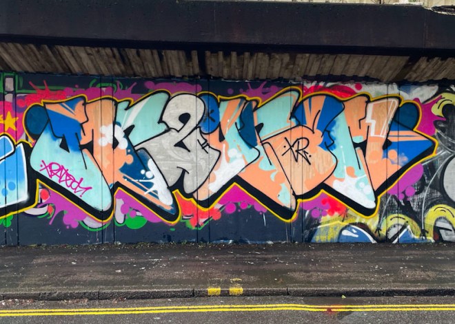
Mr Two Gram, M32 Spot, Bristol, January 2023
To Desi’s right is a great piece of graffiti writing from Mr Two Gram, whose letters I still struggle to read. The grey ‘O’ or is it a ‘G’? always looks like an ampersand to me. Lovely letters and some superb fills round off this very nice collaboration perfectly.
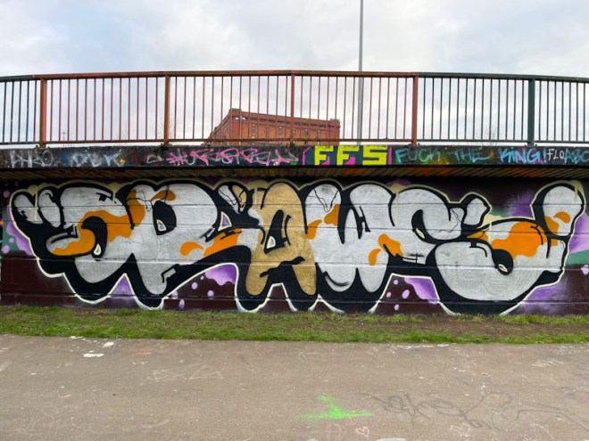
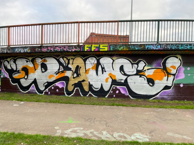
Mr Draws is one of the most enduring and endearing artists in Bristol. His writing is familiar, albeit unconsciously, to any Bristolian who keeps their eyes open, and has been for several years. This large piece in Cumberland Basin is a cracker, which reminds m a little of a koi carp.
Mr Draws, Cumberland Basin, Bristol, January 2024
This is a very nice piece of writing from Mr Draws, with his typical letter shapes, a nice deep drop shadow and some nice fills. The gold ‘A’ draws the eye, and I have noticed a few pieces lately that have contained a gold letter… perhaps it is a thing. This is a fine piece from a fine artist.
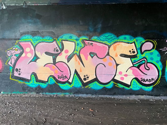
Today is the first day of our skiing holiday, and it is going to be a bit of a challenge to write posts this week. Forgive me if they end up being a little brief. I have found a quiet moment before we have got going this morning to post this rather lovely piece of writing from Lewse.
Lewse, Brunel Way, Bristol, January 2023
There is no question about it, Lewse is utterly underrepresented in Natural Adventures. Her accomplished pieces, sometimes accompanied by characters, appear reasonably frequently, but a special feature of her work is its longevity, with many pieces lasting a year or more. This is a perfect example of her work, with a Pink Panther character and some beautifully filled letters, along with a superb blue patterned background. A fabulous piece of graffiti writing.
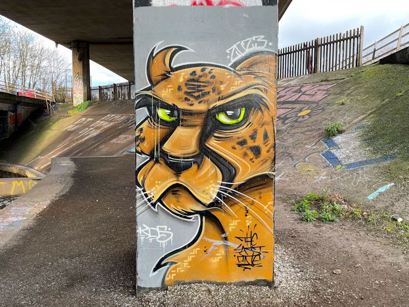
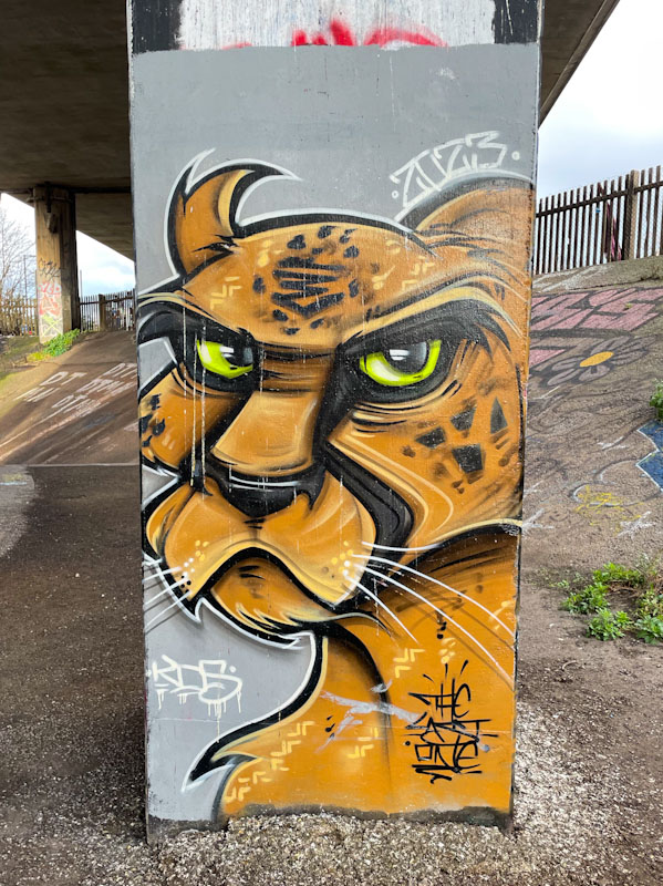
We were recently lucky enough to have another visit to Bristol from The Last One, whose painting around the country is both admirable and relentless. This column piece under the M32 is an absolute beauty.
The Last One, Frome Side, Bristol, January 2024
While I am not entirely what kind of big cat the animal is, it is beautifully painted. The Last One has a genuine talent for creating very special pieces, and the more visits to Bristol, the better.
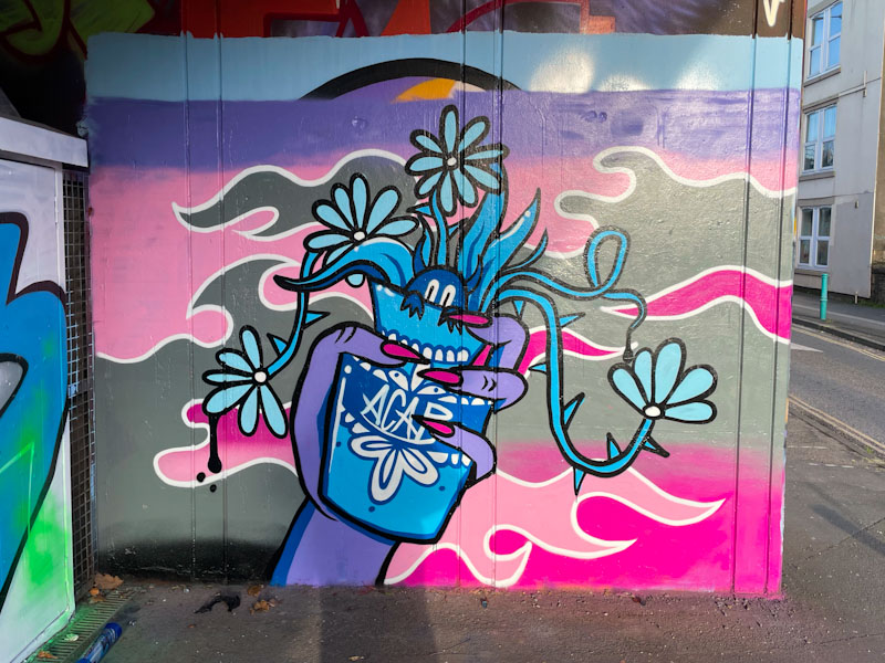
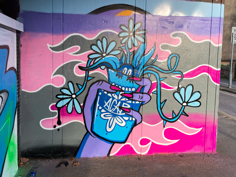
The day I met Bloem was a red letter day for me, as I have been hoping to bump into her for quite a while, and this was the piece she was painting at the time. Formerly signing her work as Hiccup, Bloem emerged onto the scene during 2023, with a wonderfully original creative approach, treating us to some pieces the likes of which we haven’t really seen in Bristol before.
Bloem, M32 Spot, Bristol, January 2024
Carrying the motif ACAB, the piece features a hand with long nails holding a small vase with flowers poking out of the top and a little creature peering over the lip of the vase. There is a little story going on here, I’m sure. To add a bit more interest, Bloem has created a patterned cloud background in pinks and greys. A lovely piece painted in her inimitable style.
Kid Krishna, Cumberland Basin, Bristol, January 2024
After quite a long hiatus, it appears that Kid Krishna has returned with some gusto and inspiration, which is always great to see. Kid Krishna has a writing style unlike any other artist I know of, but what is fascinating about that is that he has several alternative styles that sit within his style, if that makes any sense at all.
Kid Krishna, Cumberland Basin, Bristol, January 2024
This is a colourful piece an a nicely buffed wall, that I have to take on trust spells out CRIE, which is what the artist usually writes. I can never be too sure with his work whether it is planned or spontaneous, and this uncertainty persists even though I have watched him a work several times. Looking at this piece, it certainly looks like it has evolved around a letter framework, but I doubt there was a black book rendition of it. This was painted alongside his painting partner Markinetic earlier this month.
Mr Crawls, Cumberland Basin, Bristol, January 2024
One of the nicest surprises of 2023 has been the rise and rise of Mr Crawls, whose bird pieces have become a familiar sight all around the city. More recently, he has teamed up with Mote to produce some great fun pieces that work so well, each painting in their own style, which somehow come together seamlessly.
Mr Crawls, Cumberland Basin, Bristol, January 2024
At first, I thought that Mr Crawls might be a bit of a one-trick-pony, but far from it, he has been modifying his characters and switching them up as he goes along. This solo bird has a comical cartoon expression, that Mr Crawls manages to paint so well. I predict another bumper year from this irrepressible artist.