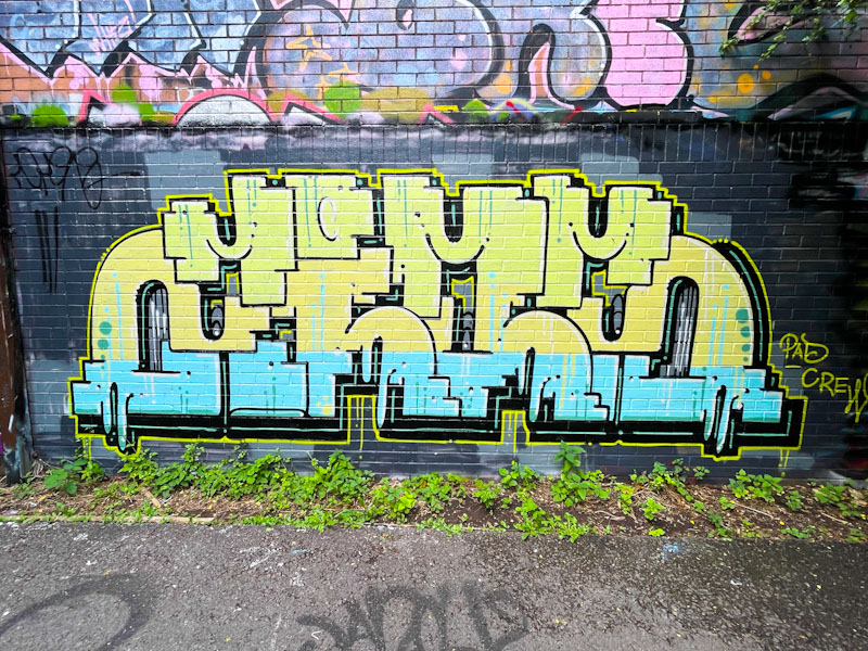
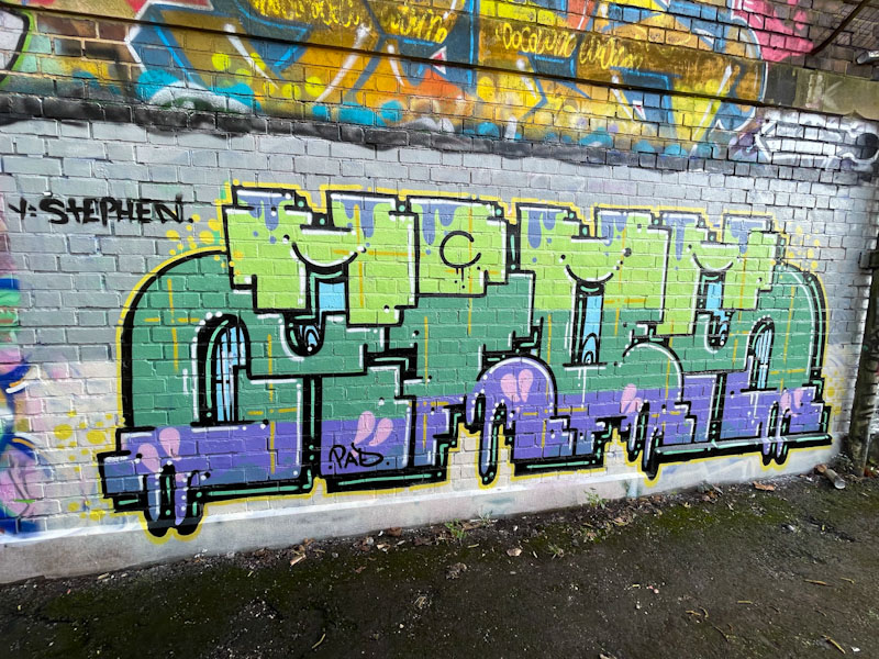
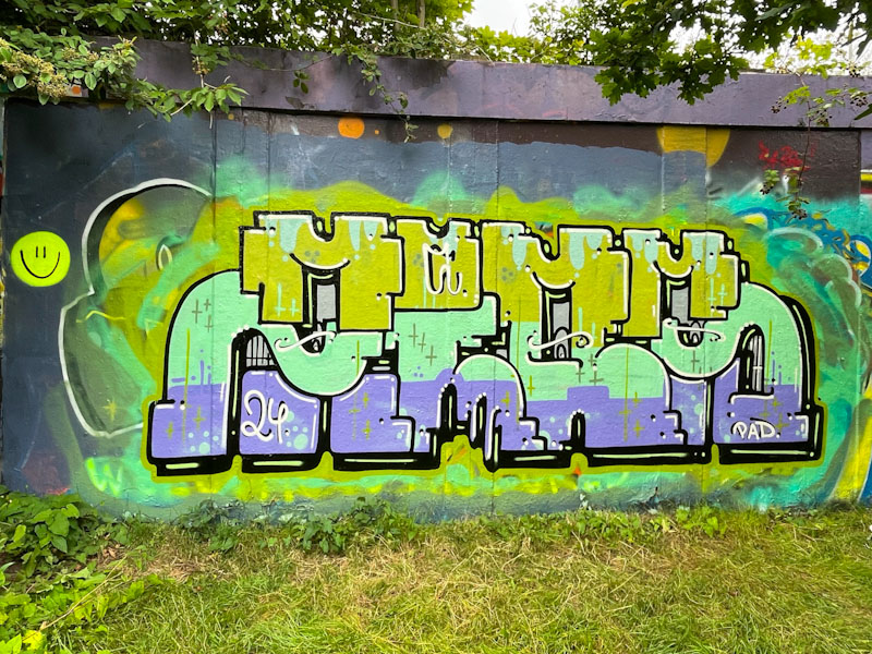
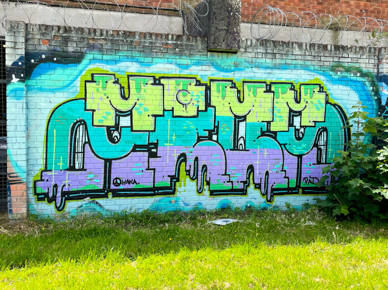
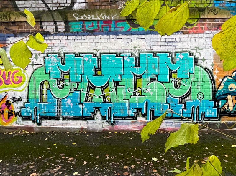
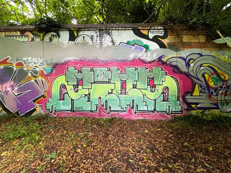
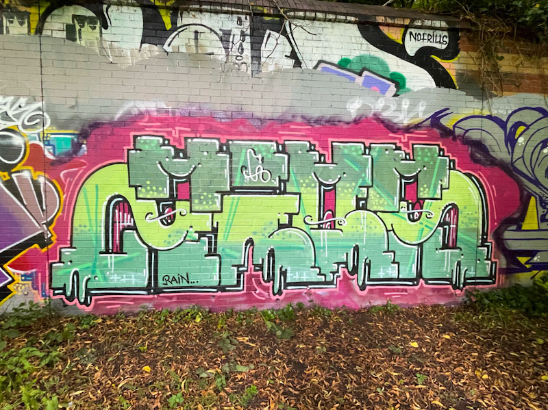
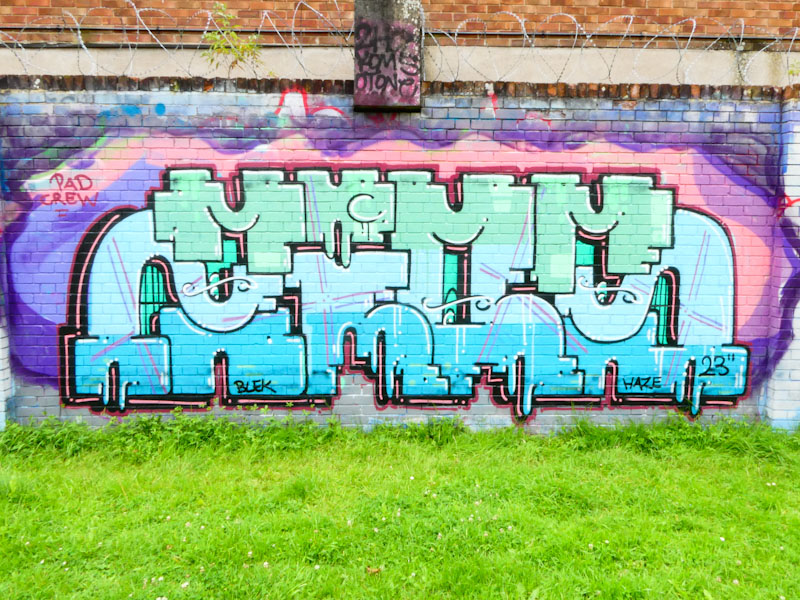
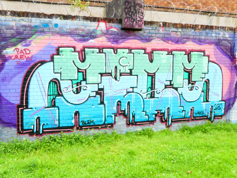
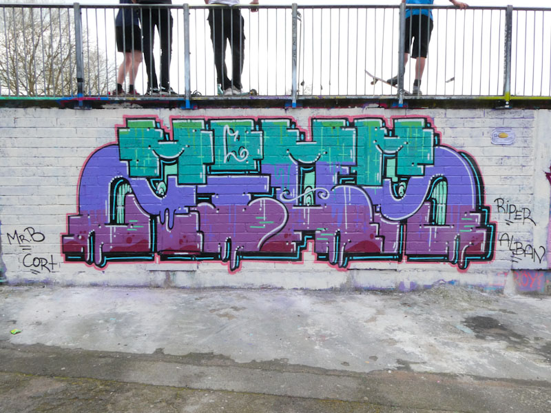
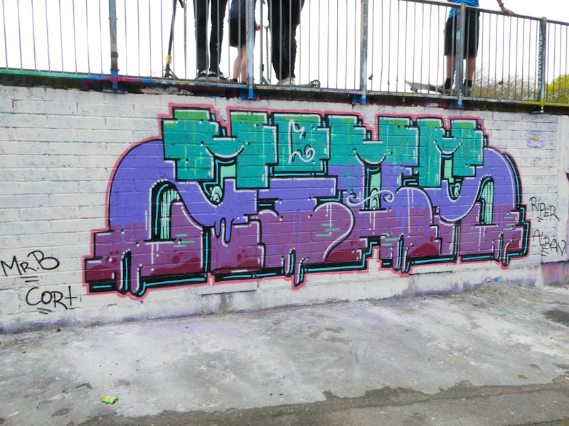
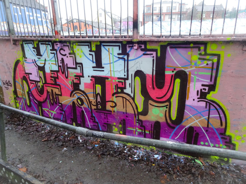
Trafficity is one of those artists who likes to recreate the same letter form and design, with the only changes from piece to piece being the colour arrangements and occasionally some of the finishing touches. There is something comforting about this, you know what you are going to get, and it is always great quality and consistency.
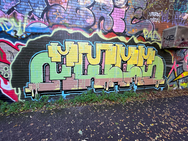
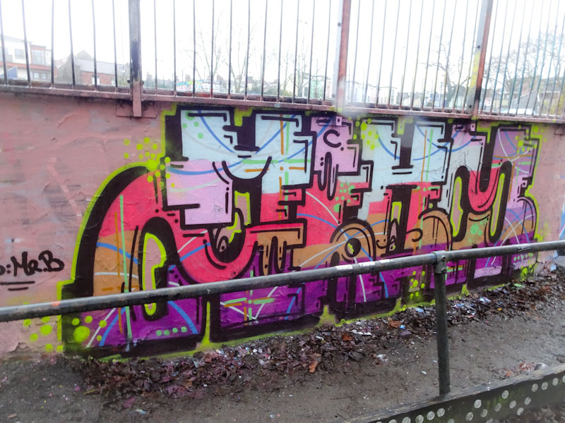
This one, on the path between Sparke Evans Park and Temple Meads station, is really nicely presented, crisp and clean. The letters spell ZIOM, although I do find it hard to fathom out from time to time. The colours, yellow, green and brown are not my favourite combination, but one that the artist seems to favour. All round, a nice piece with some fun blue drip accessories to finish.