
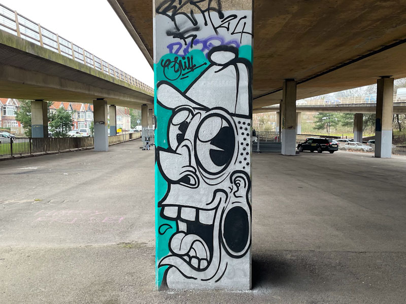
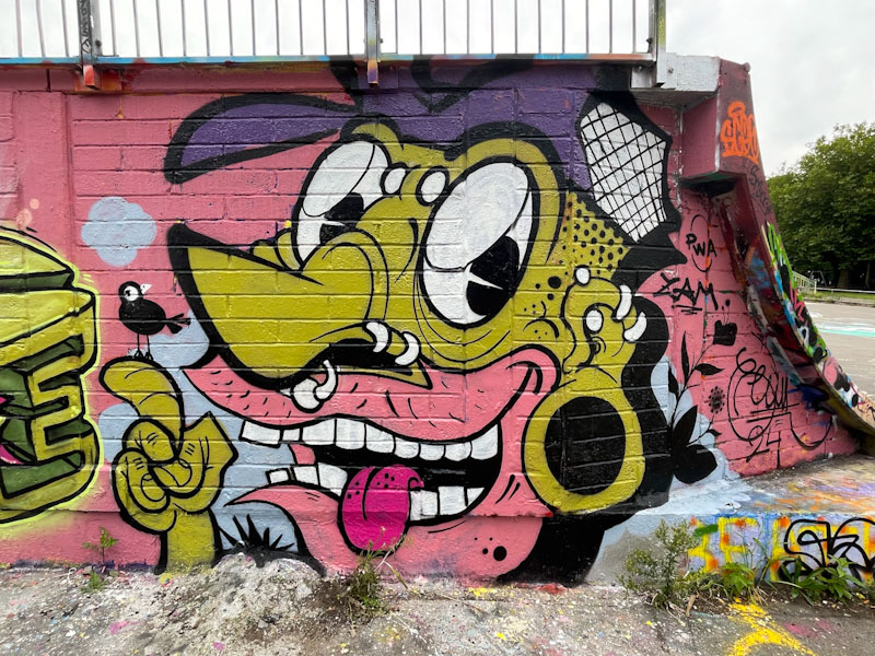
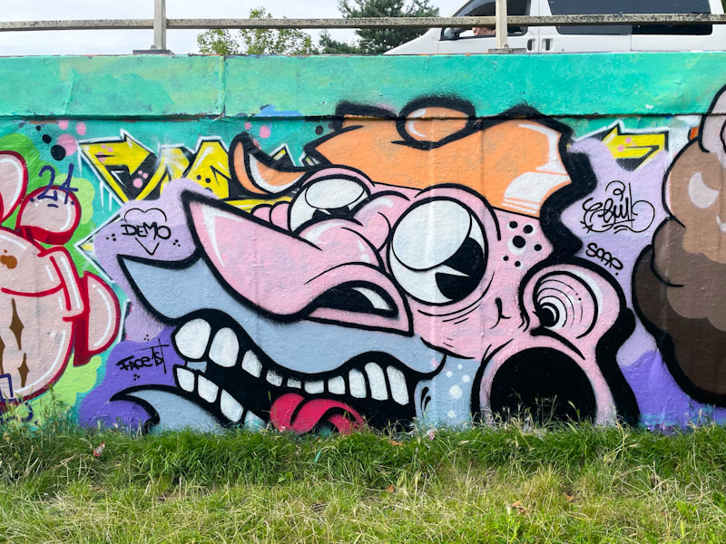
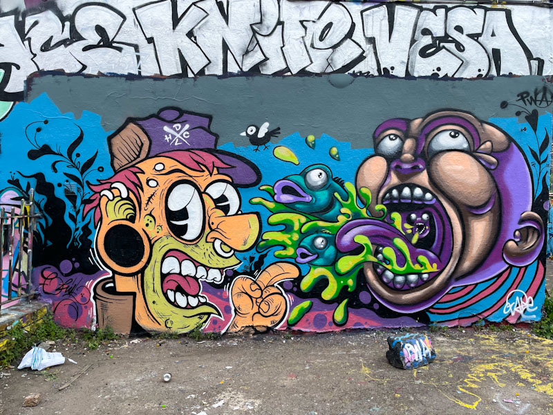
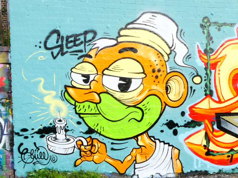
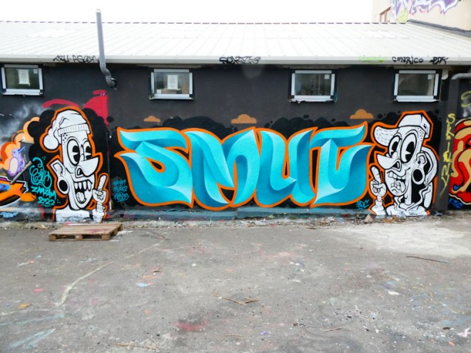
A gallery of fantastic cartoon-style work from Bristol street artist and tattooist, Chill (PWA)
Instagram: @chill.works


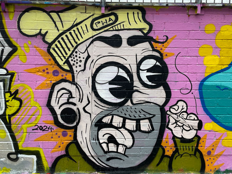


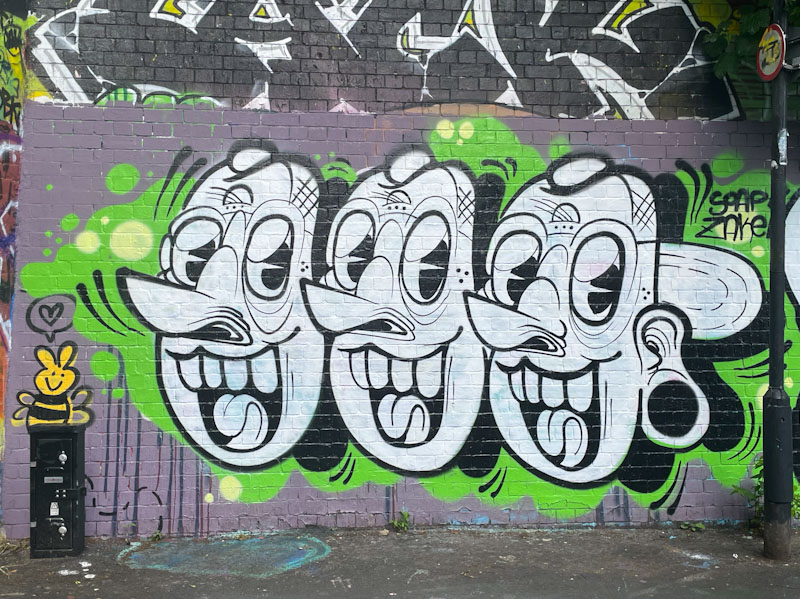


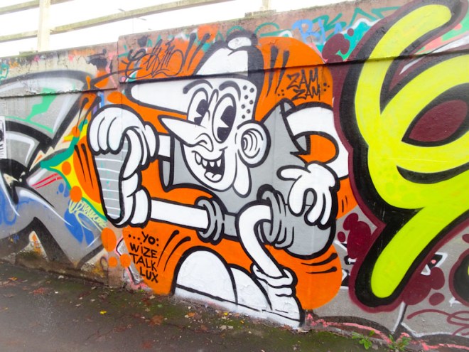


A gallery of fantastic cartoon-style work from Bristol street artist and tattooist, Chill (PWA)
Instagram: @chill.works
.
Without contrition
claiming they are listening
fooling nobody
.
by Scooj
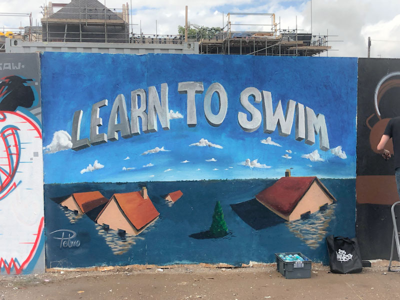
One of my favourite Bristol artists is Pelmo. His work is usually well thought out and is about so much more than the artwork, often there are messages of love, affection and care with the relationships between characters. In this unusual piece, there are no characters, but a very strong climate message.

Having worked in environmental communications for twenty years, some of it on climate change, I have seen many images like this one, and they are not uncommon. What is different here is that it is not a corporate ‘explainer’ but a heartfelt warning. Pelmo has captured the jeopardy of failing to act in a gentle, but effective way. I could look at this piece for a long time, it chimes for me and has a serene quality to it. Great work from Pelmo.

There is a very strong relationship between street art and tattoo art, for example, some of Bristol’s best street artists; 3Dom, Sepr and Chill, among others, are also tattoo artists. So it is no surprise to learn that Helen Harper, who painted this gorgeous lion at the Cheltenham Paint Festival is also a tattoo artist.
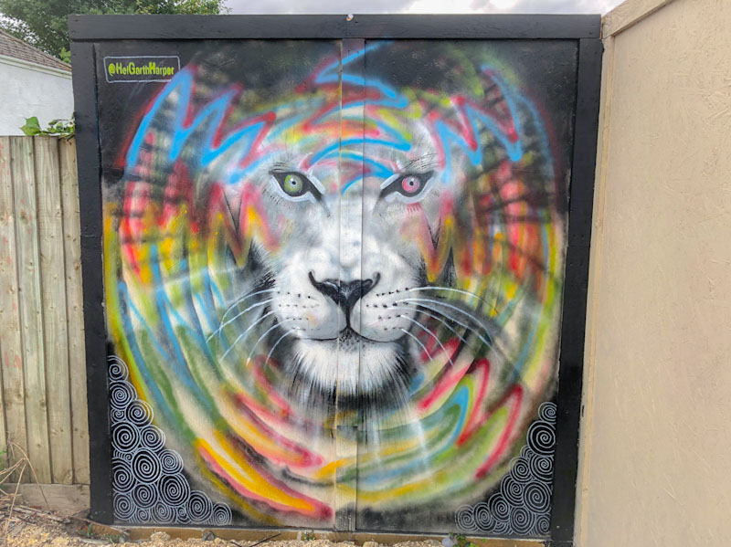
There are three elements to this piece that work nicely together. The black background has some swirly patterning, and the lion’s face is painted in a greyscale that works well with the background. Encircling the lion’s face is a circular burst of colour, radiating outwards. This is the first piece that I have seen by Helen Harper, but I look forward to seeing more in the future.
.
Peter principle
power beyond competence
so out of her depth
.
by Scooj
* Peter principle:
The Peter principle is a concept in management developed by Laurence J. Peter, which observes that people in a hierarchy tend to rise to “a level of respective incompetence”: employees are promoted based on their success in previous jobs until they reach a level at which they are no longer competent, as skills in one job do not necessarily translate to another.
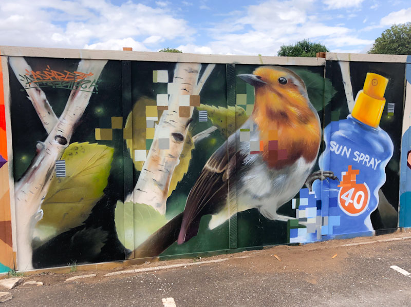
Even though Aspire no longer lives in Bristol, I have managed to come across some of his work this year, which is a joyful thing. Of all the artists that have left Bristol in recent years, I miss his work (and that of Kleiner Shames) the most. Thank goodness for festivals such as Upfest and the Cheltenham Paint Festival, which have encouraged Aspire to leave London and share his work in the provinces.
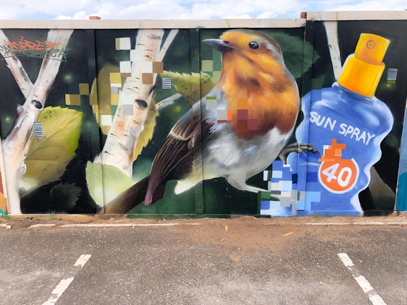
This piece is an absolute belter, with a beautiful Robin, set alongside some silver birch trees and weirdly a bottle of sun spray. I’m not quite sure I get the significance of the plastic bottle, but it certainly sets up an interesting juxtaposition in the piece. As always the whole thing is superbly crafted, and Aspire’s pixelated sections perform the job of a signature. Top work from Aspire.
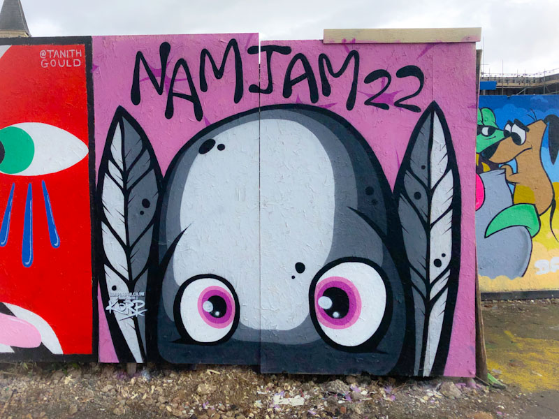
You might recall that I posted a piece by Korp only a few days ago of his Upfest piece. Here he is again with another fine ‘worm’ character portrait, this time from the Cheltenham Paint Festival.
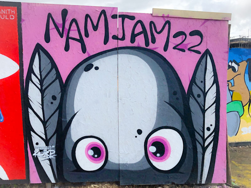
The character in greyscale with some pink elements is rather cute, if that is the right word, peering from the boarding out at viewers, feathers either side of its face. What Korp does really effectively is create shadows with different shades of paint, to create depth in the face, all of which is done with sharp lines and great solid fills. This is another fine festival piece from Korp.
.
North London derby
where there can only be one
come on you gunners
.
by Scooj

It is always tough to lose those we love and care about, and no matter how often it happens, it doesn’t seem to get any easier. Grief is a powerful and important emotion, and through it we remember what we have lost. Stivs has painted several tribute pieces for his friend Sear, and each one is a touching reminder.
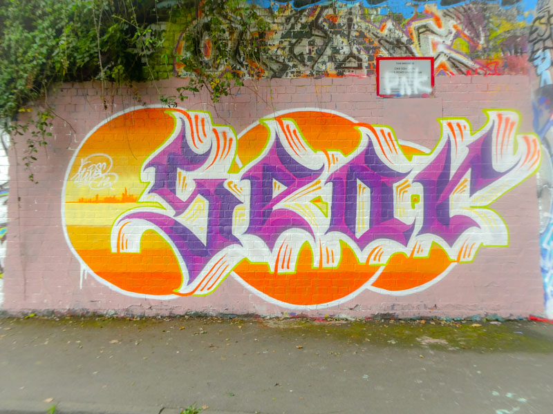
This piece, at the farm-side entrance to the tunnel combines Stivs’ calligraffiti with a little bit of landscape in the orange circles. The colours are eye-catching and the whole thing on-point, although the lettering and the circles look a little bit out of balance, but maybe that is just me. A fine tribute from a loyal friend.

It was a genuine pleasure to see this lovely piece from Slakarts, because I haven’t seen much of his work lately. I am hoping that his absence from the streets is an indication that his work is going well. Balancing work and pleasure can be a challenge, but you’ve got to keep those shekels coming in.
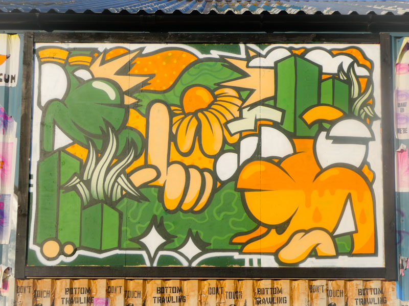
Adopting the same colour scheme as the other pieces in this collection of Elton Street pieces, Slakarts has painted a rather special mural, with a lot more content than his customary stylised portrait. There is a semi-rural landscape, some high rise flats and flowers, accompanying the character. On-point and very clean, this is a wonderful piece from Slakarts.


