.
The winter solstice
the light at the tunnel’s end
not long to go now
.
by Scooj
.
The winter solstice
the light at the tunnel’s end
not long to go now
.
by Scooj
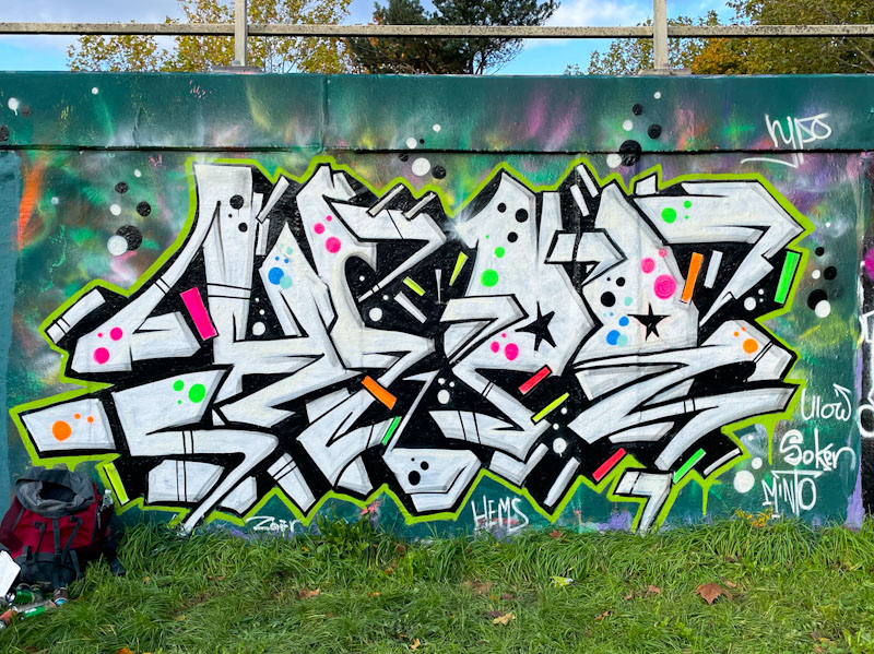
I met Hypo for the very first time when he was painting a piece adjacent to this one, which I sadly never got to photograph, because it had been painted over by the time I returned. What a lovely and interesting person Hypo is. I mentioned to him that he has been smashing it lately not only in quality of his pieces but in the quantity of them that he was turning out. He explained that he had been seriously ill a little while back and that while he was unable to work he was painting as part of his rehabilitation. It was good to see him looking well. It is amazing how our health completely shapes out lives, our losses and our opportunities.
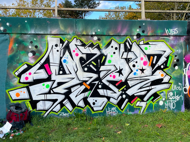
I would not describe this as a typical Hypo piece, being a little more cryptic and busy than his more typical work. The black and white letters have plenty of extra details and lines and have been filled sparingly with coloured spots and stars. There are some nice shout outs to Hemper, Ulow, Soker and Minto, which puts his peers into clear context. Hypo painted this piece alongside his LDub mates Dun Sum and Zeks. Nice transformative work.
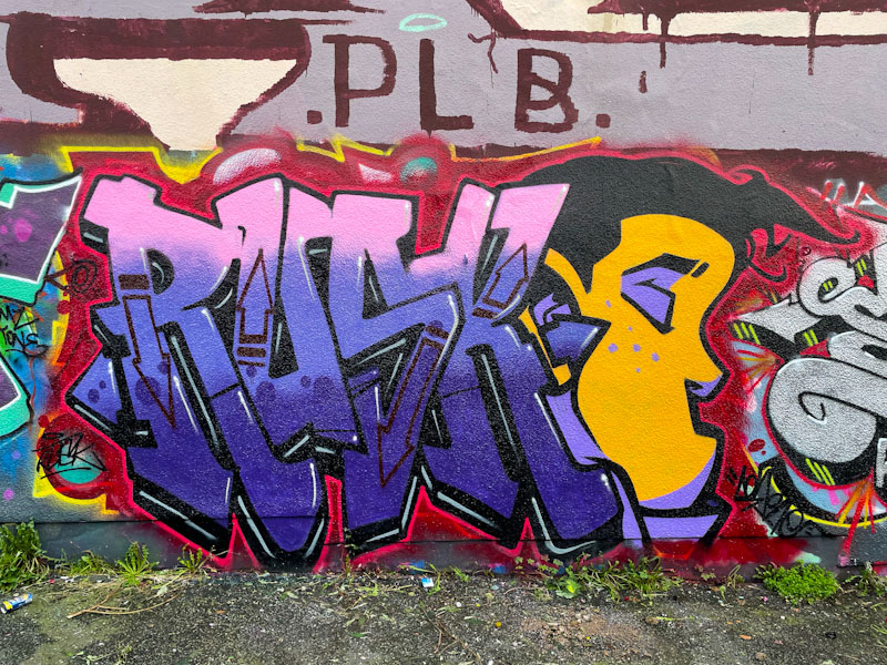
There are times when you need to keep your eyes open and think rather than make assumptions. When I first saw this modest Rusk piece I raised an eyebrow, because it was obviously a ‘quick one’ but that the incorporation of a face was something a little different from rusk. My assumption was that this was a solo rusk piece but deeper thought brought me to the conclusion that it was a collaboration, and then the penny dropped that Theartofsok had painted a piece only a stone’s throw away at the same time and the face was in his style. This was a collaboration.
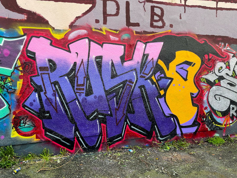
Rusk has been quite busy painting in Bristol lately, which is great to see, because he does tend to go through quiet periods, or paints in unusual and faraway spots. The writing here is classy as ever, beautifully filled and bordered. The profile face to the right-hand side by Theartofsok is outstanding, and its beauty is in its simplicity. A very fine and unexpected little collaboration, which I can’t imagine anyone saw coming.
.
Privatisation
ruination of our trains
profiteers clean up
.
by Scooj
* The trains in England are a disgrace and an embarrassment. Visitors from overseas must be utterly bewildered by how bad our train services are.
Underfunded, with profits being creamed off by shareholders.
Why on earth do we put up with it? People will pay hugely inflated prices only to stand on a train, sometimes for several hours. Oversubscription is the norm, which must have implications for health and safety of passengers.
Surely if every passenger had to book a seat, sales would be curtailed when the train was full. I believe that is the system in America.
Delays, cancellations and reduced carriages are the norm. Often the electronic booking systems are broken. Encountering a ticket inspector/guard is a rarity.
Even if you get a seat, trains are grubby and cramped. Food and refreshment services patchy and expensive. The whole thing makes for deeply unpleasant experiences. It wasn’t always like this, and people used to mock British Rail!
Nationalise and subsidise the trains or set higher standards/penalties for operators.
The Privatisation obsession of Thatcherite Britain has failed its people but made a privileged few unimaginably wealthy. Disgusting.

With this piece, I got to see that Kid30 is not a one-trick pony. The only pieces I have seen by him before, and that is only a few, have been mash-up pieces of cartoon characters stitched together. This x-ray tortoise piece is something quite different.
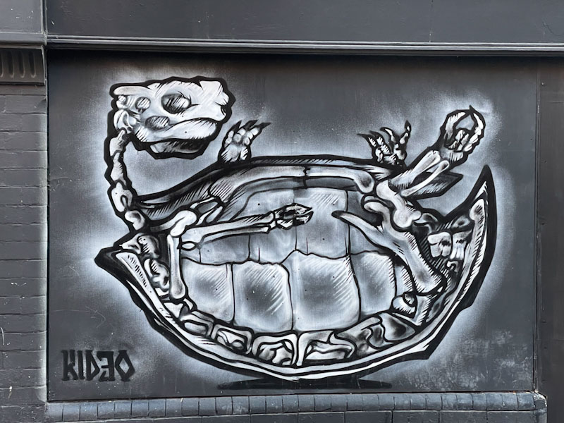
I would guess that this piece is probably a commission, although maybe he simply felt like doing something a little different. I am not sure whether the tortoise skeleton is anatomically correct, but it looks pretty credible to me. Kid30 has used this grayscale piece to show off his talent, which is pretty visible throughout Nottingham.

I find myself writing (last night) about this wonderful piece by Boaster in Nottingham from a hotel room in Sheffield having spent the day in Manchester. I seem to be ‘on tour’ quite a lot these days, although this trip isn’t with work, but with my daughter who is checking out some university options.
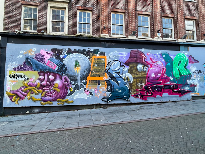
I have come across Boaster twice before at Upfest, and remember really liking his surreal work. This piece is a belter, spelling out BOASTER with individual mini-pieces for each letter. The B and the O are both outstanding in their own right, let alone the rest of the letters. It is such a pleasure and a privilege to be able to visit other towns and cities in England and to enjoy their culture, architecture and of course street art. The best bit is that I hadn’t studied the street art scene in Nottingham, and that each piece I found was a super unexpected bonus. Bravo Booster!
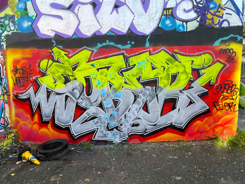
I will never be able to keep up with Klashwhensober’s prolific presence around Bristol. Not only does he paint whenever he gets the opportunity, he also paints at all the regular spots and some of the out-of-the-way places too. I’m not sure I have seen him occupy this particular wall in Dean Lane before and it didn’t last for very long, so I am pleased I captured it when I did.

Without a doubt, this is one of Klashwhensober’s better pieces and he has smashed it on a premium wall and it doesn’t look in the slightest bit out of place. The bright yellow and grey letters stand out beautifully on the contrasting orange/red background. Great fill patterns and drop patterns too and the finishing is pretty much on point too. A great piece from Klashwhensober.

Having been so prolific earlier on in the year, Mr Klue is going through one of his lean periods, and it can be quite a struggle finding anything new by him. This has always been the way with Mr Klue who is a ‘peaks and troughs’ kind of artist.

This piece adorns the end of a ramp wall at the skate park adjacent to Horfield Leisure Centre – a place I used to visit frequently when our daughter was learning to swim. Mr Klue has a great eye for his colour palettes and doesn’t disappoint with this KLUE piece. The letters feel a little squashed, and I think that the height of the wall has cramped his style quite literally. It is, however, always great to find anything from this unusual abstract graffiti writer.
.
The brightest cold moon
in a sea of blackened sky
train to Manchester
.
by Scooj
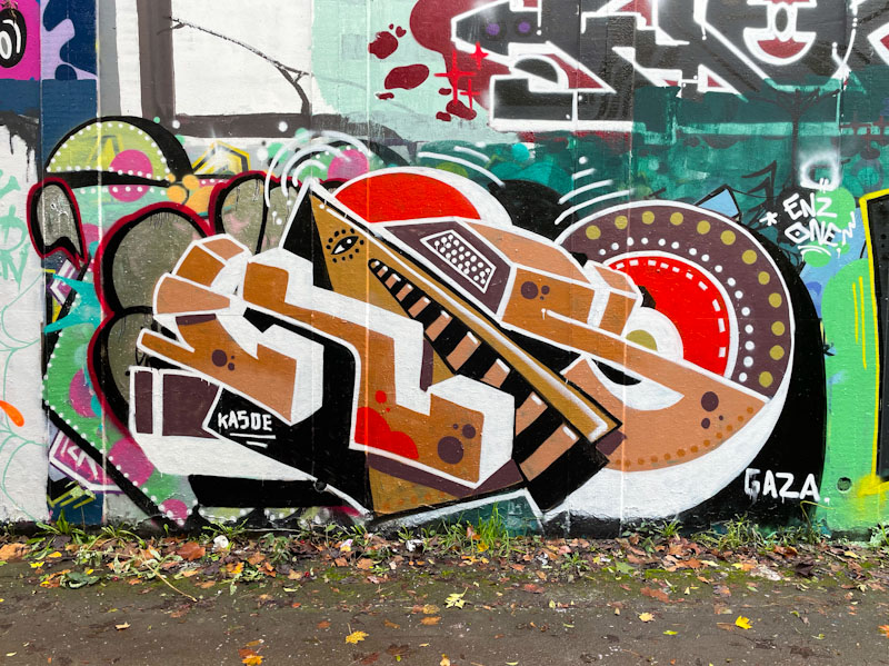
What an absolute treat. Gatoloco, who is an occasional visitor to Bristol, has absolutely knocked it out of the park with this outstanding piece of writing. The letters spell KASO, he appears to have dropped the ‘E’, but maybe that was all he could fit into the space.
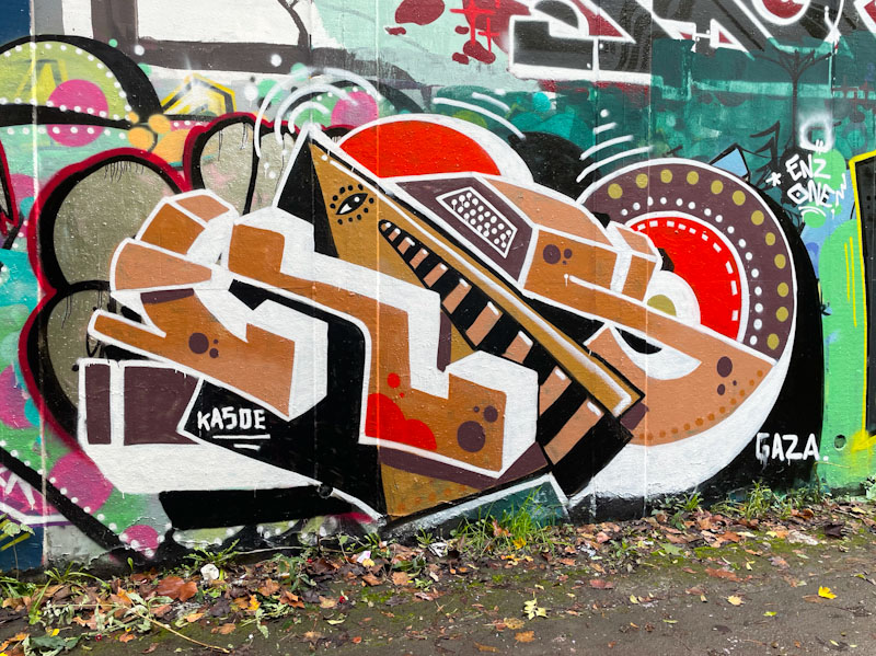
I think that Gatoloco might be my favourite writer outside the city of Bristol. He brings so many design elements into his work, without it looking busy or fussy. I love the stripes on the letter ‘A’, a theme he has adopted in other recent pieces (a quick squint at his Instagram account revealed). The piece can be roughly dated, by the shout-out to Gaza. Fine work from the visitor.


