
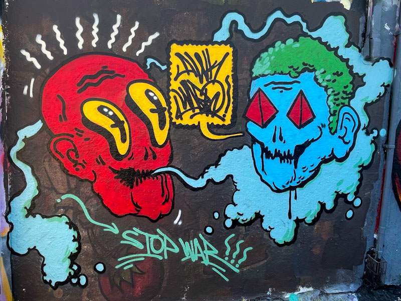
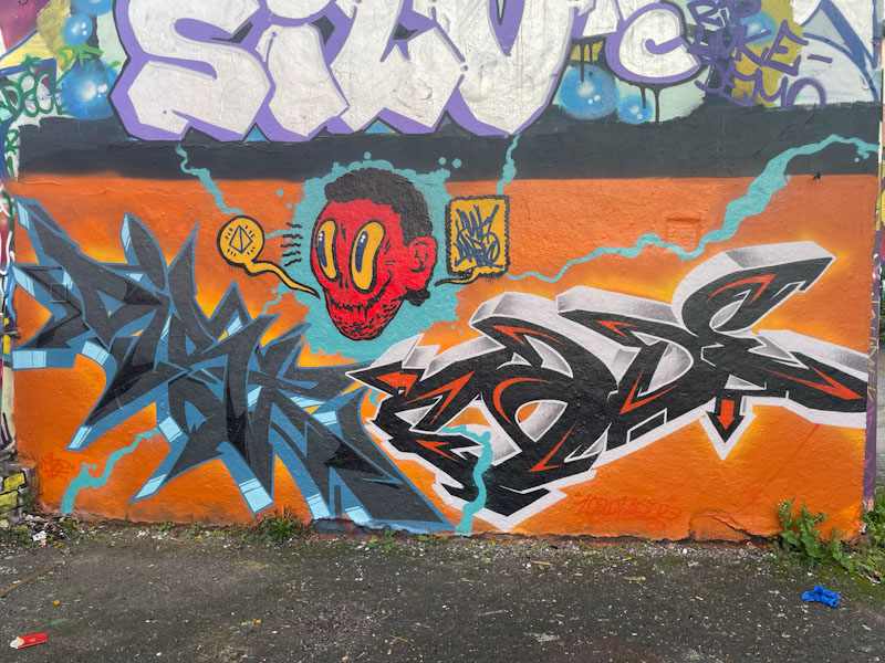
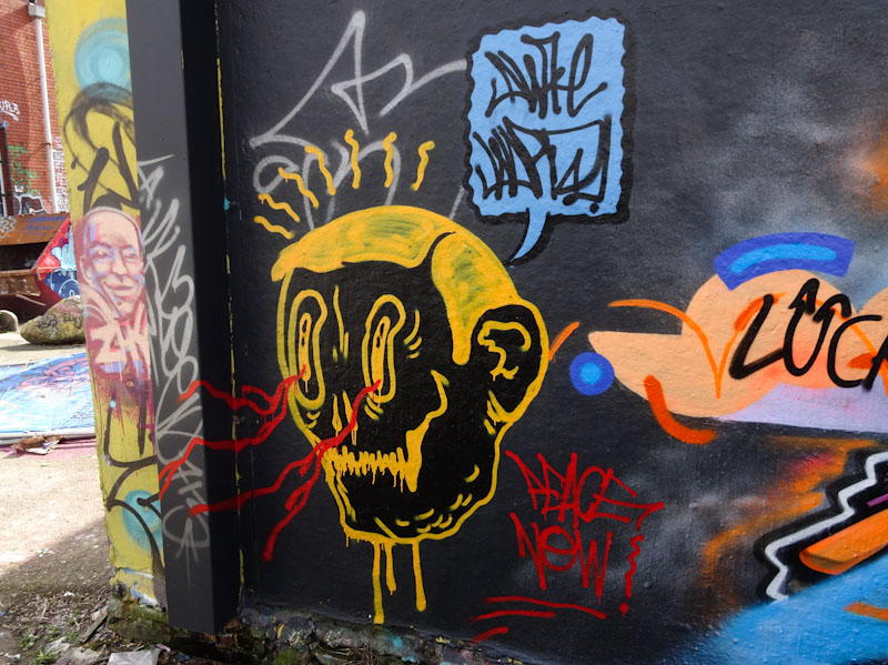
A gallery of fabulous character faces from Bristol artist Awkward.
Instagram: @awkward_uk
All photographs by Scooj


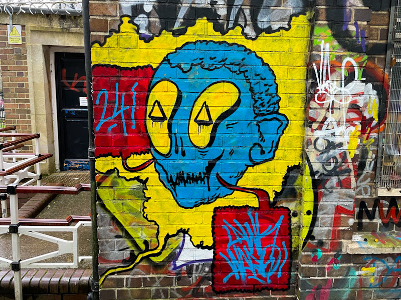


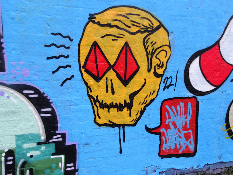
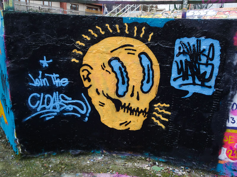
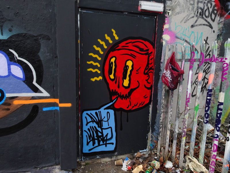
A gallery of fabulous character faces from Bristol artist Awkward.
Instagram: @awkward_uk
All photographs by Scooj

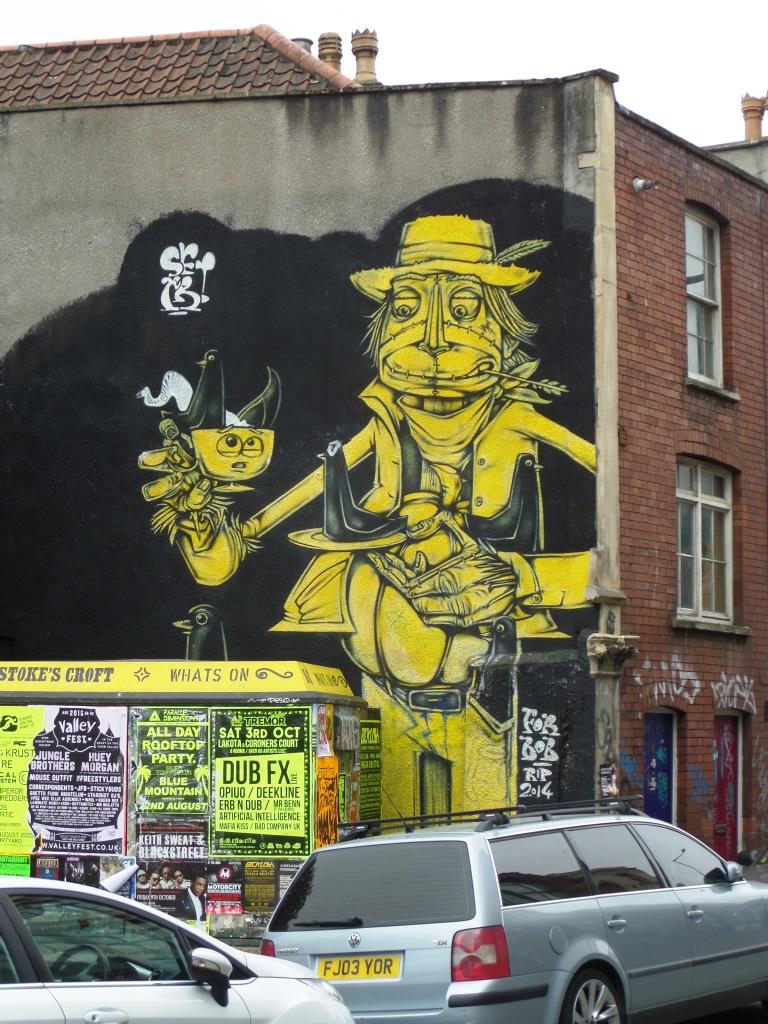
Turbo takes an awful lot of punishment. This little corner of Stokes Croft represents the heart of Bristol rebellion. Occupied at various points by the homeless, addicts, drunks, revellers, artists, tourists, the curious even. It is a spot impacted by footfall, fires and tagging. For many years, a beautiful Sepr scarecrow mural loomed large on the end wall but over time it has degraded, so up steps the hero of the day, Sepr, ably accompanied by 3Dom to refresh the wall.

Sepr has stuck quite close to his original piece, sticking with the literal scare crow idea painted in a clever contrasting black and yellow two-tone colour scheme. A troupe of performing mice accompany the crow, who is drinking out of a ‘Bob’ mug.

3Dom has done all of us a great service in painting the utility box with one of his magnificent symmetrical radiating, organic pattern pieces. This utility box is usually festooned with hundreds of peeling fly-posters that add to the general untidiness of the spot. I’m sure it won’t be long before we can no longer see this beautiful splash of colour. Beautiful, witty, charming and just what the spot needs.
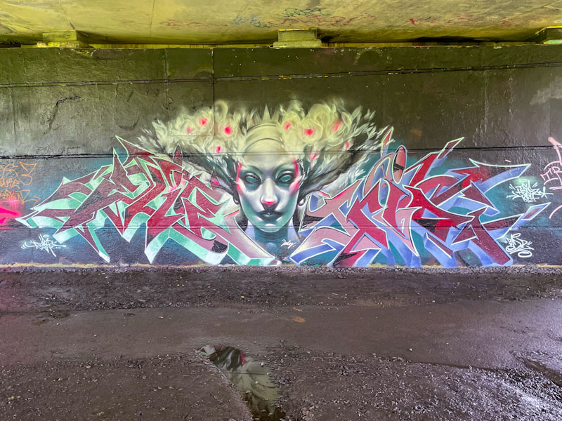
This extraordinary collaboration from Dibz, Jody and Fade, in my view, approaches graffiti/character combination perfection, and I feel that the more I say about it, the more I risk devaluing it. This piece, is adjacent to an earlier collaboration by these three which I haven’t yet had the space to post…
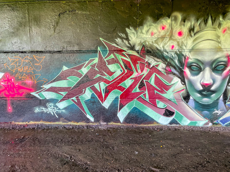
The classic triptych begins with some stunning writing from Dibz with an outstanding deep 3D drop shadow, full of shades creating loads of depth. There are some nice dark highlights in the corner of some of the letters too.
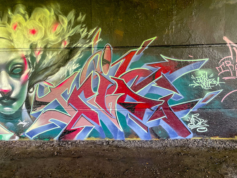
Bookending the central character on the other side is some writing from Fade which closely mirrors Dibz’ writing. The main difference between the two is the colour of the drop shadow. Their work is deliberately merged into one.
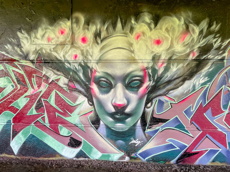
Arguably, the star of the show is the portrait piece from Jody in the centre. I don’t know what it is that makes this one so special, maybe it is the colours, maybe it is the writing either side, I just don’t know, but it is truly outstanding and captivating. The portrait is full of mystery and power, with the flowing hair and wispy flowers providing plenty of movement. This is really great work from the three. How often have I said that over the last year or two?
.
Season finale
it would take a miracle
I’ll hold out for one
.
by Scooj
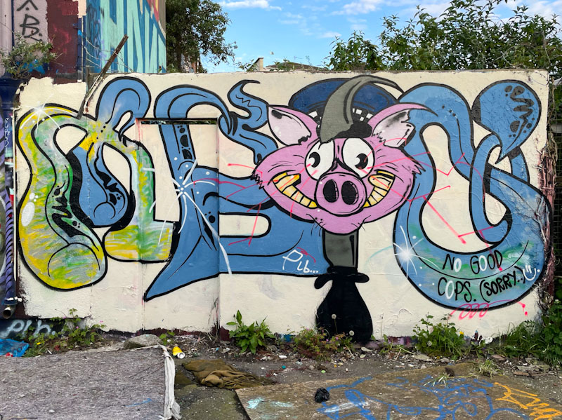
I had to return to this spot to get some decent photographs of this unusual piece by Taboo, as the first lot were covered in shadows, but that is how it works. I work on the principle of always taking pictures of a new piece, whatever the light conditions, because it could be tagged or overpainted within hours. If I get a second chance to take better pictures, then that is a bonus.

Taboo has had quite a quiet period over the last six months or so, so it was good to find this one on the Cycle path. In his unique antistyle graffiti writing, Taboo manages to combine his unusual letters with characters, in this case a kind of grinning pig. I suspect the pig reference relates to the police, because he has included the words “No good cops. (Sorry)” which I guess is a polite way of saying ACAB. Looking forward to seeing more from Taboo as the summer unfolds.

This container, behind the Watershed, is one of the more curious spots in Bristol. I am not sure who owns the container, nor do I understand quite why the council has given permission for it to be sited here, but here it is and fortunately for us, it has played host to a series of high-end commissions over the years. Inkie replaced the Paul Monsters piece that had been here before a little while back, but I have only recently photographed it.
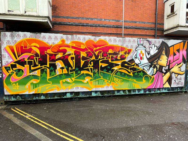
There are several Inkie elements that have come together in perfect harmony in this combination piece. The print background runs through the whole piece and sets a regular patterned backdrop. Of course the distinctive writing in very Inkie colours is as good as you’ll see and to the right is one of his beautiful Art Nouveau style characters. The only board of the piece that leaves me scratching my head is the cartoon-style spray can, which doesn’t look like an Inkie piece at all and doesn’t quite fit with the rest of it.
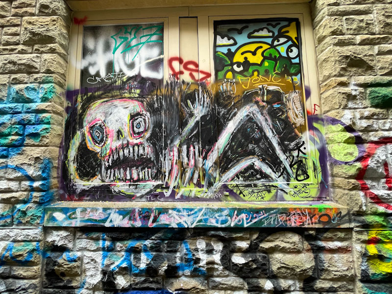
The work of Alex Arnell, in my mind, verges on the grotesque… not his artwork, I hasten to add, but his subject material. Although he operates out of Brick Lane in London, he appears to have visited Bristol on a couple of occasions, and has left behind a gallery of characters in Leonard Lane.
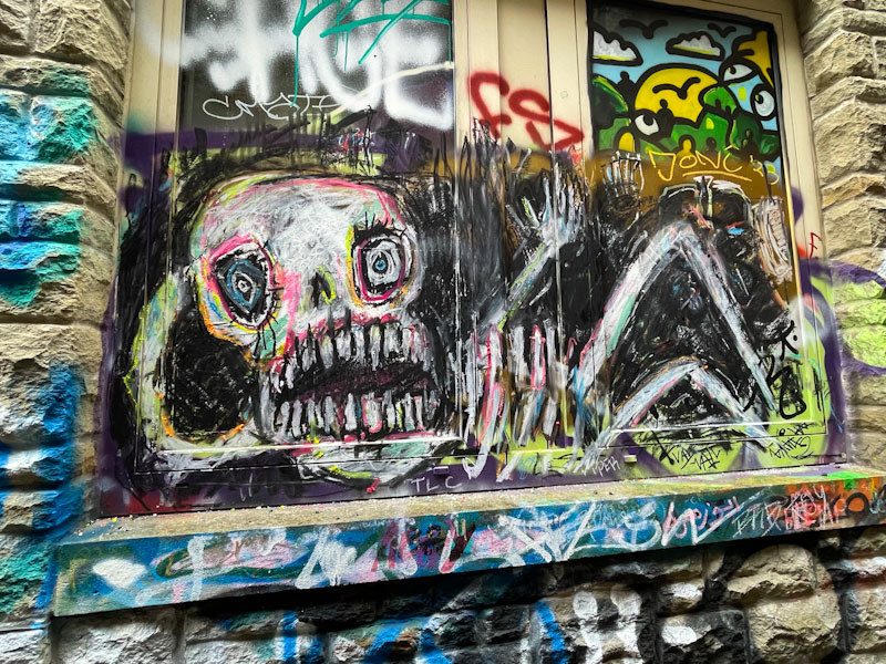
Alex Arnell’s style is utterly unique and could be interpreted as scribbles that ‘anyone could do’. That may or may not be true, but the point here is that he does it, and he does it really well. I like deliberately naive artwork because there is an authenticity about it, and although a cultivated look, it is also honest and unpretentious – although there might be those that consider it grossly pretentious. The skeleton is rather scary, not because it is a skeleton, but because there is threat and alarm in his expression. Crazy stuff, but most welcome.

The maxim ‘you can never have too much of a good thing’ is a variant of the phrase ‘you can have too much of a good thing’, and the two have very different meanings. In this instance I am adopting the former in relation to the number of recent pieces painted in Bristol by the London-based Roo.
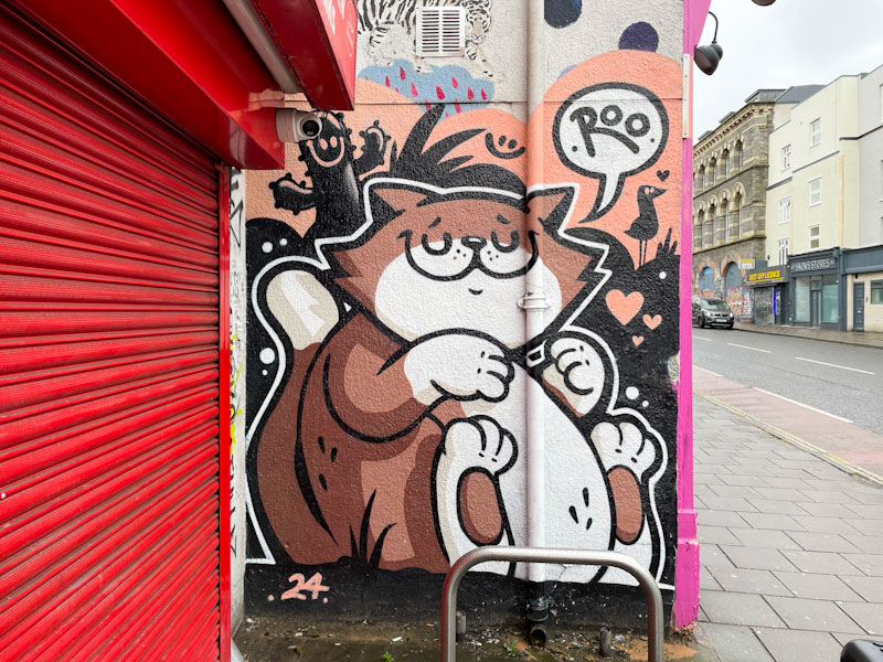
It has been a very long time since this wall last had anything meaningful on it, and Roo has filled the space perfectly. Her precision and apparently simple design actually underplays her skill in creating such a tight piece. The character is bound to strike a chord with cat lovers, and the black ‘naturescape’ complements the piece nicely. Great work from Roo.
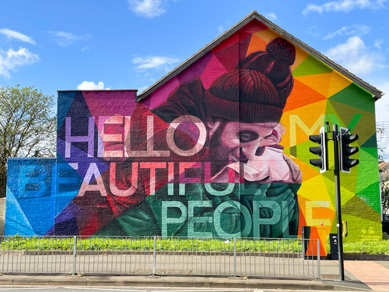
My work trip to Peterborough in April had spin-off benefits, as do all my work trips when I am ‘on tour’, in the form of exploring a new city, finding interesting doors and sniffing out graffiti and street art. I cannot visit a new place without having my extended radar on full alert for opportunities to find things that interest me – some might call it marginally obsessive, and they might be right.

Nyces (Nathan Murdoch) is a bit of a celebrity in his home city, and this piece sparked a series of local newspaper and TV features about the artist, such as this one in the Peterborough Telegraph. The colourful piece is not only wonderfully painted in a patchwork of colour and geometric segments, it also has an uplifting message for the heavy traffic that passes by saying “Hello my beautiful people”. Nyces is a big graffiti fish in a small bowl.
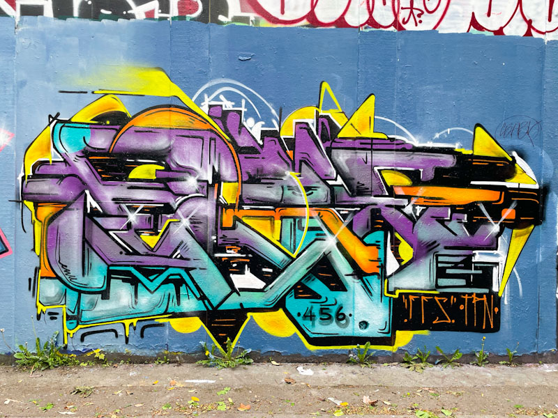
There are one or two artists that are on fire at the moment, and I am really struggling to keep up with their work, which vexes me a little, because I want to share it all – I’ll need to find a way of sharing moor, possibly through mini galleries or something like that. Kid Krishna, has been going nuts lately, and I must have seven or eight recent pieces in my archive, all waiting to be posted.
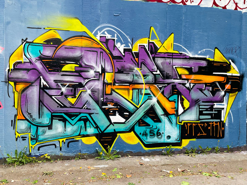
This is a bright and colourful piece of graffiti writing spelling out CRIE, which you can see more clearly in this one than in some of Kid Krishna’s other pieces. There is so much intricate work, and a flow that runs through the letters both in design and colour. Kid Krishna’s work always comes across as quite organic, chaotic and unplanned. I don’t know if that is the case or not, but it is also consistently good.


