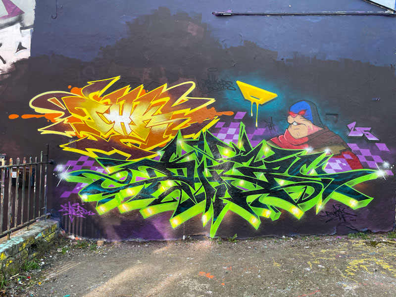
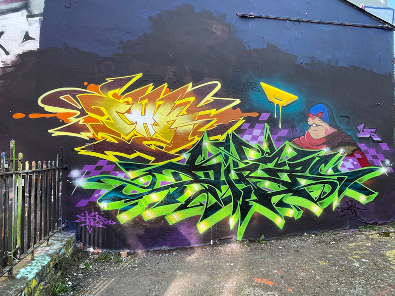
Although Dibz and Fade have had a reasonably quiet winter, they have still managed to get out frequently enough to collaborate on some very impressive walls. This wall is one of their favourites, and because of its shape requires them to paint closer together than some of the other longer walls they like to paint.
Dibz and Fade, Dean Lane, Bristol, March 2025
In this piece, they each get to showcase their style and technique, using different base colours. Stepping back you can see that Fade’s work, in yellow, has a slightly softer finish, with more curves, than the slightly less forgiving angles on the green writing by Dibz. I don’t know too much about the character in this piece, but I am guessing both artists contributed to it. Naturally there is lots more to come from these two.
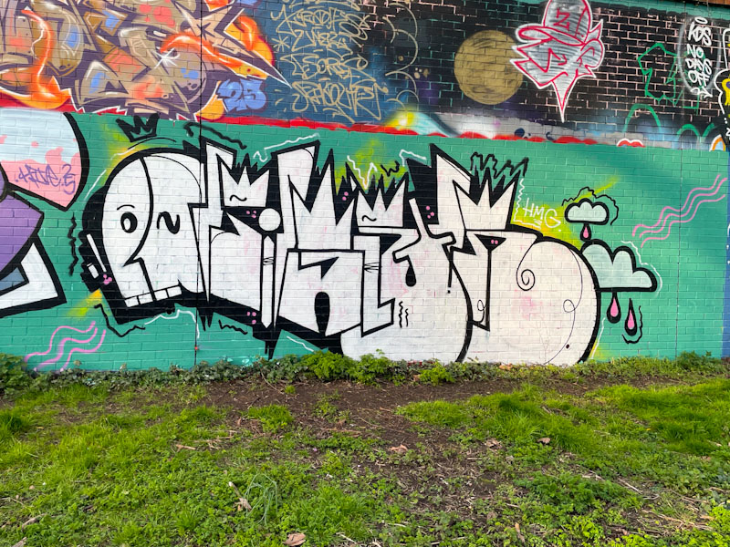
Although he doesn’t appear to paint all that frequently, Dirtygypo has an instantly recognisable style. I have tried on several occasions to work out what his letters spell, and I have come to the conclusion that they say DIRTY, although I have little confidence in this. I guess I’ll just need to meet him while he is painting sometime.
Dirtygypo, Sparke Evans Park, Bristol, March 2025
The colour scheme adopted by Dirtygypo for this piece is elementary, but I have to say that the jade green background colour works very well indeed with the white letters. There are a couple of splashes of lime green and yellow around the edges that add some extra interest. The letters are in the standard format that Dirtygypo uses and includes a stylised face at the start. Really nice graffiti writing, with some mystery sill to solve.
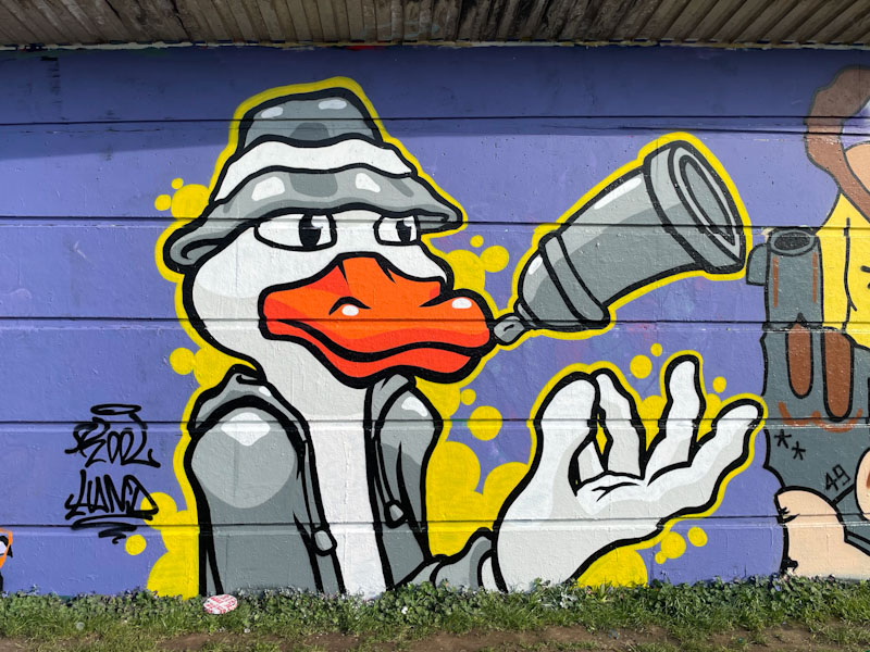
Kool Hand is a bit of an unsung hero on Natural Adventures. I kind of take it for granted that he will turn out regular pieces in his unique no-nonsense cartoon style, but that smacks of complacency on my part, and I feel I need to ‘big him up’ a little, because he deserves higher recognition of his work.
Kool Hand, Cumberland Basin, Bristol, March 2025
This is a lovely, clean and tidy character piece featuring a cartoon duck tossing a spray can in the air. Wearing a bucket hat, the duck in a coat has a friendly demeanour about him and seems to be having a good time. The piece is set on a solid purple background, and the superb yellow border bleeds out in countless places to form bubbles. A well conceived and executed piece from the fabulous Kool Hand.
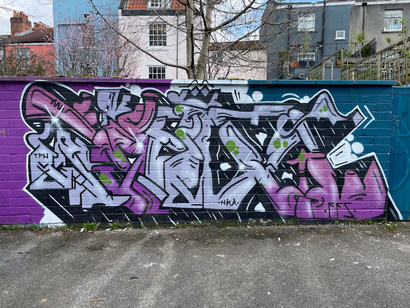
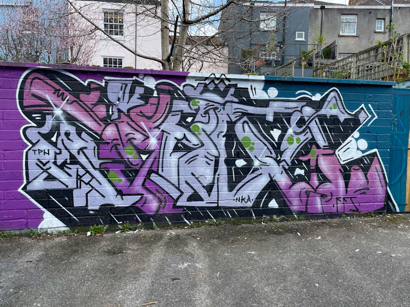
I rarely visit Picton Lane, so when I do, there is usually something new to find, and this piece from Kid Krishna made the trip worth it. Kid Krishna is on something of a roll at the moment, and he is definitely a bit of a ‘peaks and troughs’ kind of artist, but he is without doubt peaking at the moment.
Kid Krishna, Picton Lane, Bristol, March 2025
The soft colour palette is easy on the eye and sits nicely on the purple/blue background. As ever, his letters spell CRIE, although I find it a little difficult to see in this piece. His letters are made up of lots of shapes, many of which almost morph into something recognisable and then morph away again. Unusual, clean and tidy work from a superb artist and nice man.
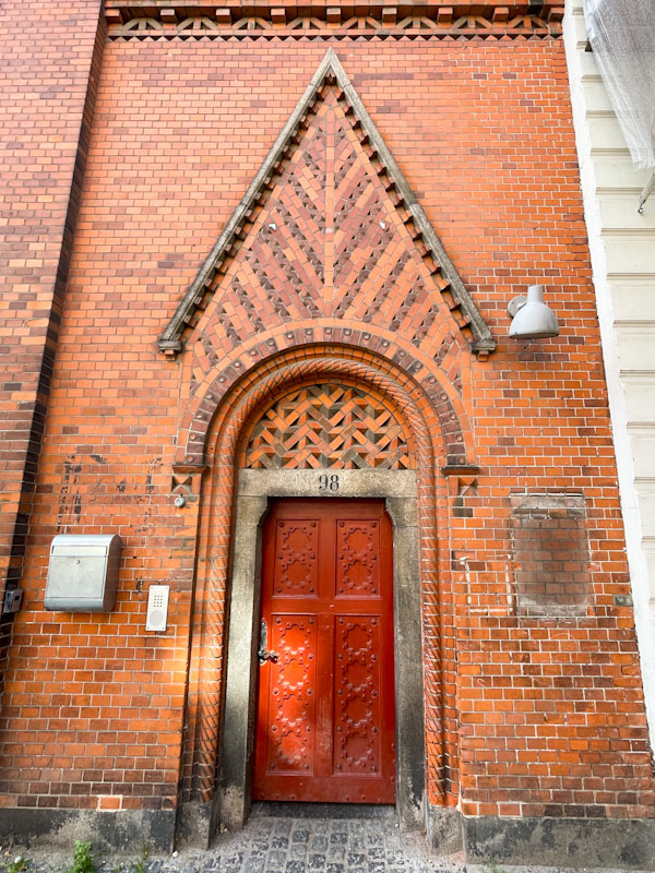
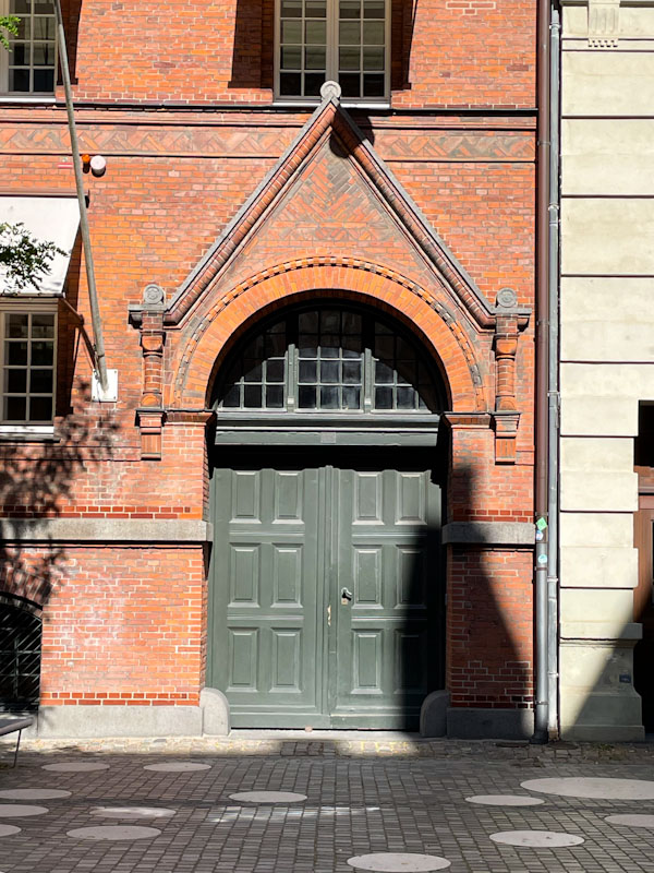
Doors 301 – Copenhagen, Denmark (part I), September 2024
In January last year, I turned 60, and have to say I wasn’t then, or indeed now, overjoyed about this landmark. Being eligible for a senior railcard is scant compensation for getting older and finally coming to terms with the fact that many of the things I wanted to do are now out of scope.
But, when old doors close, new ones open, and my birthday present from my (then 89-year-old) mother was a weekend break to a European city of my choice. I chose Copenhagen because I have never visited Scandinavia, it is not very far away, and you can fly from Bristol Airport. I had also heard many good reports about the Danish capital from friends who had been there before.
Getting there was incredibly straightforward and fast, and because my mother has limited mobility, we got through the airport security etc, in minutes. On arrival, the welcome was extraordinary and warm, from airport staff to train attendants. We decided to get a train from the airport to the city centre, as our hotel was next door to the Station, and it couldn’t have been easier. The train was clean and comfortable – it felt like a treat, but that probably tells you more about the appalling state of rail services in England.
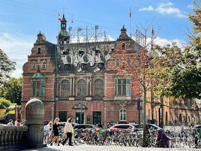
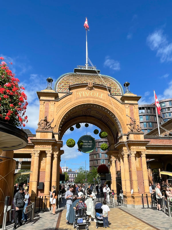
Our hotel, as well as being adjacent to the station, was also very close to the Tivoli Gardens, the world’s second-oldest theme park (I am informed that the oldest one is also in Denmark). We headed in that direction on our first day and jumped the massive queues, by taking the restricted mobility entrance, and I wheeled my mother about the park for the rest of the morning, which she thoroughly enjoyed – I told her not to get too used to it!
I left my mother at the hotel for the afternoon, and went on one of two epic walks through the city hunting down street art and of course, doors. I got a little carried away, and I’m afraid this might be a very long series of doors, but worth it, I hope. Enjoy this first selection of doors from Copenhagen:
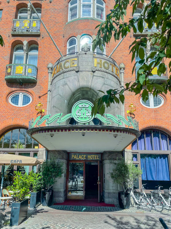
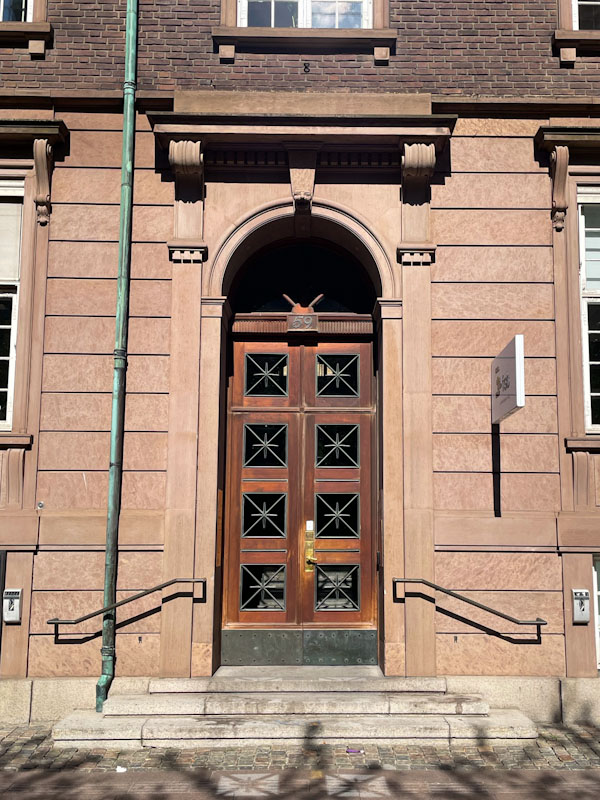
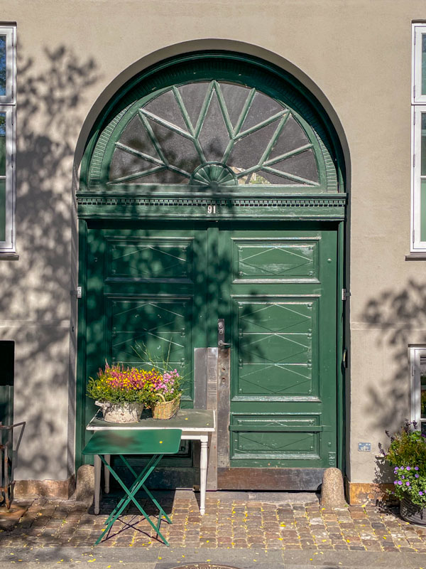
Three doors on the brick building which is on the western edge of Tivoli Gardens theme park, Copenhagen, Denmark, September 2025Front gateway to Tivoli Gardens, Copenhagen, Denmark, September 2024Large arched doors to the beautiful brick-built Copenhagen City Hall, Vestervold, Copenhagen, Denmark, September 2025Glass doors and grand entrance to the Palace Hotel, Vestervold, Copenhagen, Denmark, September 2025Large double doors with ironwork window panels, Vestervold, Copenhagen, Denmark, September 2025Superb green double doors and large fanlight, Vestervold, Copenhagen, Denmark, September 2025Beautiful red doors and brick surround, Galerie Ellen Frilling, Copenhagen, Denmark, September 2025Green double doors, Vestervold, Copenhagen, Denmark, September 2024
On looking back at these doors, I am reminded of the outstanding architecture and red brickwork that runs throughout the city. I am also reminded of the gorgeous weather we had for the few days that we were there. More next time, but until then may I wish you a happy weekend.
If you have made it this far, you probably like doors, and you really ought to take a look at the No Facilities blog by Dan Anton who has taken over the hosting of Thursday Doors from Norm 2.0 blog. Links to more doorscursions can be found in the comments section of Dan Anton’s Thursday Doors post.
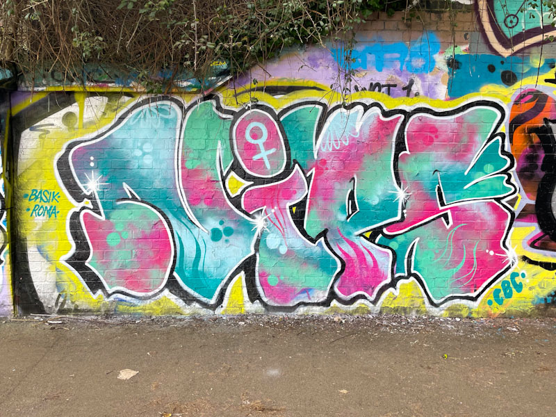
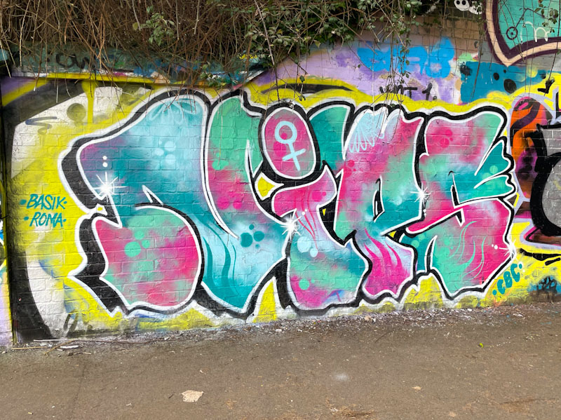
Aha! There is a certain consistency and reliability with Nips’ pieces that I am really attracted to. Her letters tend to be similar in shape from piece to piece, but it is in her fills where she really excels and shows off what she can do.
Nips, St Werburghs, Bristol, March 2025
Set on a fairly elementary yellow backdrop, the letters NIPS are filled with a stunning patterned mix of pinks and blues, with some great designs and reversed out spots. The eye is drawn to the female symbol in the dot of the ‘i’, which is assertive and proud. Nips has included a couple of nice shout-outs to Basik and Roma too. I hope we see plenty more of Nips in 2025.
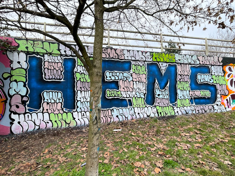
A major feature of the resurgence of Hemper recently has been the way he has experimented and embraced a whole raft of different styles. He has always painted original pieces, full of imagination, but I am not sure that I have seen such variation in letter shapes and overall appearance before.
Hemper, M32 roundabout, Bristol, February 2025
This large and unusual piece spells out HEMS, obviously, but is also surrounded by a subtly coloured background of mini ‘Hems’ in a kind of bubble graffiti style of writing. This must have taken quite a while to paint, but the overall effect was worth it. Lots more to come from an artist who is on a journey of rediscovery.
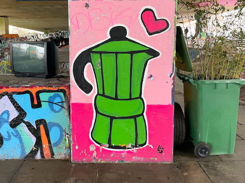
One of the great pleasures over the last eight or so months has been watching the development of Lis (formerly Le Imposter Design), from an occasional line-drawing artist to a full-on and busy spray can street artist. Her transition has been swift, but he has held onto some of her original techniques and augments some of her pieces with pens for the finer detail.
Lis, M32 Spot, Bristol, February 2025
This is an unusual study piece on a column in the M32 Spot. There was a tagger a few years ago who used to paint coffee pots like this all over the city, but this is the first one I have seen since then. The piece has a naive art style about it, and is fun to look at, and I wonder if it had a dual function of being a bit of a practice for borders, lines and shading. So much more to come from an artist who is in overdrive.