.
In-box reducing
meetings eliminated
the Mary Celeste
.
by Scooj
.
In-box reducing
meetings eliminated
the Mary Celeste
.
by Scooj
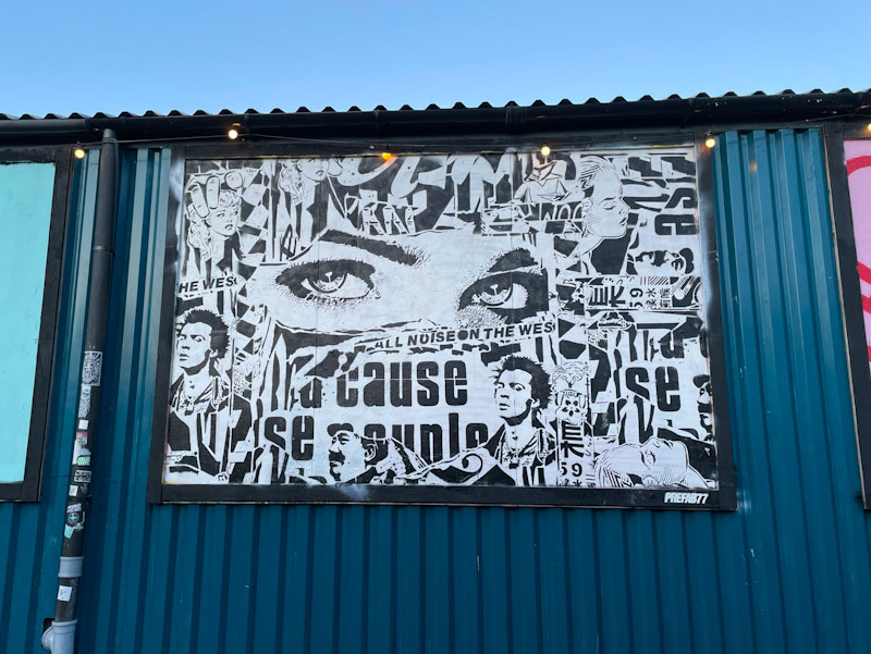
I am not sure that I have come across Prefab77 before, but as a massive fan of the North East band Prefab Sprout, I can’t help liking this artist simply because of his name. In addition to this large piece in Elton Street, Prefab77 also left a smaller one in Leonard Lane, perhaps during a single visit to Bristol.
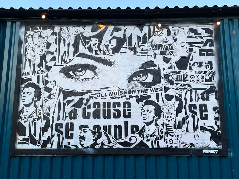
The black and white piece is really clever, looking like a collage of words and images stuck to the wall. It is actually a composite of stencils to create this ‘scrapbook’ appearance. A busy piece with lots to look at, Prerfab77 has brought us something rather special.
It is a funny thing, but when you have been observing and documenting street art as long as I have, you get to notice things that many others simply wouldn’t, and you can pretty much always spot talent and promise from the vast spectrum of artwork and graffiti appearing on our walls daily.
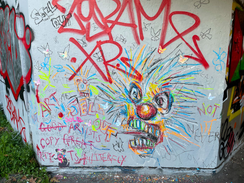
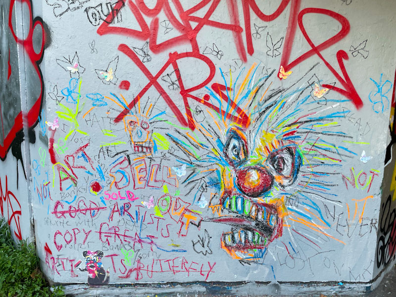
To Many, this piece by Alex Arnell wouldn’t elicit a second glance, but the child-like scribble is a deliberate style that challenges the status quo. One of the indications that this piece is by a capable artist is the shading on the character’s nose, giving it depth, something a child would not do. The grotesque and alarming face is surrounded with slogans and words, and there is even another head that mimics the central character. I couldn’t end this post without mentioning the butterflies that are associated with some of Alex Arnell’s work, and the little Banksy rat that has been given the Arnell treatment.

This is another piece that was painted during the RBF paint jam to celebrate Bnie’s birthday and Vozie’s new baby with a Rugrats theme. It is of course by Desi, who more often writes Veil these days.

This must be one of Desi’s best pieces to date, with every element of the work coming together nicely. I believe that the character was painted by her and if it was, it is the first time I have seen her include a character, and it is brilliant. Her lines are sharp and her fills varied and interesting and one is left with an overall great piece of writing, that sits comfortably with all her RBF friends. Fabulous stuff.
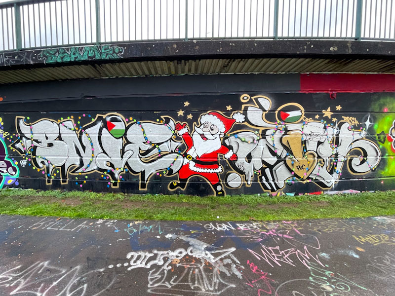
So far this year I have only found one Christmas piece and this collaboration from Bnie and Unity is it. The fabulous duo were painting alongside several other members of the RBF crew during a paint jam in support of the people of Palestine. This piece is absolutely draped in Christmas good cheer.
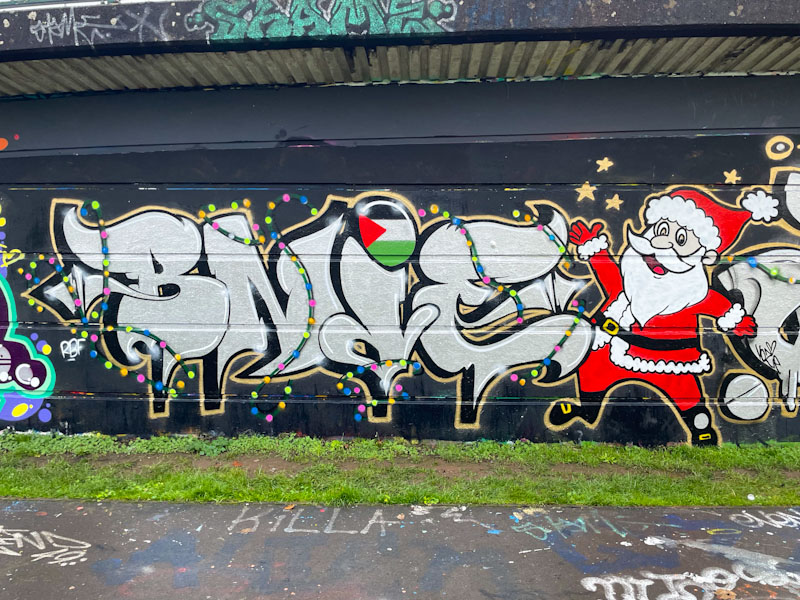
To the left, Bnie has painted her letters in a festive silver colour with a string of Christmas lights weaving in and out of them. The Palestinian flag features prominently and Father Christmas does what Father Christmas does to the right. I think that Bnie painted him, but equally it might have been Unity.
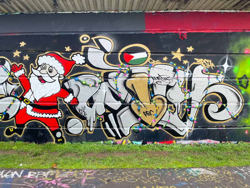
Unity has been visiting Bristol a little more frequently recently and that can only be a good thing as it means we get to see more of her brilliant work. Unity continues the themes and colours that Bnie has adopted, with the only real difference being a splash of gold in the ‘I’ of Unity. Another Palestinian flag indicates firmly that the public mood in Bristol, which this art reflects, is with the innocent people of Palestine, who played no part in the Hamas attack but are paying an unimaginably high price by the Israeli response to it. Let us hope for and demand peace in the region.
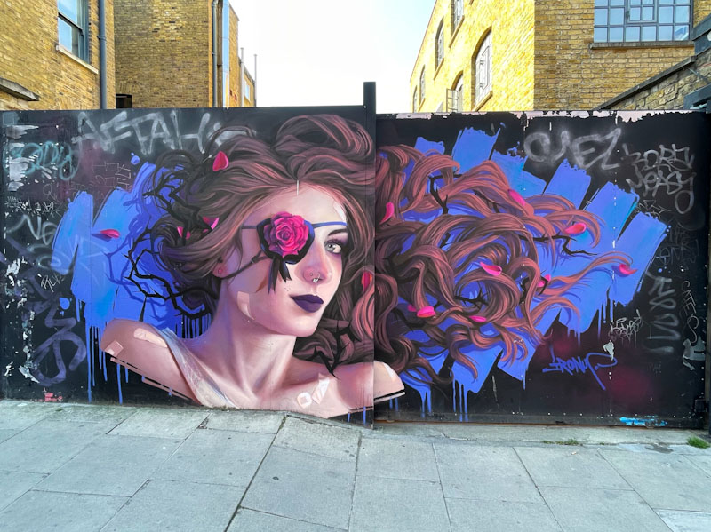
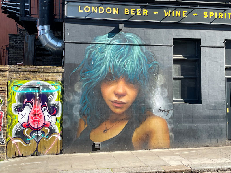
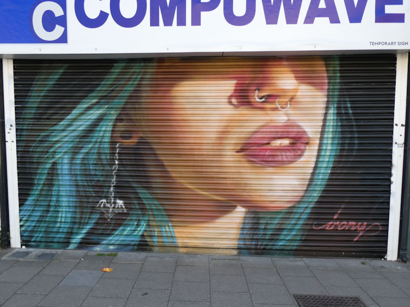
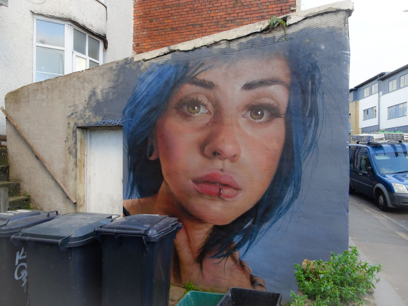
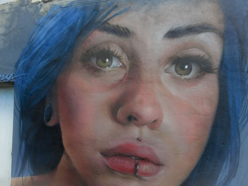
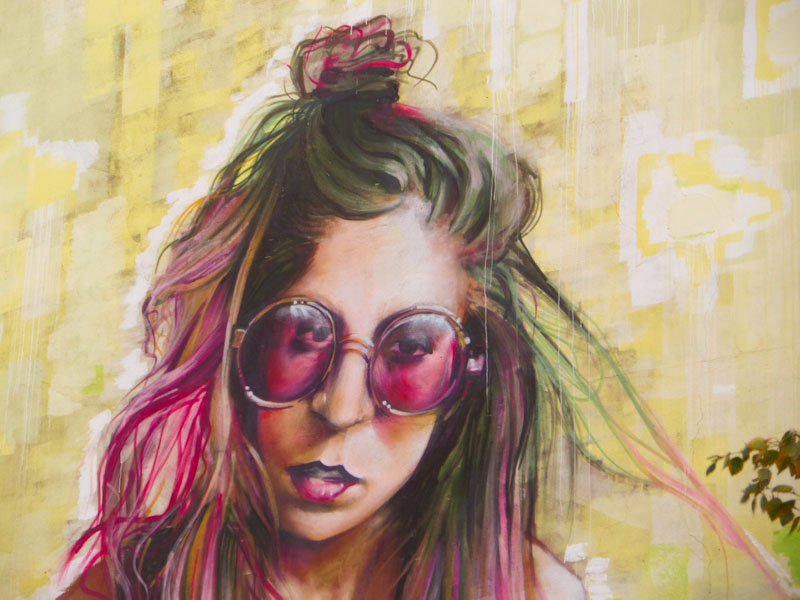
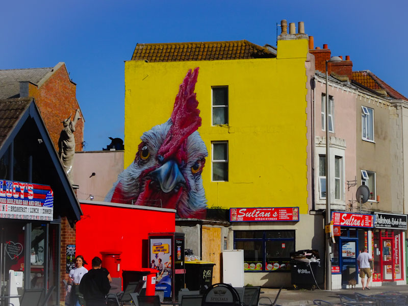
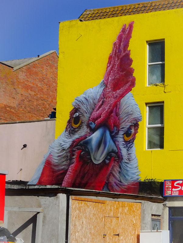
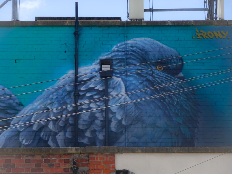
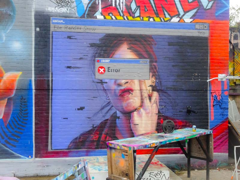
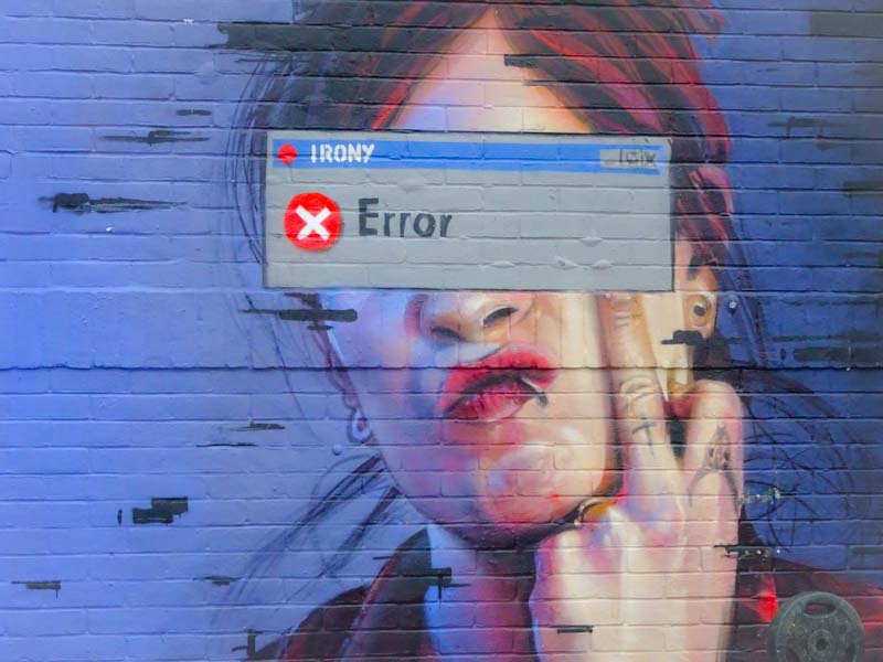
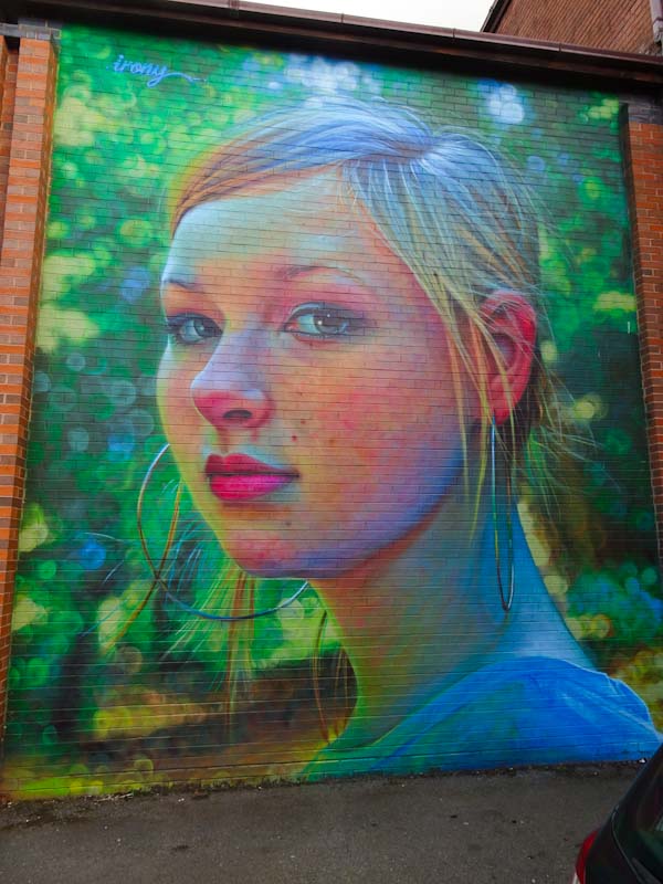
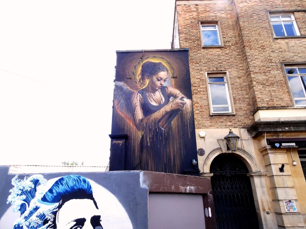
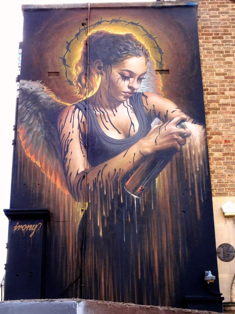
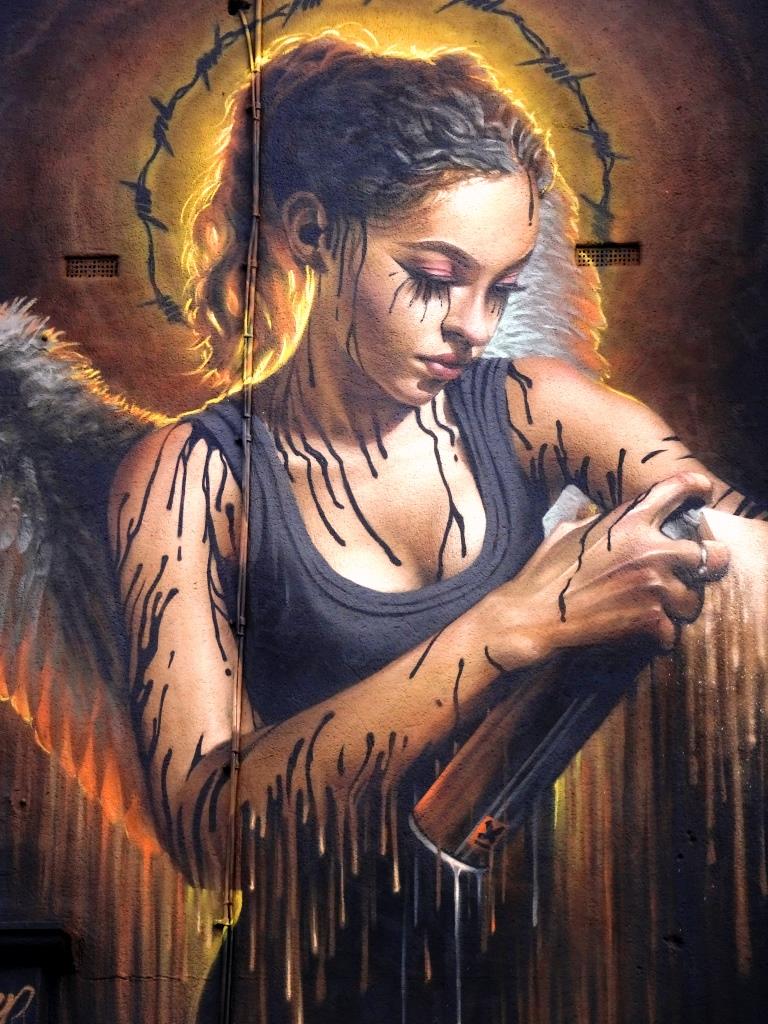
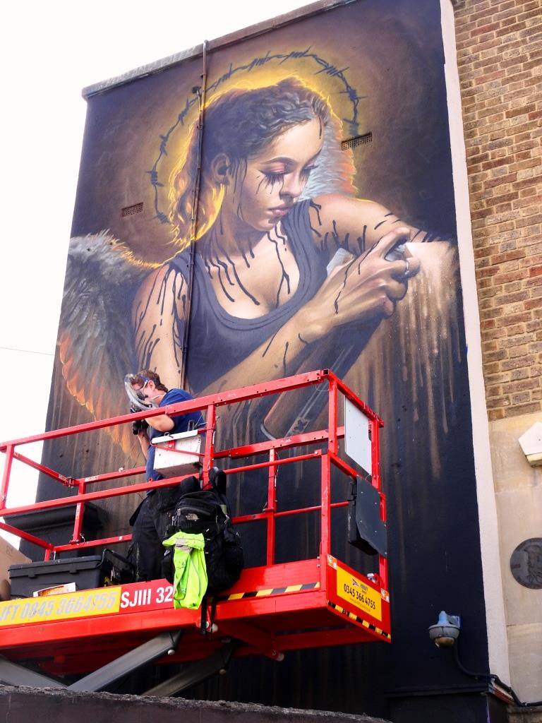
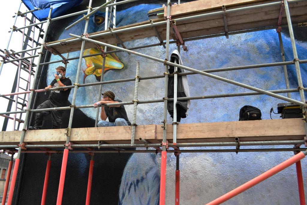
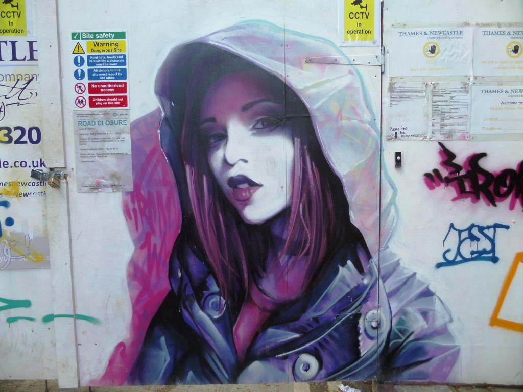
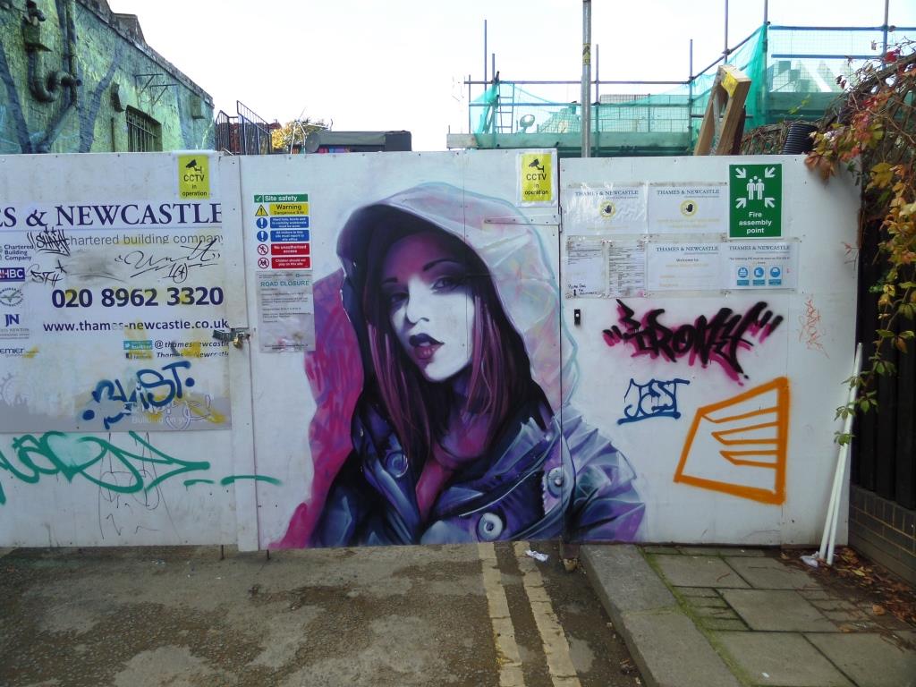
A gallery of extraordinary artwork from the magnificent artist Irony.
Instagram: @whoamirony
All photographs by Scooj


.
Her ten-to-two step
exaggerates her waddle
ponytail swinging
.
by Scooj
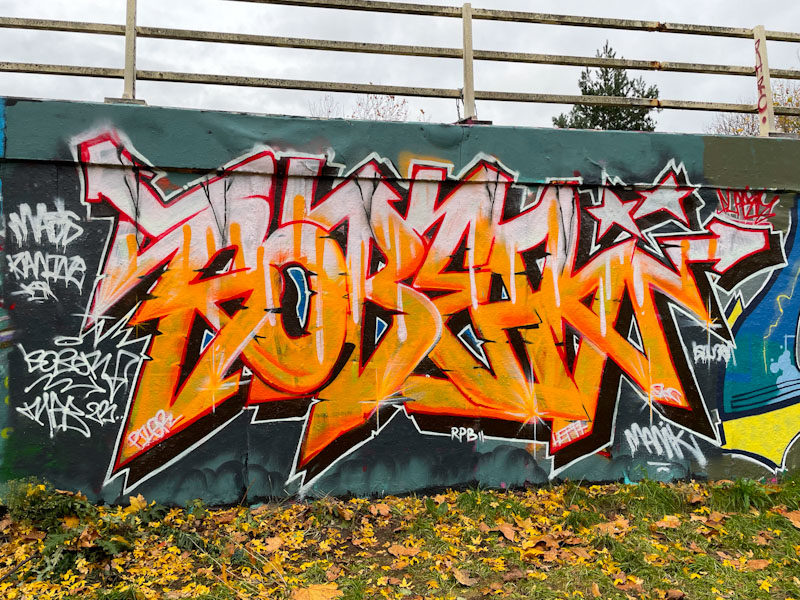
When you see the word ‘various’ for the location in the title of this blog post, you can be pretty certain that it will be a post of Klashwhensober’s work. I feel that the only way I can do him justice is to do a round up of his left-overs each month, such is his high productivity rate. Here are some pieces from November.

All the pieces spell out SOBER, but you can see simply from first inspection that some are more thought out than others and that the execution can be a little variable, probably reflecting Klashwhensober’s attitude and approach with each piece. Klashwhensober’s general development is steady, but it is not linear… meandering improvement might be a better description.
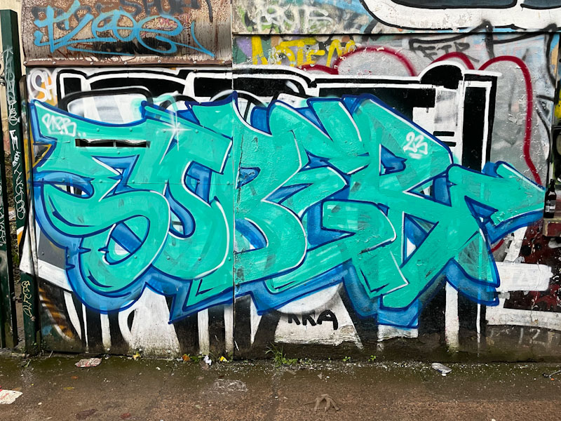
This blue piece is nice enough to look at, and it is clear that it was painted quickly. The paint is thinly spread, which might indicate that it is a bit of a ‘dregs’ piece.

Rounding off the quartet of pieces from November is this chrome piece, which is arguably the best of the bunch, painted down in Leonard Lane. There is more of a sharp feel to this one, with some nice little details and ‘dents’ in the lettering. Have no fear, there is still plenty more to come from Klashwhensober.

One of the last things I would have expected to see in my two-hour wander around Exeter back in October was a collaboration between Mister Samo and Paul Monsters, and yet here it was… a glorious piece of colour, design and creativity.
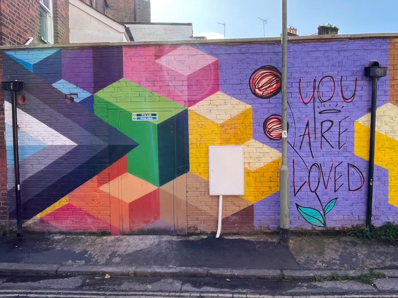
I have a feeling that the piece might be called ‘you are loved’, and there is a great deal of warmth and positivity about the piece, and the styles of the two artists although quite different complement each other perfectly.

I suspect that the two artists know each other through the Upfest festival in Bristol, at which both have painted in previous years, and Paul Monsters works in the Upfest shop and is heavily involved in the logistics of the paint festival. As ever, Paul Monsters’ geometric designs create depth and hard edges, against which the character forms by Mister Samo stand out.
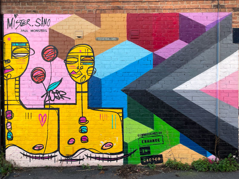
I love Mister Samo’s work, which is highly designed but at the same time simple and clean. The characters in Mister Samo’s work look like sophisticated doodles, and even though simple, convey a lot of emotion and charm. A real treat and fabulous collaboration from these two excellent artists.
.
Gifts by mail order
uncomfortable new norm
planning a real shop
.
by Scooj


