
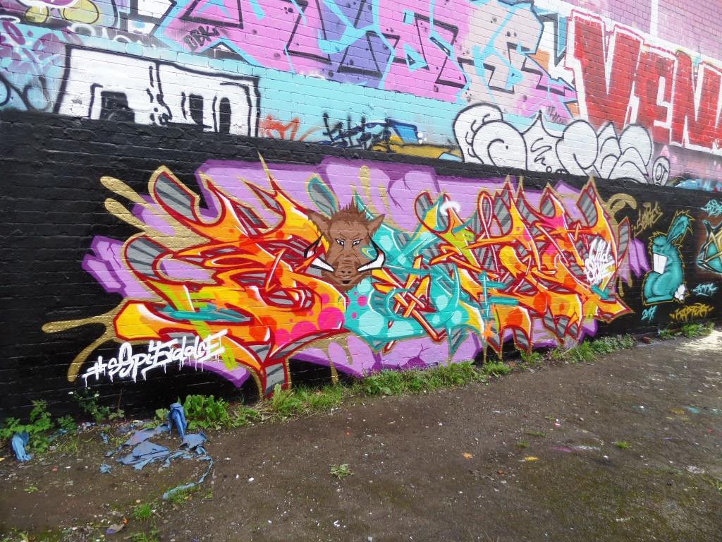
A gallery of outstanding graffiti writing and characters from Bristol artist Soge
All photographs by Scooj


A gallery of outstanding graffiti writing and characters from Bristol artist Soge
All photographs by Scooj
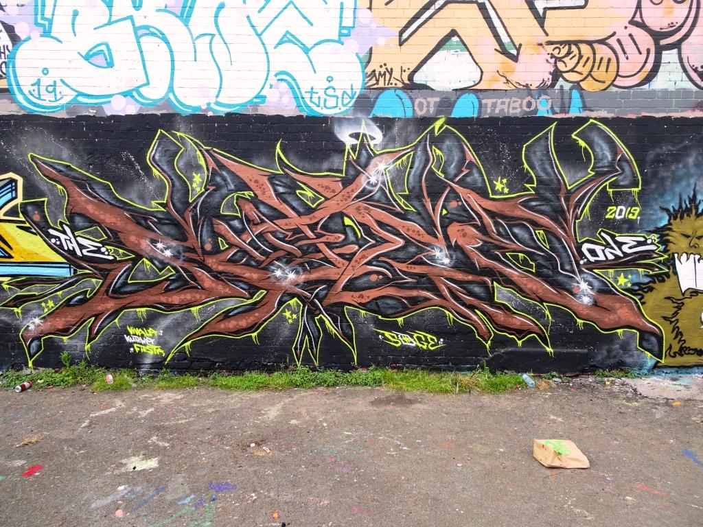
There is little more I can say about this piece other than it is utterly outstanding. Of course, I can’t leave it like that, so I’ll give you a bit more background. I am guessing it is a commission, because it is on a business wall, but what a commission. The artists are Smak, Sled One and Kosc, and they have smashed this wall out of sight. The only downside is that it is an absolute beast to photograph on account of being in a narrow lane and on a curved wall.

From left to right the artists are Kosc, Smak (SM), Sled One and Smak (AK) and they have used a wonderful combination of black red and grey colours. Decay of old would be in his element. Kosc has painted an amazing photorealistic portrait with a bit of a glitch in it and has spelled out his name. This is simply magnificent. On its own this one third of the piece would be worth the trip.

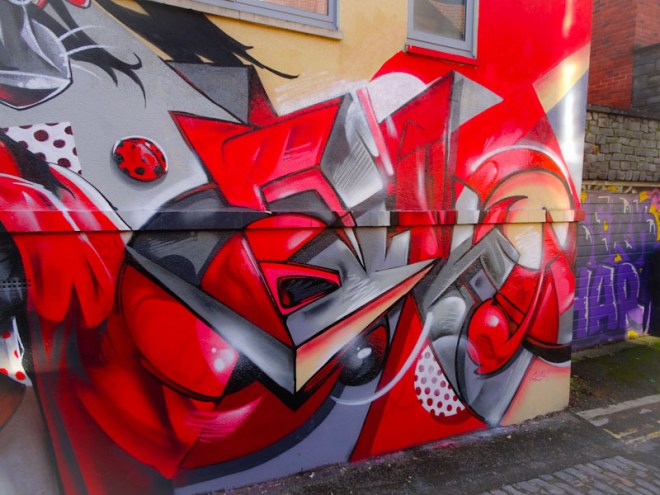
Smak has spread his letters either side of the Sled One piece with the SM sandwiched between Kosc and Sled, with the AK rounding off the piece on the right-hand side. As you would expect from Smak, the letters are flawless and the design simply brilliant.

Taking up centre stage in this three-way collaboration is a celebration of the wolf from Little Red Riding Hood. Sled One is the king of crazy creativity, and here the wolf is chewing on a spray can, which is squirting paint on one of two ladybirds in the piece. Look closely at the picnic basket, and you might just see a hint that the wolf hasn’t gobbled our heroine up but has instead squished her into the basket.
This is a glorious collaboration from three of Bristol’s best street artists. get yourslf down there.

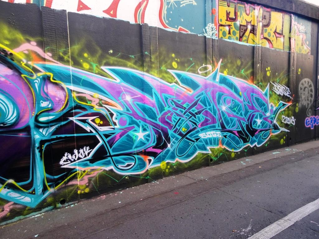
It is those PWA boys again working their magic, this time along the M32 cycle path. Always happy and always brightening up our lives, and let me tell you our lives need brightening up these days.
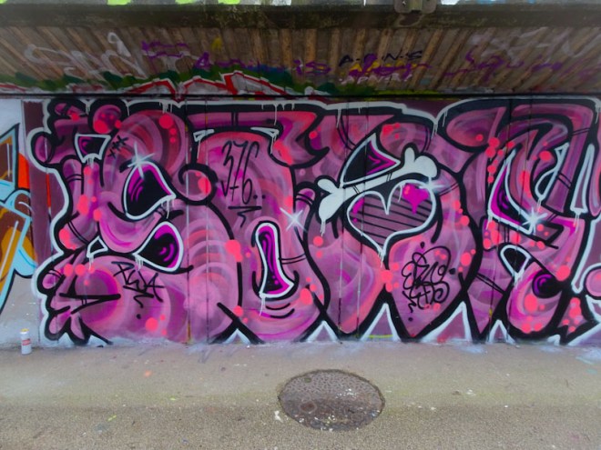
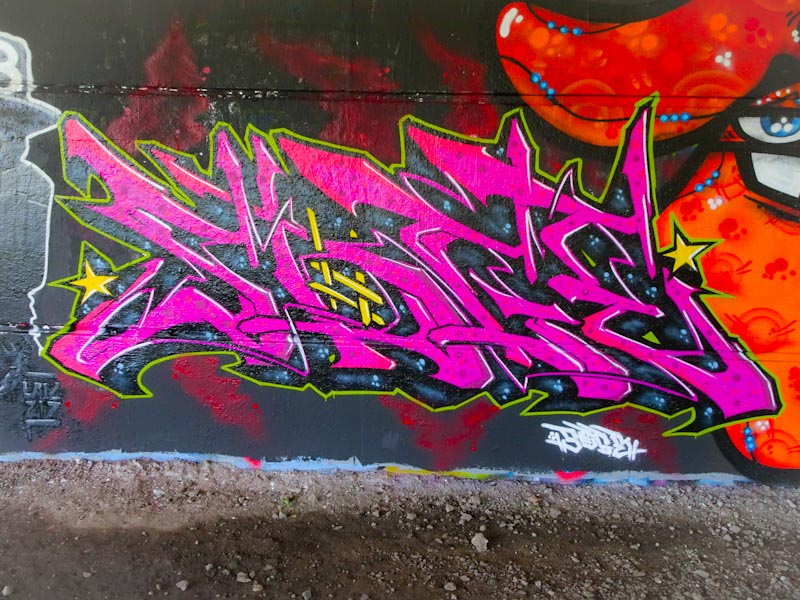
Soap and Face 1st tend collaborate by painting their separate pieces joined by a colour palette and some decorative features. This time thy have gone for pinks and purples and Soap, spells out SOAP with some lovely fills and a rather fetching bone across the A.
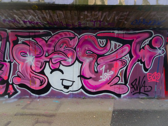
Face 1st brings us a laughing girl with FACE for hair, and carries across the same colours and some similar fills. This is yet another great collaboration from this pair.
.
Going back in time
watching a TV series
going back in time
.
by Scooj
There are a great many artists in Bristol that I could label ‘old faithful’ and Biers is definitely one of them. His style is very recognisable with irregular letter sizes, but a ‘house-style’ font that is very much his own.
I was pleased to see this piece appear and the others with it because this wall had remained stagnant for far too long. In my view it is one of the best walls in Bristol, but the turnover tends to be quite low, and so anything new is always welcome. This is Biers at his best, clean and crisp with decent fills and nice white accents to create a 3D feel. classic Biers.
It seems that every week there is another artist new to the Bristol scene, or at the very least new to me. This bright column piece is by a young lady going by the name of Big Hev, and it is a privilege to witness the start of her journey painting walls.

There is something very appealing about this portrait, its simplicity and its bold colours. In time the shading and so traits will come, but I really like the striking nature of this piece, it demands to be looked at and enjoyed. I have found one other of her pieces, but am looking forward to many, many more.
Doors 136 – some random doors from Bristol
As the lockdown continues, everything seems to get just that little bit harder. The routines become confirmation that nothing changes or has changed for such a very long time. There is a collective cloud sitting above the nation and there is little hope for anything changing any time soon. Thank goodness for Thursday Doors… a moment of escapism and a change to the tedium of our coronavirus lives.
This is a selection of doors and gates from my walks around the city of Bristol.


So there is the little break in our ‘groundhog day’ existence, I hope you enjoyed it.
If you have made it this far, you probably like doors, and you really ought to take a look at the No Facilities blog by Dan Anton who has taken over the hosting of Thursday Doors from Norm 2.0 blog. Links to more doorscursions can be found in the comments section of Dan Anton’s Thursday Doors post.
by Scooj
.
Cat wakes us at night
we in turn torture her day
cat wakes us at night
.
by Scooj
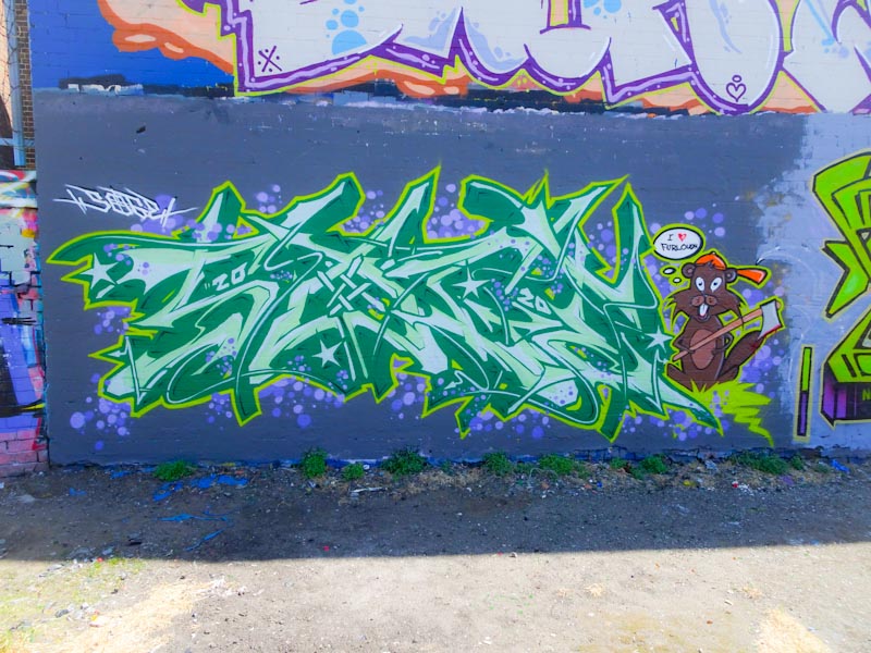
The fabulous purple patch that Pekoe seems to be enjoying continues with this wonderful portrait piece in the corner of Montpelier Park. There is a lot of joy in the piece, and it reminds me a little of the kind of portraits that Kid Crayon does… bright and unusual colours and a hat.
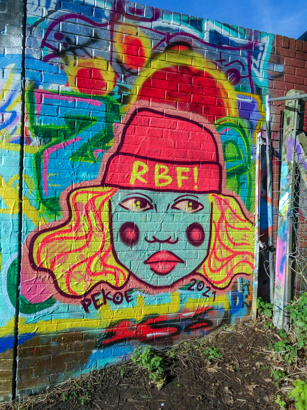
I recently visited Montpelier to switch up my walks a little bit and give the dog a bit of variety. It was a fruitful trip and finding this was the jewel in the crown. I knew of its existence, but I didn’t know where in Bristol it was, so I kind of got lucky. Something really likeable about this one and Pekoe seems to be turning out some happy pieces.
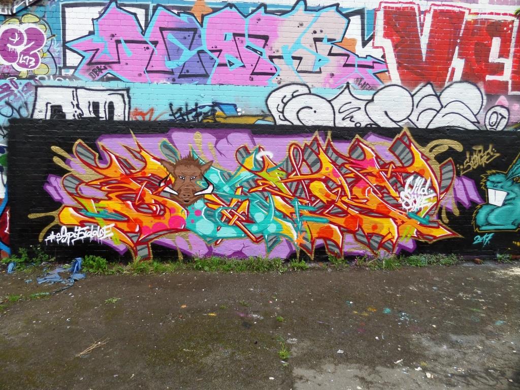
I can’t recall seeing these two collaborating before, but that doesn’t mean it hasn’t happened, simply that my memory doesn’t serve me as well as it used to. Sepr and Acer One is a partnership that I wouldn’t have predicted, as their styles are very contrasting, but this new wall is Cumberland Basin is absolutely spiffing.

The central section is by Acer One and is an amazingly technical piece of writing, based on a geometric design style for which he is known. Standing up close, it is near impossible to work out what these letters say, but by stepping back, the brain interprets it more easily and it says ‘More Love’ – I don’t think any of us can argue with that.

The central panel is bookended by two exquisite characters from Sepr. On the left is a devilish Cupid whose love arrows are finding mischief, in particular with a seagull who appears to be smitten.
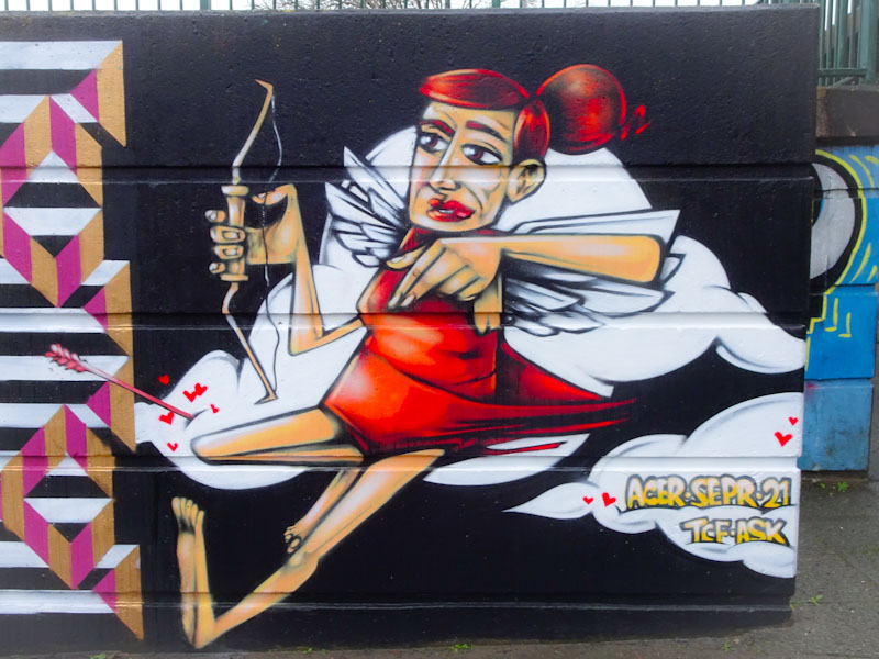
To the right a female Cupid character is also firing love arrows across the piece. I don’t quite know what these two characters symbolise, but they are brilliantly painted and a lot of fun. Maybe they are a representation of the frustrations of lockdown and our distance from our loved ones.
All in all a superb collaboration and well worth a visit.


