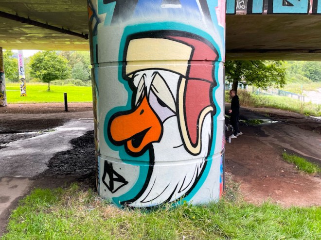
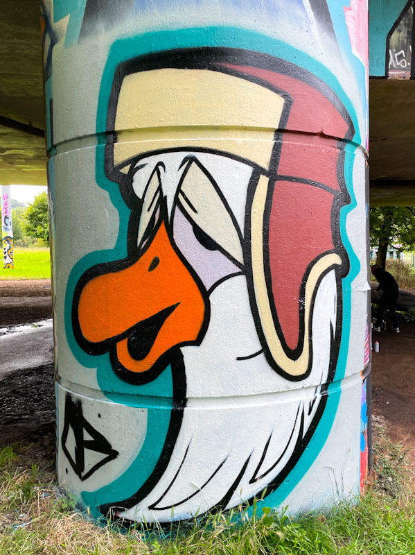
It turns out that Mr Crawls is much more than a one trick pony, as I suspected, and has been painting different variants of his bird portrait mega-tags. The first one to appear in Natural Adventures was a Gull called Gul, then a parrot. This fun bird is ‘The Goose’.
Mr Crawls, Brunel Way, Bristol, August 2023
The Goose can be identified by the shape of his beak, his rather droopy eyes, and a distinctive winter hat with ear flaps. The cartoon character has been painted beautifully with clean lines and strong solid fills. I have the set of three birds so far, and plenty of unpublished gulls… I wonder what other designs Mr Crawls might have up his sleeve.
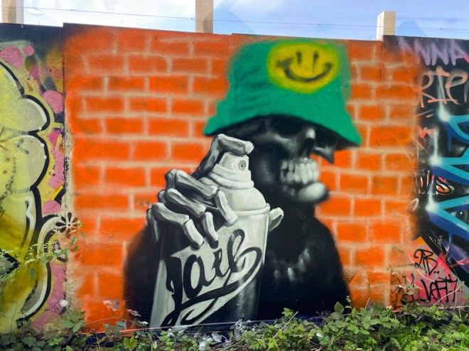
Laic217 is an artist who simply keeps on finding new ways to present his extraordinary talent. Using his trademark skeleton holding a spray can, he has gone for a different form of distortion in this remarkable piece. The skeleton is slightly out of focus, as our eyes are drawn to the sharp skeletal hand and spray can with the word ‘Laic’ written in script on the side. This is a great idea and outstandingly executed, tricking our eyes.
Laic217, Greenbank, Bristol, August 2023
There are other elements that we see in Laic217’s work, such as the brick wall, bucket hat, smiley logo and neck chain, which no self-respecting piece from the artist would be without. I consider this to be one of Laic217’s finest compositions, brilliantly painted and conceived. The effect works really well and would require a whole bunch of rethinking technique. Bravo!
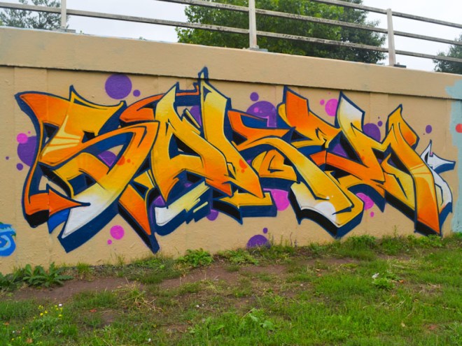
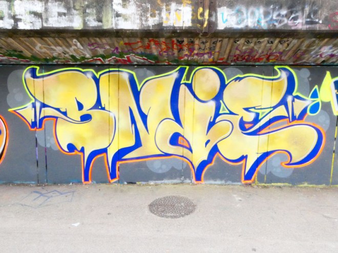
You’d need to go back to 2018 to remember this beauty from Soker. I don’t know how, but this piece got stranded and forgotten deep within my archive, and a quick delve has unearthed it for me to post today. Soker is one of the very best writers in Bristol, which is why it is a little surprising that I never posted this one.
Soker, M32 roundabout, Bristol, August 2018
The first thing to grab the attention is the classy colour palette. The fills in the seamlessly intertwined letters are of the very highest class, drifting from which, through yellow to oranges with consummate ease. The letters spelling SOKEM are pretty much perfect, and so cleanly finished. The buffed wall helps the piece to stand out and the pink and purple spots the cherry on the top. As close to perfect wildstyle writing as you will see.
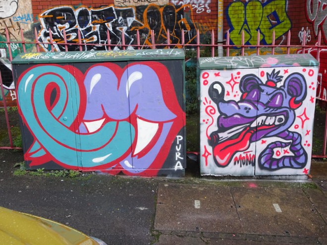
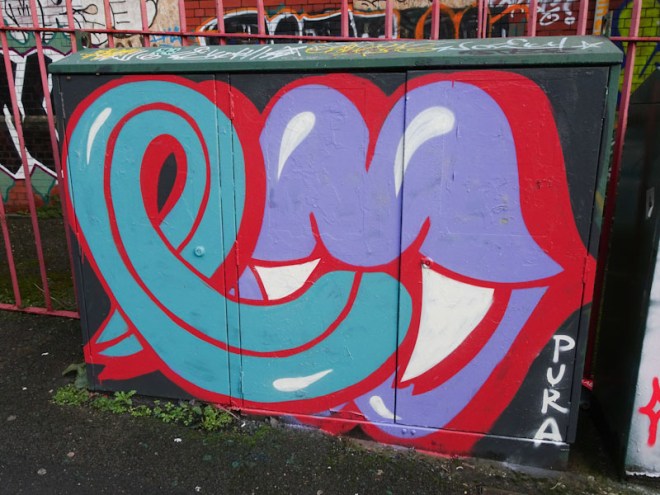
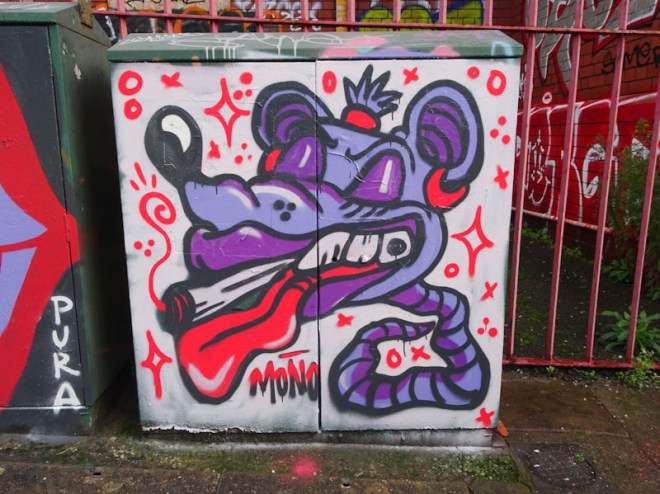
Pura Decadencia and Mono, Dean Lane, Bristol, December 2020
I took a short journey into my archives to find this small collaboration, something I rather like doing from time-to-time, as there are so many fantastic artworks that never make it into this blog. These pieces were painted in Dean Lane way back in December 2020.
Pura Decadencia, Dean Lane, Bristol, December 2020
To the left is an iconic mega-tag piece featuring one of Pura Decadencia’s mouths, complete with vampire teeth and and very long tongue. I really like her straightforward design that remind me a little of the Rolling Stones logo, filled with mischief. Pura Decadencia paints only occasionally, and I was encouraged by her recent piece in Brunel Way, and hope she’ll bring more of her artwork to Bristol before too long.
Mono, Dean Lane, Bristol, December 2020
Mono, who I believe is no longer living in Bristol has been concentrating on her illustrations and animations that are really fantastic. This is a creative and imaginative piece of a rat (?) smoking a joint. The rat’s tail stems directly from its head, there is no body. The piece as a whole feels slightly provocative and edgy, which is sometimes so easily forgotten with a majority of rather more sanitised street/graffiti art. Altogether this is a fun collaboration decorating utility boxes, which deserve to be painted.
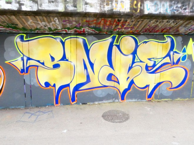
It feels a little bit repetitive banging on about how good Bnie’s work is, given that I say so every time that I post her work, but it is pretty much impossible not to do so. Bnie has been pretty busy this summer, not only on the streets of Bristol, but on the festival circuit too.
Bnie, M32 Cycle path, Bristol, July 2023
Bnie has played with her font a little in this piece, with a slight relaxation on the form with some arrows and pointy bits at the base of the letters. The letter fills are clever, looking almost reflective, as though dappled sunlight is bouncing off the piece. The letters are lifted with tidy 3D drop shadows and yellow and orange borders. Painted as part of an RBF paint jam.
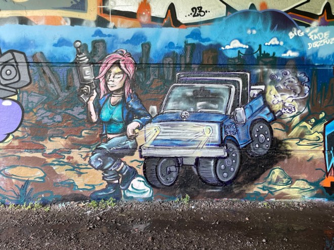
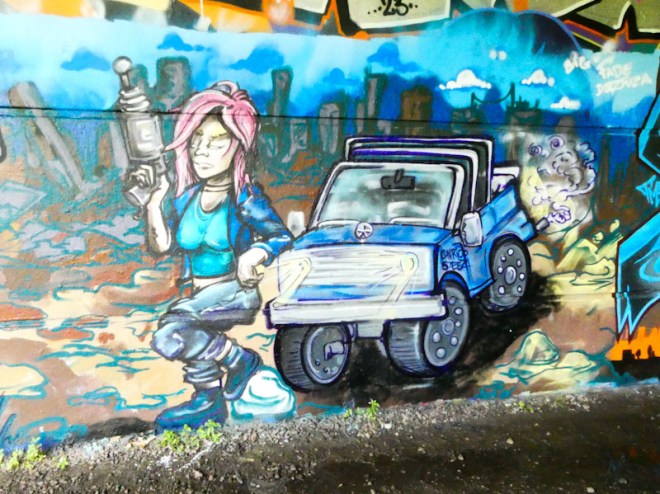
This piece from Conrico is the second in a long wall paint jam collaboration with a dystopian future theme. The first piece was a ‘Terminator-style’ crocodile but Kool Hand. Conrico, who has a wonderful natural style, has painted a female figure handling a futuristic gun and standing in front of a four-wheel drive vehicle with its headlights on.
Conrico, Brunel Way, Bristol, July 2023
There is tons of atmosphere in this piece, and in common with other Conrico pieces, there is a great story going on here. The dark buildings in the background and rubble to the left of the piece, speak of a war zone, in the narrative of many films in this genre. I can’t help thinking that there is a little bit of Sarah Connor (The Terminator) in the character, which intentional or not is a good thing. A nice touch is a shout out to Dibz and Fade whose epic piece was painted over during this paint jam.
Kool Hand, Conrico, Werm, Korbe and Daz Cat, Brunel Way, Bristol, July 2023
There is never a time when I am not thrilled to find a Pekoe piece. She belongs to a small handful of artists who define the Bristol scene and ones that I always keep a special eye out for. This modest piece on the M32 roundabout marks a return to her portraits, which have been playing second fiddle to here writing recently.
Pekoe, M32 roundabout, Bristol, July 2023
This pink faced girl with green hair is in three-quarter profile and is glancing out of the side of her eyes, giving her a slightly irritated or angry look. With great lips and the signature tears, this small piece reminds us what a great artist Pekoe is. It is amazing that she has found the time to paint this piece, given her bust summer festival itinerary.
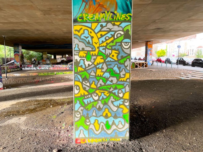
I thought that Creamylines might have been a bit of a flash in the pan when his pieces tailed off last year, so it was hugely exciting to find this piece recently under the M32. His work lends itself particularly well to columns, although it would probably work equally well in a landscape format.
Creamylines, M32 Spot, Bristol, July 2023
I like to think of his work as being similar to stained glass, with each element being surrounded by a solid line, like lead around glass. The way the colours work together would also not look out of place in a window with light shining through. As with much of his work, the sun is prominent with rays emanating out across a scene strewn with little characters and eyes. Great stuff from Creamylines.
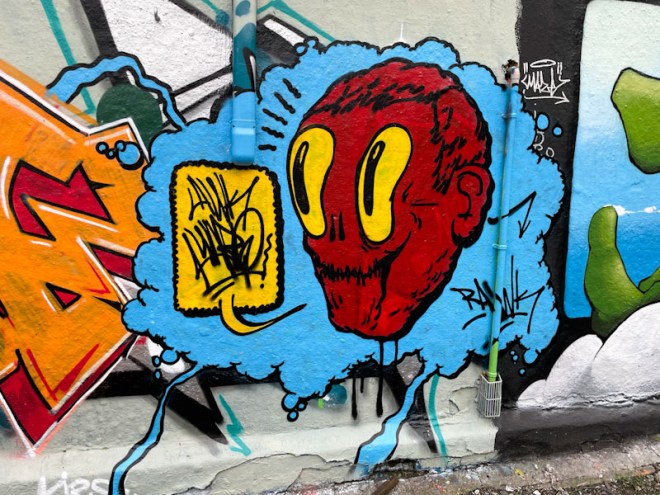
Awkward is an artist who makes occasional appearances in Dean Lane, although I’m not sure I have seen his work anywhere else in Bristol. He specialises in his mega-tag character faces that are usually accompanied by a speech bubble.
Awkward, Dean Lane, Bristol, July 2023
In this piece, the unnerving character painted in red has huge yellow comedy eyes. The nose is represented only with two nostrils, resembling a skull. The speech bubble has the letters AWK sitting above WARD. The whole piece is set within a blue cloudy background with a few bubbles. These rare appearances, I feel, don’t fully do justice to an artist who has clear and obvious talent, but who may be constrained by time to put into his artwork. His pieces are always worth looking out for though.
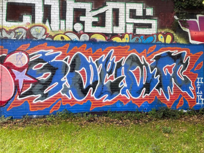
Solar is definitely an artist I would like to know more about, as he is something of an enigma to me, and I have never had the fortune to meet him, or indeed most of his elusive PLB friends. His work is quite unique and touches on the anti-style, but not in a way that is similar to others who paint that way. Although he changes his fonts from piece to piece, there is a consistency about his letters within a piece.
Solar, Sparke Evans Park, Bristol, July 2023
The most striking thing about this work is the colour combination and contrast between the blue and black letters and the red and orange surround, set on a blue buffed background. I can’t really describe the letter forms, but can say that somehow they are typically Solar, and the gentle way he has of almost disguising his name. I will soon be able to pull together a gallery of his work which will be a great showcase of his individual style.