.
Oak, cherry and elm
I’ll be pushing up daisies
before they mature
.
by Scooj
• after a day spent planting trees on a hillside in the Peak District National Park
.
Oak, cherry and elm
I’ll be pushing up daisies
before they mature
.
by Scooj
• after a day spent planting trees on a hillside in the Peak District National Park
By the time this post is published I will be half way through a team away day in Derbyshire, planting trees. I have to leave right now so that I am not late for my lift.
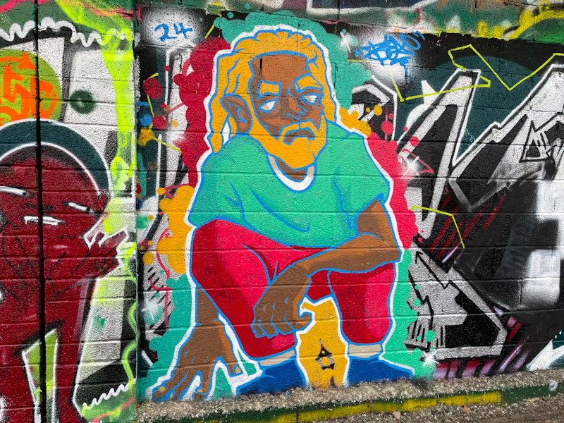
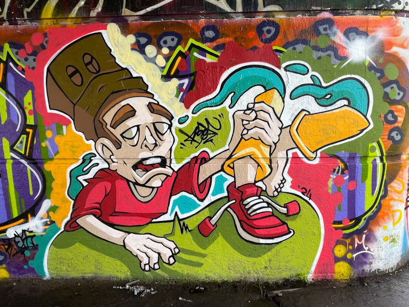
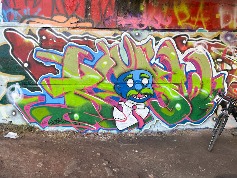
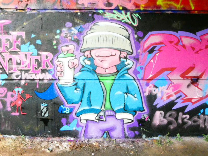
This is another magnificent piece by Bean whose Easter break return to Bristol has been both productive and seen some real improvements in his work. I love the character’s hair in this piece. Norma’s service resumes tomorrow I hope.
I don’t do this too often, but I forgot about today’s posts until just now (8.42am). I have a lot on my mind. I am in Buxton in Derbyshire with work. Today’s posts are going to be super-short.
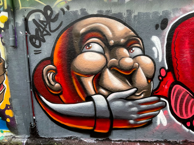
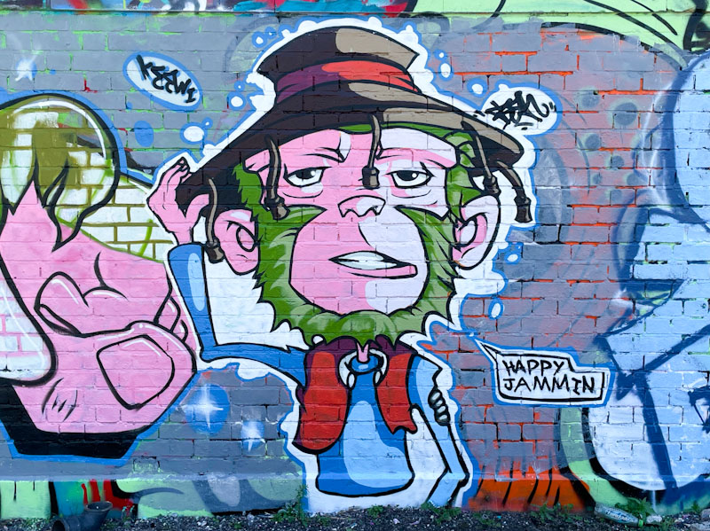
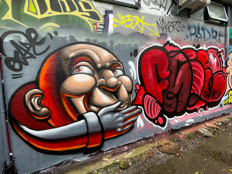
A brilliant pairing of Face 1st and Zake from the PWA crew. Zake smashes it with this gorgeous cartoon portrait full of texture and depth.
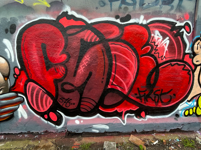
The writing from Face 1st is a little unusual but nonetheless captivating. Spelling out FACE and no smiling girls this time.
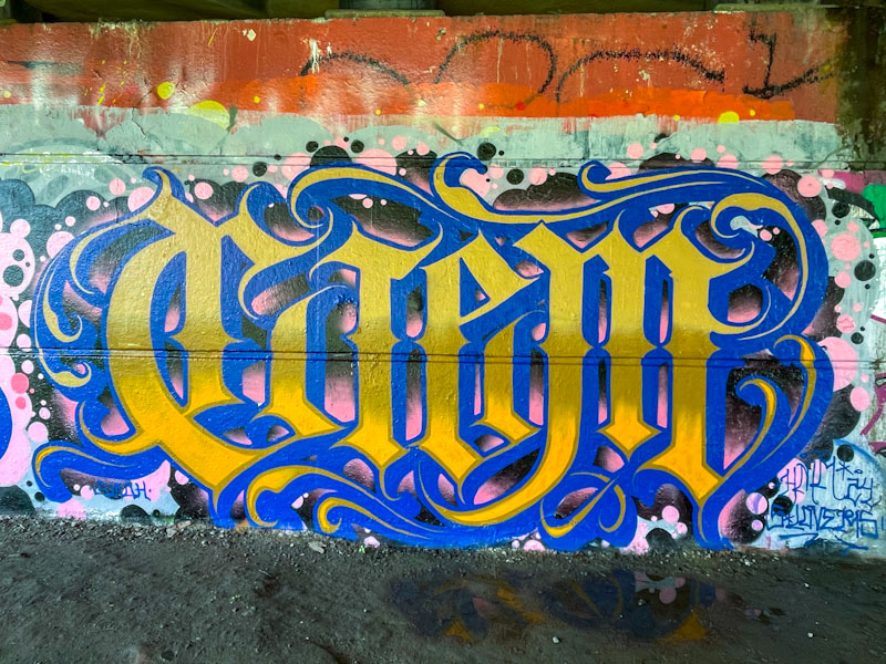
We are blessed in Bristol with having not one, but three calligraffiti artists, each bringing their own take on the style. The three are Stivs, Wxttsart and Todoaciem. There may be others, but if so, they are a little under my radar. This outstanding piece under Brunel Way was painted beneath Brunel Way, next to a piece painted by compatriot Pura Decadencia (to come).
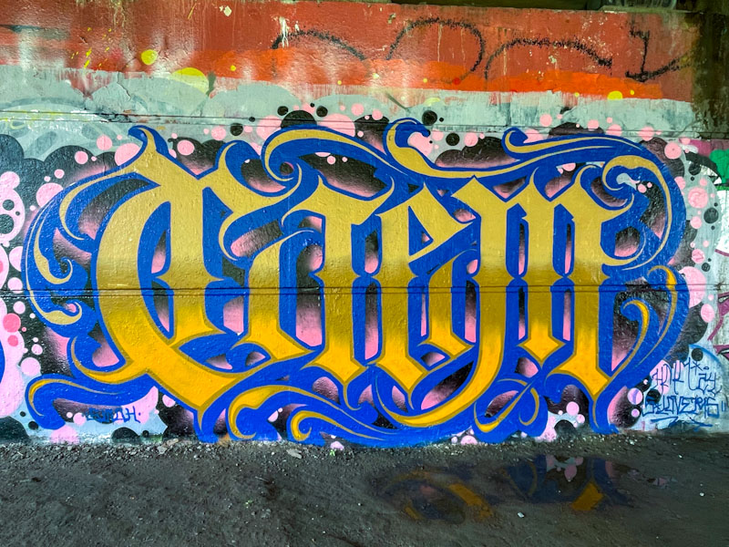
The letters spell CIEM, as you might expect, but what is really special here is the additional decorative scrolls on the edges of the script, creating a wonderful flourish. The colours blue and gold give it a regal look that works surprisingly well on the backdrop of black and pink spots. This is a top piece of calligraffiti from a confident and technically very skilled artist.
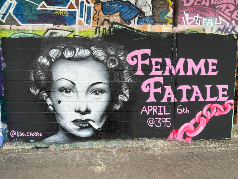
This is a special piece for me, because I was present while Tao Create was painting it (for a short while, at least) and met her for the first time. I have been wanting to meet her for a while to be able to tell her how much I admire her work and how much she has improved in recent months. I think that meeting the artists is the bit I love most about photographing their art, as it gives you glimpses of insight into their personality and sometimes their inspirations and ideas.
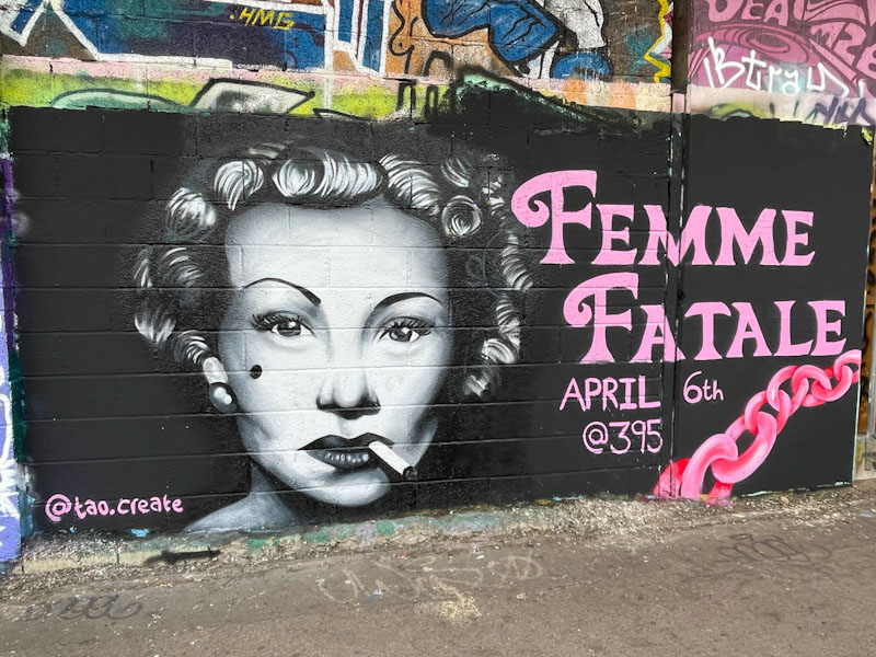
This piece was painted to promote a Femme Fatale event on 6 April. Now, I am a little bit old and never been all that well-connected with the music scene since the 1980s, so I had to find out a little bit about what this was all about. This is what I came up with:
Femme Fatale Heartek MicroCabaRave
An event held at 395 on Saturday 6th April. Doors are at 17:00 with entertainment starting at 18:00. The event finishes at 01:00. The event has been tagged in the techno, jungle, dub, reggae and industrial categories.
I don’t much like posting promotional pieces, because I am a bit funny about that, it feels akin to advertising, but of course I make exceptions.
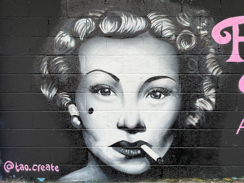
Tao Create’s portrait is copied from an image, not of anyone in particular, to represent the Femme Fatale idea. Given that Tao Create hasn’t painted all that many pieces in the photorealistic style, this is absolutely remarkable. I very much hope to see more of her work during 2024 and beyond, she is a real talent.
.
An unholy hour
digital display torments
do I sleep again?
.
by Scooj

Cort tends to keep a very low profile, and I think he likes to keep it that way. On the few occasions that I have met him, he has been a man of few words, letting his artwork do the talking. Although he is not as productive these days as he has been in years gone by, the quality of the work has made up for the infrequency.

This piece in Peel Street Green is a belter, and he has replaced his usual CORT letters with the word DRUNK. I wonder if that references the state he was in when painting it, or whether there is another story behind the letters. The piece is nice and sharp with good colours and some nice letter fills. There is both fun and movement in the whole thing that gives it some vibrancy, and it certainly stands out in this long gallery wall.

It has been a genuine pleasure discovering a wide variety of Raid pieces over the last couple of years, and what I have noticed that as well as experimenting with his letter shapes, he has also been improving his fills immeasurably.

It would appear that Raid painted this one in the rain, and wasn’t overjoyed about it. Fortunately, it doesn’t appear to have affected the piece in the slightest. The fill is exquisite and imaginative, and it would appear that Raid has hit upon a winning formula. Everything about this piece is good, and the finishing is perfect, right down to the fine orange border. Bravo Raid!
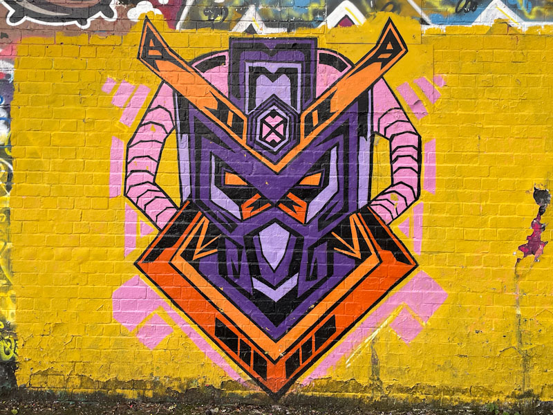
It took a couple of attempts for Acesartworld to complete this robot head… the first time I saw it, it was just white outlines on the yellow background with a note in pink, that was quite difficult to read saying “pending WIP” (Work in Progress). I think that he was quite lucky that it wasn’t dogged, because it is the kind of place that it can happen.
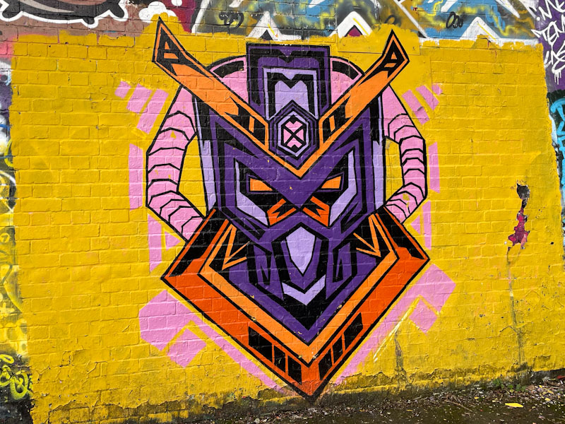
The bilaterally symmetrical piece is nicely designed and executed, although I note he had to extend his yellow background a little tom accommodate the ‘horns’. There is an interesting colour problem in the piece, which is that pink doesn’t work well on yellow, and the accents around the piece would have benefitted from having black borders. Acesartworld has since painted another of these ‘masks’, and it would seem to be something he is playing with – I look forward to seeing even more.
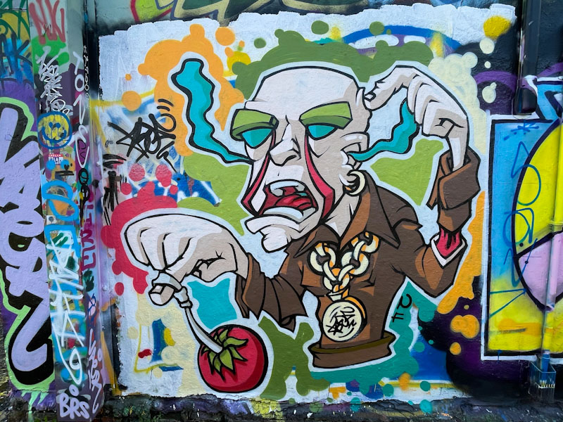
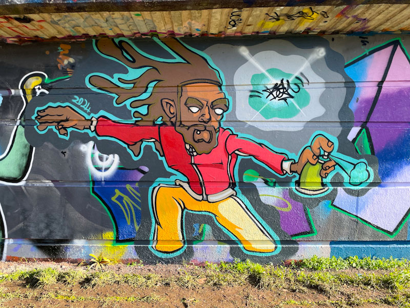
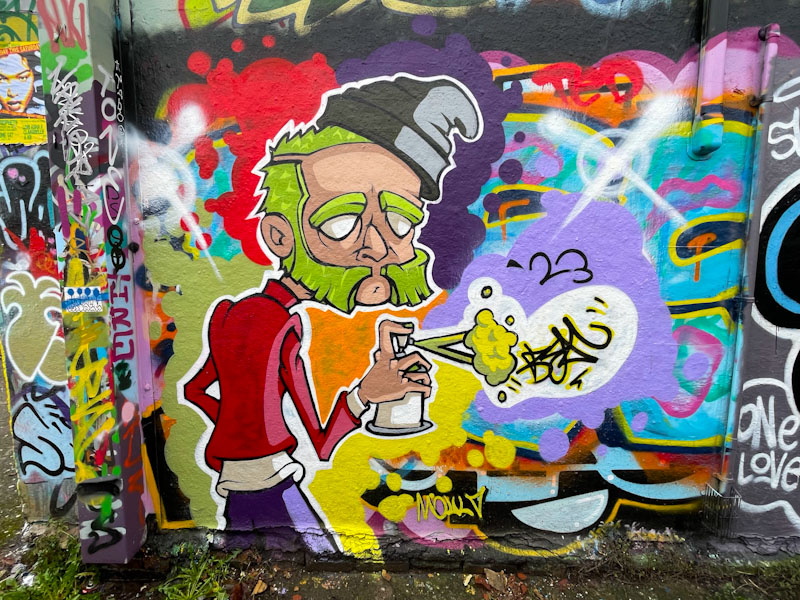
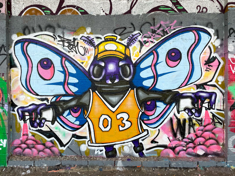
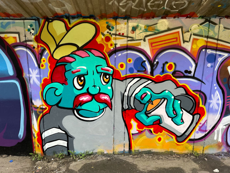
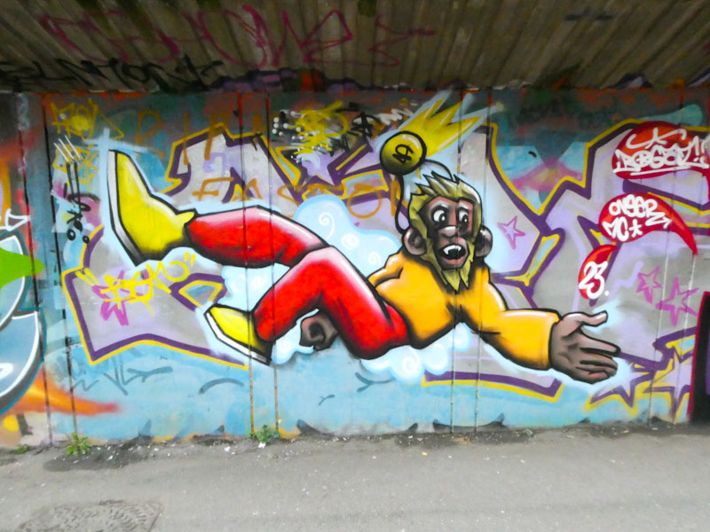
A gallery of outstanding cartoon characters and writing from Bristol artist Bean
Instagram: @ceelo_bean
All photographs by Scooj