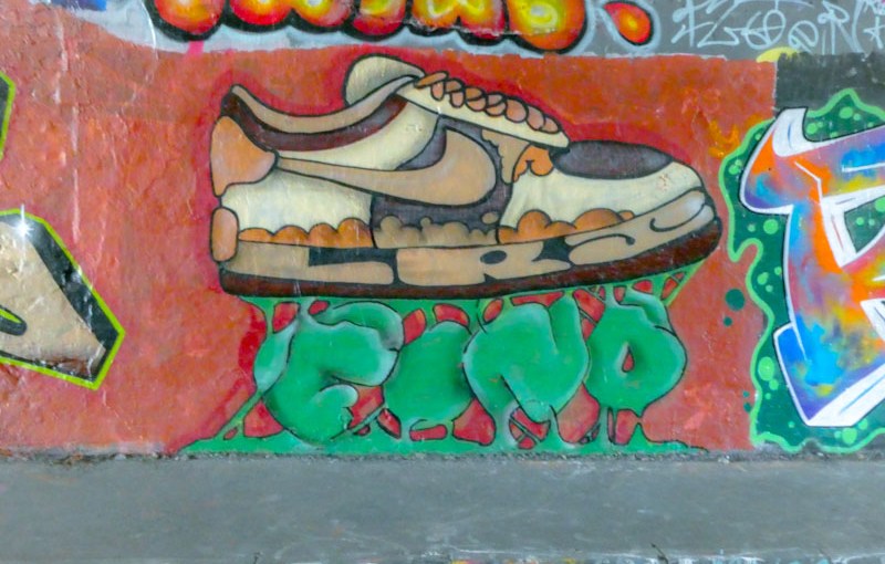
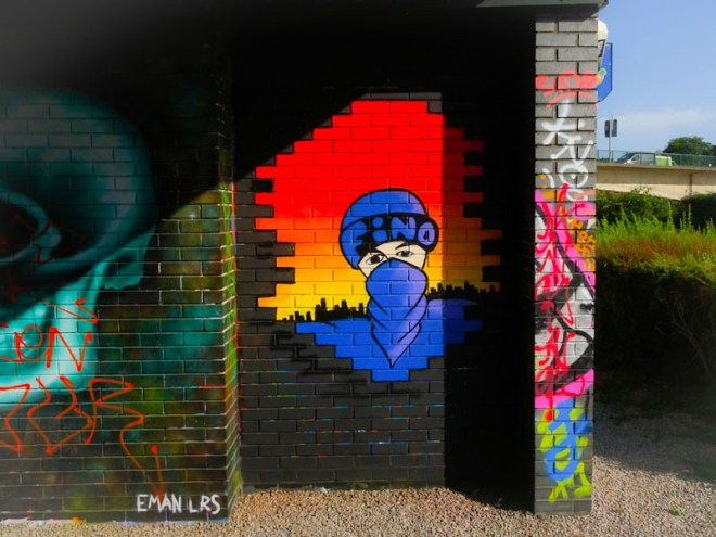
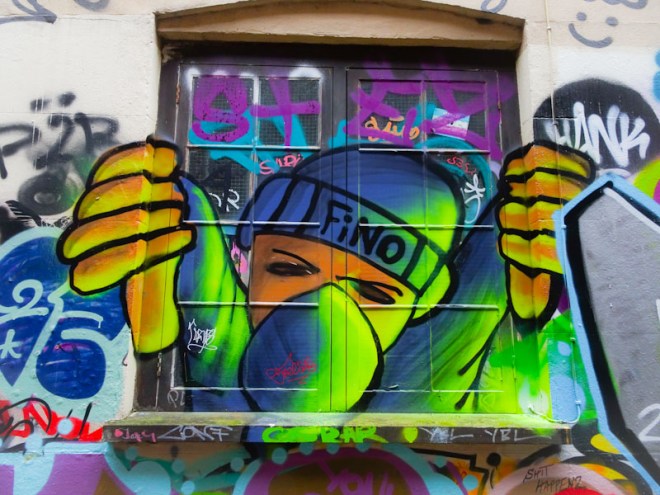
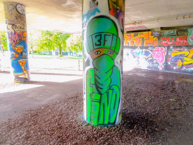
A gallery of character pieces and graffiti writing from 3F Fino or simply Fino
Crew: LRS
all photographs by Scooj
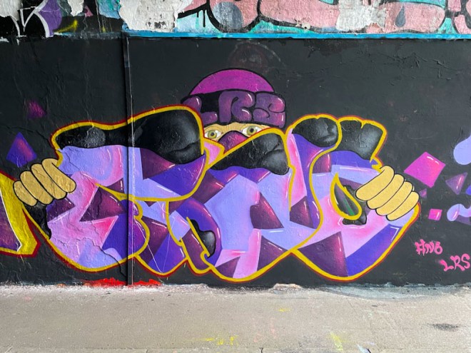


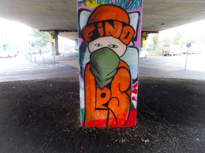



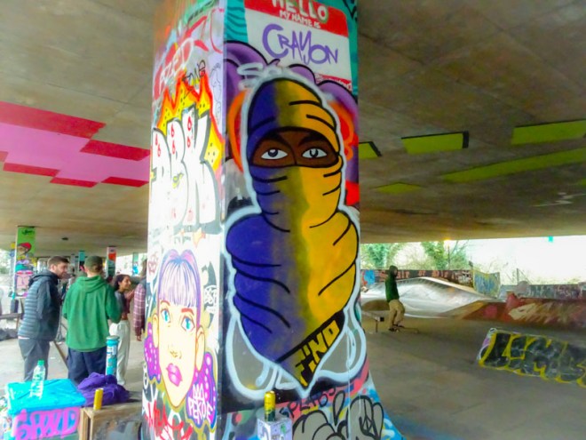

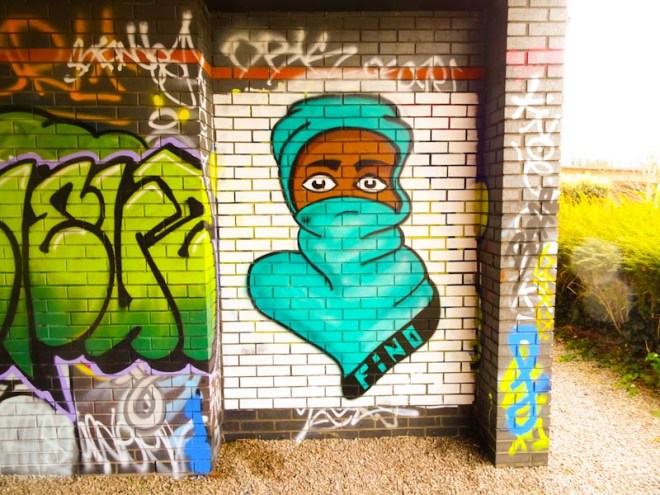
A gallery of character pieces and graffiti writing from 3F Fino or simply Fino
Crew: LRS
all photographs by Scooj

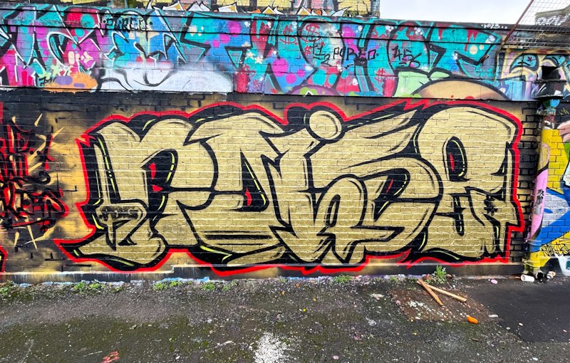
Ooh! this is a very nice piece of graffiti writing from Noise, which was painted in collaboration with Werm for the ‘World Wall Stylers’ December 2023 challenge (@worldwallstylers), which I think incorporated the colours gold and red. Noise followed the brief well.
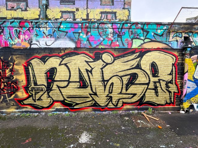
I like Noise’s large letters, that really impose themselves, and the fact that the ‘I’ sits over the ‘O and S’ which in turn sit over the ‘N and E’. The gold fill is nice and solid with only a few decorative elements, leaving the letters looking uncluttered. This is yet another decent piece from Noise.
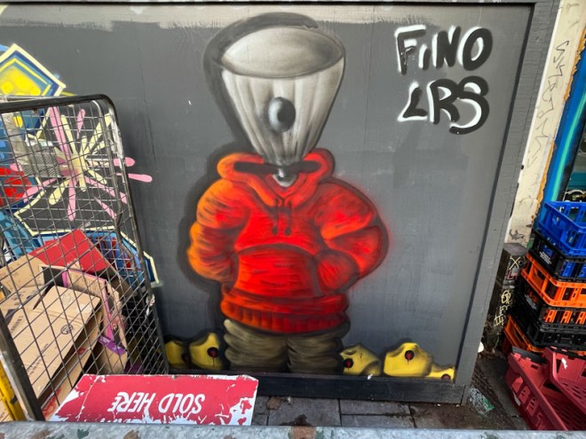
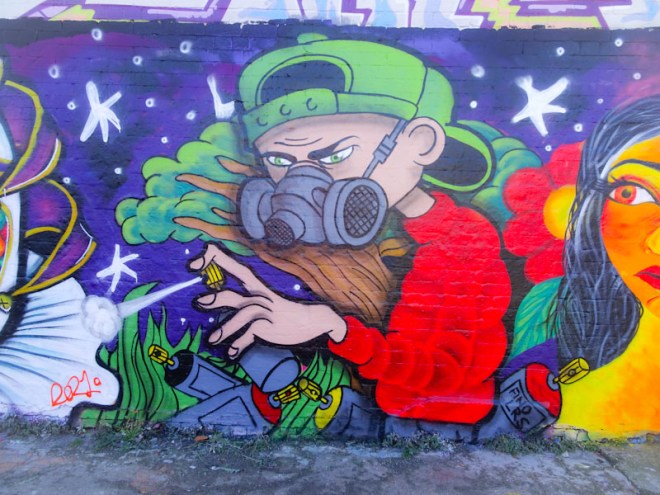
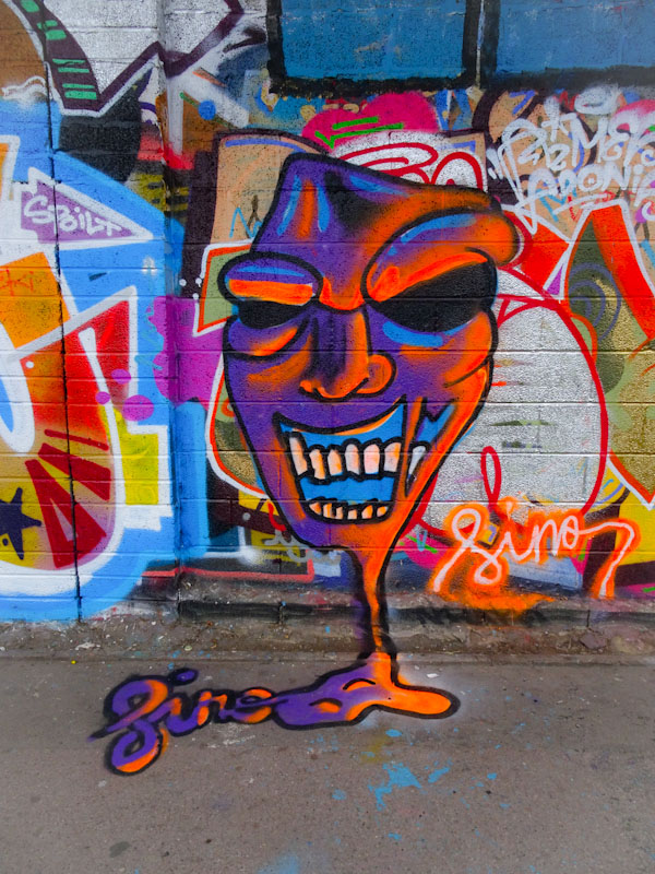
One of the nice things about pausing and going back through archives is that it gives me a chance to post those pieces I had always intended to, but never quite got round to doing. This fun spray can character piece by 3F Fino is one of those.

This piece in Mina road spent much of its time being obscured by all sorts of shop paraphernalia and rarely saw the light of day, however, I got lucky and managed to capture it when it was partially exposed. The character, with a nozzle for a head, is standing in a pile of what look like banana caps. I felt, that this was a piece that demonstrated 3F Fino’s development really well, and he did a great job on the fabric shadows and textures, and the same with the shapes and orientations of the caps. A really good piece from the artist, who appears to have stopped painting in Bristol (although I saw a piece by him last week). Time for a gallery? I think so.
.
Tuneful gusts and squalls
in the midst of Storm Isha
whistling chimney
.
by Scooj

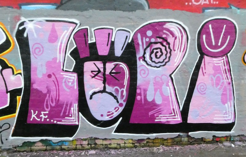
My rummage through my graffiti archives continues with this beauty from Lupa, painted last February. I have said before that I am attracted to her slightly crude style, which is definitely not to detract from it, but to distinguish it from some of the other writers who paint with knife-edge precision. There is room for all styles on the walls of Bristol.

Lupa’s letters are large and chunky, giving plenty of scope for creating interesting fills. In this case, she has used some lovely shades of purple and lilac which are carefully blended in several different ways, overlayed with some symbol decorations. Her trademark face in the ‘U’ is looking a little sad, and is joined with a simple smiley on top of the ‘A’. An attractive piece from a graffiti writer whose work definitely appeals to me.
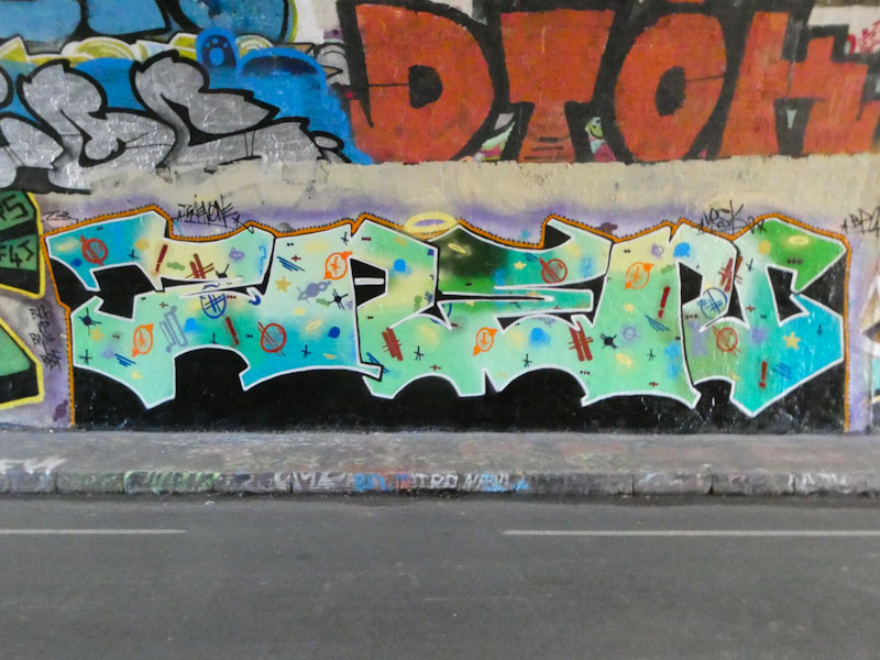
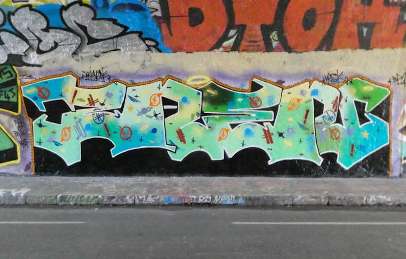
I did another bit of digging through my archives, something I like to do from time to unearth some overlooked or ‘left behind’ pieces, and found this beauty by Zaenone, which I photographed in St Werburghs tunnel a year ago before I had clocked the artist.
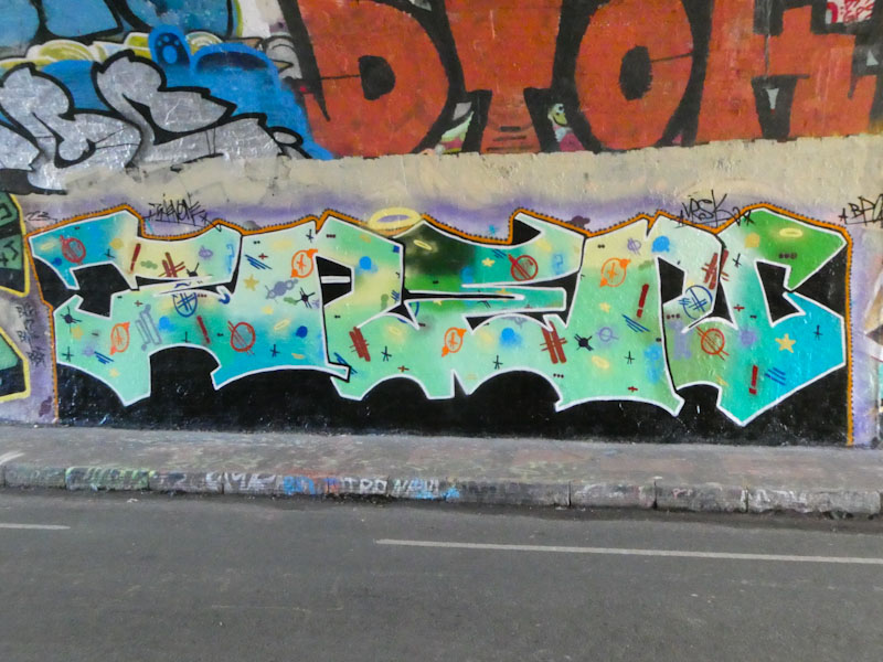
The large, bold letters spell ZANE, but in this one are not accompanied by character bookends, unlike the other pieces I have posted by the artist. The fill is simply magnificent, incorporating a range of blue and green colours that drift into one another, and decorated with dozens of little symbols and marks. The whole thing is a really beautiful piece of graffiti writing, and I am so pleased to have found it in my archive and put a name to it too.

At around the time that this piece is published, my beloved Arsenal FC will be a few minutes into their first league match in a couple of weeks, against Crystal Palace, and I will be at the Emirates Stadium cheering them on. The result of the game could determine my mood for the next few days, so I am keeping my fingers very firmly crossed. Naturally, I have had to plan my day carefully, and I wrote this post last night, to provide continuity of publishing my daily two street/graffiti art posts at around 11.55 and 12.55 UK time.

Raid is another artist who has been regularly hitting the walls of Bristol throughout last year, constantly adjusting and refining his letters to great effect. This one in the tunnel is a little bit more like some of the first pieces I saw of his, back in March last year, with an ornate lower case ‘a’. There is a very nice colourful fill with a cosmic feel to it, and enough of a background to help the letters pop. Definitely time for a gallery, even though I have less than one year’s worth of photographs of Raid’s work. Watch this space.
Come on you Gunners!
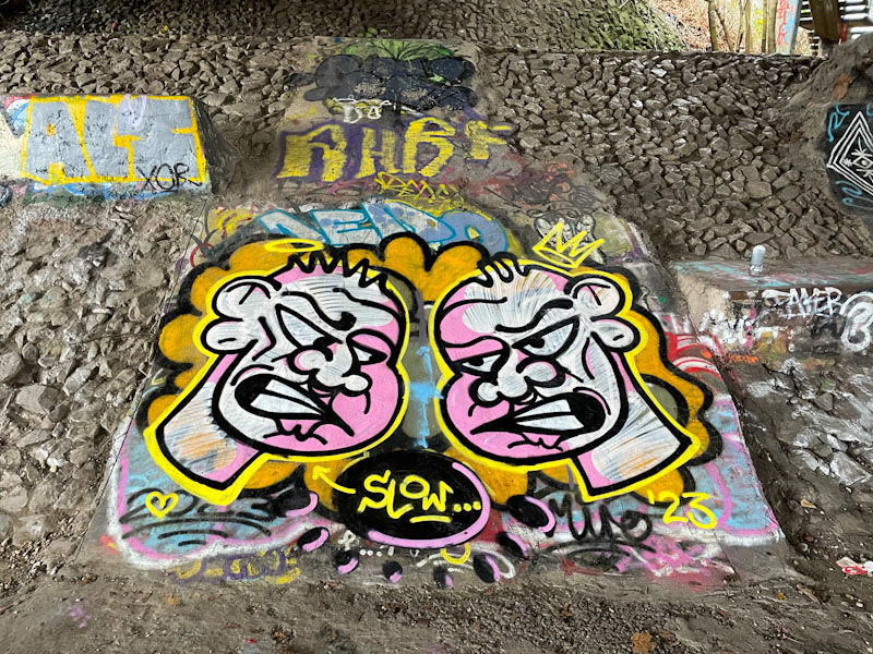
I am rather fond of Jevoissoul’s work. It doesn’t have the sharpness or precision of writers like Dibz or Smak, nor does it create extraordinary characters in the way that Sled One or 3Dom can, for example, but it has a charm and authenticity that underpins the vast spectrum of art and graffiti that we see in Bristol. On such solid foundations great things are built.
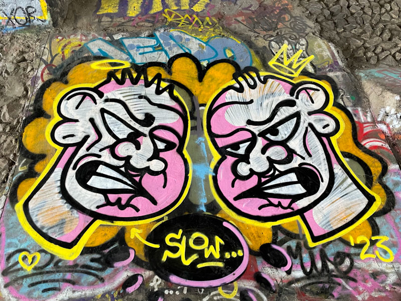
Jevoissoul has painted two of his characters with ‘Popeye’ smiles. The fills and shading is basic and effective, creating some contrast and depth in its simplest form. No Jevoissoul piece is complete without the word ‘slow’ in attendance, although I don’t know why he writes it, nor why it is pointed at the character on the left. One for the next conversation I have with the artist.
.
Break the winter break
my adrenaline pumping
gun down the eagles
.
by Scooj
* after a bit of a pause, my beloved Arsenal resume their season, having had a run of bad results before the winter break. For those not familiar with the English Premier football league, the nicknames for Arsenal and Palace respectively are The Gunners and The Eagles.
Also, Arsenal are the only team in the English football league who are not named after a place (although they were originally called the Woolwich Arsenal). The area of Arsenal in North London and the underground station are named after the football club after it relocated from Woolwich and dropped that part of the name.
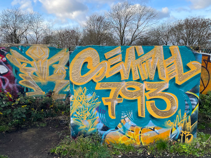
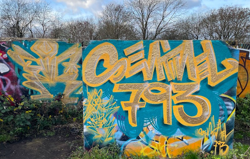
I recognised the style, but couldn’t put a name to it when I first saw and photographed this classy piece up on Purdown. I had to do a google search when I got home and then the penny dropped that ‘Sentinel 793’ is the music moniker that is used by Benjimagnetic, so here is a piece using his graffiti writing skills to promote his music skills.
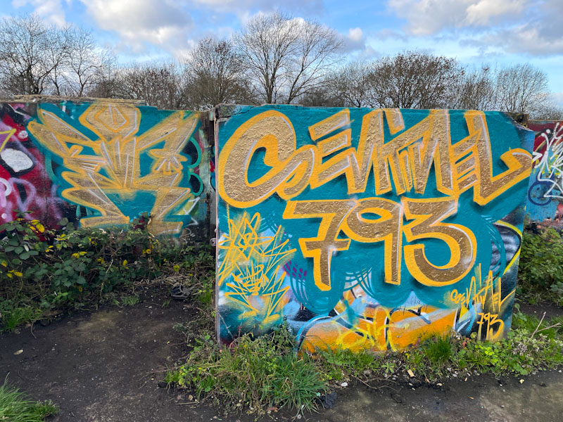
I guess this cross advertising worked to a degree as I have just been listening to some of his tracks, and although not really my cup of tea, they are nicely produced. The writing and the dancing character in particular, are, on reflection, easy to spot as Benjimagnetic pieces in retrospect. The blue and gold colours work really nicely together in this unusual piece.



 Natural adventures