On a recent drive around Bristol getting from one spot to another, I managed to stumble across a few Merny pieces that I hadn’t been aware of or hadn’t been able to locate. This one is on a shutter in Trinity Street next to a Taboo Pink Panther piece a little bit away from the beaten track. Shutters are tricky, because most of the time they are up and you don’t get to see the artwork.
Merny, Trinity Street, Bristol, September 2023
This philosophical piece features three passers-by and the words; “The earth spins on its axis, one man struggles while another relaxes”. I like that. The characters are painted in Merny’s naïve style and reflect everyday people. Naturally there are little identification numbers and lines dotted about the place, consistent with most of Merny’s recent works.
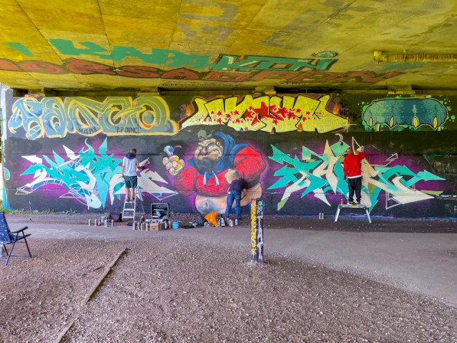
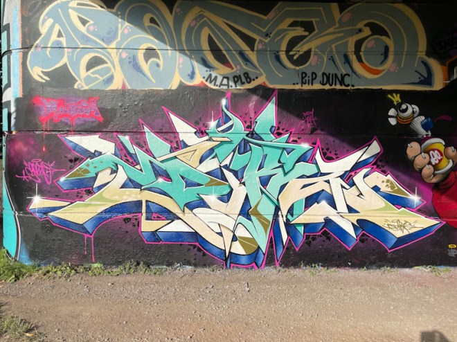
Dibz, Cheo and Fade, Brunel Way, Bristol, September 2023
I don’t often place work in progress (WIP) shots as the feature image, preferring to have the completed piece in all its glory, but in this instance I have gone for it, showing three masters at work, Dibz, Cheo and Fade.
Dibz, Brunel Way, Bristol, September 2023
The turnover on this wall this year has been quite staggering, and the bar has been raised a few notches on the quality of pieces that appear there. On the left Dibz has done his stuff with pin-point accuracy and a crispness that is synonymous with his work.
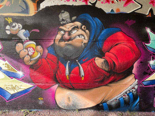
Cheo, Brunel Way, Bristol, September 2023
The beast of a piece in the middle is by Cheo, and is frankly utterly brilliant. The overweight character is holding a spray can (a popular theme I have commented on many times in this blog) and looking like he might have had a beer too many the night before. The genius of the piece is the ‘Hello Kitty’ underpants creeping out of the top of the character’s trousers. The hairy belly and five o’clock shadow are nice touches too.
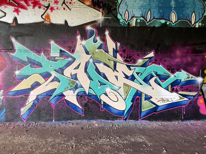
Fade, Brunel Way, Bristol, September 2023
To the right, Fade reflects the colours, and to a certain extent the style, of Dibz’ writing on the other side of Cheo’s character. There is some mirroring of fills and drips too. The key difference between the two is the complexity of the design and thickness of the letters. Perhaps one day it will not be possible to distinguish between the two. A superb Triptych.
Doors 236 – Lincoln City doors (Part VIII) – Gateways of Lincoln
This September, and the months leading up to it, has been an incredibly busy time for me at work, landing four major projects. I hope that things will start to calm down a bit and that I will have a bit more time to allow space for creativity and imagination. I have found it difficult to keep my blog posts going through this period, but have managed to maintain the discipline, which is good for my mental health. Unfortunately the haikus have dropped off, but I am excited to get back into a rhythm with them.
I will be treating myself to a few days in Cornwall on my annual fishing trip, starting tonight and it is the perfect way to ‘come down’ from such high intensity.
This week I pick up with some more Lincoln doors which I have broadly themed into gateways, most of which would have had gates or doors at some point. After this week, I think there might be a fun leftovers post, before moving on to some Italian treats from the summer. Here we go:
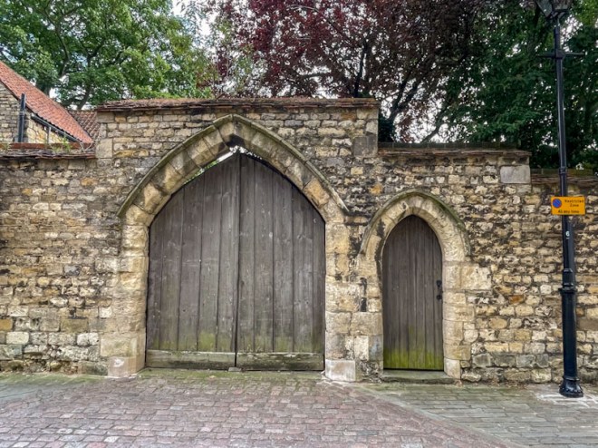
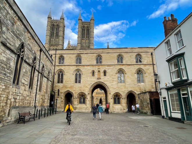
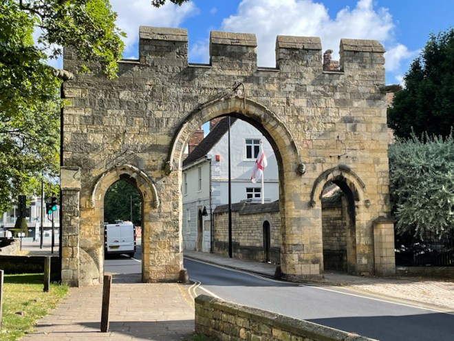
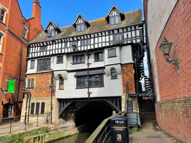
Little and large gates, Lincoln, July 2023Exchequer Gate, Lincoln, July 2023Lincoln Guildhall gateway from the north, Lincoln, July 2023Lincoln Guildhall gateway from the south, Lincoln, July 2023Priory Arch gateway, Lincoln, July 2023Stokes High Bridge over the River Witham, Lincoln, July 2023
OK, so a bridge with a Tudor building over a river isn’t technically a gateway, but is is a rather impressive sight and one I wanted to include. The doors below were up the passage way on the right of the building, near the spiral fire escape.
Tudor door, Stokes High Bridge, Lincoln, July 2023Side entrance door, Stokes High Bridge, Lincoln, July 2023
One final push with work this morning before I go on my escape. I hope you have a great end of week and weekend.
If you have made it this far, you probably like doors, and you really ought to take a look at the No Facilities blog by Dan Anton who has taken over the hosting of Thursday Doors from Norm 2.0 blog. Links to more doorscursions can be found in the comments section of Dan Anton’s Thursday Doors post.
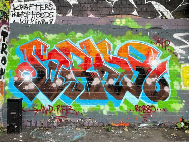
Although rather small, this is a rather good piece by Dopes. The choice of hoarding is challenging, being at the top of a DIY skate ramp, and on short boards that have been slapped together. On the upside, anyone who paints this spot is likely to have their work on display for a considerable period.
Dopes, M32 Spot, Bristol, September 2023
Dopes has been out and about a fair bit recently and the quality of his work is always high. Out of necessity, the letters bleed off the top of the hoarding, but in spite of that are nicely proportioned. Great colours and white rather than dark borders and 3D drop shadow. Easy on the eye stuff from Dopes.
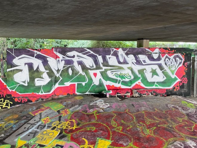
I had seen this piece at the entrance to St Werburghs tunnel for a while, and there was something about it that stood out, but I couldn’t pin it down. I didn’t post it because I didn’t know who it was by. A serendipitous catch up with Logoe recently at the other end of the tunnel provided me with some insight about the piece. Logoe was raving about it and said it was by Drax, a highly-regarded old-school writer, and one of the original graffiti writers, from London I think.
Drax, St Werburghs, Bristol, September 2023
Armed with that background, I revisited the piece after our conversation, and the ‘something special’ about the piece is its class. It is fairly modest and unsigned, so definitely a piece for those in the know. The beautifully finished letters spell DRAX, and the more you look at the fills and borders, you can see that it is by a highly experienced and skilled artist. My only slight concern (and this is a me thing) is the colour scheme – regular readers will know that I am not a big fan of brown, and I am not too sure about the brown/blue combo. Great to have the mystery solved.
I don’t often visit the BB Gallery (Bristol to Bath cycle path), mainly because the turnover there is fairly slow, and it is a bit of a death trap, especially while walking the dog. The bicycles, e-scooters and e-bikes, whizz along this stretch of the cycle path, making navigation more like running the gauntlet. It is only a matter of time before there are some serious accidents. (Sounding like the old man I am becoming).
Object…, BB Gallery, Bristol, September 2023
What a thrill to find this small piece by one of my favourite Bristol artists and all round nice guy Object…. The curious imaginary beast is all eyes and fingers, creating a rather grotesque image which is somewhat softened by the speech bubble and the words: “Nah, this has gone all wrong, where’s my rubber gone…”. I love the way this has been painted on an old piece of scrap wood and screwed onto the posts as a contribution to this free outdoor gallery. Utterly unusual (unless you are Object…), slightly disturbing and understatedly brilliant. A classic piece.
Dog Bless the Band, Greenbank, Bristol, September 2023
If the writing is curiously-shaped, monolithic and coloured in earthy muted hues, then it is highly likely to be by Dog Bless the Band. If it also spells MOTEL, then it is definitely by him. This modest piece fits all the criteria perfectly.
Dog Bless the Band, Greenbank, Bristol, September 2023
So earthy is this piece, that it appears to have emerged from the soil beneath it, perfectly matching the undergrowth that seamlessly rolls along the ground and up the hoarding. This is deliberate and skilfully done. I like the comment “I’m 37% nettle stings”, an occupational hazard, painting this stretch of hoarding. In my view, this is a really classy piece painted in a style, touching on anti-style while just about remaining within certain conventions. Love it.
I think that this is a reasonably old piece by Mr Penfold, but not to me it isn’t because I only recently tracked down this spot, after some considerable time looking for it. The side of this building in White Street has about five windows, beneath each of which is a nice flat rendered wall – perfect for painting.
Mr Penfold, White Street, Bristol, September 2023
I haven’t seen much on the streets by Mr Penfold for quite a while now, so finding this was rather pleasing. I think he is concentrating more on his studio design work, which is well worth a gander on his Instagram feed. Often Mr Penfold’s pieces are abstract designs, but every once in a while he paints a character, but they are usually peppered with abstract shapes as is the case here. I would love to see more of his str4eet pieces, but I guess he is out there being busy with his real work.
Bean has more than made his mark in Bristol, and his characters have livened things up a great deal. He is on a roll and there doesn’t seem to be any stopping him. This colourful piece under Brunel Way, featuring two characters and some writing, shows how the young artist is quickly growing in confidence and improving his technical skills.
Bean, Brunel Way, Bristol, September 2023
The characters that Bean paints have a very distinct look in a cartoon style that relies on using two tones of each colour in each section of the piece, light and dark, to create some depth. There isn’t much blending of colour or use of highlights, that some artists use to create depth. Bean’s writing is free in form, and very nicely filled. This is an artist who seems to be in a hurry and is turning out imaginative pieces at an alarming rate.
Hiccup (Bloem), Cumberland Basin, Bristol, July 2023
Hiccup, or Bloem as she is signing herself, is fast becoming a favourite of mine. Not only is she developing her technique at lightening speed, she hasn’t been painting walls for all that long, but she has a wonderfully creative mind, and her work is exciting and varied. This ’tile’ piece is a great example of her versatility.
Hiccup (Bloem), Cumberland Basin, Bristol, July 2023
There is a little bit of the Willow Pattern in this tile piece, which adopts the colours of Delftware, or Spode. What Hiccup has done here is quite original, and certainly different from anything I have seen in Bristol before. There is a softness of touch in the piece, and an ease with itself, which I can’t properly articulate. The patterns and the letters are beautifully painted, and the flashes through the letters gives the tile a shiny look. Beautiful work from Hiccup. I would love to meet the artist, to be able to complement her on her great work.