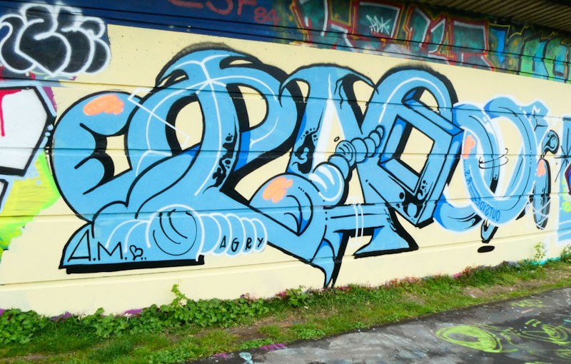
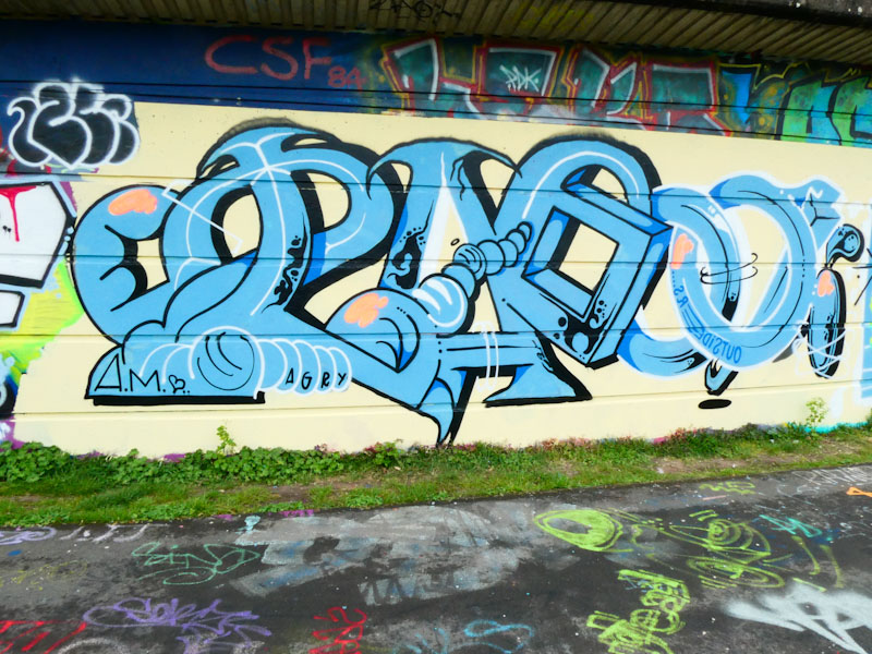
Another artist who consistently turns out High-quality pieces time and time again is Claro_que_sssnoh, and this one is on one of his favoured walls on the M32 Cycle path.
Claro_que_sssnoh, M32 Cycle path, Bristol, April 2022
All the ingredients are there, his intricate joined up writing, looking a little bit like pipework, set on a gorgeous red background with drips. The subtle blue fill patterns in the letters are really nicely worked and the whole thing looks strong and confident. Great writing from the Spanish artist.
On the curved wall at Dean Lane, Acer One painted this rather attractive piece, using his preferred rainbow writing that he has been working hard to perfect recently. The letters, in this case shapes, are slim and regular, and look as if they painted from a corporate font template. That sounds like a bad thing, but it really is not. Acer has designed up his lettering and shapes with thought and precision to create this font, and as ever his execution is faultless.
Acer, Dean Lane, Bristol, May 2022
Painting the curved wall is always a risk, because turnover is quite high, so it was brave of Acer to paint here and in fairness, it did last quite a few days. The extra nice thing about this font is the double shadow, one black and the second grey. I am very much enjoying this reinvention of Acer’s style and look forward to seeing a whole lot more.
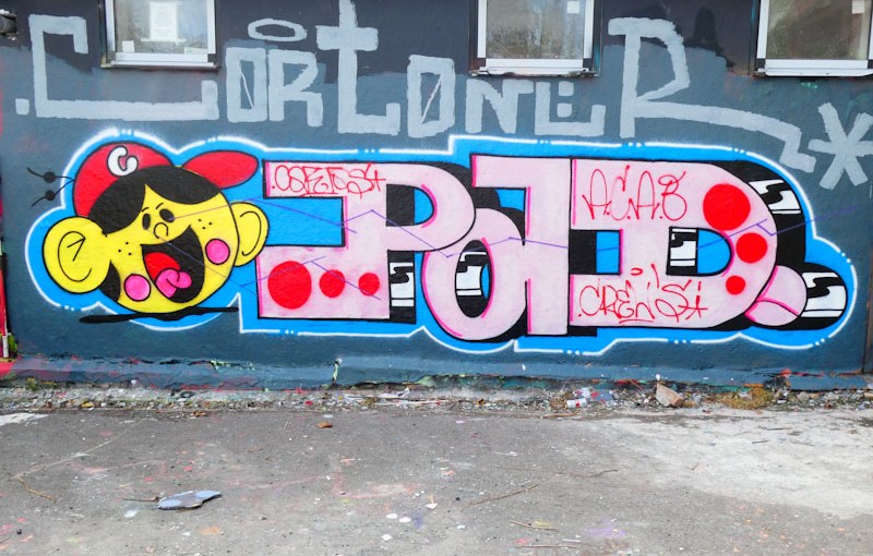
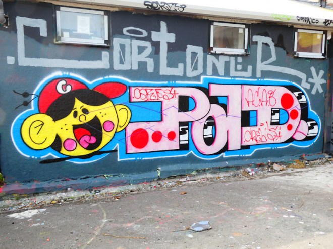
Cort is an intriguing artist. He is a quiet ever-present who just gets on with doing what he likes doing with the minimum of fuss, and then once in a while he produces what I would term ‘statement’ pieces like this one, which shout loud and clear to all who view them ‘I am Cort and I was here’.
Cort, Dean Lane, Bristol, April 2022
This is the second highly memorable piece from Cort on this wall in the last few weeks and clearly demonstrates his talent. PAD is the crew he belongs to that includes Laic217 and Trafficity, and is given centre stage in this piece. The character is nicely done and is clean with great solid fills. I believe Cort’s modesty belies his talent, and his work is often overlooked on the Bristol scene, which is a pity.
Here is a piece for the iced biscuit lovers among you. It was painted by Nina Raines in what appears to have been a mini paint jam by the Bristol Womxn Mural Collective a couple of weeks ago. I’m glad I managed to get a picture of this piece, as some of the others had already been tagged, and all of them were painted over shortly afterwards. It’s a dog-eat-dog world out there.
Nina Raines, Cumberland Bain, Bristol, May 2022
I have enjoyed watching Nina Rains’ artwork over the years, because she seems to be able to turn her hand to pretty much anything, and her styles adapt to the work she is creating. If she didn’t sign her pieces, it could be difficult to identify her work. Not only is this beautifully designed and painted, but it fits the shape and texture of the wall perfectly. More great work from Nina.
Nothing lasts long in Bristol these days, and even ‘high end’ pieces can have shorter lifespans than they deserve. A case in point is this wonderful collaborative wall under Brunel Way from Dibz and Acer. Rather more tragically, these two painted together again in the same spot last Friday/Saturday, and by Saturday afternoon it had been overpainted.
Dibz, Brunel Way, Bristol, May 2022
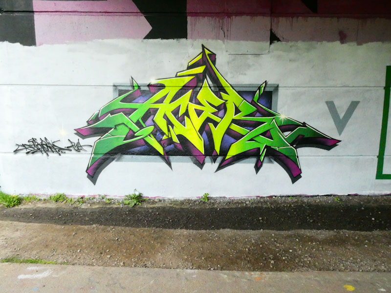
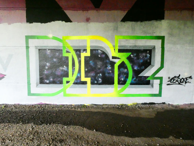
To the left is the Dibz contribution, but to add a little fun, each of the artists wrote the other’s name. So in this outstanding piece of wildstyle writing, Dibz has written ACER. I cannot put into words how good this writing is, so you can just judge for yourselves.
Acer One, Brunel Way, Bristol, May 2022
To the right, it is Acer One’s turn to play the game and adopting his favoured style of writing (at least recently) he has written DIBZ with care and precision, adding a little bit of interest behind the letters. The whole thing is a beautifully executed bit of fun from Dibz v Acer One.
One of the most recognisable styles in Bristol is from Taboo, and the interesting thing about that is that although he usually writes ‘Taboo’, no two pieces look the same, unlike some writers who like to recreate their letters in a similar format from piece to piece.
Taboo, Cumberland Basin, Bristol, May 2022
In this one, Taboo’s unruly letters, once again seem to defy convention, for example, he uses two different border colours halfway through the word. The letters are imaginative and creative, and don’t really follow a font style, although one can tell that they are all by the same artist. No character in this piece, which is a bit of a pity, because they add a further dimension to the overall work. This is yet another wonderful piece of writing from an artist who likes to plough his own furrow.
One of the best things about looking for and photographing street art is the surprises. Sometimes, everything can get a bit predictable, with the same artists spraying the same kinds of things in their usual spots, and then a piece like this appears shaking everything up.
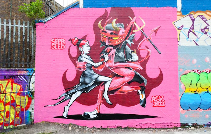
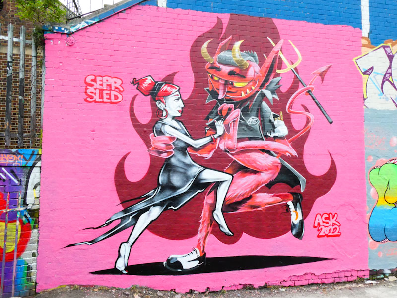
Sepr and Sled One, Dean Lane, Bristtol, April 2022
Sepr and Sled One have collaborated before, and in this piece, a true collaboration has emerged with the two styles blending into the same subject. I am guessing the piece is called ‘dancing with the devil’ if one says what one sees.
The lady to the left is by Sepr, and the greyscale figure is full of movement and concentration, dancing with her much larger partner. The devil character is by Sled One and is delicately, touchingly, holding his partner. One can only guess at his intentions, but in this moment the dance appears to be both intense and tender. Incredible storytelling from the pair of artists. The devil’s shoes are a hoot. This is one of the best character pieces in Bristol so far this year.