.
Death-defying flight
hugging the ground tight, then swoop
high into the sky
.
by Scooj
.
Death-defying flight
hugging the ground tight, then swoop
high into the sky
.
by Scooj
I don’t know very much at all about Dream Safari, the artist who painted this Einstein piece at Dean Lane. From his Instagram account I know that he specialises in characters and portrait murals, but beyond that I don’t know much more other than it took him six hours to get to Bristol to paint this, so obviously not local then.

Einstein is being a naughty chap with a tab of something on his tongue. At this point I have to confess my ignorance about recreational drugs, so am unable to say too much more about what is going on here. The portrait is nicely worked in grey scale, apart from the obvious splashes of colour. Great to see visiting artists as always.
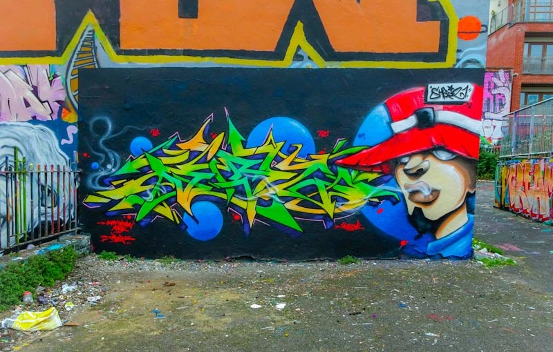
This superb collaboration from Dibz and Shade One was a precursor to their Cheltenham Paint Festival collaboration in the Honeybourne Line tunnel painted last weekend. Unfortunately I didn’t get to see the finished Cheltenham piece, but was privileged to watch the pair working together.
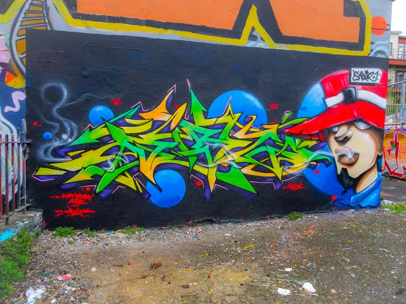
This Dean Lane Piece is truly outstanding, and the quality of design and execution is of the highest order. I particularly like the blue bubbles, the largest of which provides the background for Shade One’s character on the right. What you see here is a near-perfect work from two very talented artists.
.
End of week cool down
Designated Survivor
with young Sutherland
.
by Scooj
Every year or two, something wonderful happens on the walls of the Dare To adult night club in the form of the Raw Wax Graffiti Jam (thank you Paul). This year’s paint jam was truly exceptional in terms of the pieces created, sadly I didn’t make it on the day, but took some pictures a day or two later.

This full wall piece is an extraordinary and quite brilliant collaboration from Zase and Silent Hobo, full of colour and vibrancy, lifting the spirits in an industrial part of Bristol that is far from inspiring. It is incredible what a lift great street art can give to an area, changing the whole character of a place and this collaboration does that in spades.
On the left hand side Zase has created one of his beautiful 3D anamorphic signatures set on a background of what look like Swiss cheese plant leaves (a favourite for street artists). On the right are a couple of large Bristol youths, always so beautifully portrayed by Silent Hobo. The whole thing works very well indeed and I am not too sure that these two have worked together before, but the result is amazing
There is so much construction work going on in Bristol it is quite mind-boggling, and this in the shadow of ten years of austerity and now a coronavirus recession – there are obviously still large bags of money out there. Construction usually means that, for a short while at least, temporary hoardings will be installed, and if you are lucky the constructors may commission street artists to paint them in the hope that they don’t get covered in unattractive tags.
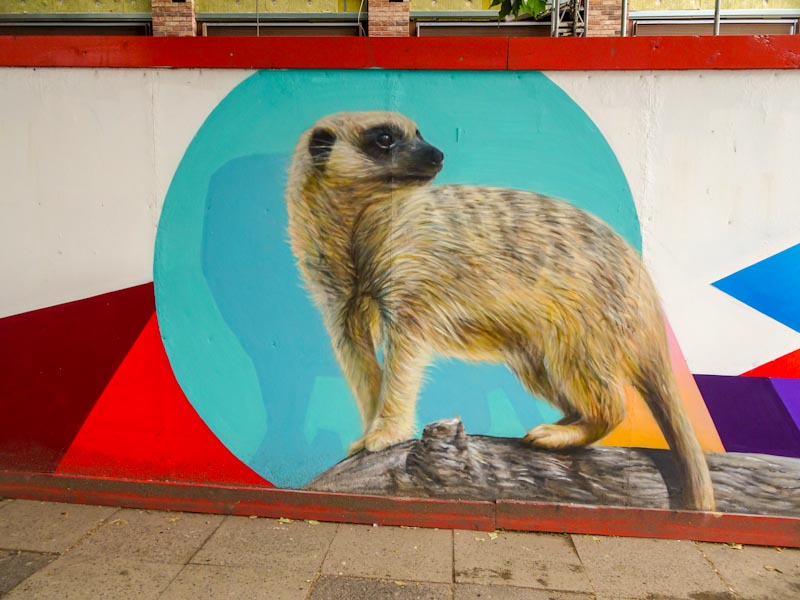
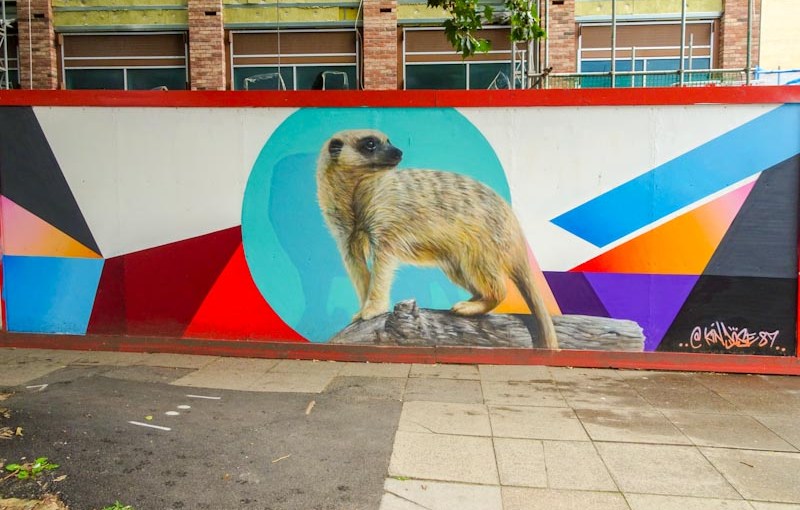
Temple way is no stranger to construction, but may be a stranger to the talents of Kin Dose whose meerkat piece is outstanding in every way. Kin Dose uses an airbrush technique that allows him to create the detail in the fur and the tree branch and so on. Sit back and enjoy this wonderful masterpiece from one of the very best.
.
Natural design
unsurpassed by engineers
miracle of flight
.
by Scooj
It’s that man again Varo with his recognisable mega-tag of a bull’s head, no doubt inspired by his Spanish heritage. This piece is a variation on his throw-up version and is rather an attractive looking beast with a rather foppish haircut.

There is something of Picasso in this piece, deliberate or otherwise and although it is nothing like it, it reminds me of Guernica, or his bull’s head sculpture made from a bicycle seat and handlebars. I like the cheeky boldness of the piece. Great fun.
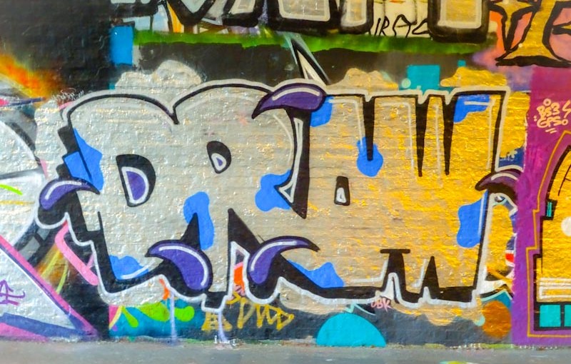
As if to prove me wrong, here is yet another Mr Draws piece, and a rather nice little one at that. Since stating a little while ago that he wasn’t getting out much, I am now finding pieces all over the place. I was also fortunate enough to catch up with him at the Cheltenham Paint Festival last weekend, and noted that he too has grown a rather nice corona beard.
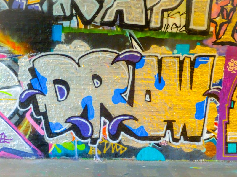
The piece in St Werburghs tunnel Is deceiving because of the lights in the tunnel. It is actually chrome but the reflected light makes it look very gold on the right hand side. Some nice simple drops and blobs just lift the piece a little. Modest and fun.
.
Stretched across the vale
suspended between tree trunks
circus act practice
.
by Scooj