Appropriation.
Beautiful winter birdsong
captured by the net.
by Scooj
Appropriation.
Beautiful winter birdsong
captured by the net.
by Scooj
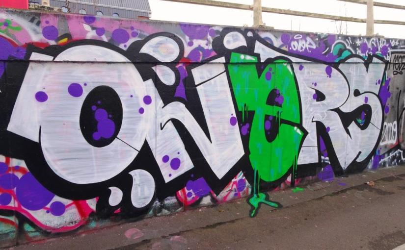
Oner has been very, very busy lately and this was a quick one he sprayed a week or so ago on the M32 roundabout. I actually caught up with him just as he was finishing off and he made time for a good chat, although I know that many graffiti writers like to just get on with their work uninterrupted.

We talked a little about how he likes to work alone, which I can see is a real benefit if you want to have flexibility and spontineity. This is a nice piece with good colour selection and great letters. I love the drips on the ‘e’ and the bleed onto the pavement. Many more to come from this prolific writer.
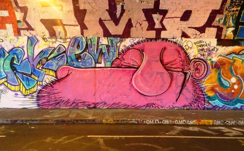
A new week, and to celebrate I am introducing you to an artist to the pages of Natural Adventures, Atchue. Although I have seen some of his pieces before, I have not known who the artist was until recently. The good news is that I have some of his work in my archives and I can dig it out when I do some of my ‘housekeeping’.
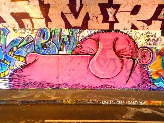
His work tends to be big, pink and bold and cartoon in style. This face reminds me of the artwork you used to see in comics like the Beano, Beezer and Dandy. The little quote on the side seems to reflect the thoughts of this marginally grotesque character…”Boobs covered in Angel Delight, yum yum”.
There is something endearing about this gurning character, and certainly it is eye-catching. Nice one to start off with.
Am I mistaken?
I think I heard the call of
a green woodpecker.
by Scooj
It has become a rare thing indeed to find much new work in The Bearpit, which is why finding this lovely piece by Skor85 was such a nice surprise. I’m afraid the quote is a little lost on me, but it feels like there is an interesting story behind this piece.
Skip forward about fifteen minutes and I have found some stuff on the Interweb that probably explains the background to the piece, and it would seem to be linked to an art project by Pierre Huyghe and Philippe Parreno.
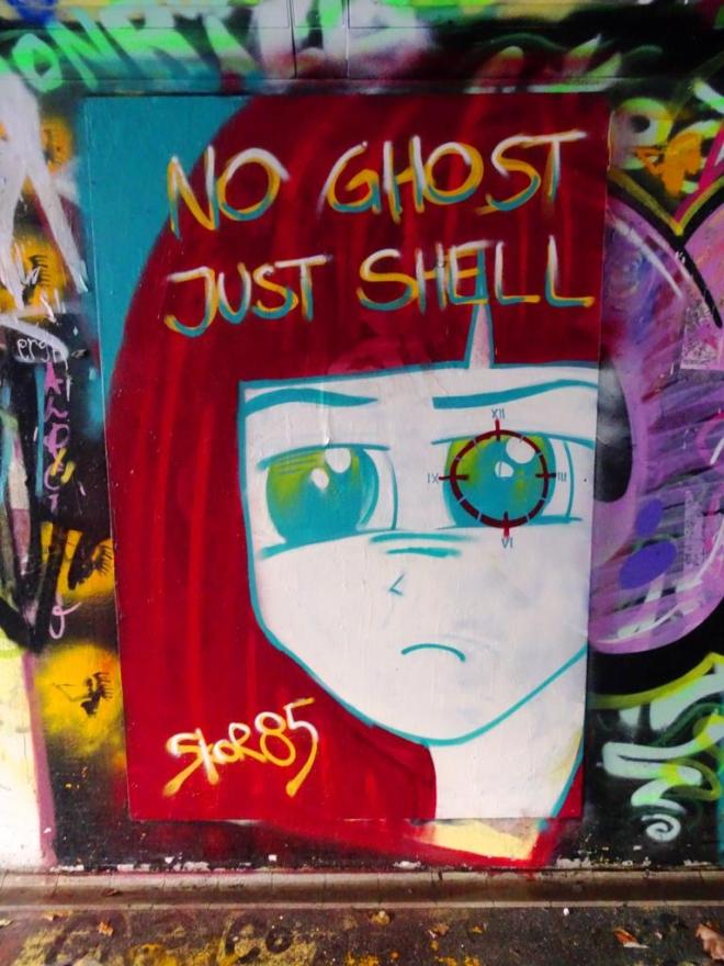
I am pleased that I had spotted a Manga connection and was going to comment on it, but feel a little fraudulent writing about it, knowing that I have been able to confirm my hunch subsequently. I love Skor85’s work which nearly always has a dream like narrative to it. It has been a long time since I have seen anything by her.
Back to home soil now and the warm and familiar sight of a Dean Lane piece by Laic217. This is the second recent piece that I have seen where he has been playing with these red eyes which are slightly disconcerting in their non-human (robotic) quality.
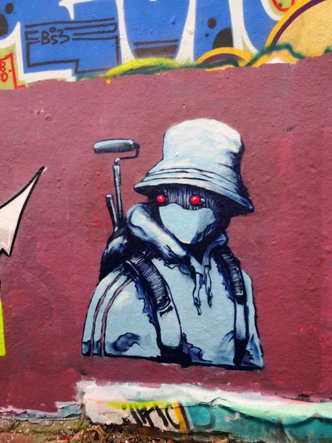
There is a slight shift in style too in this overall piece. To me it has a water-colour kind of quality and looks like it has been lifted from an artist’s sketchbook. This feels like Laic217 is moving on to a new level, where his confidence and competence is allowing him to experiment more.
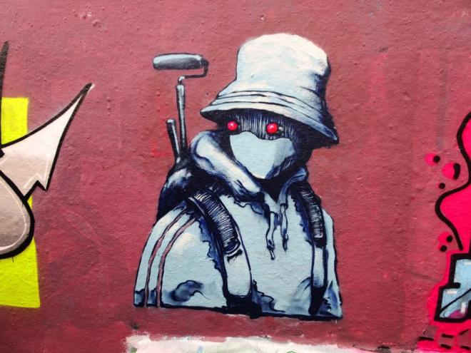
I believe he was supposed to be painting this wall with Cort and Cros, but had arrived long before the others and had pretty much finished before they arrived. This is a pity, because it is a long time since I last met this elusive artist.
At my feet he lies
wet dog smell filling the air
I’ll light a nice fire.
by Scooj
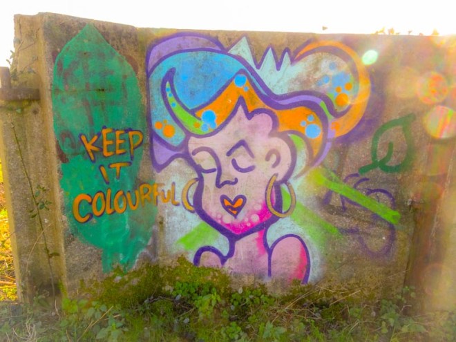
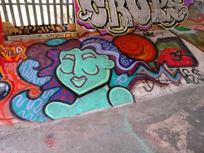
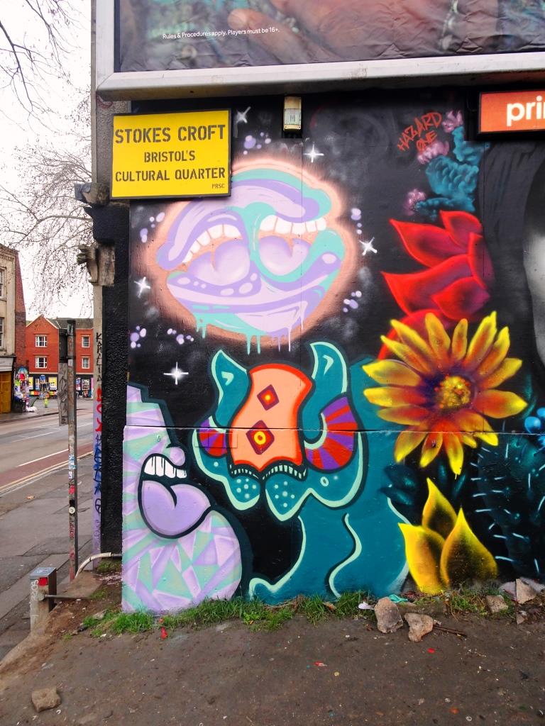
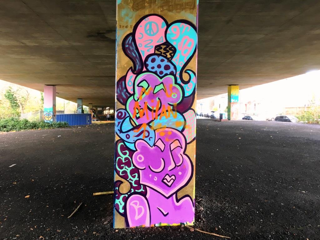
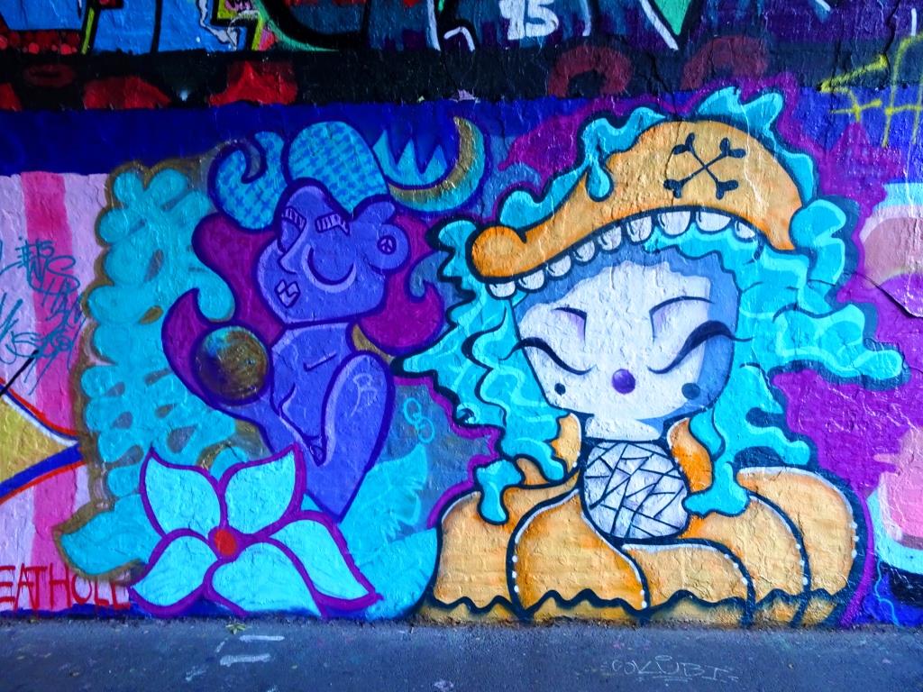
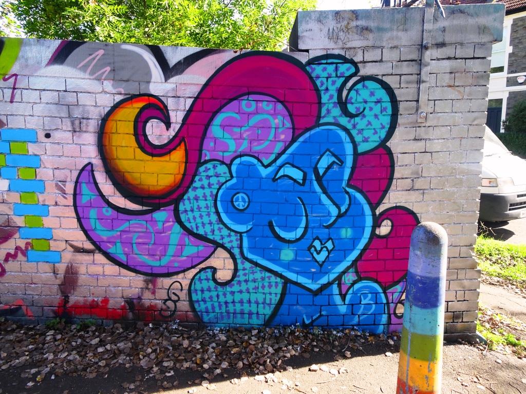
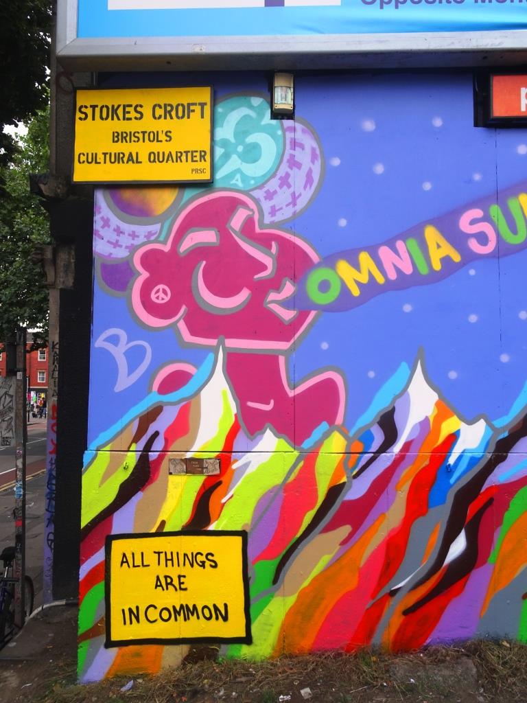
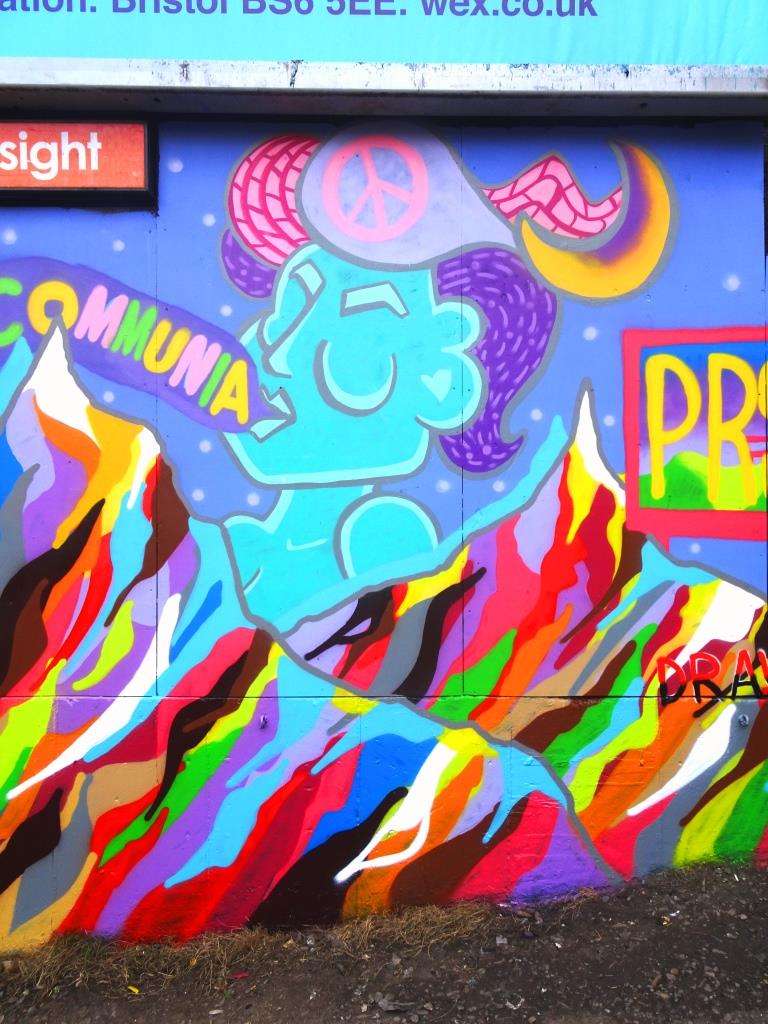
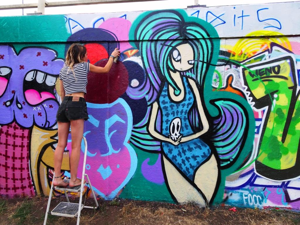
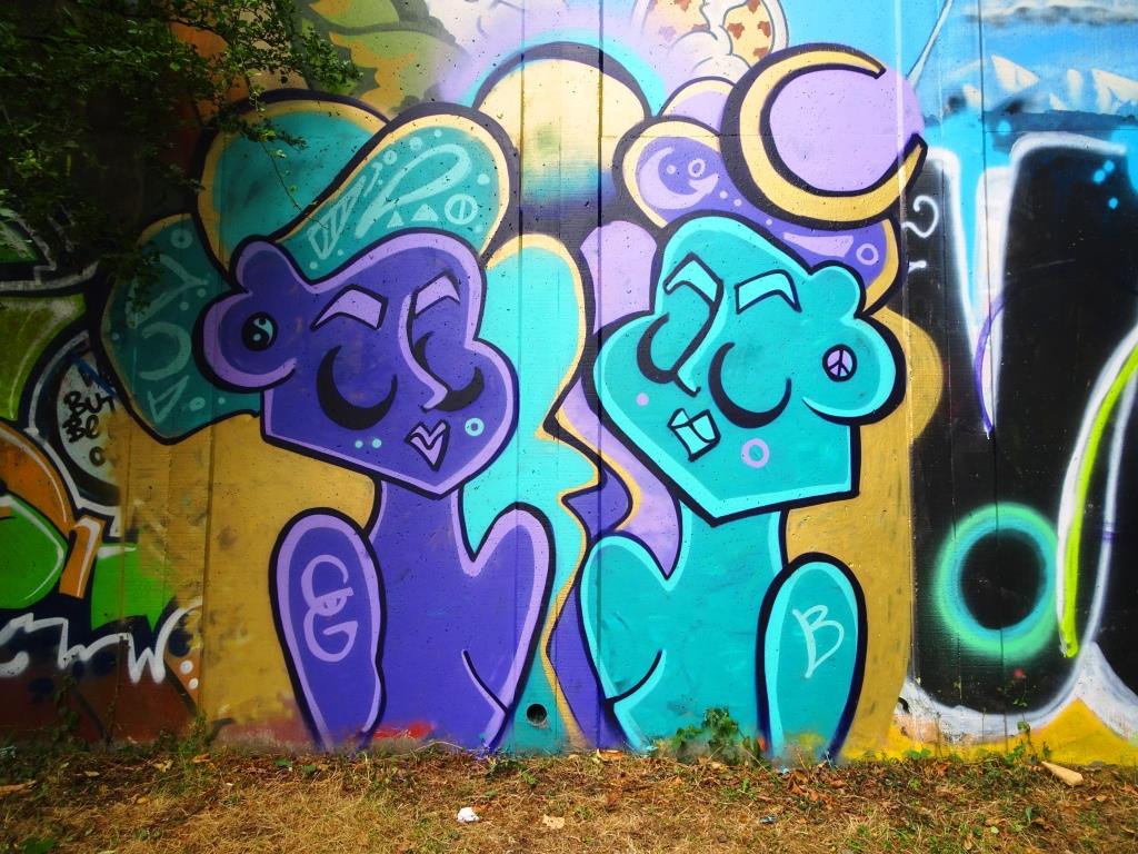
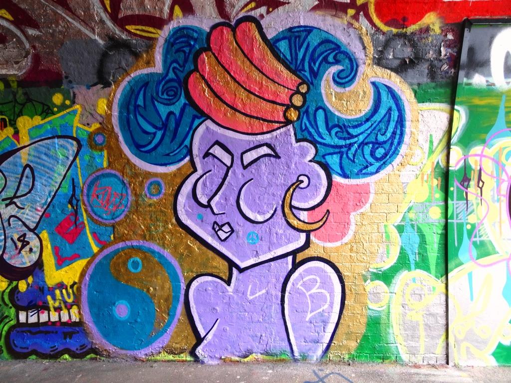
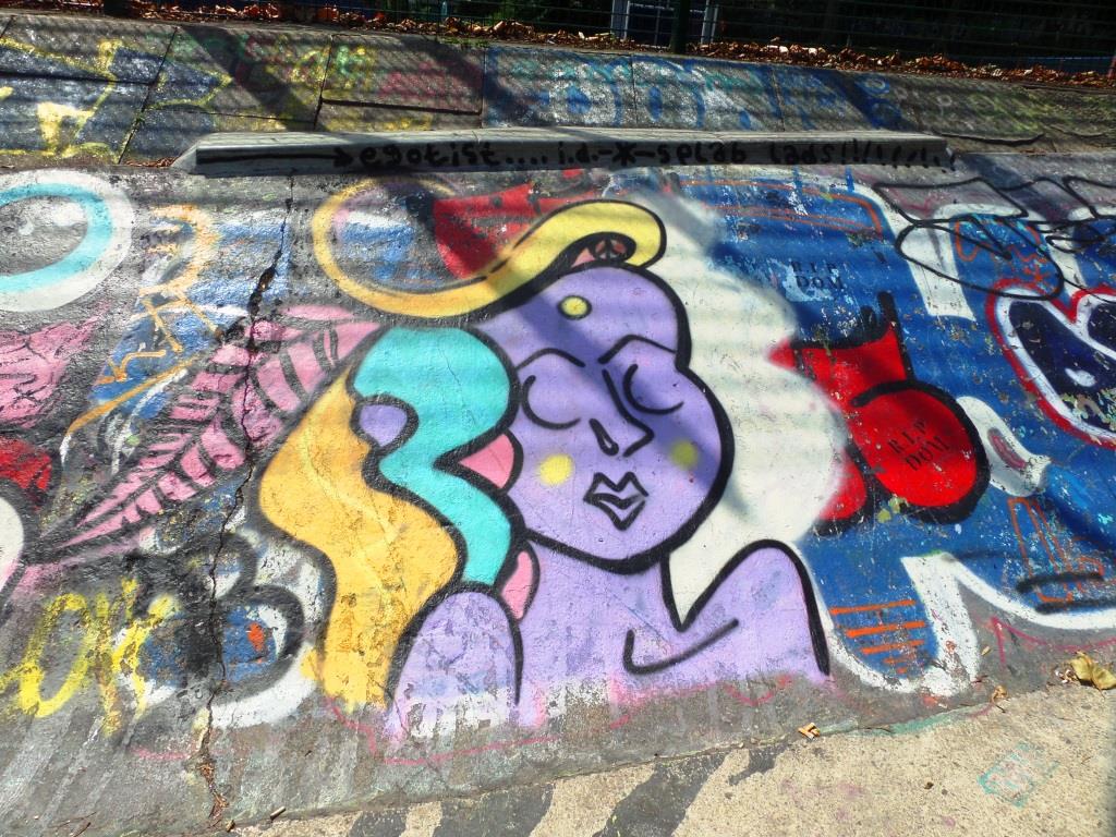
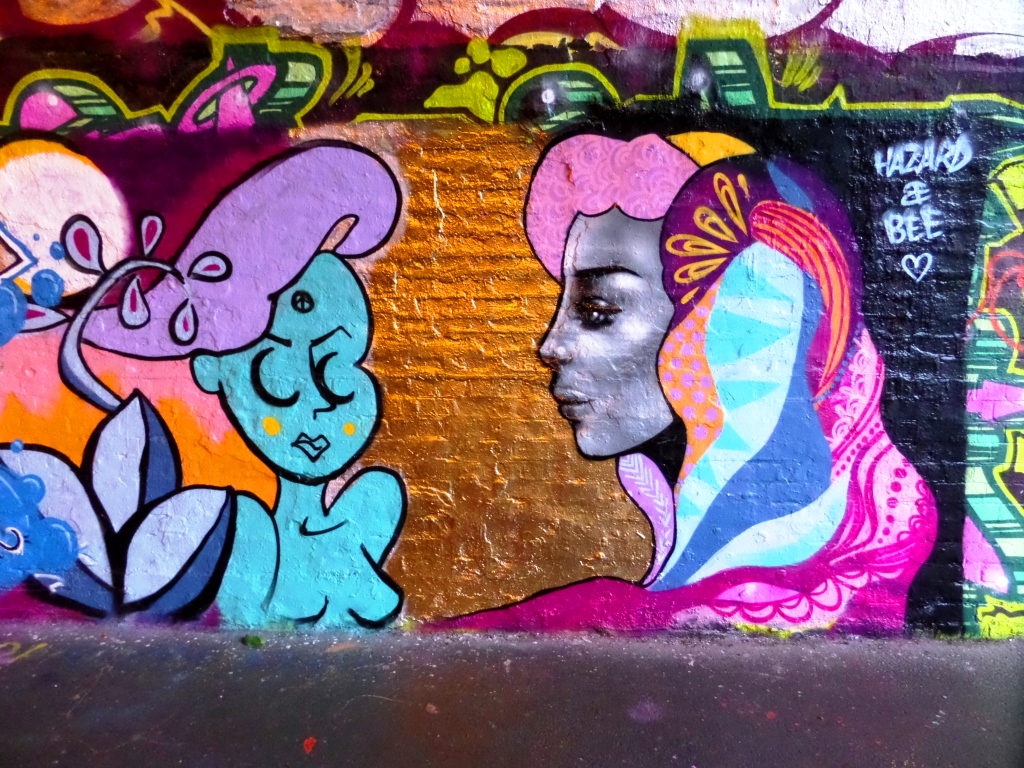
Keeping it colourful with this gallery of beautiful faces by Bristol artist Tasha Bee.
All photographs taken by Scooj


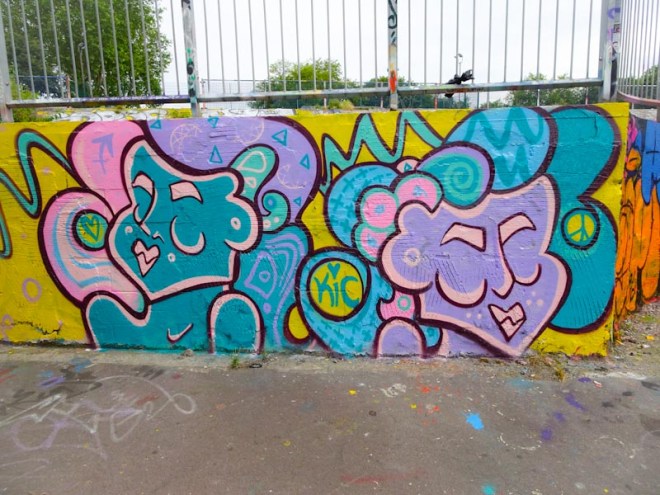
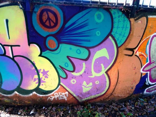


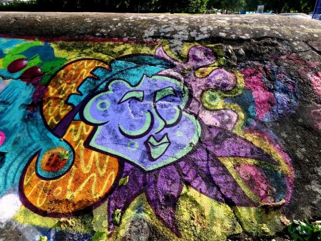












Allen Street in East Village is a bit of a mecca for street art, but it is not concentrated like some of the spots in Bristol, but rather it is dotted about along the entire length of the Street. This exceptional piece by Joe Miller was rather new when I photographed it in October 2017.
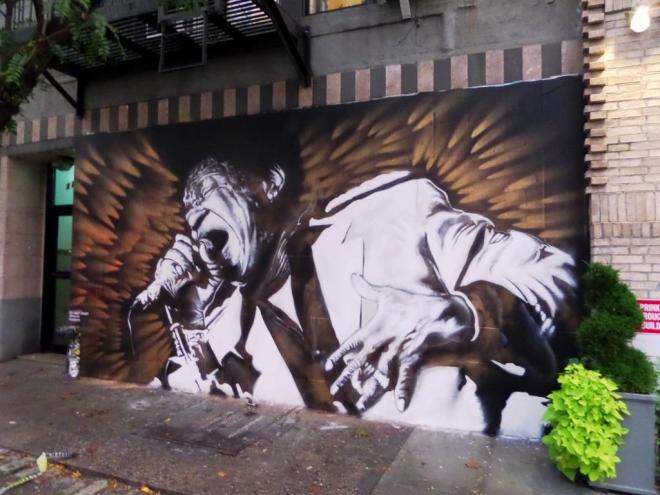
The piece is a tribute to Charles Bradley a well known soul singer originally from Florida, but who had lived in New York for more than 20 years, and had died the month before from cancer. The mural has such incredible energy and movement and captures the singer doing what he loved and did best. It is an amazing piece.
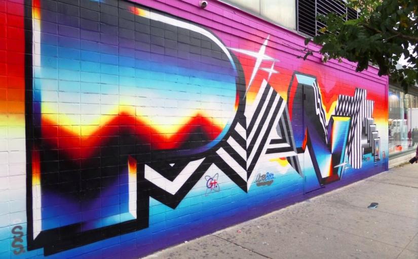
On my walks around New York, I somehow ended up near this piece on several occasions, I guess it was easy to recognise and see from a distance, so it had imprinted on my mind. It is an interesting designed writing piece by Felipe Pantone.
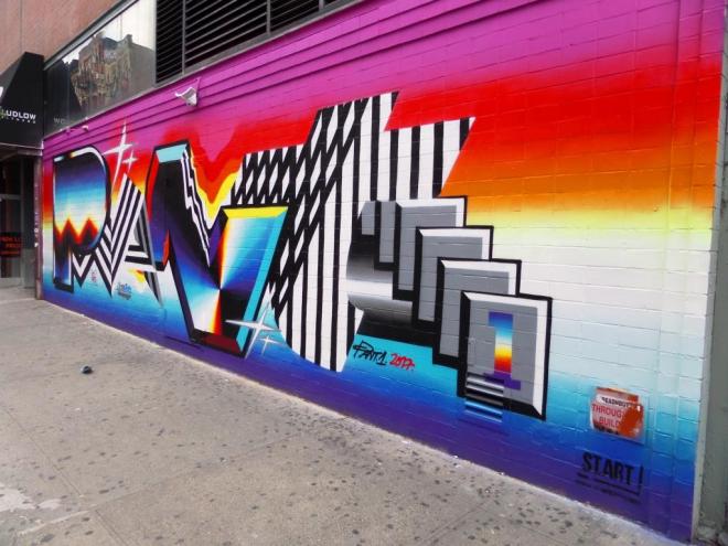
The whole thing, the bright prism colours, the black and white stripes, the precise straight lines all remind me very much of 1980s design, when there was little or no subtlety and everything was vibrant and ‘in your face’. I guess what I am saying is that I get some strong retro vibes from this piece. A nicely thought out and painted piece.


 Natural adventures