.
To become the best
you must meet and beat the best
change the paradigm
.
by Scooj
.
To become the best
you must meet and beat the best
change the paradigm
.
by Scooj

There were several memorable highlights to our recent weekend away in Liverpool, and nestled just under my wife’s completion of the half-marathon, and walking around the docks and the Liver building, was this utterly outstanding portrait mural by Liam Bononi.
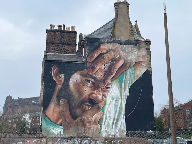
The portrait piece, of a contorted agonised male face, is particularly impactful on account of both its size and its positioning on an entire elevation of a large, isolated Victorian building. There is so much detail in the face and hands, a signature of Liam Bononi’s work, and there is a fair amount of emotional wrestling going on here.
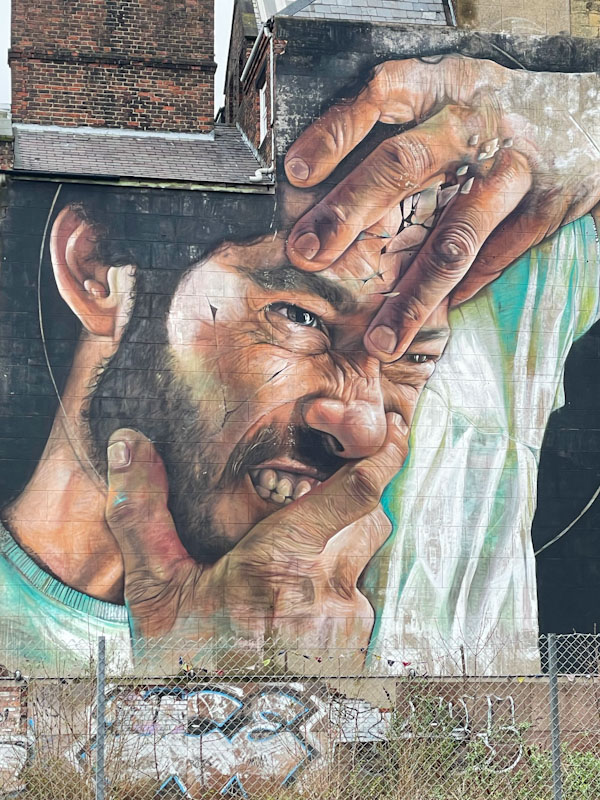
Without doubt, I am a big fan of Liam Bononi’s work, and the quality of his portraits. What a fabulous surprise to find one as magnificent as this on the back streets of Liverpool.

As you will know from yesterday’s post, I recently spent a weekend in Liverpool, and the old ‘graff radar’, which I thought I had turned off, swung into active duty. Not being familiar with the street/graffiti artists in Liverpool, it was comforting to come across this rather nice mural by Molly Mural, who has painted many times in Bristol, where she is based.
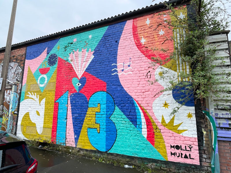
I’m not sure how long the mural has been there, but I guess a while, as some of the paint was chipping. The piece appears to be full of symbolism and stories and is centred around the numbers 1 and 3. The abstract piece is characteristically colourful, and after doing a little Interweb search, it turns out it was inspired by Taylor Swift’s ‘second era’ and her lucky number 13. You live and learn.
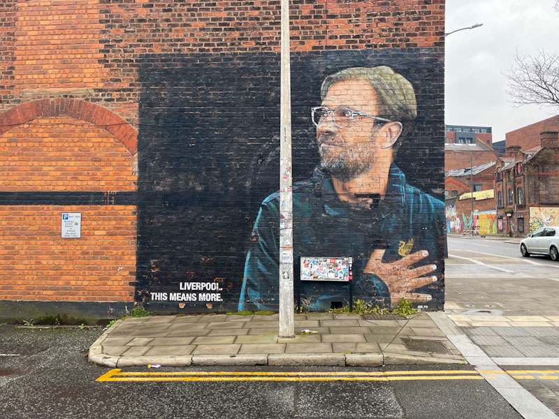
A couple of weeks ago I visited Liverpool with my wife and daughter to cheer on my wife and our nephew-in-law who were running the half-marathon. After finding a strategic place to stop and wave them on at the mile marker, we had an hour or two to kill before being at the finishing line at the end of their admirable adventure. Our rather less energetic walk took us to a café, which happened to be in a street art district.
This discovery had been completely unplanned by me, I have only once before been to Liverpool, long before I was interested in street art, and didn’t do any research before our trip. I got lucky once again. While my daughter and niece, caught up and had a coffee, I ran around the area, like a mad thing, taking as many pictures as I could. This was one of the first.
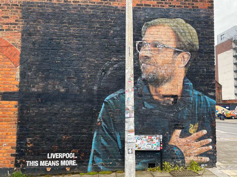
As a football fan, I can appreciate that this is a fine piece on two levels. One, the quality of the portrait of Jurgen Klopp, former manager of Liverpool Football Club, and two, the love for football and how the local team touches lives. The artist is Aske, not known to me, and this is a fine tribute to a local hero. More from this Liverpool adventure to come.
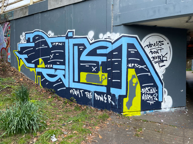
The council, for whatever reason, seem to like buffing the walls of the M32 roundabout with a neutral grey paint. I am not too sure what the purpose is, other than to give people doing community service a civic activity. That the exercise is costly and futile doesn’t really come into the equation. Once buffed, the wall becomes an inviting canvass for street/graffiti artists.
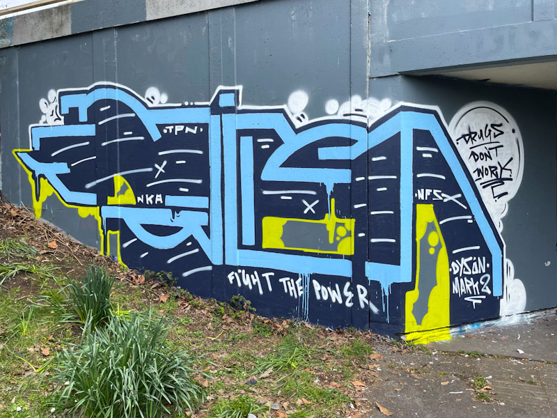
Kid Krishna didn’t waste too much time creating this CRIE piece in blue lettering with some yellow splashes. The piece carries a couple of messages: ‘drugs don’t work’ and ‘fight the power’, which suggests the artist is working through a few things, as are we all, at the moment. A nice ‘virgin wall’ piece.

Dirtygypo has returned to the streets with a few pieces this spring, and this is a rather nice one painted in Cumberland Basin. The letters still puzzle me. There are thoughts that they could spell Pilger or Dirty, but I don’t think it is either of these.

The letter forms are consistent with his usual approach, but he has added in some great colours, and the lightening breaks in white really stand out through the piece. The characterisation of the first letter is one of several signatures that aid with identification, but to be honest, his writing is unlike anything by any other artists in Bristol and is easy to identify. It is just those damn letters that perplex me.

There is something very exciting happening at the moment with Liz (Le Imposter Designs). Having dabbled for a while with her line and paint drawings/illustrations in selected spots, she moved on to working with spray cans, and it seems to have lifted her into a new world of possibilities, and her excitement is obvious to see through the frequency of her new pieces and her creativity.
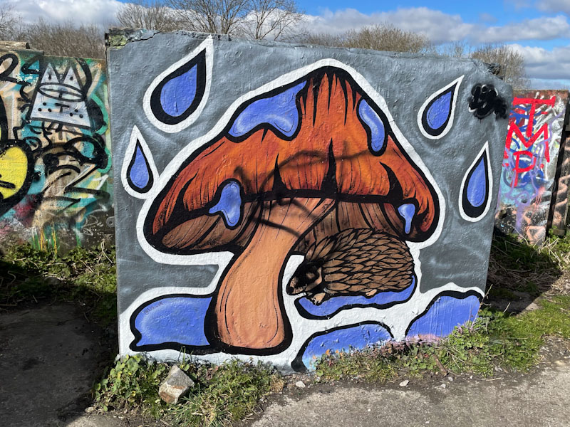
Obviously, the central theme to Lis’ artwork is the representation of mushrooms and toadstools, and this piece on a concrete slab in Purdown is a great example. It is a pity that some twit has felt the need to tag the piece, but fortunately it doesn’t detract too much from the mushroom and rather cure hedgehog. While the main body of her work is achieved using spray paint, I think that some of the detail is achieved using pens, which doesn’t devalue it one jot. I am loving the emergence of Lis and can see a very bright future ahead.
.
When it is our time
and we die, it is our time
skin and bones remain
.
by Scooj
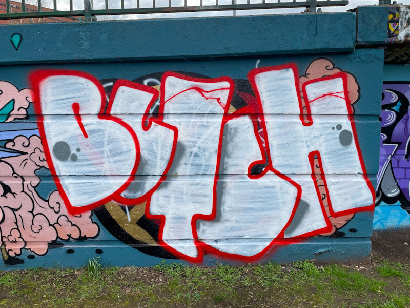
I have to confess that I have a real soft spot for Butch’s graffiti writing. I like the name, I think it lends itself well to the art form, I like his letter shapes and I like his understated presence.
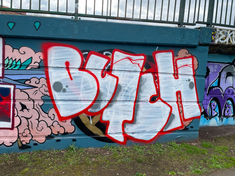
Butch has a fairly standard approach to arranging his letters where, going from left to right, each letter overlaps its successor. With the addition of some shadows, this method provides some depth to the piece. This looks like a bit of a quick one, with a white fill that barely does the job of filling. A couple of nice spots round the piece off nicely. More on the way from Butch.
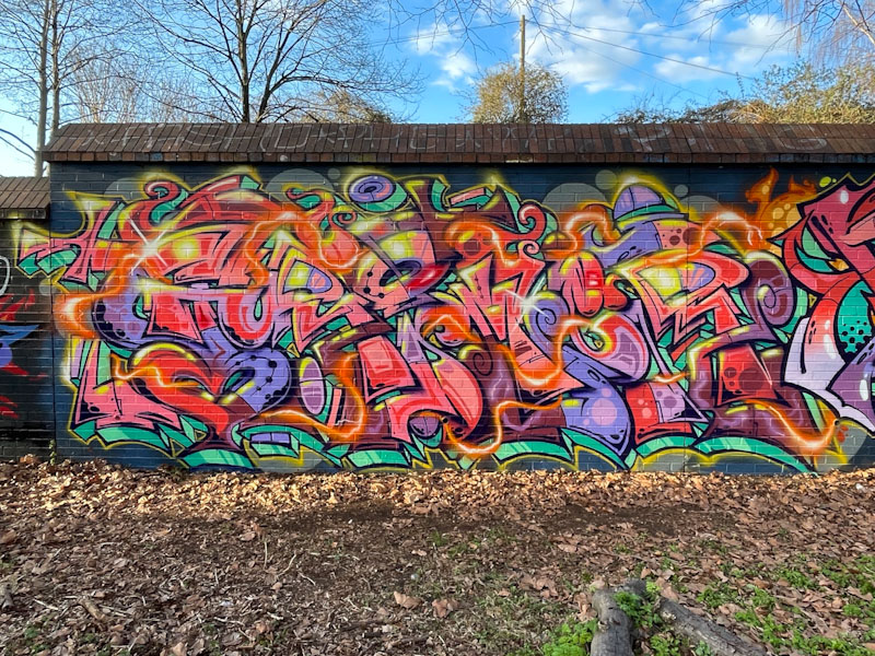
Grimes has pretty much made it to the top of my list of Bristol graffiti writers at the moment, taking into account the frequency of his pieces and the outstanding quality of them. Unlike some graffiti writers, his style remains broadly the same, but he manages to squeeze out every square inch of space on the walls he paints and create the most amazing burst of energy and movement.

Colour and quality are two words I would use to open my description of this piece. Every element is in its place and finished perfectly. I particularly like the plasma ribbon running through the whole thing. This piece continues Grimes’ run of good form, which shown no signs of letting up.


