
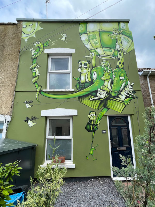
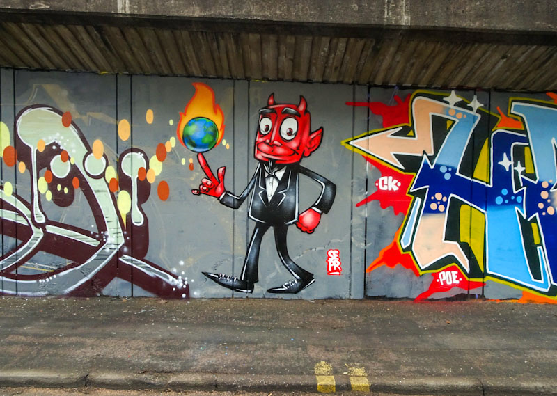
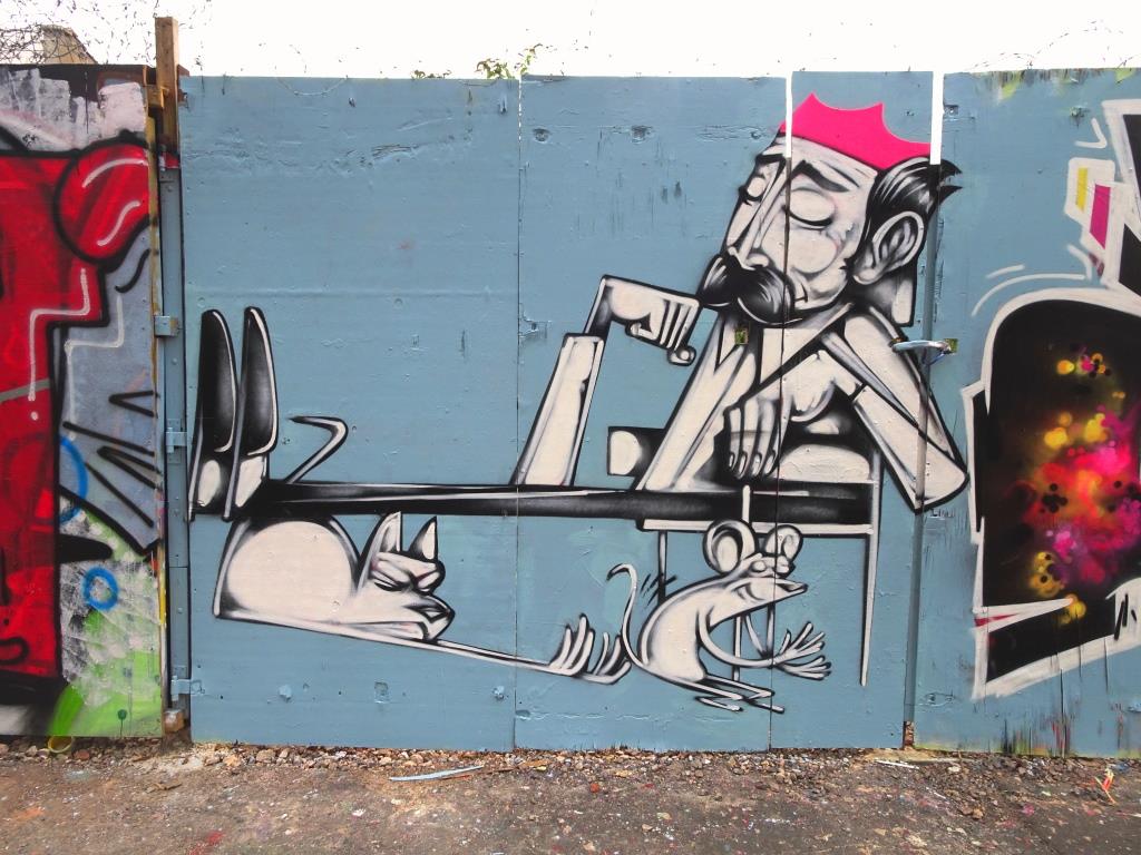
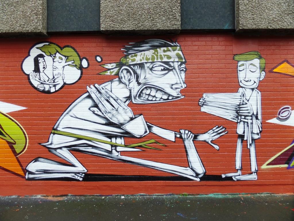
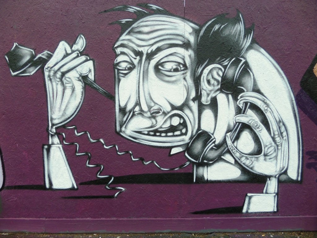
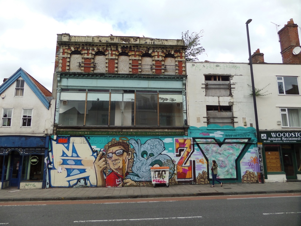
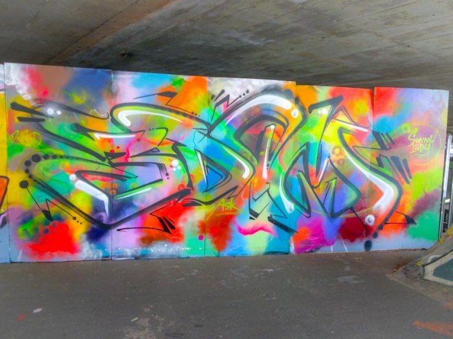
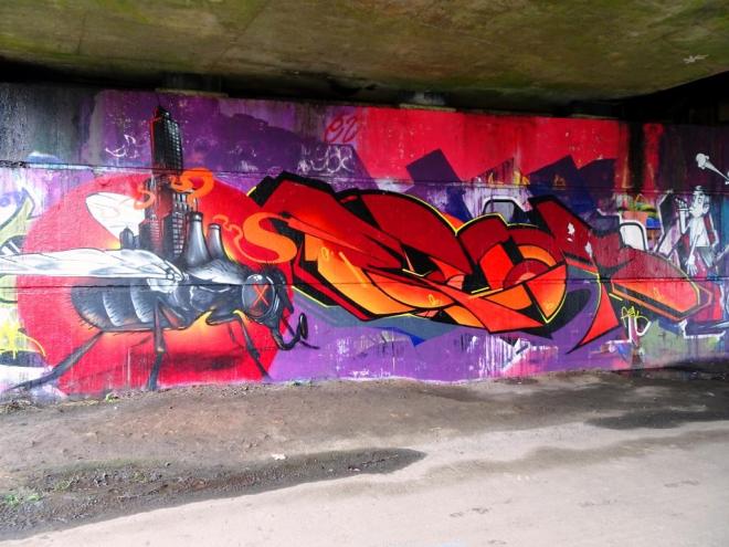
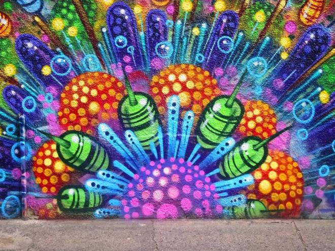
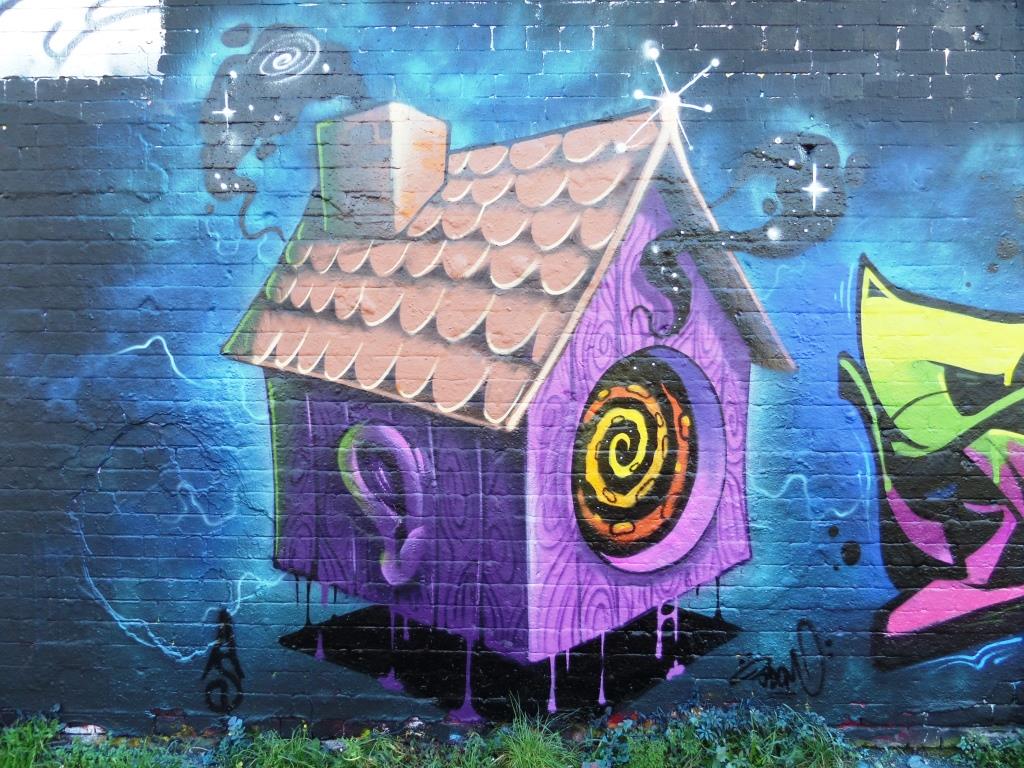
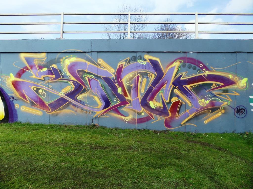
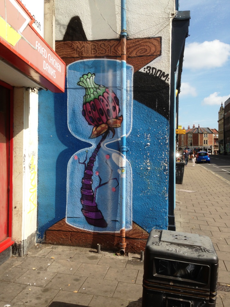
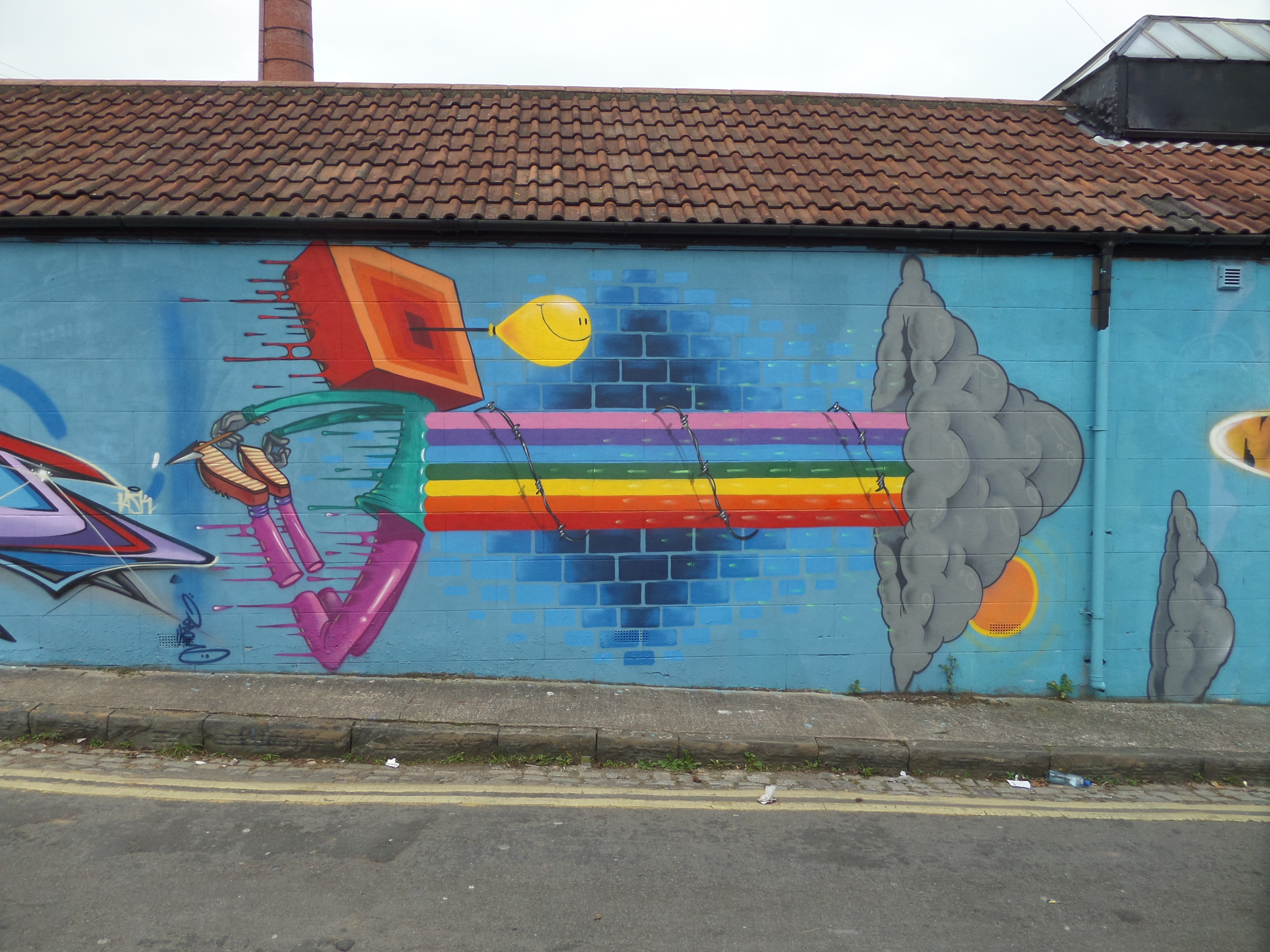
A collection of street art from the brilliant Sepr
Instagram: @sepr
All photographs taken by Scooj

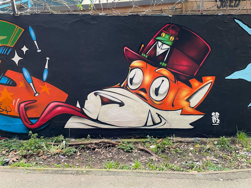


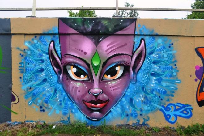
A collection of street art from the brilliant Sepr
Instagram: @sepr
All photographs taken by Scooj
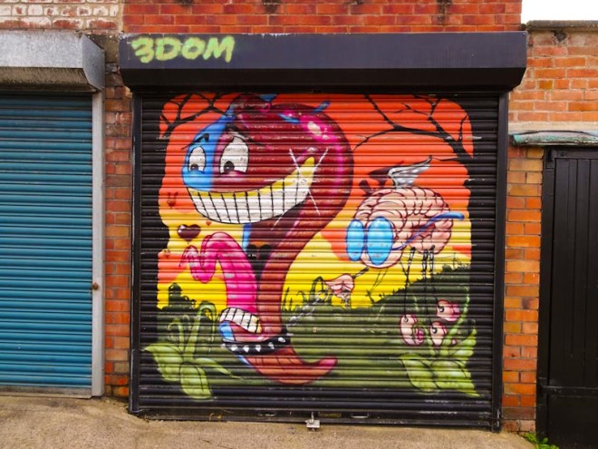
I don’t know how many iterations of this camel there have been on this particular wall, but I can think of at least four. Feek seems to be the main driving force, often accompanied by 3Dom, behind this themed wall which has incredible ‘foot fall’ or rather, driver-by viewings.
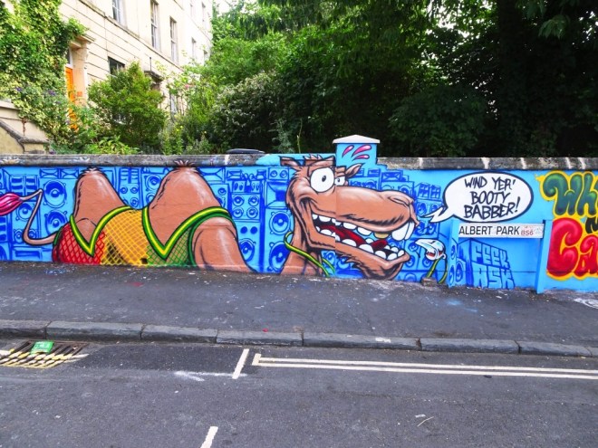
The wall is something of a landmark known to most north Bristolians as they journey towards the M32. Here the camel, speaking ‘Bristle’, is set on a background of speakers and draped in Rastafarian colours. Altogether brilliant. Below is a previous incarnation of the wall.

Another day, another Deamze piece…his work rate is really phenomenal and the quality of his designs and their execution is unparalleled. It is easy to become blazé about his work, because his standard is so consistent, but if you take a good look at this piece, there is so much to admire.

The colour selection works well with yellow tones set on a blue background. There is a lot of intricacy to the interlocking letters and precision in the shapes. Yet another outstanding example of this incredible talent.
Daa da da da da da da da daa daa dada dada. Getting right to the heart of the matter is this brilliant Simpsons piece from Soker. He really is quite one of the best writers around and this sofa scene totally proves it.
His use of the Simpson characters on the sofa, a scene so familiar to anyone who watches the show, to create his name is inspired, and taking a closer look, there is almost a Picassoesque look to Lisa and Homer in particular.
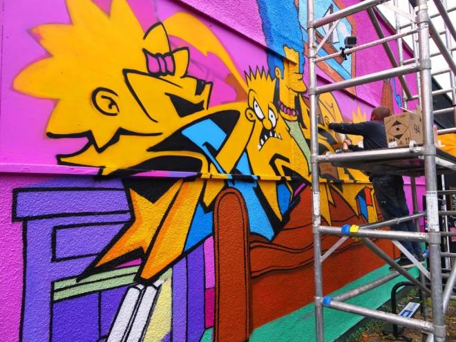
The whole scene is well observed, with the lampshade and the picture of a sailing boat on the wall, and is indeed a special homage to the genius of Matt Groenig.

I managed to catch up with Soker, which I have never managed to do before, and had a quick chat on the Friday, again on the Saturday morning and later on in the Spotted Cow. I think he had slightly overdone his merrymaking on Friday night and had to abandon painting on the Saturday, nursing a bit of a sore head.
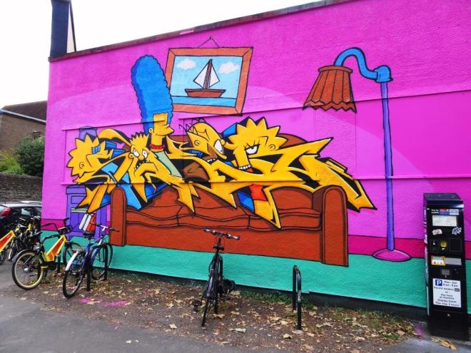
I asked him why sometimes he wrote Soker and at other times Sokem. His answer seemed sensible to me…he started off with Soker (pronounced Soccer), but found the R difficult to write, so changed it to Sokem, before reverting once he found the R easier.
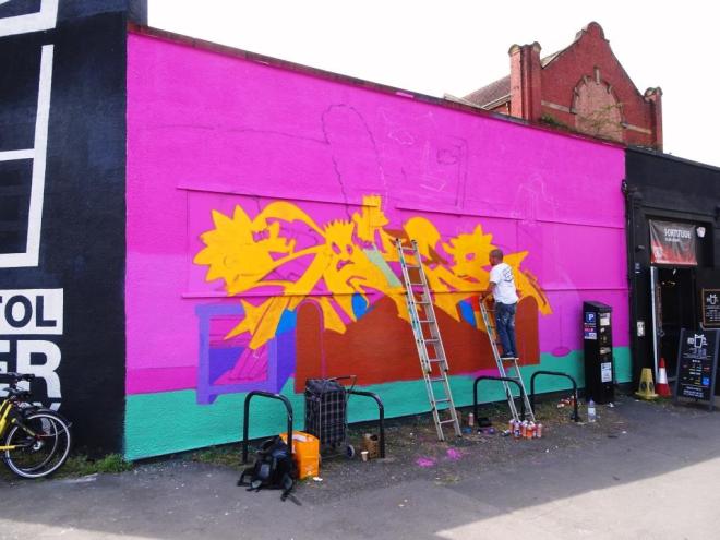
This has to be one of my favourites from Upfest 2018, and is really an outstanding piece.
Oh I just love it when I make new finds when I am actually looking for something completely different and stumble upon something like this. I was driving round Easton hunting down Andrew Burns Colwill’s new mural when I drove up Devon Road – a funny road that has a dog-leg layout, one part of which is a back street and the other a fairly busy main road.

This is of course by Deamze, and I just don’t know how it fell outside my radar, but I am glad I found it nonetheless. Even better is that I know who the character references are which can’t be said for a lot of the 80s and 90s cartoon characters that Deamze uses.
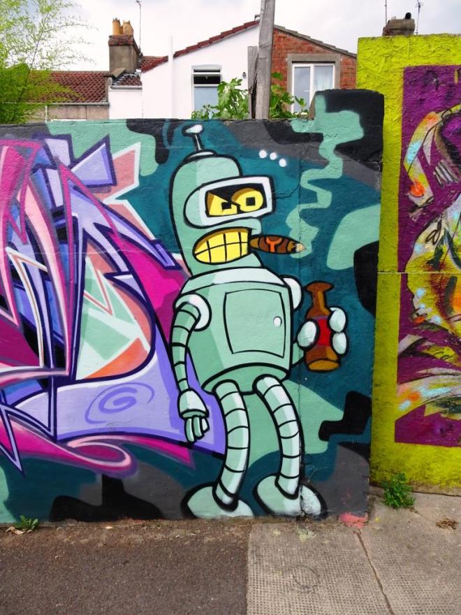
The character is the robot Bender from the TV series by Matt Groening (creator of the Simpsons – who have featured big time at Upfest 2018). It is all very good, and Deamze’s wildstyle writing is exceptional as always. I love the freshness of this piece.
Oh, will this gorgeous weather never end? It is causing havoc with my photographs!
No prizes for guessing who this glorious piece is by, it is of course Deamze, the master of wildstyle writing accompanied by a cartoon character.

The Character in this piece is a rather worse-for-wear looking Batman with the obligatory spray can. Even though the work is on a textured surface, the piece is crisp and clean.
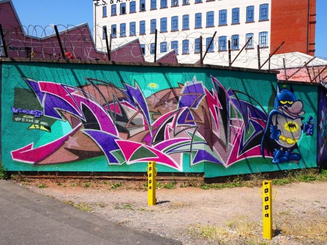
Deamze uses several writing styles in his work, and this one incorporates his zig-zaggy shapes that make up the letters D E A M Z. A lovely fresh piece for the summer.
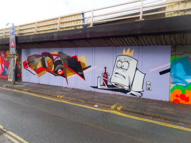
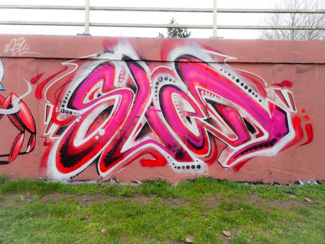
I haven’t seen a new Voyder piece for ages, so was very excited when I knew this one had been painted at the M32 roundabout. Unfortunately this is one of the spots that is obscured by the sun and shade effect from the adjacent trees. Now I love trees as much as the next man, but not when they do this to sensational graffiti art works like this one.

Even with the variable light conditions on this piece it is possible to see the sheer excellence of this top writers talent. Once again we see a return of his neon squiggle that he draws so perfectly and balances off the whole piece of writing. I have run out of superlatives to describe just how good this guy is – perhaps it is just better to look and marvel.
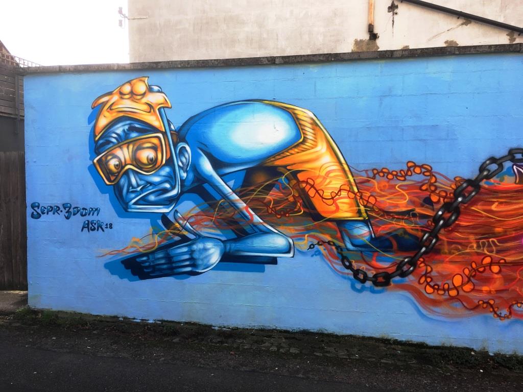
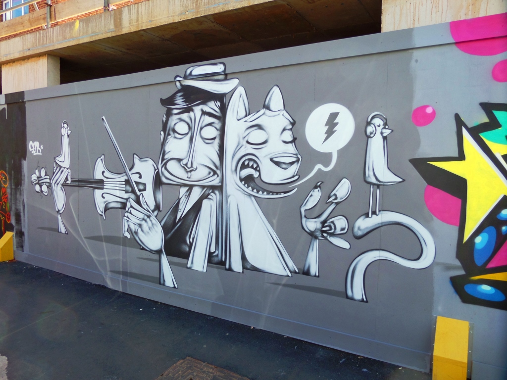
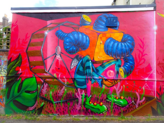
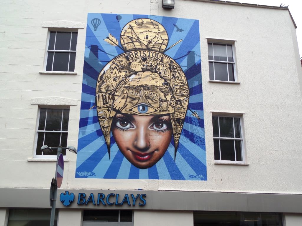
A collection of street art by Bristol’s 3Dom
All photographs taken by Scooj


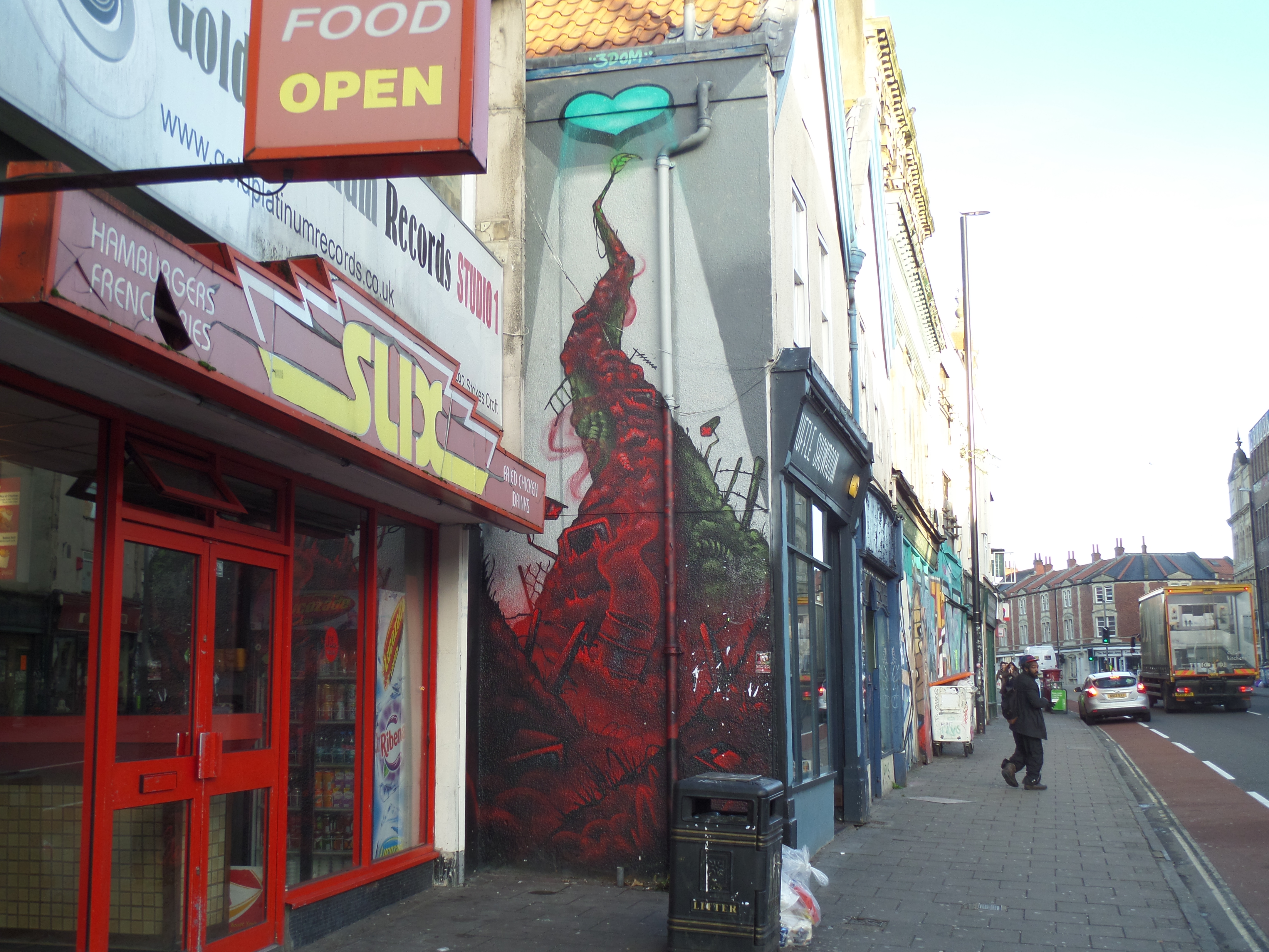
All photographs taken by Scooj
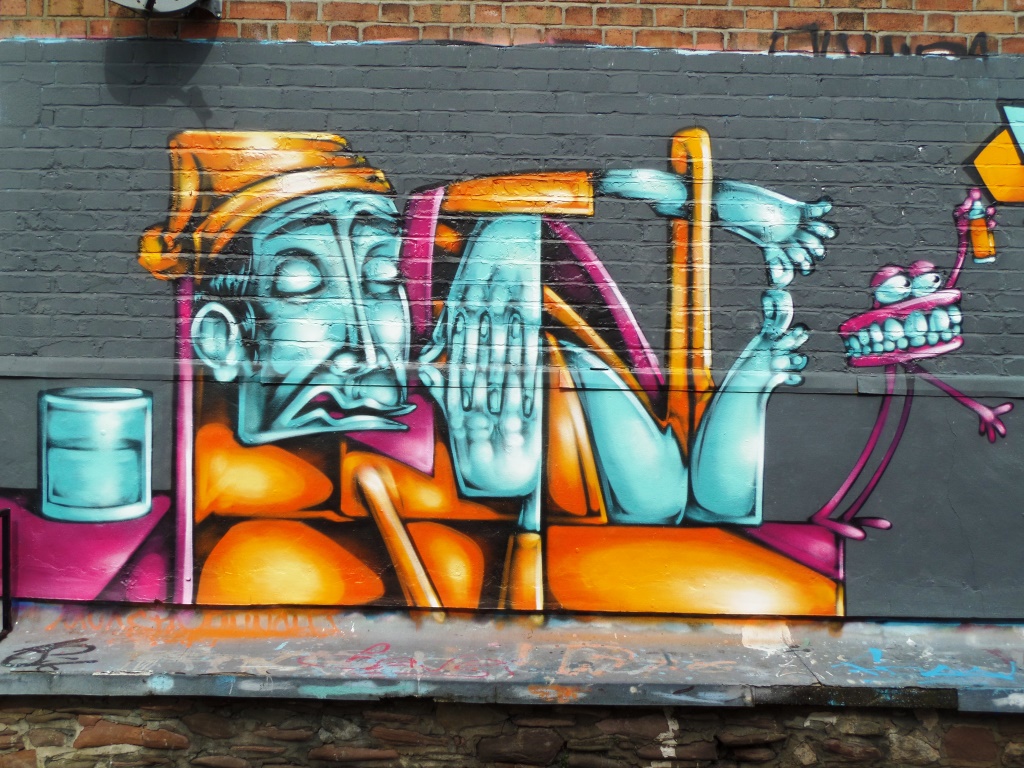
I really like the work of Ments and this is a really great example of his organic writing style. It takes a little while to get your eye in, but look carefully enough and you can clearly make out the letters ‘M E N T S’ and once you see it, it is difficult not to see it.

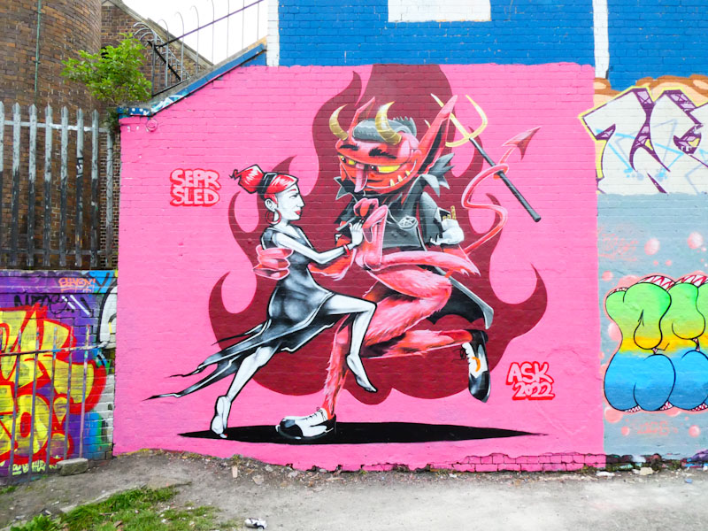
His work is quite unique in Bristol and therefore really easy to spot when you see it. Once again, I’m not sure why this piece has been languishing in my archive for so long, but at least I have posted it now. It was originally painted adjacent to a wonderful Sled One piece and both pieces were of the highest quality from this ASK pair.
It is funny how easy it can be to miss things. I know this piece is reasonably new, but I don’t know exactly how new. I drive past the wall when I park up at the M32 to take pictures there, without really looking at it, because the artwork there has been the same for years. So I only noticed on my last trip.
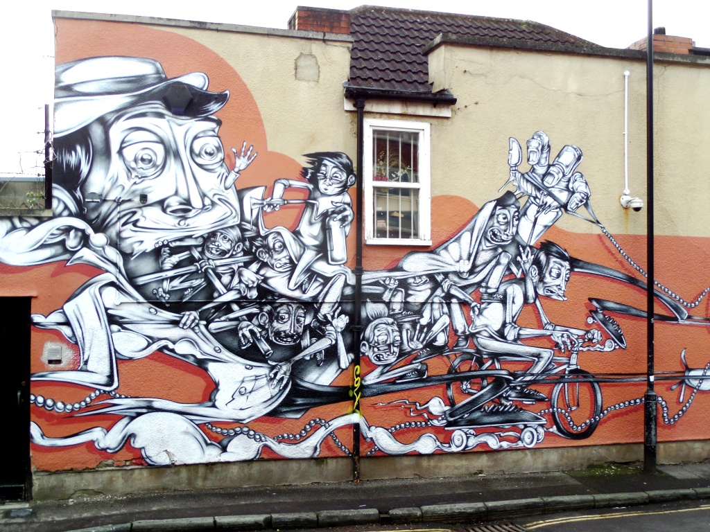
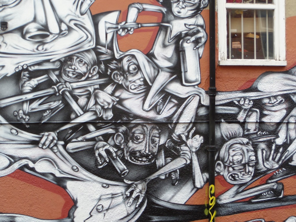
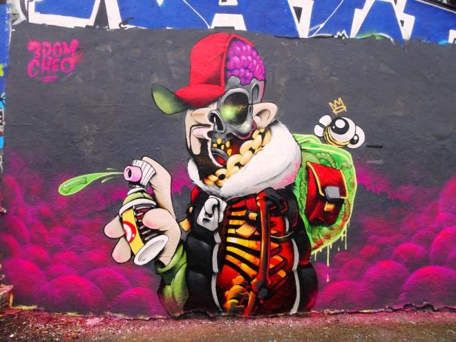
I don’t think many other ‘hunters’ have spotted it either, because I’ve not seen it on Instagram at all (or maybe that passed me by too!) It is a brilliant and vibrant piece by 3Dom, Feek and Sepr for the Children’s Cycle Exchange in St Agnes. The collaboration is full of fun and utterly in tune with young minds, even incorporating a cheesy joke about a flea DJ.
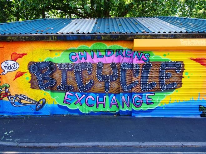
I am not entirely certain about which bits 3Dom did and which Feek did, and it might be that they truly collaborated on the snail-on-a-bike and the central writing. The right hand side is unmistakably by Sepr albeit a bit more colourful than some of his work.

I felt very privileged and lucky to find this piece on two counts…its utter excellence and its modesty, in that it was completely under the radar. Very, very happy.


