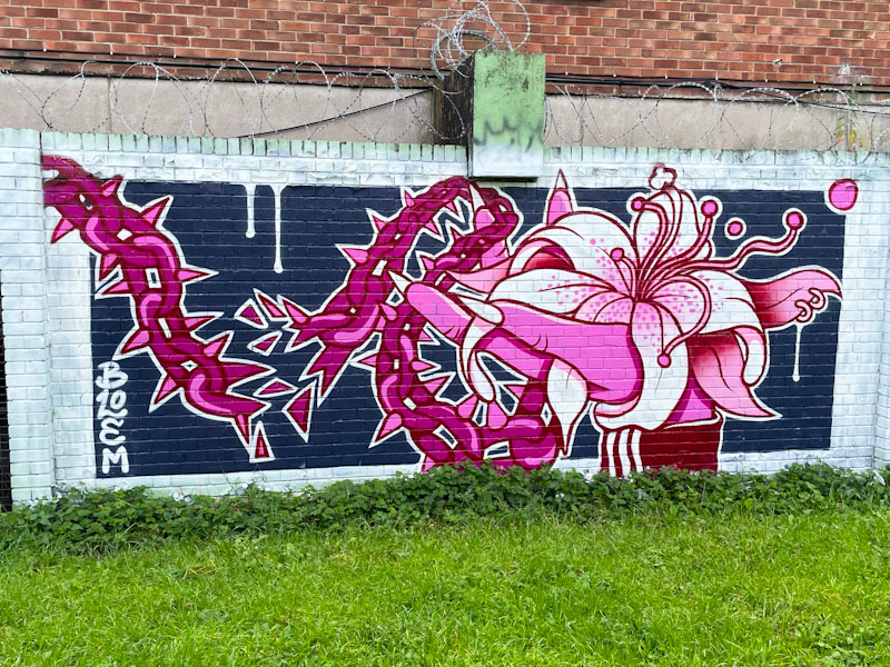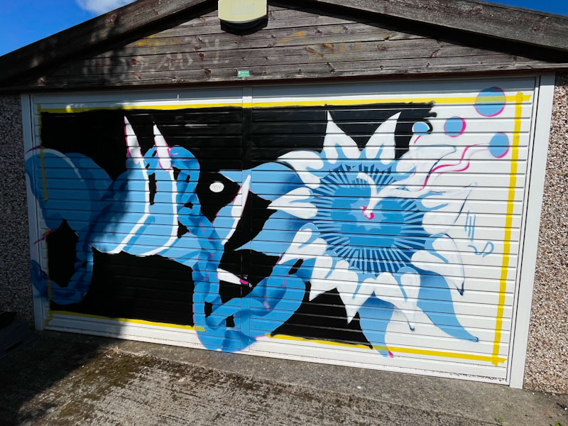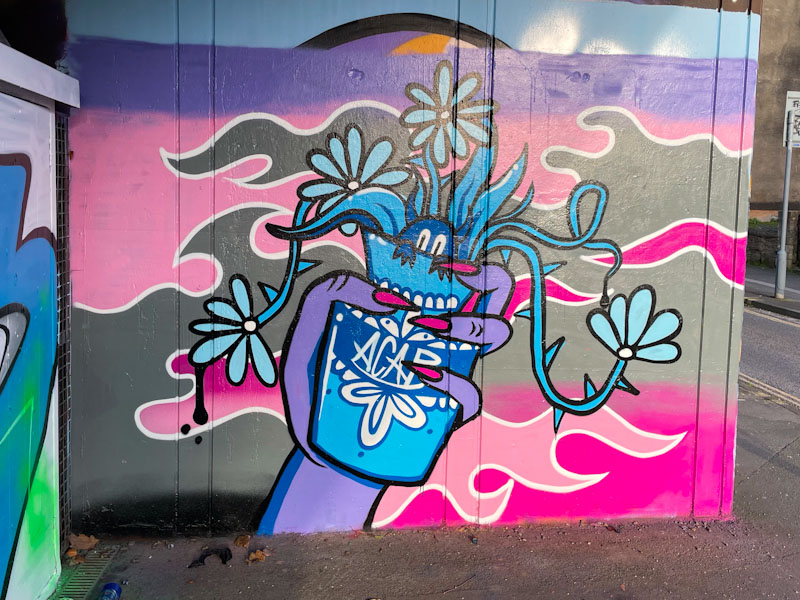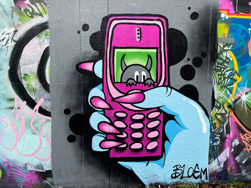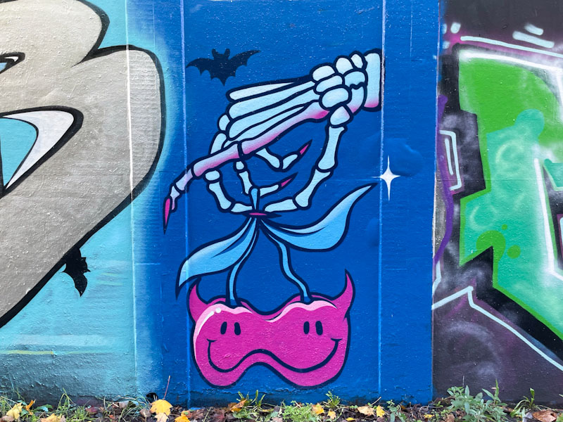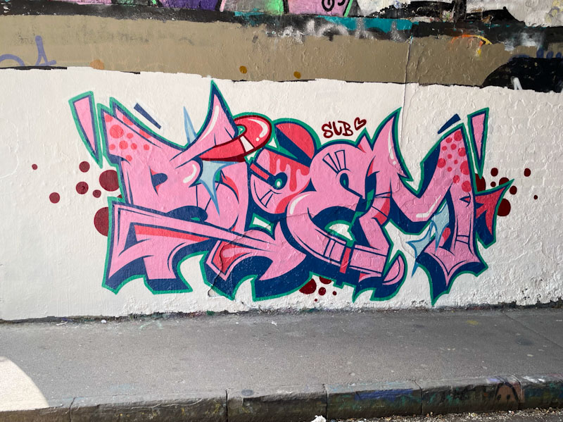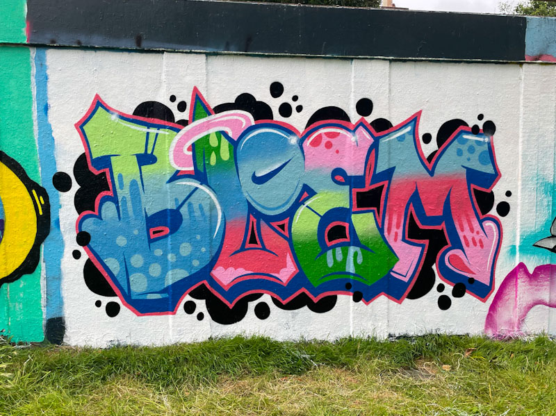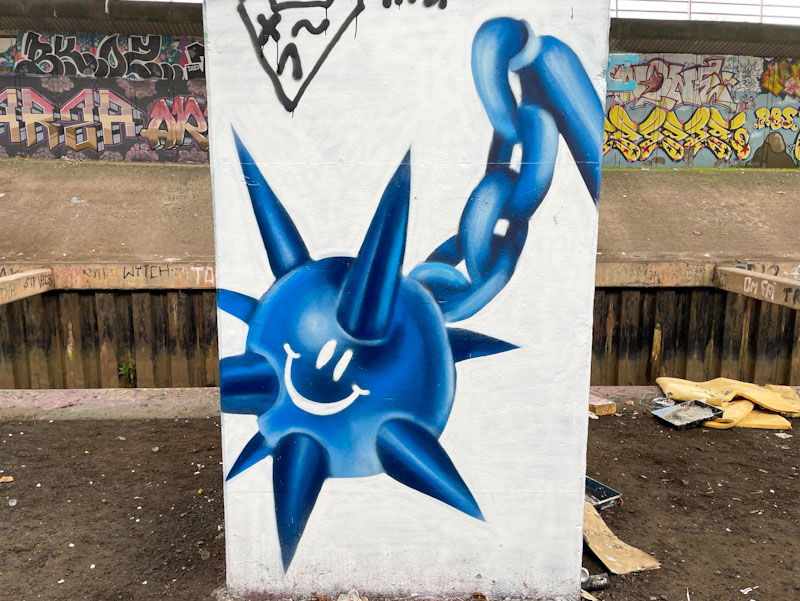
This is a magnificent column piece under the M32 from Bristol artist Bloem. The spiked ball and chain should come as no surprise really as these motifs appear in her work, whether her artwork or her jewellery. Bloem seems to like sharp objects and chains and is mastering the latter in particular.
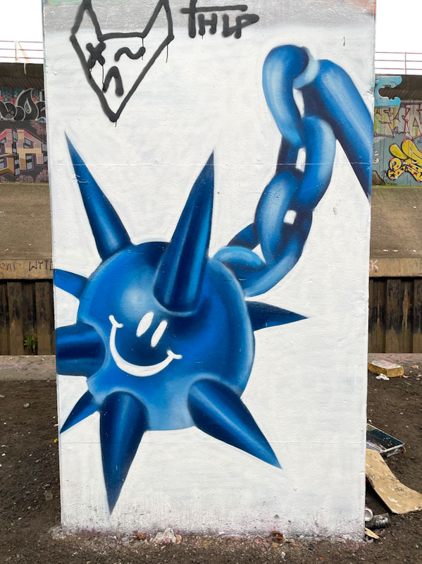
There is humour alongside the threat in this piece, with a fun smiley in the middle of the ball. What is interesting to note in this piece is the amount of depth Bloem has managed to create by using light and dark shades. This is a developing aspect to her work which was quite flat when she started painting walls. A great piece from an artist who is just getting better and better all the time.