
.
A long life defined
by birthday Asterix books
I’m a happy man
.
by Scooj
.
A long life defined
by birthday Asterix books
I’m a happy man
.
by Scooj
Over the last three or four months, Slakarts has been rather busy with his three-quarter profile throw-up character, and probably produced more of these than his regular and rather more complex faces. This one is on one of the tunnel entrances of the M32 roundabout. There is an interesting artefact of photography, light and paint in this piece… in the feature photograph you can see the ghosts of old graffiti underneath the white parts, but in the content photograph below, the white fill is simply white. Curious.
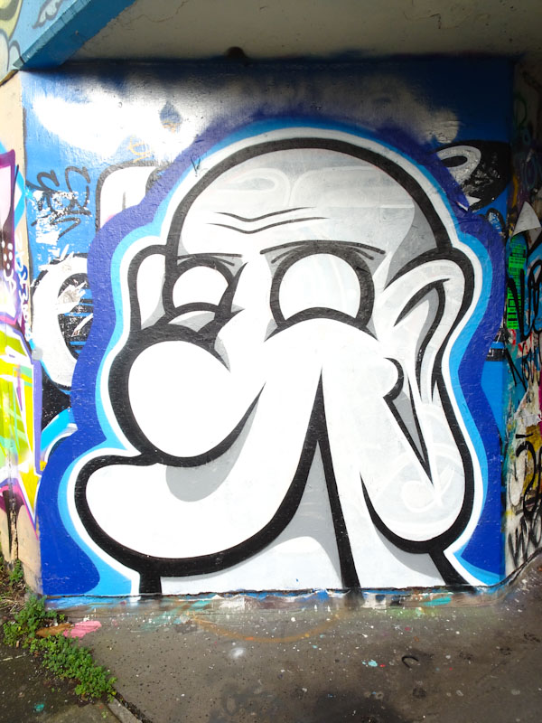
I rather like this one from Slakarts because it is a little bit more finessed than some of the others in this series. The black lines are clean and the blue outlines work very well indeed. More of these in the archive!
Another Christmas 2020 piece, this time from Eman who since his reasonably recent arrival in Bristol has been making his mark about the place. This piece was painted alongside Decay, and it is interesting that both artists opt for a little character in their name.
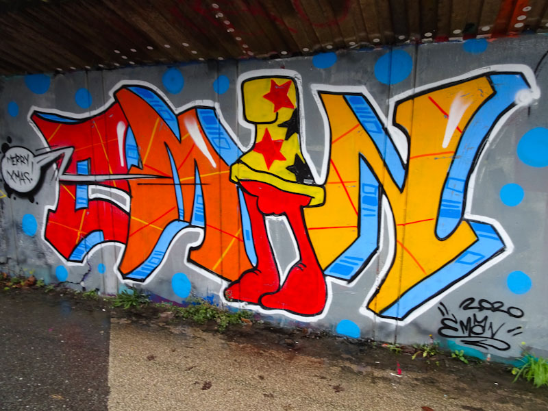
I think that this piece is an improvement on the first one that I saw in pretty much the exact same spot. The colour progression from letter to letter is nicely worked out and the blue shadow is nicely done. The character is rather cute and brings us those Christmas wishes. An all round nice piece.
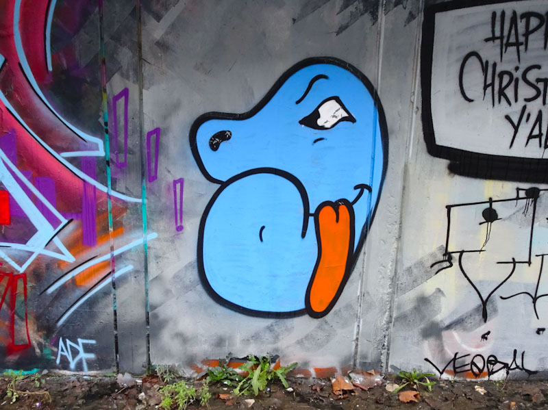
This little character, also by Eman was lurking nearby.
.
From Lionel Bart
a musical of sheer class
starring Mark Lester
.
by Scooj
The Frome side spot is marginally less accessible than most of the other regular spots in Bristol and certainly feels a little more edgy for an old codger like me, but the rewards are definitely worth the effort.
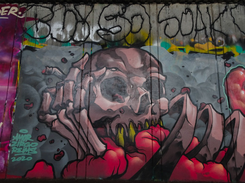
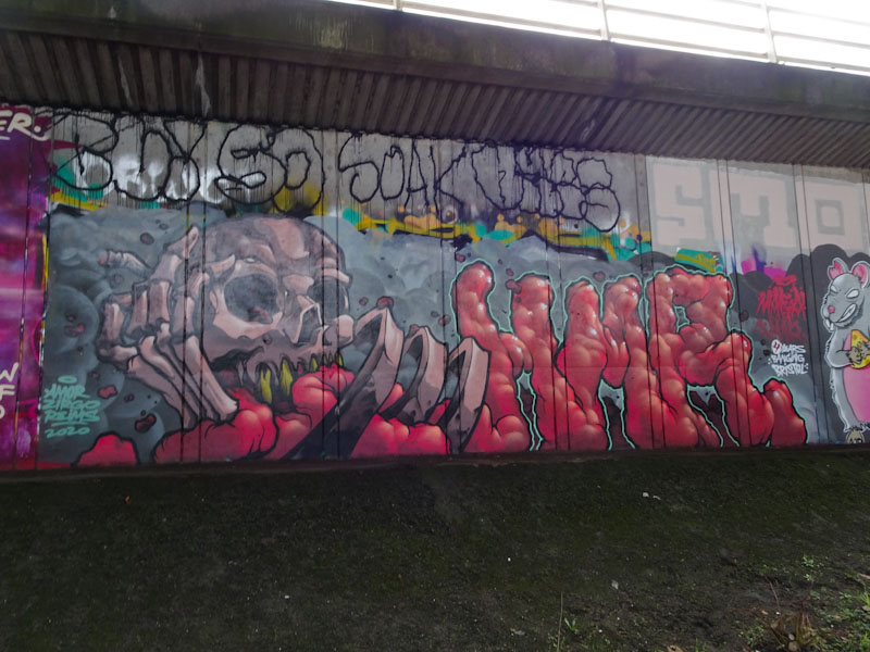
On a recent visit I picked up a whole load of new pieces, including this one from Dabuten Tronko – it is a bit of a beast. Unfortunately the light conditions weren’t favourable for photographing this wall and there is quite a lot of glare. I wonder if dusk might be a better time to visit. The skull and skeleton are nonetheless very nicely done, complete with yellow teeth.
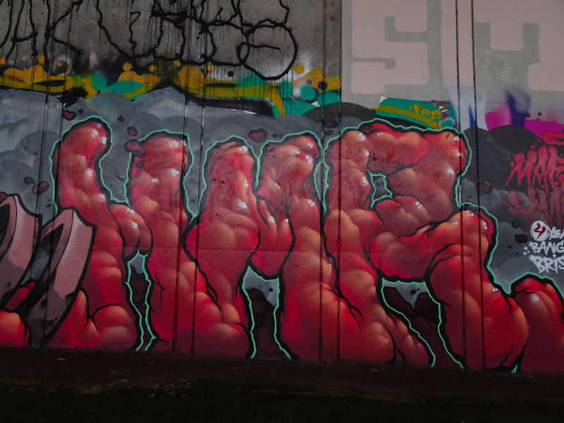
What I assume to be guts form the letters HMR which is the crew of Spanish artists who are becoming so firmly established in the City. The thin green outline is brilliant and helps make the whole thing stand out. Another fine piece from Dabuten Tronko whose work often seems to be slightly off the radar.
.
Too good to throw out
still bringing us some pleasure
much too old to keep
.
by Scooj
Here is a recent fun piece from Ryder down at the M32 roundabout featuring characters from the Willo the Wisp children’s TV programme from the 1980s. There is always something that makes me smile about incorporating children’s characters into the subversive world of graffiti art.

The writing is, as always, perfectly painted, with nice letter shapes and horizontal colour fills that complement each other well. The 3D shadow has a vanishing point in the centre of the piece which is less common than the shadow going in one direction.
The piece is bookended with characters from the show, with Willo on the right and on the left Evil Edna, the TV set. A very nice holiday piece from Ryder.
It was great to see that Zace was getting into the Christmas spirit down at the M32 Spot with this alien face wearing a Father Christmas hat. One of the good things about 2020 for me has been the sheer number of new artists spraying their work in Bristol of which Zace was one.
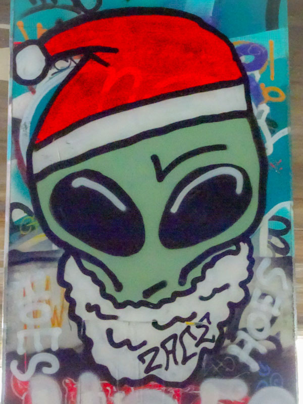
I think the best part of these new artists is the diversity they bring. One might think that the ‘market’ was flooded, but as with all art, there are no limits to the variety of styles and subjects that people bring with them. I am really looking forward to watching Zace develop over the coming year.
.
‘Most impossible
feeding family of four
without complaining
.
by Scooj
When I first saw this piece I thought it might have been by Mudra, mainly because of the bright colours and capped character, but I couldn’t find his recognisable signature anywhere, so I had to think again. It is in fact by Dit Oner, whose range of styles is to be admired.
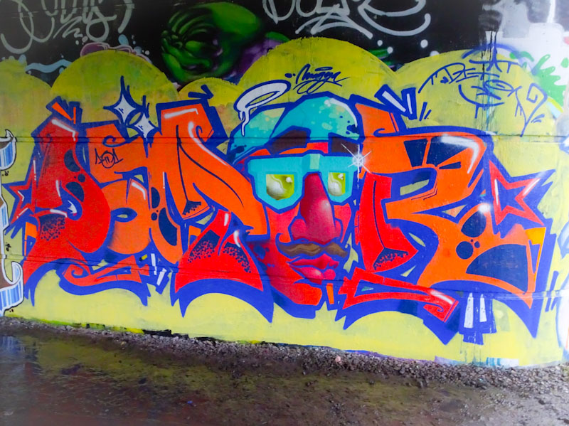
This is a writing-character piece with the character being incorporated as one of the letters. The letters are beautifully designed and filled and the little white highlights help with the 3D effect. The character too is very nicely done and integrated into the writing. I have my doubts however about the yellow background. it simply doesn’t work for me, just a bit yucky and insipid. perhaps a darker colour might have worked better. Nonetheless a fine piece of writing from the Spaniard.


