Goldfinches return
colours exaggerated
in bright winter sun
by Scooj
Goldfinches return
colours exaggerated
in bright winter sun
by Scooj
An old one from Face 1st, although not that old – painted sometime in 2019, but not photographed by me until February 2020 because I haven’t been down to this spot very often. The colours are magnificent and set alight with the dayglow green outline.

I think I have more pictures of Face 1st’s work than any other artist in Bristol which reflects his incredible energy and productiveness. I would guess that for each picture I publish on Natural Adventures there is at least another one in my archive. The only other artist that comes close is Nevergiveup and his #followmyrabbits.
I took these pictures ‘blind’. What I mean by that is that is was a very sunny day (a rarity this February) and the wall was reflecting so much light that I couldn’t see it on the LCD screen of my camera. I coould have popped up the viewer, but I had the dog with me and only had one hand free (and I am lazy). Nonetheless I think I got a couplle of great shots of this amazing and slightly verloked Rezwonk piece.
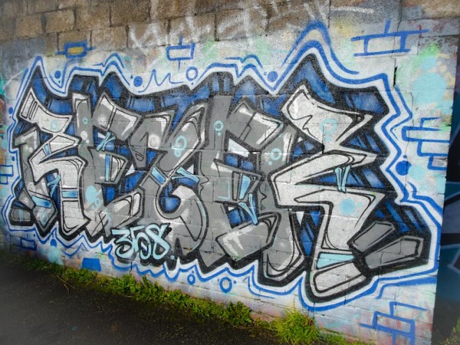
I’m not too sure what the 358 refers to along the bottom of the piece, but the writing is first class as always with Rezwonk. I also love the way these guys paint suggestions of a brick wall on the background, even when the piece is on a brick wall! Is there a part of Bristol where Rezwonk hasn’t left his mark?
Counting 1…2…3…
beautiful green Spring meadows,
remember these things?
by Scooj
It is quite amazing just how vibrant the street/graffiti art scene is in Bristol. So far I have published 31 different artist galleries, but this is just scratching the surface of the talent in the city (and beyond). Every day I will find something by artists I have never heard of before (I am still learning), maybe because they don’t paint very often or maybe because they are new or sometimes our paths simply haven’t crossed. This really nicely worked collaboration is by Awkward and Benjimagnetic, neither of whom I know about.

From looking at their Instagram accounts, which I found by looking up #jointhecloaks featured at the bottom of the piece, it looks like both are well connected to the music industry. The skull on the right was by Awkward, and the writing by Benjimagnetic. I think that the latter does more graffiti work and has several pieces posted on his Instagram feed. On my first encounter with these two I woud say that their work is accomplished and this piece certainly caught my eye. I wonder if I’ll be seeing any more of it around the place.
Spelling out HEMS, this is a really easy-on-the-eye piece from Hemper. A great colour palette and sensational light green shading on the lettering really lifts the piece and it stands out from the crowd.
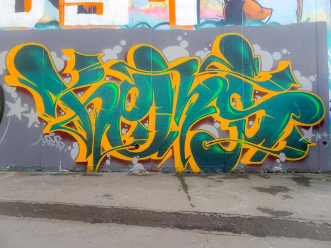
When I see graffiti writing of this quality I want to show it to other people who perhaps categorise all tagging, burners, throw ups and writing broadly as ‘graffiti’ and don’t really give it a second thought. A piece like this is beautifully designed and brilliantly painted, and couldn’t be more different from a scruffy tag on a lamp post for example. Fabulous work from a Bristol master.
Note: always notice
compliment, but not too much
path to happiness
by Scooj
I have waited a long while to photograph this mural from Mr Penfold, mainly because it is not in a place I frequent all that much, there isn’t any other street art to speak of just in this spot, so it requires a special trip or an occasion when I happen to be in the right place at the right time.

That time was about a month ago on one of those rare sunny days in an otherwise very wet (the wettest on record) February. This mural is what Mr Penfold does so well and so distinctively. In his ‘liquorice allsort’ colours and 1980’s designer patterns Mr Penfold presents with a pleasing abstract pece that turns a boring wall into a point of interest. This is most likely a comission from the shop or possibly from the Business Improvement District. A nice piece.
There is not a big culture of wheatpasting in Bristol, compared with say Shoreditch or Barcelona, so it is always a pleasure when or ‘established’ artists stick up a few pieces here and there. I apologise for the poor quality of the picture below – I hate it when that happens, but am too lazy to go back and take a better one.
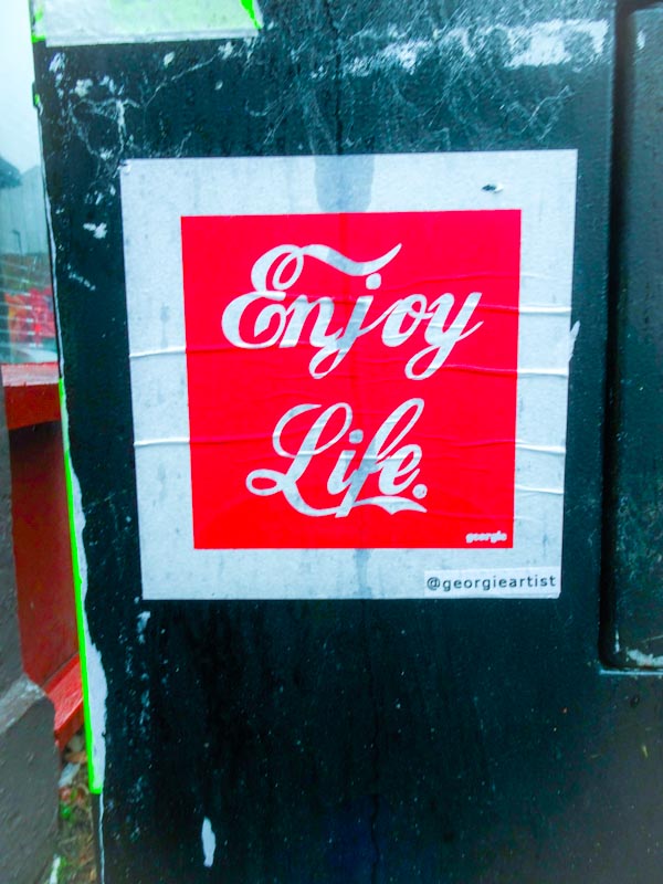
This little one by Georgie could easily be mistaken for an advertising poster for fizzy drink manufacturer Coca Cola, with its deliberate use of colours and fonts. I can’t quite make out whether this is an ironic piece with its ‘Enjoy Life’ tag line, or whether this is a genuine upbeat piece. I’ll let you decide.
.
Half sphere set in blue
so tiny in that context
so large in focus
.
by Scooj


