Haunting sounds.
Accordion plays
minor tones,
singing soft
with melancholic stanzas;
I hold back the tears.
by Scooj
Haunting sounds.
Accordion plays
minor tones,
singing soft
with melancholic stanzas;
I hold back the tears.
by Scooj
Parts of the country
prepare for a wintry storm;
not expected here.
by Scooj
Creativity
marooned, shipwrecked in my head
no means of escape.
by Scooj
Perhaps not so subtle in this instance. Here we have another deliciously clean piece of writing from Subtle on the long hoarding in Moon Street. The orange and dark pink sit really well on the grey background. As mentioned recently, it seems that Subtle has become more active of late and I am seeing his work appearing on Instagram more often too.
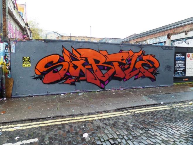
I like the way the shading on his lettering is fashioned in such a way that there is a vanishing point somewhere behind and below the piece.Other less accomplished writers do much simpler shading to their pieces, as if a light were being cast from one direction. I’m not sure if that makes sence, but I think I know what I mean.
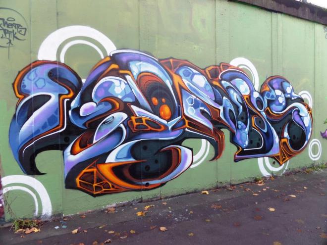
This is a supremely beautiful work by Epok from a recent paint jam down at the M32 roundabout. I like everything about this piece, the proportions of the letters, the angles and curves, but most of all I think the colour selection is sublime, and I love the tinges of red in the middle of the piece.
I have never met Epok, nor seen him spraying, but would surely like to see him at work. There is something different about his wildstyle pieces that really catches the eye. I think that one of the main things is that his writing doesn’t adhere to our writing conventions of letters having an equal height and proportion. His letters fit into his design, which often tapers at one end or the other.
I love this piece. Outstanding.
Ok, so this is an interesting piece in Ashley road that appeared recently. It is, I think, by the Bristol artist Fiver, who also goes by the name Fiva and Henry Barnes who I posted about back in March this year. It is a bright and cheerful piece and would appear to be a celebration, welcoming ‘Eira’ into the world. Maybe his own child? I don’t know. I hope this isn’t just a one-off because I like the style of his work here.

As well as turning to street art from time to time Henry Barnes is also a tireless campaigner for the National Autistic Society and their too much information campaign, which is a thoroughly brilliant thing.
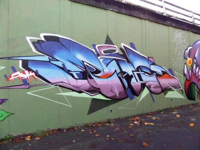
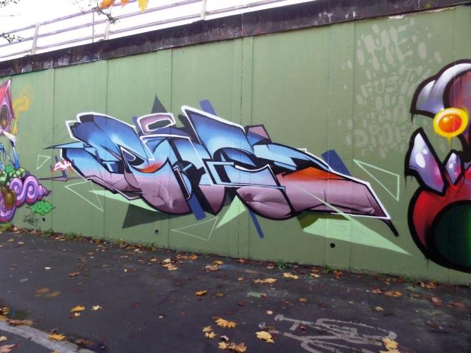
It has been some time since I last saw anything by Ments, so it was fantastic to come across this fine piece recently that was sprayed as part of an ASK paint jam. The wall was given a great backwash of grey-green, and several excellent works produced.
Ments has a wonderful organic style to his wildstyle writing, which spells out MENTS…although I struggle to see all those letters. The colour selections are fabulous and work so very well against the backdrop.
This is an outstanding piece and welcome return from Ments.
This is a nice witty piece from Feek as part of the Halloween ASK collaboration at this spot. The ASK crew have been very busy recently. This piece has a real comic book feel to it and is by one of the artists whose work I don’t see too often – the last piece was on one of the ramps at Dean Lane skate park.
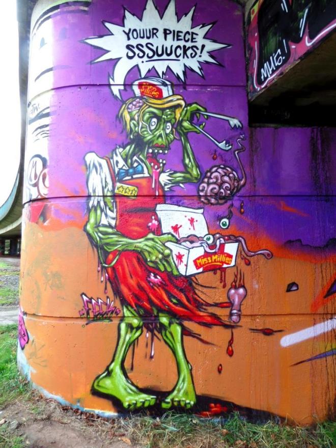
Feek has painted a ghoulish Miss Millies (a poor man’s KFC, if there is such a thing) waitress serving up body parts, with a speech bubble saying ‘youur piece sssucks‘ a reference not only to the food pieces being served up, but also a playful jibe at his crew mates and the pieces they are working on.
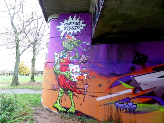
I have just noticed another thing about Feek’s work that I have never noticed before, but it would appear that he nearly always includes a speech bubble as if he wants to give his characters a voice. I’d really like to see more of his work on Bristol’s streets.
Nothing is
where it ought to be;
upside down,
chaotic,
it could be some time before
normal life resumes.
by Scooj
This piece and the one adjacent to it by Deamze have gone now as the buildint they are sprayed on is now surrounded with anti-graff hoardings, presumably because some development work has begun.

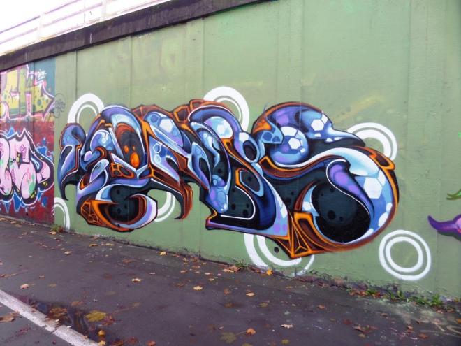
This is yet another high-quality piece from the Soker production line. Strong clear lines and colours, clean work from this great writer. There is a party feel to this piece with a backdrop of orange flashes and blue bubbles that contrasts cleverly with the pink and green lettering. The baseball caps on the letters adds a nice tough to the piece.


