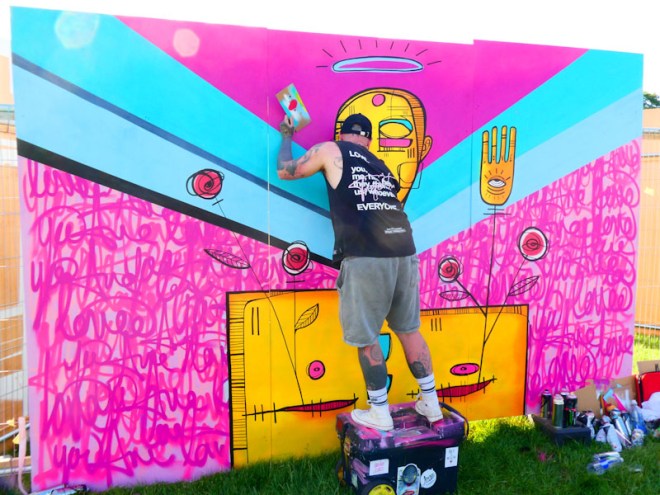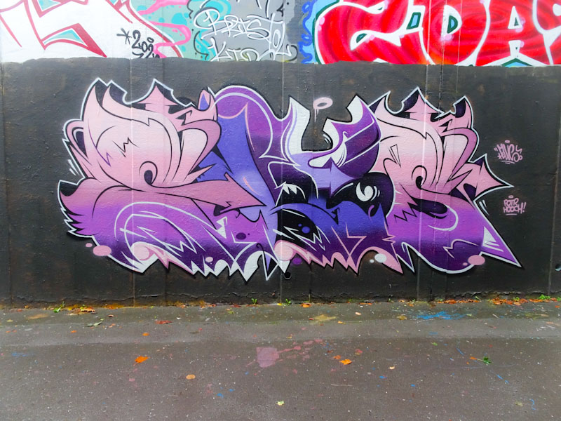
I had a nice chat with Mr Draws over the weekend in this exact spot while he was buffing over this piece in preparation for a new one. At least he was going over his own work – how often does that happen?
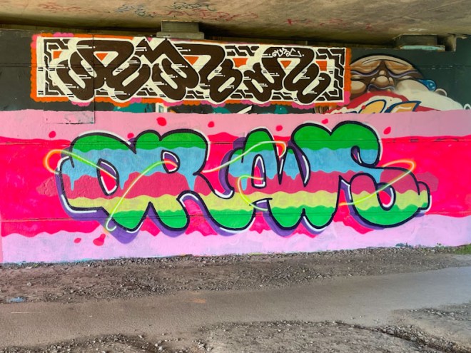
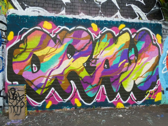
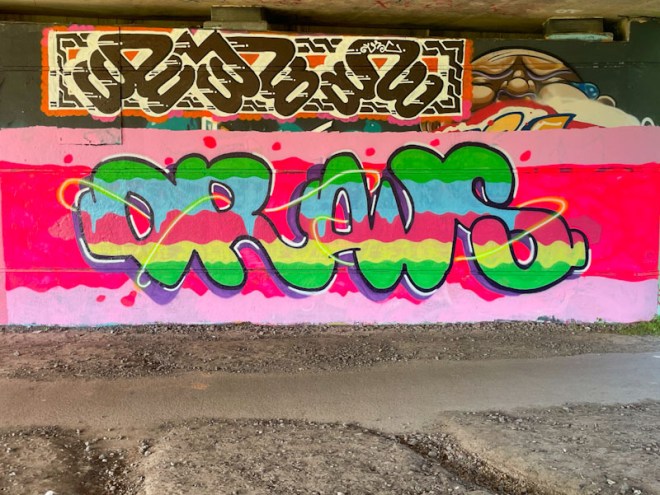
The bright colours in the letters and background have a hint of confection about them, almost good enough to eat. The whole thing calls out jelly to me, but I think that that might just be me. I know that Mr Draws wasn’t too happy with the neon pink colour, as it seemed to strip away the paint beneath. My advice is to steer clear from the neon colours, they are tricky and in the sunlight they decompose really quickly.