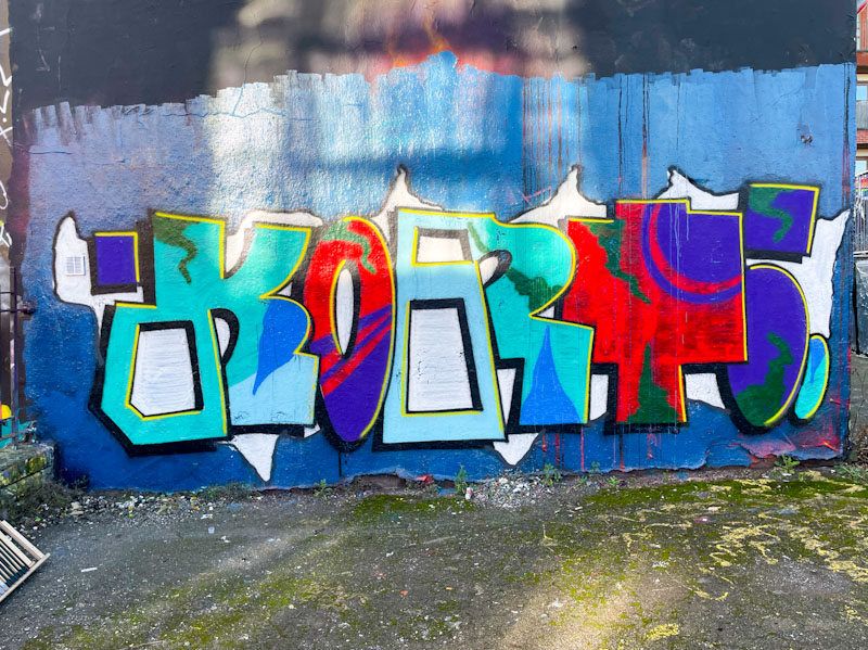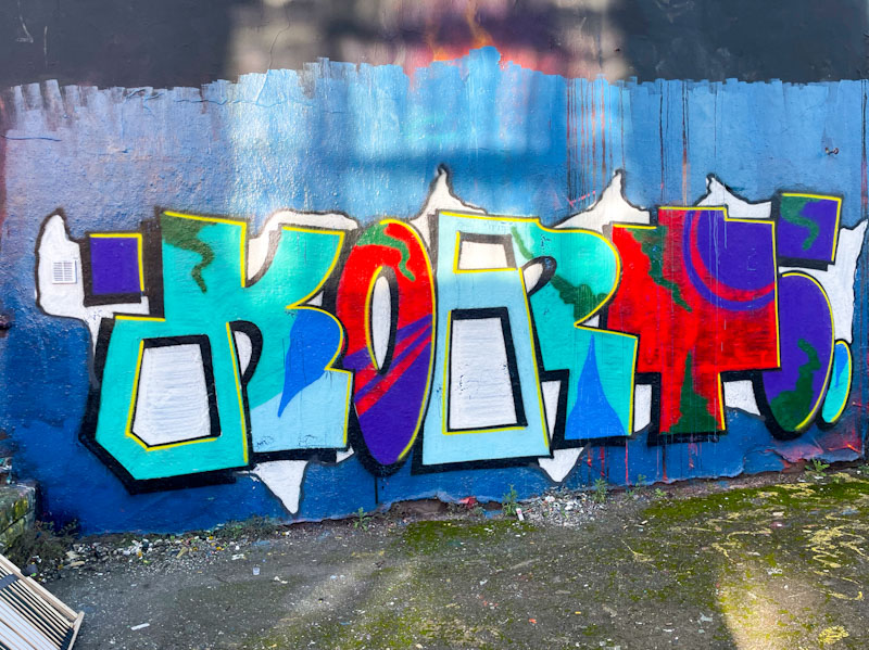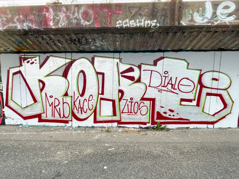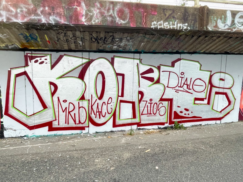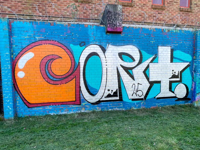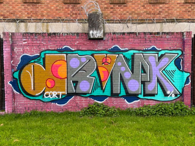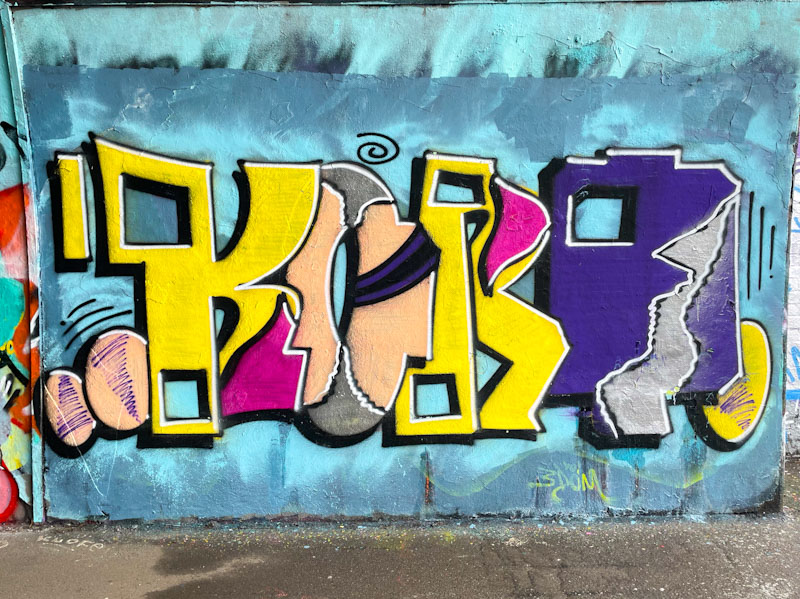
I would describe Cort’s graffiti writing as unconventional, both in its conceptual design and also in its unusual selection of colours. These are, in my view, good attributes and what contributes to his ‘quirky’ work standing out.
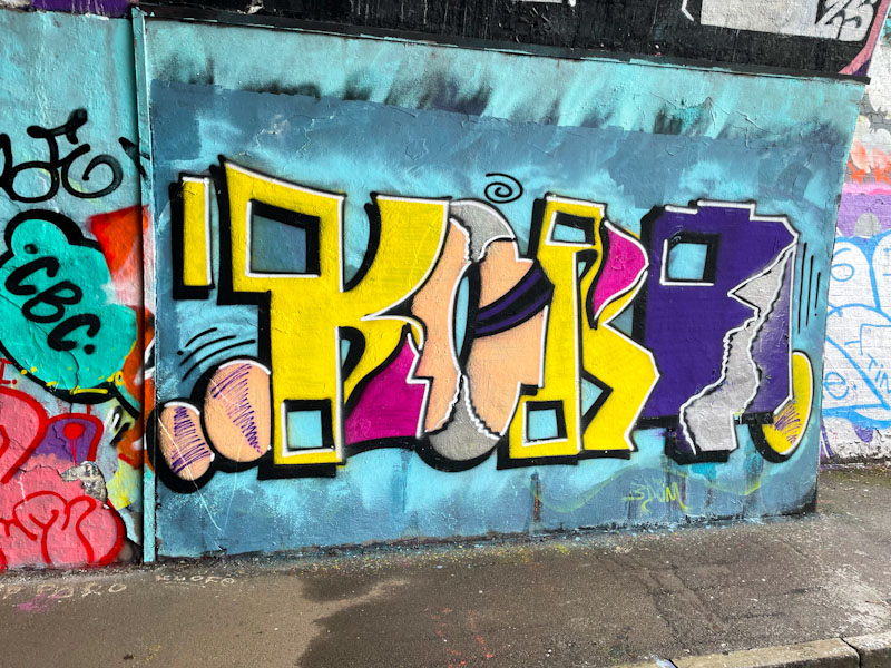
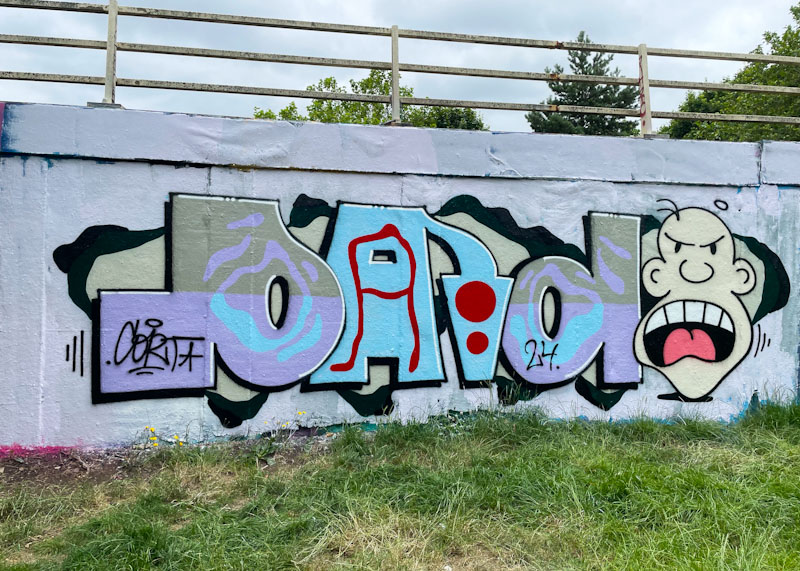
This piece, spelling KORT, is so off the wall that it is quite difficult to critique, other than to say I really like it. One of the unusual features in this particular piece is the cut away squares in the letters, that provide that very distinctive look so peculiar to Cort. It is good to see more of his work appearing at the moment, as a great balance to the volume of conventional graffiti art we are so lucky to see in Bristol.