1910. Upfest 2018 (106)

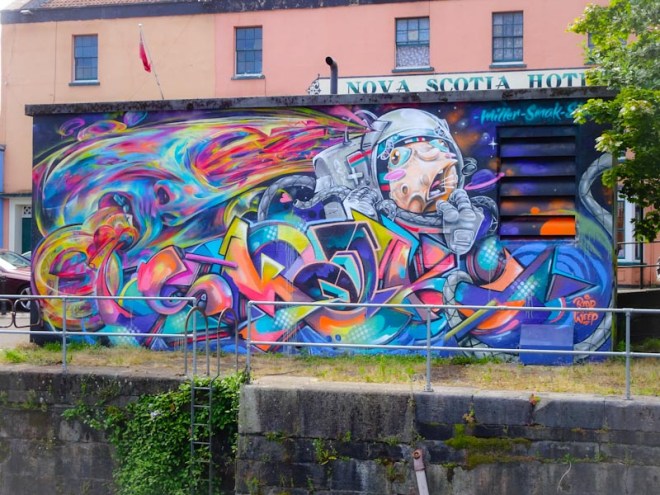
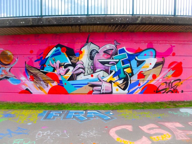
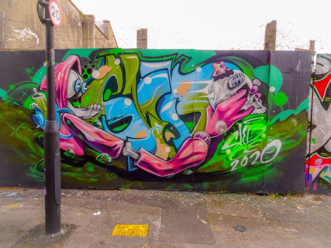
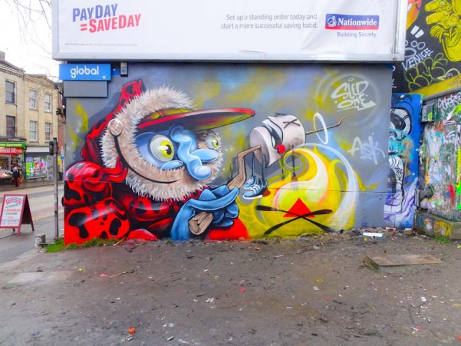
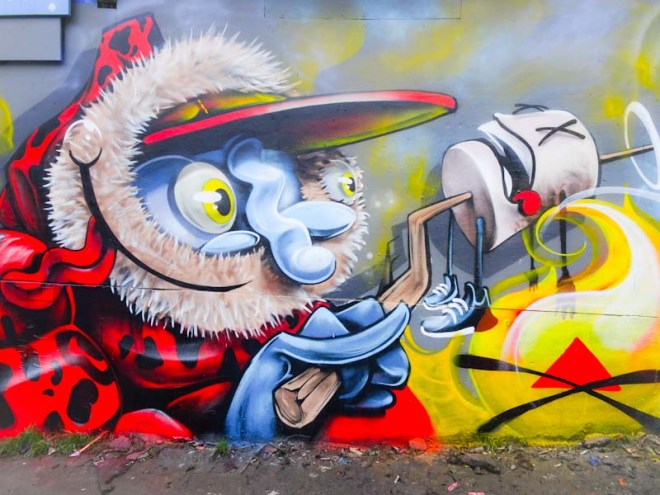
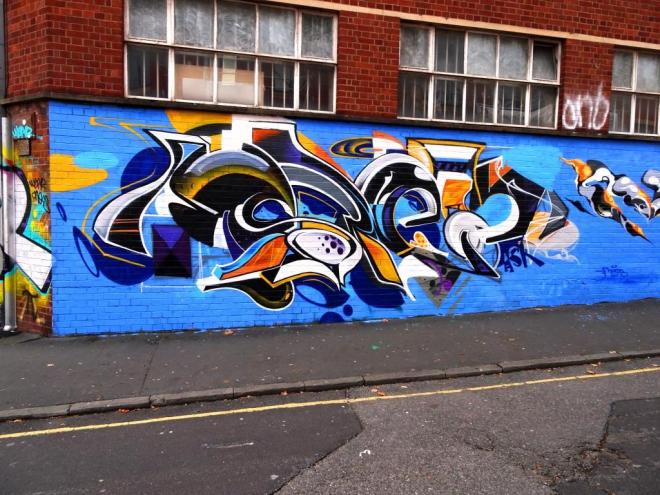
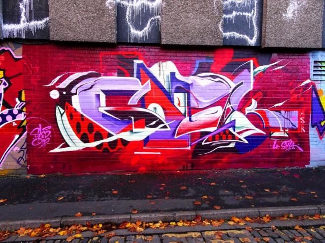
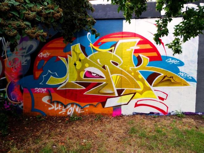
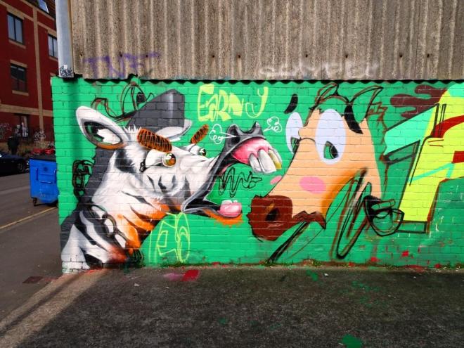
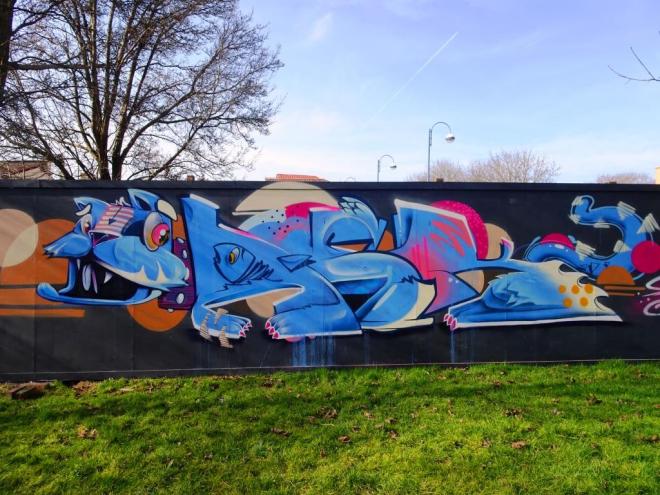
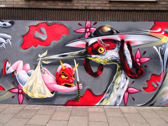
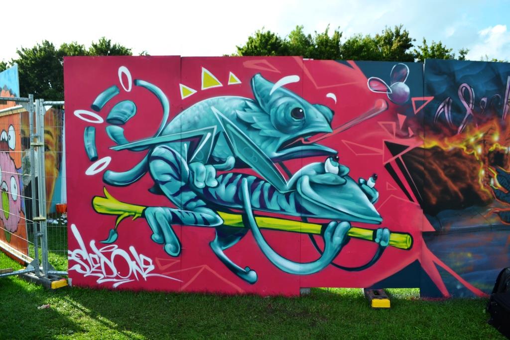
I have only ever seen three pieces by Beep Monkey, and each of them has been at each of the last three Upfests. His work is consistently good and has a lovely cartoon style that is both witty and fun.

Beep Monkey, Upfest, Bristol, July 2018

I always look out for his work at Upfest because his wife is a colleague of mine, although it took us a couple of years to work out the connection. In this piece it looks like the monkey and the rabbit are having a bit of a disagreement. The piece almost looks animated and the three white flashes give it some movement. Another beauty from Beep Monkey.

Beep Monkey, Upfest, Bristol, July 2017
Beep Monkey, Ashton Gate School, Upfest, Bristol, July 2016

1909. Upfest 2018 (105)

Regular readers of Natural Adventures may recall posts about the ephemeral work of Annika Pixie who is a Bristol artist and regular at Upfest. Annika is a vibrant and colourful member of the local art community, who appears to spend her winters in Thailand teaching before returning to her adopted city.

Annika Pixie, Upfest, Bristol, July 2018

This portrait carries all the hallmarks of an Annika Pixie piece. The face is partly obscured by a thin veil as if peering through a net curtain and there is a sadness in the girl’s expression. on her chest are some little ballet dancer stencils…I wonder what the story is here. It is always great to see Annika’s work although I was disappointed to have missed talking to her this year.

1908. Upfest 2018 (104)

The Hen and Chicken on North Street has a lot of wall space and is one of the focal points of Upfest. This particular wall has had some beauties on it in the past and this monochrome piece by 8Mail is no exception. Although this artist has been to Upfest for the last six years, I’m not sure I recall his work and can’t find any in my archives, but I do think I’ll have to go and take a better look.

2Upfest18 556 28 July 2018

Usually working in charcoals, this urban artist likes to capture chaotic and fleeting moments. There was just such a moment while he was painting the piece, when he tried to use the chair in the picture to stand. All I need to say is that the artist is a tall young man, and the chair was not designed for standing on.

This is a fine simple piece, that despite its simplicity contains real interest. I found it captivating.

1907. Upfest 2018 (103)

This is the third of D7606’s 10 celebratory balloons that he pasted up around the Upfest site to celebrate the 10 years that the festival has been running.

D7606, Upfest, Bristol, July 2018

In this one, which completely upstages the Tesco poster on which it is pasted, we are presented with an image of Frida Kahlo – a popular figure for street artists.

D7606, Upfest, Bristol, July 2018

I have more of these balloons, but am not quite sure if I collected all ten of them – we’ll have to wait and see when I get to the end of my Upfest 2018 posts.

1906. Upfest 2018 (102)

One of the things to look forward to each year at Upfest is the collaborations from Caro Pepe and AgeAge. There is a chemistry when these two come together, not only in their styles, but in their personalities. It is obvious that they really enjoy working together and this is reflected in the fusion of their work.

Caro Pepe and AgeAge, Upfest, Bristol, July 2018

Caro Pepe paints the faces, usually female and usually with one eye obscured in some way. AgeAge creates the robotic machinery that intertwines with the character. This pairing painted this wall last year too, so it could be considered their wall I think. I’m hoping that they will be returning next year.

Age Age and Caro Pepe, Upfest, Bristol, July 2017

1905. Upfest 2018 (101)

During the Upfest 2018 weekend, I really struggled with who was painting this piece. The difficulty was that it was on a new wall that didn’t really offer close access and the artist was perched high up on scaffolding. It turns out that the piece is by Bristol’s magnificent Jody.

Jody, Upfest, Bristol, July 2018

Jody is meticulous with his work and certainly never rushes. For this reason, many visitors to Upfest never actually get to see his finished pieces, until they return some time later. It was days before he finished this one, but wow, it was well worth the wait.

Jody, Upfest, Bristol, July 2018

This is a cleverly worked portrait of a woman behind a golden cat mask and it truly outstanding. Like so many of his works it seems to have gravitas…I can’t really express what I mean by that other than that there is a seriousness about the work. Beautiful piece beautifully executed.

1904. St Werburghs tunnel (56)

I am really pleased to see that Face 1st and Soap have teamed up again, it feels like a while since they last collaborated, to produce this beautiful piece. The two distinct halves are joined by the hair of Face 1st’s girl.

Face 1st, St Werburghs, Bristol, December 2018

I love the concept of Face 1st’s character sketching out an idea in her black book, there is a lovely story unfolding and it brings a whole extra layer to the piece. This really is something special.

Soap, St Werburghs, Bristol, December 2018

The Soap half of the collaboration is yet another great example of just how good his writing is with the blue and lilac elements almost resembling stained glass windows. I always feel these two artists are so modest with their work, and it is a pity that something like this is lurking in the darkness of St Werburghs tunnel…it deserves more prominence.

1903. St Werburghs tunnel (55)

What a wonderfully clever piece this is from Fiva, who has used his trademark block letters to spell out his name but has repeated the word in a different font through the letters in a way that gives the whole thing a 3D look. This piece uses techniques that are used by Pref ID who is a master of this kind of visual wordplay.

Fiva, St Werburghs, Bristol, December 2018

As is often the case with Fiva’s work, he leaves us a character as additional interest in the piece. I really like his work and only wish he did more but realise that he, like many other street artists, is likely to have a real job and maybe family and can only get out to play when time and circumstance permit.

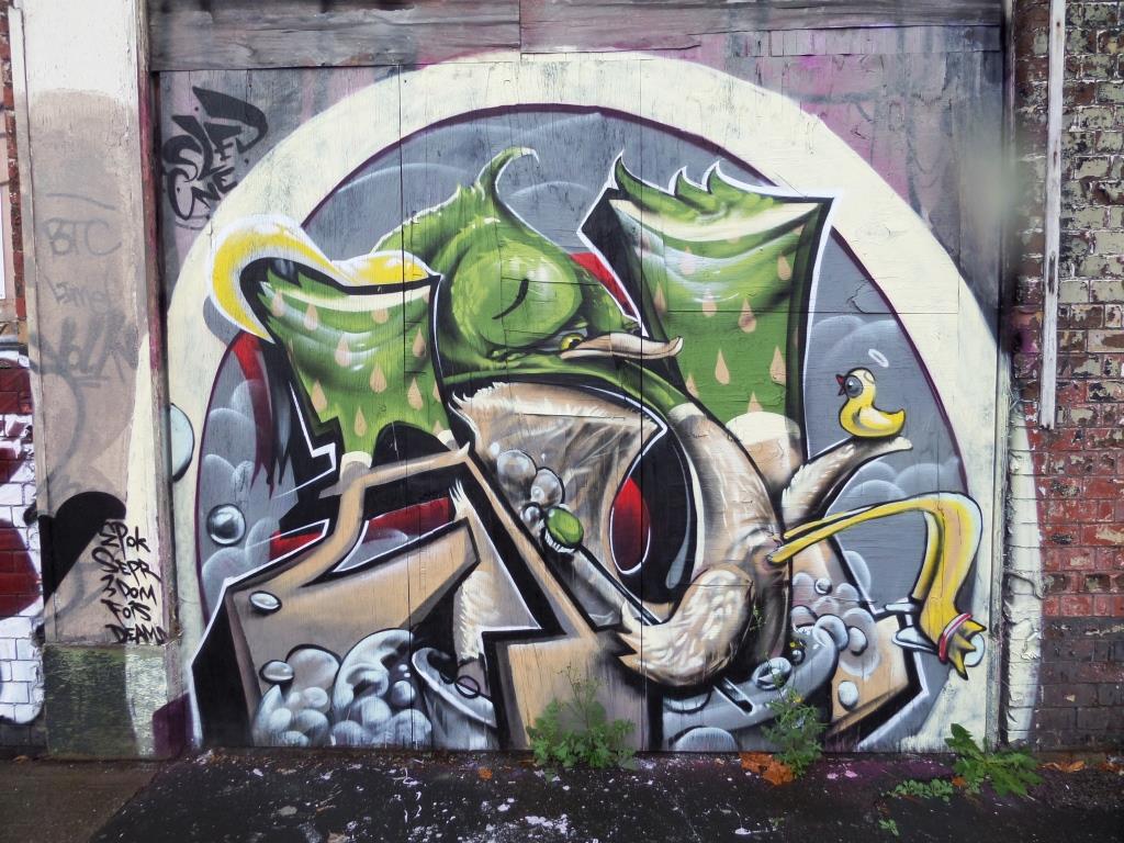
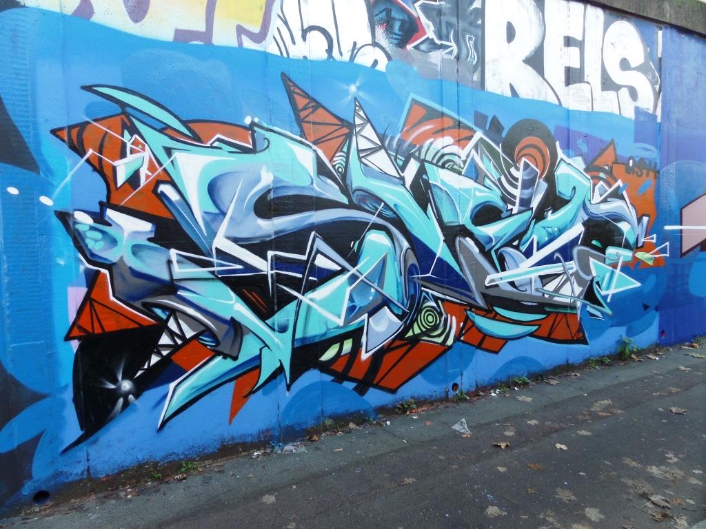
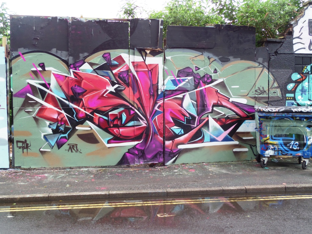
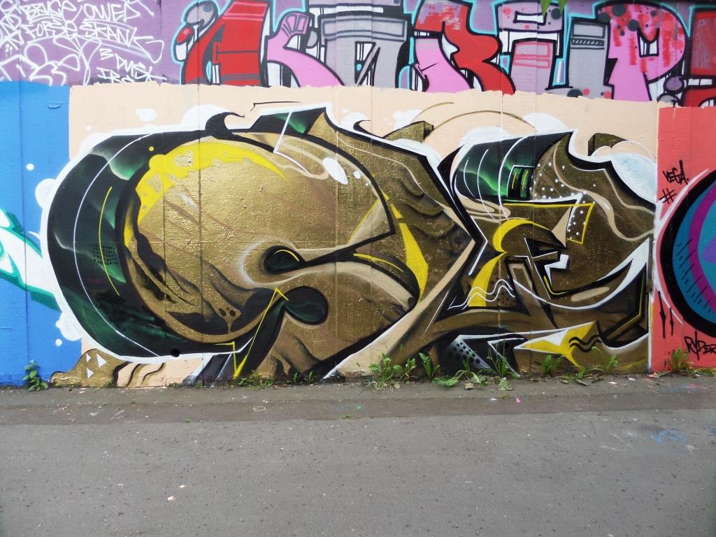
1902.M32 Spot (36)

This Deamze burner photobombed a recent post of a Silent Hobo column, but in my view deserves a post all of its own. This writing is one of the forms that Deamze uses in his work. It is much simpler than his wildstyle work, but still has a clean and sharp look to it.

Deamze, M32 spot, Bristol, November 2018

The colours and drift of shading work really nicely and the whole thing stands out and looks so fresh. You could give a hundred artists a can and a wall and ask them to recreate this, but none would be as good. At the top of his game.


1901. St Werburghs tunnel (54)

Mr Klue, as I have mentioned before has been on a bit of a binge lately, and has produced as many pieces in the last couple of months as he has for the rest of the year. This is something that should be celebrated, as his work is emblematic of the down to earth Bristol street art scene.

This piece in the tunnel at St Werburghs by Mr Klue has an ephemeral, wispy, smokey quality to it. I think that the letters spell out KLUE, and the whole thing is a little different from his normal offering in that it is less complex somehow.

Mr Klue, St Werburghs, Bristol, November 2018

I guess that when writing letters, there is less freedom for the abstract artist…sure you can do swirls and twirls and disguise the letters, but they are still letters. With the free-form abstract work one usually sees from Mr Klue, there tends to be a little more richness, texture and content. Having said all that, I rather like this and the colour selection too works for me.