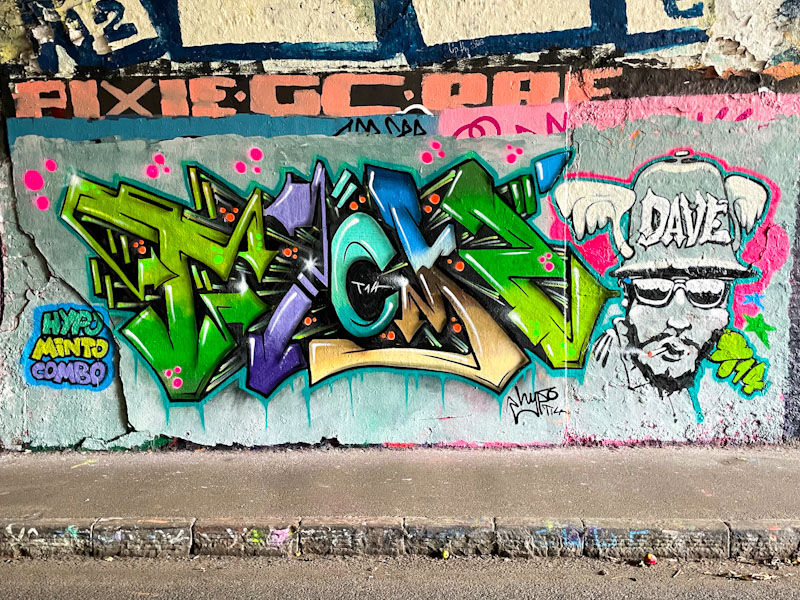
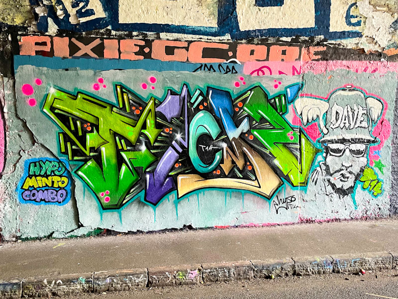
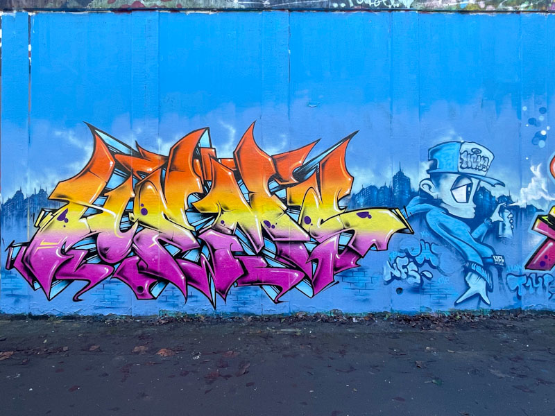
Hypo and Minto, St Werburghs, Bristol, August 2025
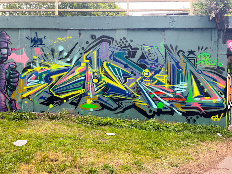
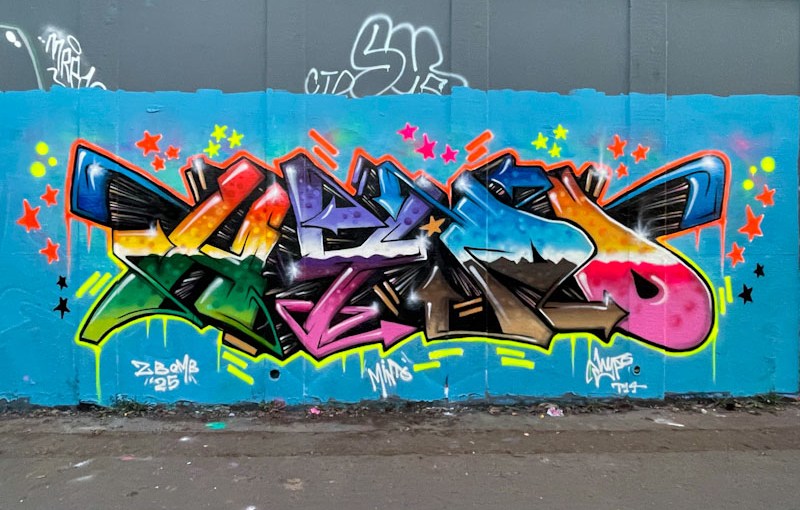
This is another fabulous collaboration from Hypo and Minto, who seem to team up reasonably regularly and clearly enjoy painting together. The little tag – ‘Hypo Minto combo’ captures the friendship really well.
Hypo and Minto, St Werburghs, Bristol, August 2025
Hypo has smashed it with his writing. The colours are magnificent and transition through the piece with grace and style. The shading, and in particular the white highlights, help the piece to pop and create a superb 3D effect. Truly outstanding. Alongside the letters, Minto has painted a contrasting greyscale character portrait, and a tribute to Dave I guess. The combination piece just works – a classy collaboration.
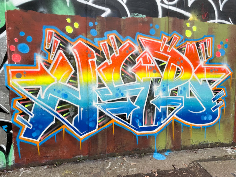
It seems today that it is all about Hypo – the previous post was a birthday tribute to Hypo from Subtle, Ulow and Minto, and this is one of his very own pieces from L Dub. Hypo has had a purple patch that has been continuous for about two years now and shows no signs of abating.
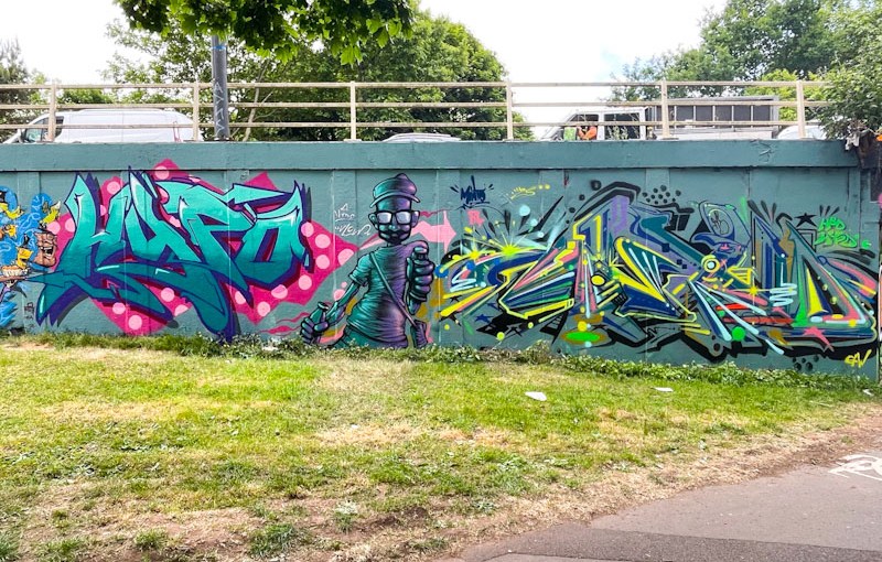
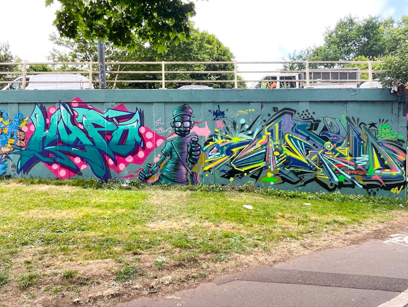
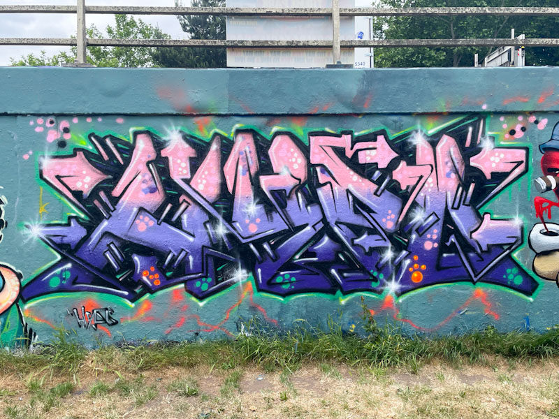
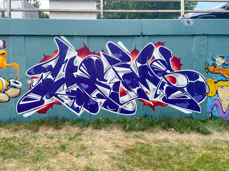
Hypo, L Dub, Bristol, June 2025
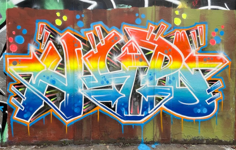
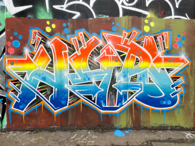
The letter blocks in this piece are each assigned a different colour, and have a lot of strong graffiti writing motifs, such as the arrows and little double bars, stitching the letters together. It is interesting to note how different the ‘H’ and the ‘O’ chrome letters look quite different due to the different colour drop-shadows. Another nice piece from Hypo.
Subtle, Ulow and Minto, M32 roundabout, Bristol, May 2025
This fine trio of pieces was painted as part of Hypo’s birthday celebrations, and brings together Subtle, Ulow and Minto – quite a line-up. There is a whole lot of colour and talent on display, marking out this section of wall as being a bit special.
Subtle, M32 roundabout, Bristol, May 2025
To the left, Subtle has created a masterclass of colour and design, with some wicked letters spelling HYPO, set on a fabulous red background with pink spots, looking like wrapping paper around the writing. Outstanding stuff.
Ulow, M32 roundabout, Bristol, May 2025
We don’t get to see Ulow’s work all that often, so it is always a great pleasure to come across one of his characters. The superb presentation of different tones and shades create a wonderful 3-dimensional effect as if the character is walking straight out of the wall. A combination of simplicity and complexity all in one character piece.
Minto, M32 roundabout, Bristol, May 2025
Rounding off the trio is this busy piece of writing from Minto. The style here has as much to do with what is absent as it does with what is present, a little bit like Benjimagnetic’s writing. Lots of colourful splashes and unfilled spaces combine to spell out MINTO, in a complex arrangement. Altogether an outstanding collaboration. Bravo!
Hypo, Cheo and Hemper, M32 roundabout, Bristol, May 2025
Birthday paint jams have definitely become more of a thing since I started writing about street art (about ten years now). This was a well attended birthday celebration for Hypo, which turned out some superb pieces. This is a triptych from the birthday boy, Cheo and Hemper.
Hypo, M32 roundabout, Bristol, May 2025
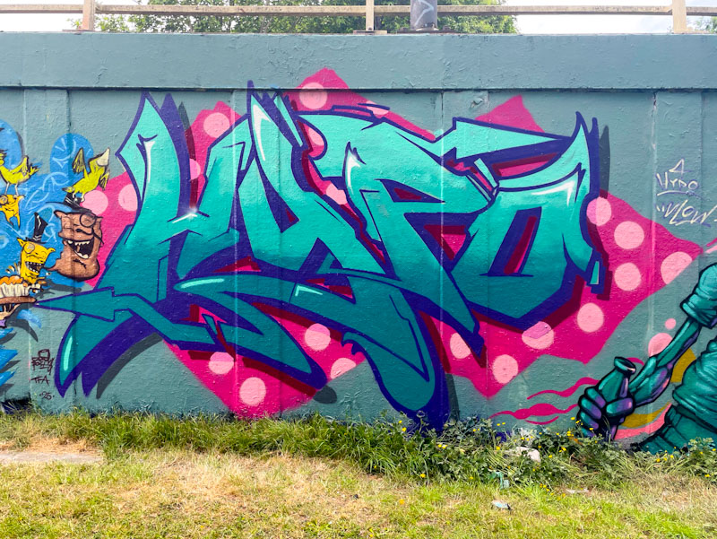
I’ve pretty much said all there is to say about Hypo’s work in so many posts over the last couple of years, and this is another fine example of his wildstyle writing, perhaps more cryptic than some of his pieces. What an accolade that so many great artists came out to celebrate with him.
Cheo, M32 roundabout, Bristol, May 2025
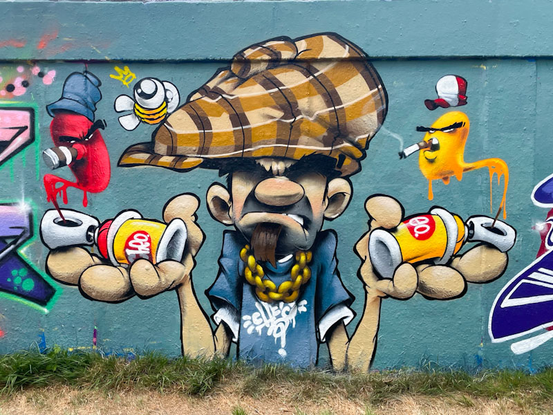
Cheo is one of the ‘godfathers’ of character work in Bristol, and this is a superb cartoon-style piece featuring an artist (is it Hypo?) pondering whether he should be using red or yellow paint. The animation is so full of humour and movement, it almost feels like watching a film clip. Of course, a signature bee is in attendance.
Hemper, M32 roundabout, Bristol, May 2025
Hemper always, always turns out outstanding pieces. This one is as creative as ever, and spells out Hems in blue and white dappled letters set on a red splash. Everything in on point, and it is easy to see that this is the work of a graffiti writing genius. Three great pieces coming together in this birthday collaboration.
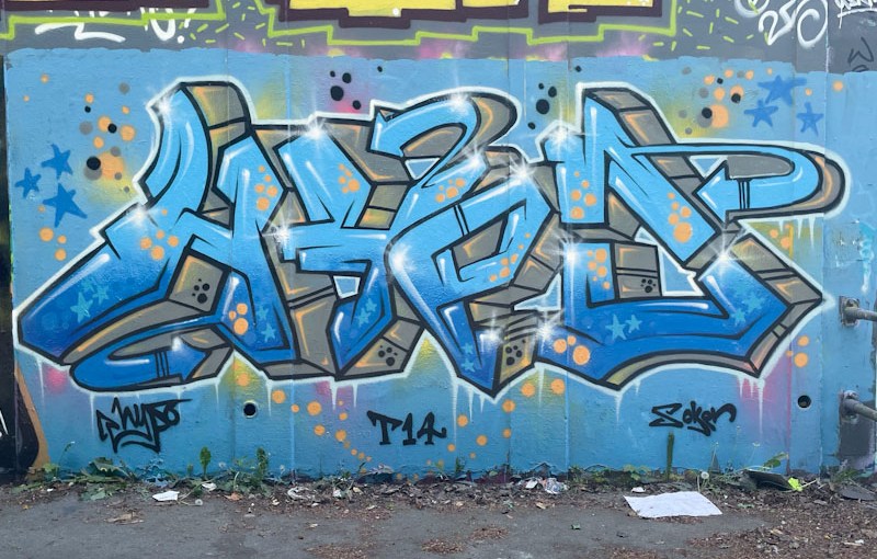
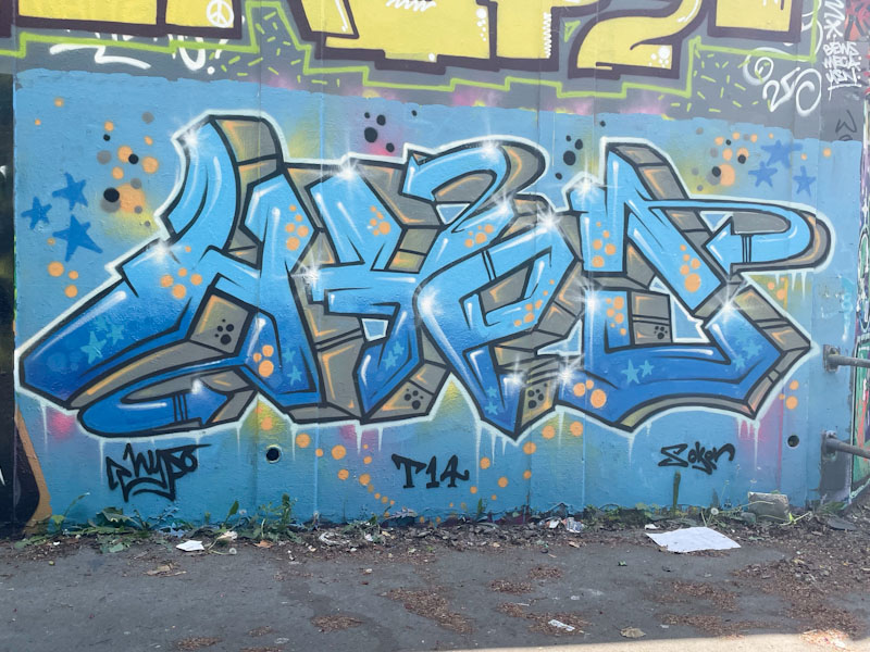
It barely needs repeating, but Hypo has been smashing it for at least a year now, and each of his pieces brings to the fore another aspect of his technical ability and creativity. This rhapsody in blue was one of a couple of recent pieces painted on this wall by Hypo.
Hypo, M32 roundabout, Bristol, May 2025
To manage to get a piece to ‘pop’ when it is painted in the same colour as the background is a skilful thing to do and Hypo has managed to do it well here with a clever use of a deep 3D grey drop shadow and some deft white highlights and starbursts. The tones are really lovely and his fills intricate with blue stars and yellow spots. A very fine piece of graffiti writing.
Hypo continues in his rich vein of form and is working his colours really hard at the moment, but not in a chaotic or random way, but rather in a considered and thoughtful manifestation.
Hypo, M32 roundabout, Bristol, May 2025
Each of the letters HYPO are given an individual colour scheme with blended tones beautifully worked. The letters are afforded a chunky 3D effect, thanks to the skilfully placed white highlight lines that deceive our eyes. Another fabulous piece in an outstanding and lengthy series of graffiti writing.
It is a great thing that Hypo has made more time for his graffiti writing over the last year or two. His regular appearances, painting the letters HYPO are more than welcome, and he has upped his game considerably over that time.
Hypo, M32 roundabout, Bristol, March 2025
This is another piece in which he uses colour to the maximum, something he is really accomplished at, and he presents his letters with what looks like a water mark running horizontally through the letters. With subtle white highlights, his letters have a superb 3D effect, leaping out from the wall. This is a blinder of a piece.
This piece by Hypo, who is on a roll right now, symbolises for me a party. If you wanted to paint the word without spelling the word, this is what it could look like. The fierce is full of energy, colour and joy.
Hypo, M32 roundabout, Bristol, February 2025
The letters spell out Hypo and are full of classical graffiti writing references, such as arrows, drips, starbursts and spots. There is lots here to enjoy, and the overall sense of wellbeing that the piece transmits is palpable. This is another in a series of wonderful pieces from the artist, who has had a great couple of years.
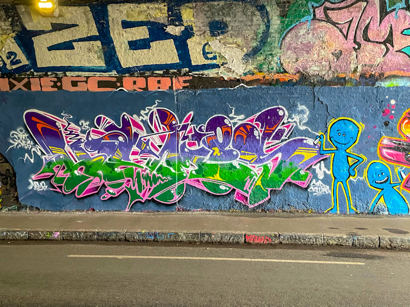
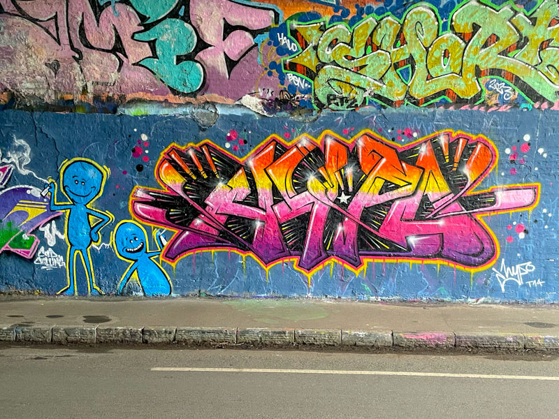
Hemper and Hypo, St Werburghs, Bristol, February 2025
Hemper and Hypo have been smashing it recently, and this is a wonderful recent collaboration in the tunnel. I fear that while I am away in France I will be missing a whole bunch of their work.
Hemper, St Werburghs, Bristol, February 2025
Hemper, like Kid Krishna, has had something of a lifestyle change and has come out of it all guns blazing. This is a combination piece of writing and little blue characters, which might have been a joint effort from both artists. Vibrant and energetic.
Hypo, St Werburghs, Bristol, February 2025
After a quiet January, Hypo too has been in outstanding form through February and this is yet another fine piece from him, with great colour transitions and his familiar HYPO moniker. An outstanding collaboration.
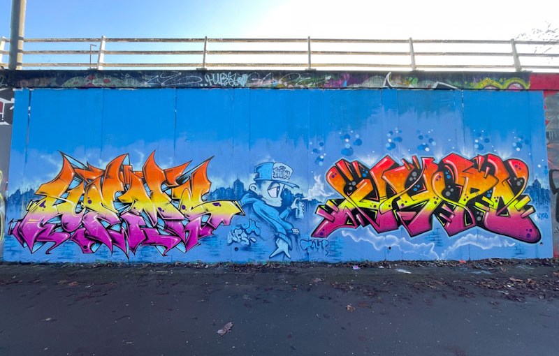
Hemper and Hypo, M32 roundabout, Bristol, February 2025
Hypo and Hemper have been super-busy this February, Hemper in particular. This collaboration has taken up quite a lot of space on the long wall on the northern side of the M32 roundabout, and it is a really impressive production piece.
Hemper, M32 roundabout, Bristol, February 2025
Hemper has produced a stunning piece of writing to the left spelling out HEMS. He has a vibrant colour horizontal gradient running through the letters, and his subtle white trims and flashes give it all a super depth and lifts it away from the wall. I think that the B boy character is also by Hemper along with the urban landscape behind.
Hypo, M32 roundabout, Bristol, February 2025
Hypo, who often paints with Hemper continues the colour scheme bringing balance to the production. This might just be one of the best pieces I have seen from Hypo. The depth of his letters is great, and the graded fills perfectly done. I particularly like the interstitial spots between the letters. There is a superb ‘old school’ vibe about this collaboration.