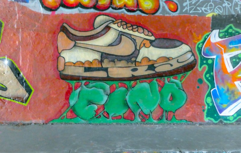
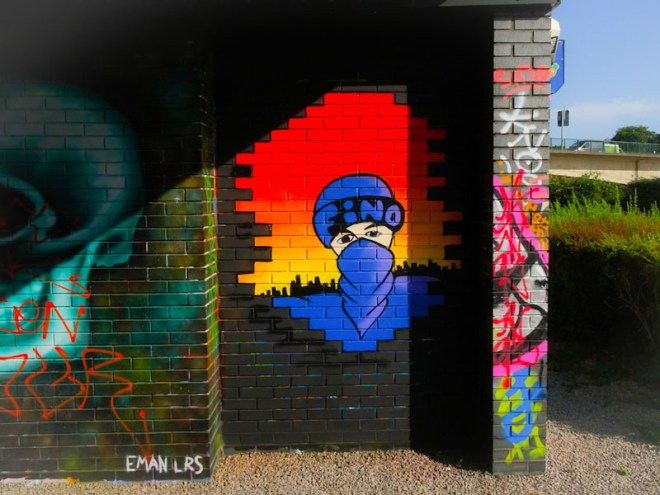
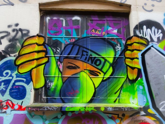
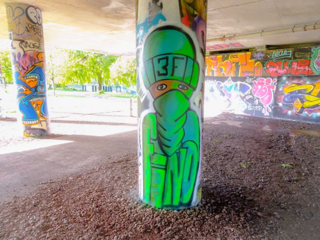
A gallery of character pieces and graffiti writing from 3F Fino or simply Fino
Crew: LRS
all photographs by Scooj
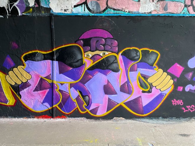


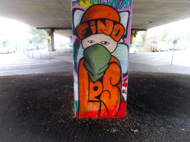



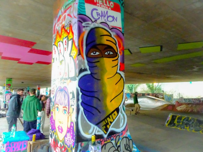

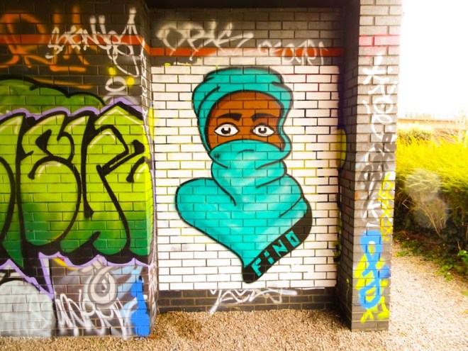
A gallery of character pieces and graffiti writing from 3F Fino or simply Fino
Crew: LRS
all photographs by Scooj
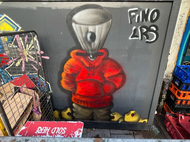
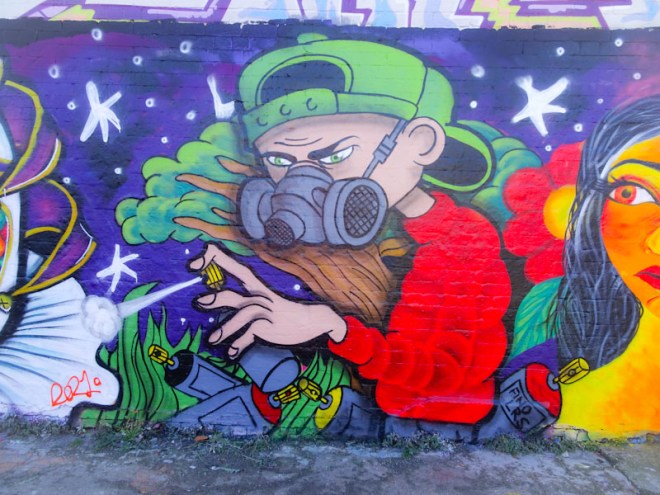
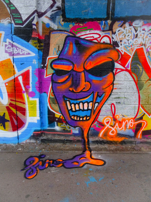
One of the nice things about pausing and going back through archives is that it gives me a chance to post those pieces I had always intended to, but never quite got round to doing. This fun spray can character piece by 3F Fino is one of those.

This piece in Mina road spent much of its time being obscured by all sorts of shop paraphernalia and rarely saw the light of day, however, I got lucky and managed to capture it when it was partially exposed. The character, with a nozzle for a head, is standing in a pile of what look like banana caps. I felt, that this was a piece that demonstrated 3F Fino’s development really well, and he did a great job on the fabric shadows and textures, and the same with the shapes and orientations of the caps. A really good piece from the artist, who appears to have stopped painting in Bristol (although I saw a piece by him last week). Time for a gallery? I think so.
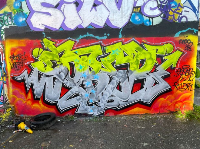
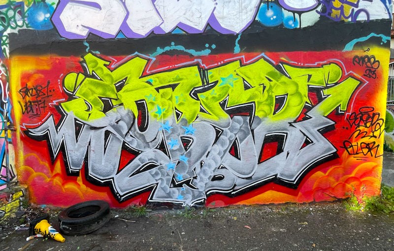
I will never be able to keep up with Klashwhensober’s prolific presence around Bristol. Not only does he paint whenever he gets the opportunity, he also paints at all the regular spots and some of the out-of-the-way places too. I’m not sure I have seen him occupy this particular wall in Dean Lane before and it didn’t last for very long, so I am pleased I captured it when I did.

Without a doubt, this is one of Klashwhensober’s better pieces and he has smashed it on a premium wall and it doesn’t look in the slightest bit out of place. The bright yellow and grey letters stand out beautifully on the contrasting orange/red background. Great fill patterns and drop patterns too and the finishing is pretty much on point too. A great piece from Klashwhensober.
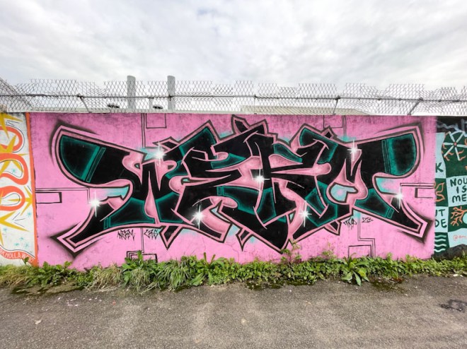
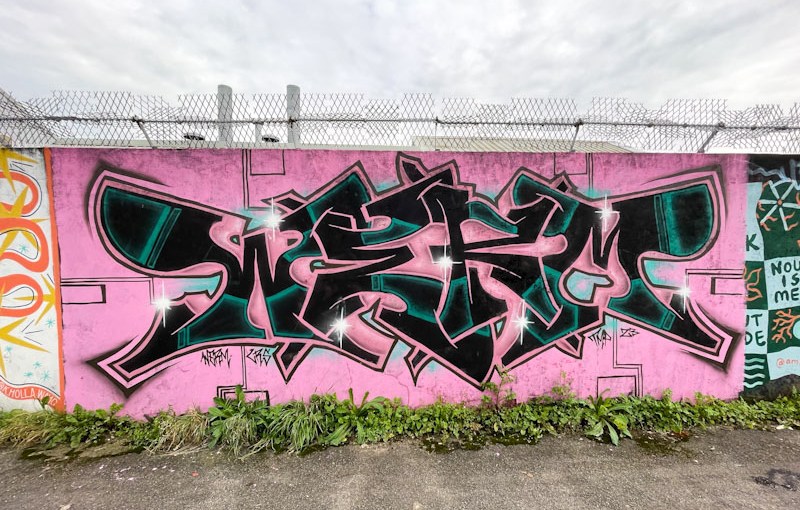
This wall is a little out of the way and not favoured by many artists in Bristol. It is however a favourite for the Bristol Mural Collective to host occasional paint jams, so I was a little surprised to find a couple of Werm pieces on this stretch, which may have been there for some time, as I don’t visit the spot all that often.

This striking piece by Werm exploits the contrasting nature of Pink and Black, a combination used to great effect by Lee Roy and Waste in Brunel Way a little while back. Judging from the letter shapes, I would say that this piece is relatively recent, and it is dated 2023. I think I prefer his work when it is slightly less busy and cluttered, so I am enjoying this new direction.
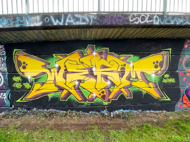
This is the third piece of graffiti writing that I have posted today. I do make efforts to try and mix up writing with street art and character pieces in my posts, because I completely get it that graffiti writing isn’t everyone’s cup of tea and is definitely an acquired taste. However, there are a lot of writers out there and sometimes there is just a lot to publish.

Werm is quite slow to change his basic designs, preferring to lock on to a particular idea and bash out dozens of quite similar pieces, before moving on to a slightly different design concept, and I think that this piece is a bit of a new transition. The yellow and purple colours are a good combination, and are actually ‘opposite’ colours, and the green glowing background accompanies them well. The letters spell WERM and are much bigger than of late, without quite so much expansion and fuss. It will be interesting to see where this transition takes us.
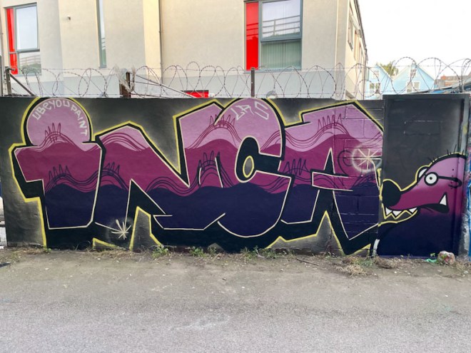
Although an infrequent visitor, The Mole is in Bristol often enough to usually make it into the pages of Natural Adventures, and into the galley pipeline. The Mole has used some sumptuous colours for this piece and presented them on a black background, which I think works, although I have been trying to imagine if any other colours might have been better and have drawn a blank.

The writing/mole character combination is a winner, but the star of the show is surely the fills. The three horizontal colour tones progress really nicely, and thin lines and designs bleed from one horizontal band into the one above. Very nicely thought out and beautifully finished, this is a great piece from The Mole.
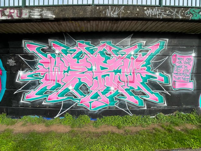
A couple of weeks back it was Werm’s birthday, and there was a fabulous turnout of friends and LRS crew to celebrate with a large paint jam. Werm, as usual, turned out an exceptional piece to mark the occasion, in the blue and pink theme colours.
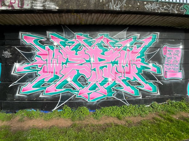
Werm is continuing with his current form of writing a small WERM at the centre of the piece with elaborate extensions to the letters creating a complex wildstyle burst of terminal arrows. His work is always beautifully designed and turned out, and has come on such a long way since his early character pieces under his Eman moniker. Happy belated birthday.

It has to be said that Werm has managed, in a relatively short space of time, to create and amplify his unique style on the Bristol scene. His work is constantly improving and developing, and he is starting to work on collaborative walls with some of the more established artists in the city.

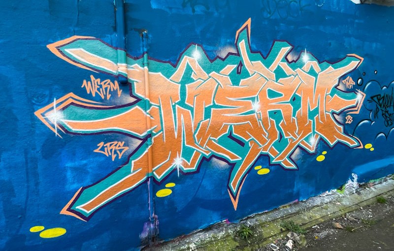
Werm is favouring a style at the moment which has extensive elaborations on the letters WERM that form the central portion of the piece, almost as though the letters are growing roots and shoots. He is also managing to fill his letters with nicely painted colour transitions, five in this instance. Werm was painting alongside the very experienced Turoe on this wall, and has picked up on a shared background of sky blue and some of the bricks of the wall picked out in a darker blue. A graffiti writer on the up.
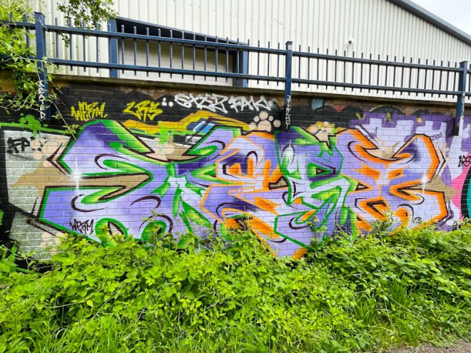
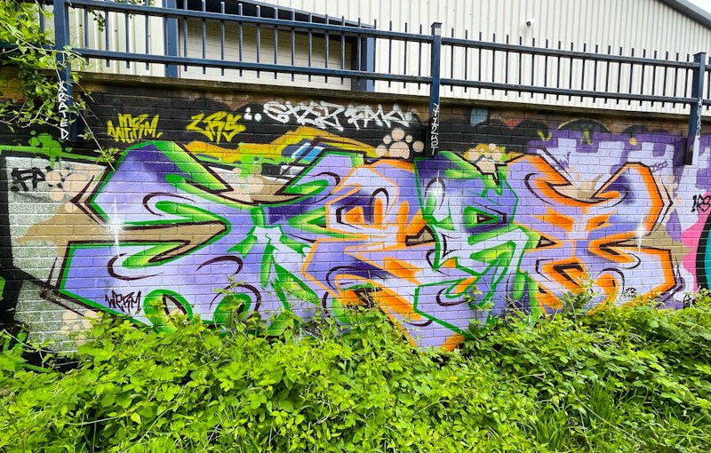
A lush scene, photographed at the beginning of this rather glorious spell of weather we are having. This is not, however, the first time I have photographed this piece, but I never got round to posting it, so I thought I’d have another go. It is, of course, by the tireless Werm.
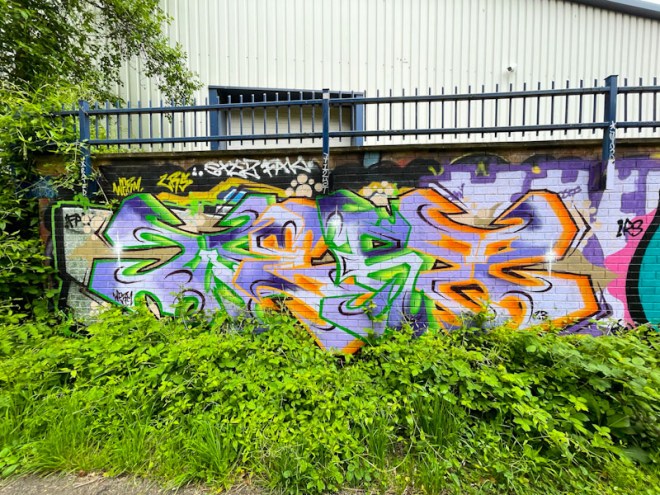
I rather like the way that the encroachment of greenery complements the greens in the piece, and that the purples and oranges almost resemble flower petals. Spelling out WERM, the letters are beautifully crafted and filled, and demonstrate just how quickly this artist has developed and keeps improving.

At a guess I would say that I only post about a quarter of all the Werm pieces that I find, and tht is probably only a half of what he paints, so I will have to find a way to remedy that. I think I might have to do a trawl through my folders and publish a mini gallery to get back up to speed.
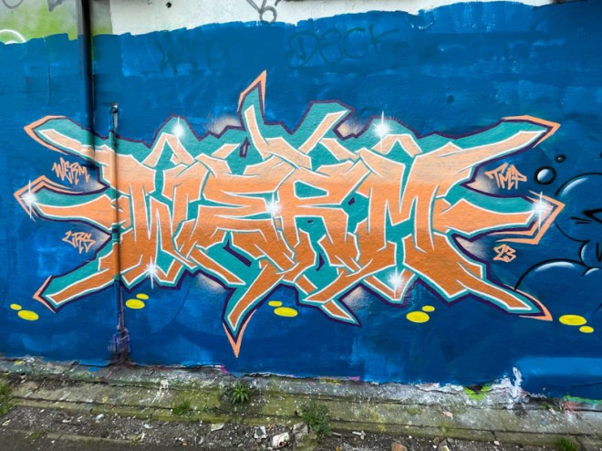
In the short three or four years when I first met Werm, who was writing EMAN at the time, he is in my view, one of the most improved artists and graffiti writers in Bristol. The technical skills he displays with his work is of the highest order, and it just shows what talent combined with dedication can do. There is more to this piece of graffiti writing than just the stunning colour combination.